

Cranks & Shocks
The brief was a bike shop looking to incorporate some stylishness to their brand, and also include an antiquated feel. An establishment looking to up their game and cement their position as a permanent fixture on the map, while catching more eyes with something that gives a more unique feel.
I started with planning out the symmetry in the text across the middle. Having an ampersand and an S next to each other is convenient in that they share similar elements. After several iterations, and having found something I was pleased with, I started work on the other elements. The monogram in the bottom centre is loosely based on the letters from the main text, but needed some obvious adjustments. The flourishes at the top also lead to a fun design in the middle: a bike made of flourishes. After planning the ribbons, I also worked in some additional flourishes in the negative space below the main text.
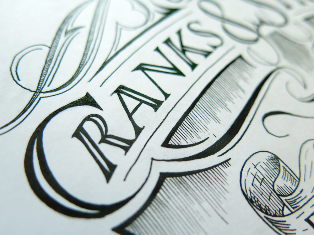
Each of these elements is suited well to being extracted and used in different places. For example, the monogram is convenient for a logo on a document or as a watermark, while the flourish bicycle functions well as a logo on a letterpress business card or promotional stickers. The main text can be lifted out to form the header on documents, and to suit any other uses such as banners or printed straight on narrow surfaces. The full design fits well on the side of a vehicle and on the window of the business.


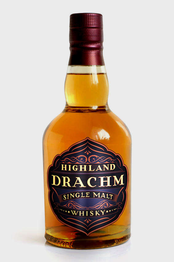
Highland Drachm
After some initial pencil sketch designs to get an idea of the right direction for the piece, I quickly transitioned to working with the piece in terms of nodes and Bézier handles.
The goal of the piece was to create something through which I could explore some aspects of coloured work that would produce a usable end product. In terms of the lettering on the piece, it’s a blend of rustic, traditional and modern Roman Capitals. The mixture of styles gives an impression of not only modernity but also timelessness and an artisan influence. This piece would be ideal for a smaller company looking to update their branding as part of growing their business and reputation while maintaining the impression of hand craftsmanship and traditional techniques.
Here’s a little preview of the piece as it would appear on the label of a bottle:
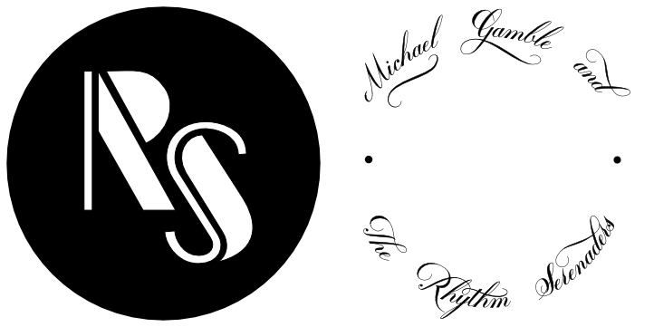
Rhythm Serenaders
Goals
To create a logo in the form of a monogram incorporating an early 1920s aesthetic, and to embody a classy and professional style; at the same time to be simple enough to undergo any scaling necessary and unique enough to be easily recognisable.
To create script lettering to surround the monogram and for the two pieces to function together and independently of each other in white on black and black on white contexts.
Direction & Style
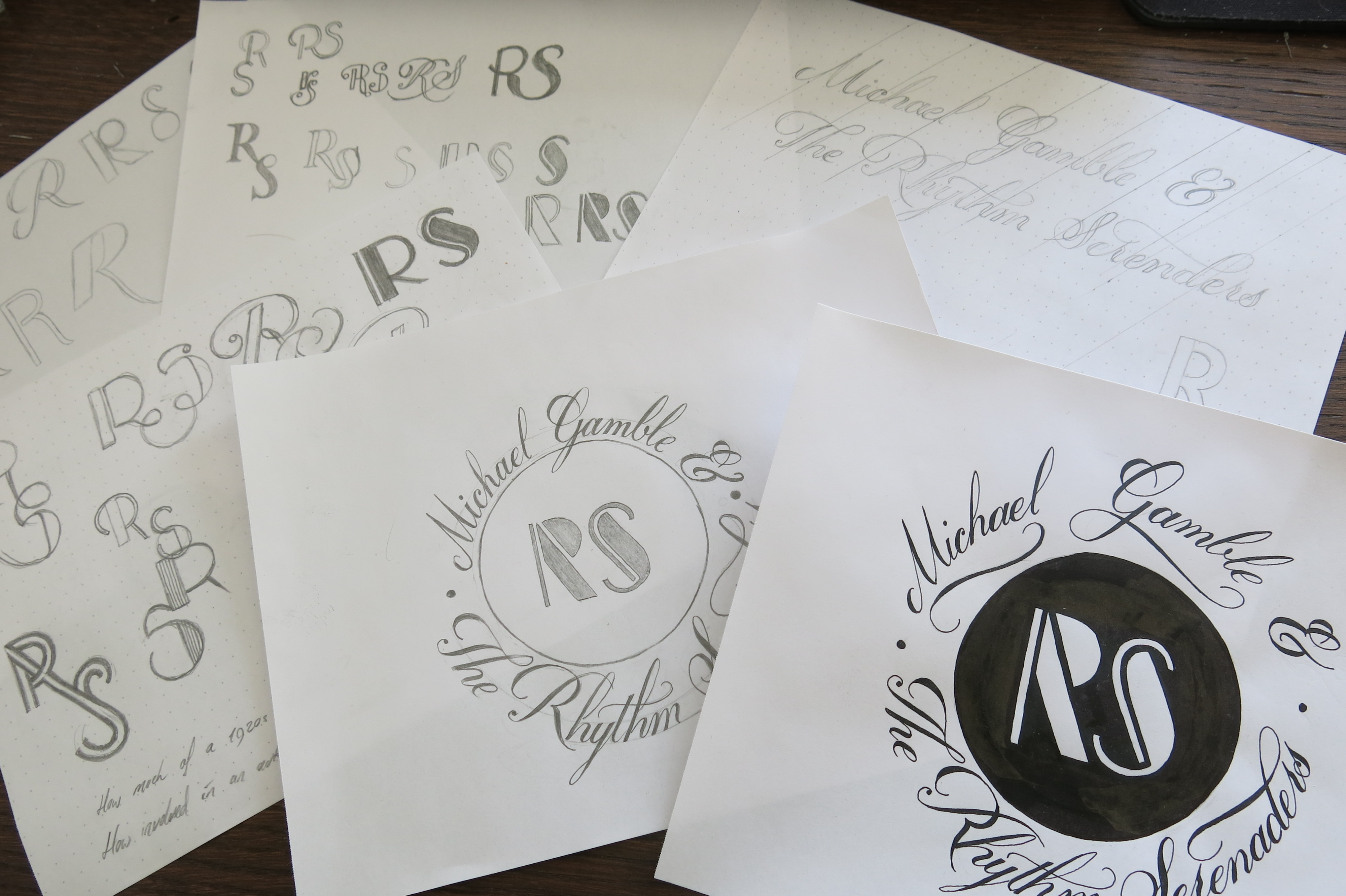
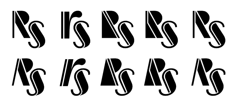
 I started out with exploring as many Art Deco and non Art Deco ideas for the monogram as possible, to discover ways in which the letter forms interact with each other in different styles. From there, I could begin to apply what I had found to create a custom style that satisfied the criteria while remaining unique to the project.
To better steer the project, I researched examples of logotypes, typography and monogram/cypher usage in the 1920s-40s, as well as the principles behind the Art Deco movement. The geometrical influence that guided the movement, particularly in its expression through typography was something I incorporated into the design while still retaining forms that are quickly and easily recognisable in the context of modern typographic principles. A modern audience will perceive the Art Deco aesthetic but will not be distracted by any jarring elements, creating an effective use of the logo while still conveying what was originally intentioned.
Revisions and Refinements
After vectorization, the last part of the process is to make numerous revisions and refinements to both the monogram and the script text to make sure they they are not only the most fitting in terms of style, but also scalability, simplicity and legibility for a contemporary audience. During this process I ensured that the monogram functions well in different contexts including the possibility of use for social media branding.
Versatility of the design elements
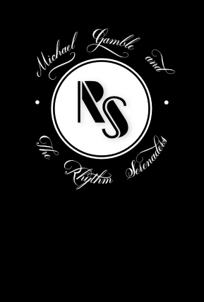
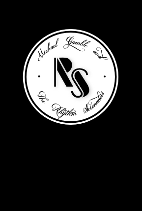
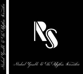
The two elements of the piece were designed not only to be used independently of each other, but also to be able to interact with each other in a variety of ways. Below are a few examples of how the elements can be used in conjunction with each other in a variety of contexts.
CD Case Layout Examples


Uniqueness & Memorability
One of the most important aspects of a monogram for these purposes is a clean and simple design. This piece is designed to be memorable and individual, while still staying true to an authentic aesthetic and classy, clear cut style.
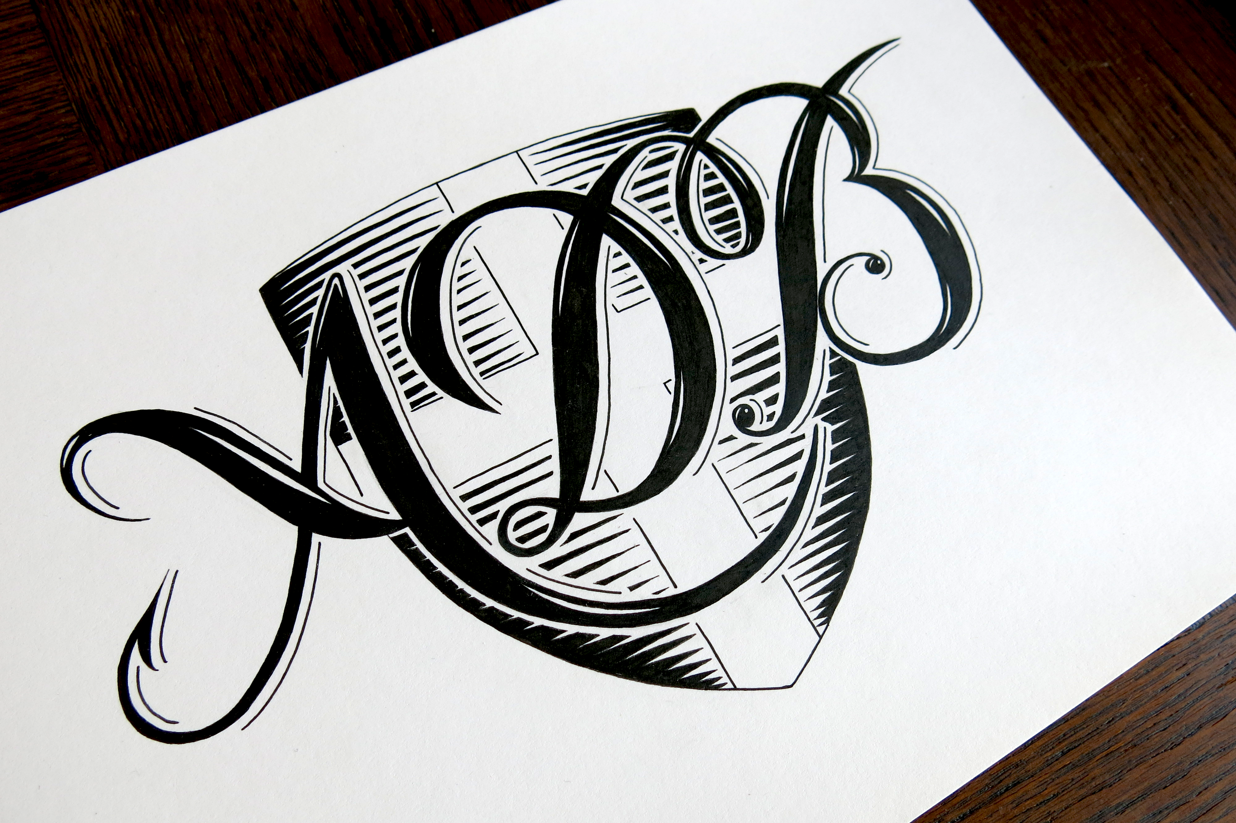
ADB
The piece consists of the initials “ADB” for a French group, and stands for “Les Amis du Brochet”. The initials were to be set over the background of the Savoy Flag (and in this case in the shape of a shield). That part being predetermined, my role was to find a suitable lettering style to complement the backdrop. I went through several different styles, mainly based around Copperplate calligraphy and Roman capitals, though I had a play around with some black letter and abstract styles before settling on what you see above. France is a country that puts great store in handwriting, much more so than most English speaking countries, with handwriting practised rigorously on special lined paper called “seyès” with five horizontal lines per vertical line. This leads to people saying that all French people have the same handwriting, and while it’s not really true, there is a higher standard to be upheld. As a result, France is a country that boasts a wide array of calligraphic signage and logotypes. If you’re ever in France, take a walk in the streets and look up at the shop fronts to see what I mean.
A Copperplate calligraphy inspired piece, then, was the perfect choice in the end, for this logo. It blends the French dedication to the written letter form with the Savoy flag (and a little of my own lettering flair,) situating the logo not only in a country, but also in a specific region. As a little side note: the client requested a fish hook as one of the details to be included in the piece, which you can see on the lower left stroke of the A.
Here are a couple of the other design ideas I had narrowed it down to before it was time to choose the final style:
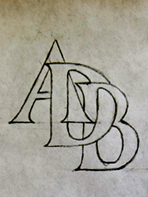
A Roman style interlinking monogram.
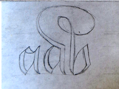
A lowercase black letter style with a flourished ligature.
Meurig Jenkins
This logo is for a composer called Meurig Jenkins, specializing in video game composition, but who has fingers in almost every musical pie you can imagine, from brass band to dub step to indie folk and Spanish guitar. Check out his amazing compositional work on his soundcloud, visit his website, or follow him on twitter!
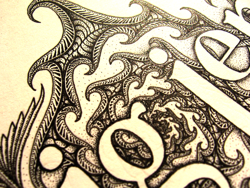
Originally, the idea behind the piece was to have the name as the negative space between swirling, snaking ribbons, but as it progressed, the more I felt that it needed to be something more than the initial sketches. I’ve always known about the beauty of fractals and as soon as I had the idea that the background could be a a design like a fractal, I knew I had to do it. The problem, of course, is that fractals are not only mathematically precise, but they are also infinite. While I would love to know more about fractal generation, I’m no mathematician, and I needed something that was the right shape and density of detail that it would both fit around the logo and be possible to execute in simple black and white. Of course, the end result is not a fractal. but I looked to fractals for inspiration, to try to find shapes and principles that are present in their designs. I went through numerous variations of the shapes and details to give the best effect. Eventually, the design I had settled on included a lot stippling to emulate the gradient-like nature of elements found in many fractals. This wasn’t a problem until the point when it came to vectoring the design. I didn’t want to use computer generated gradients in digitization, because in the end, they give a very different feeling to what you can achieve with stippling. The problem, then is that a vector file including thousands, if not tens of thousands of tiny circles, ends up being enormous. I was lucky that the design has rotational symmetry, meaning that I only had to fill half of it, then duplicate and rotate it by 180 degrees. Even still, there were many times, especially towards the end of the process, when the number of elements on the screen was simply too much for the software, leading to many crashes. Of course, I got into the good habit of saving my work about once a minute.
The final piece:
Here is just the fractal design behind the name:

I wasn’t lying about the stippling! This next one is entirely made of dots. Please don’t try to count them.
The file is made of many layers, and I quite like the look of this layer on its own. There is a row of triangles lining the outline in the centre of the design and extending out towards the edges. Take a look!

The original piece, of course, includes the name, unlike the versions above. However, the reason I vectored the entire fractal, instead of leaving out the parts behind the name, was so that I could do this too:

It’s almost the opposite of the original, with the name containing the design, rather than excluding it. This image, however, has a very different feel to it, I think, but is a useful variation because it fits in a smaller space but retains a glimpse of the details of the original.
Lindy Focus Logo
Lindy Focus is a dance camp based in Asheville NC, focusing on swing and vintage dance. Having existed for twelve years never having had a logo, they contacted me about commissioning something with a more hand-made feel. Wanting something with more feeling, they requested something that was ornate.


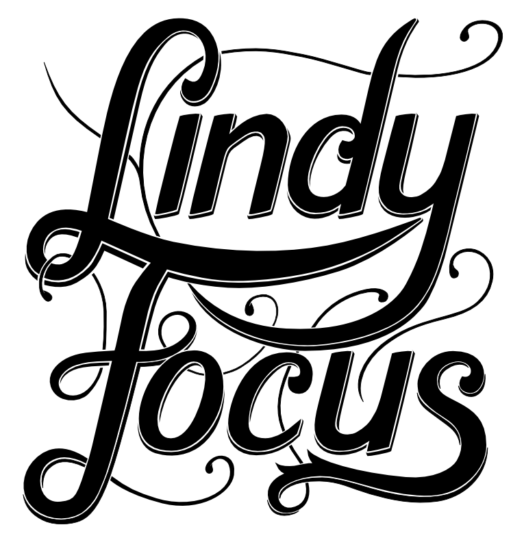
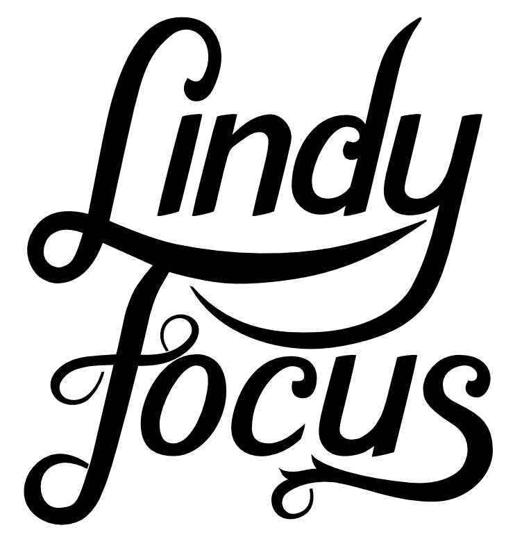
After settling on a design that suited the project, the piece was sketched in full, then inked, scanned and vectorized. The client was presented with 4 final files: a full detail black and white version, a simplified version, a most basic version, and a full detail coloured option.
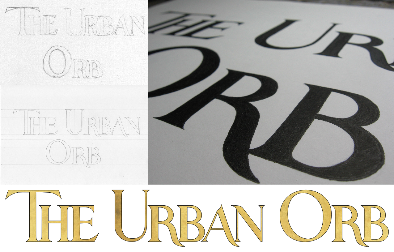
The Urban Orb Logo
This client contacted me with an interest in having a logo designed for branding purposes on a series of youtube videos about the game Dark Souls. After a some discussion, a style was decided on, to be delivered in several different versions to be tested through video editing to ensure readability but unobtrusiveness. The final videos use a design with a semi-transparent fill and solid black outline, meaning that the logo is never invisible, but never stands out starkly.
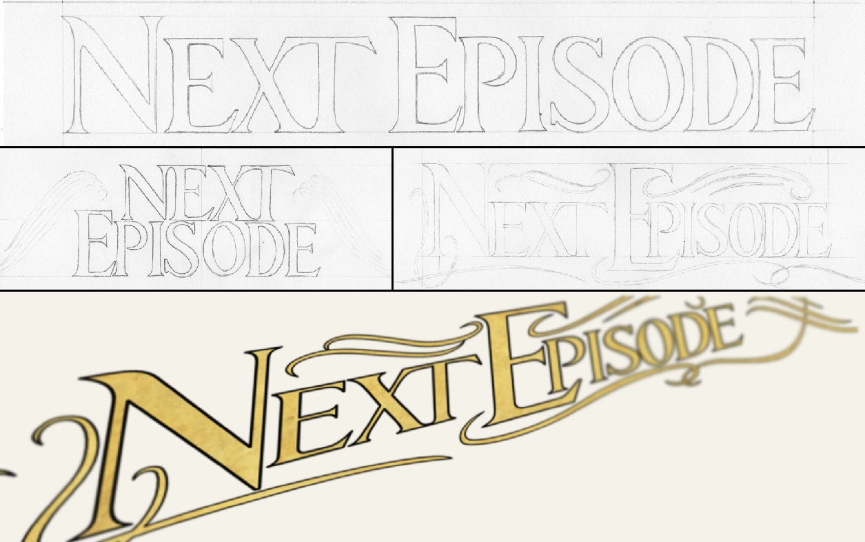
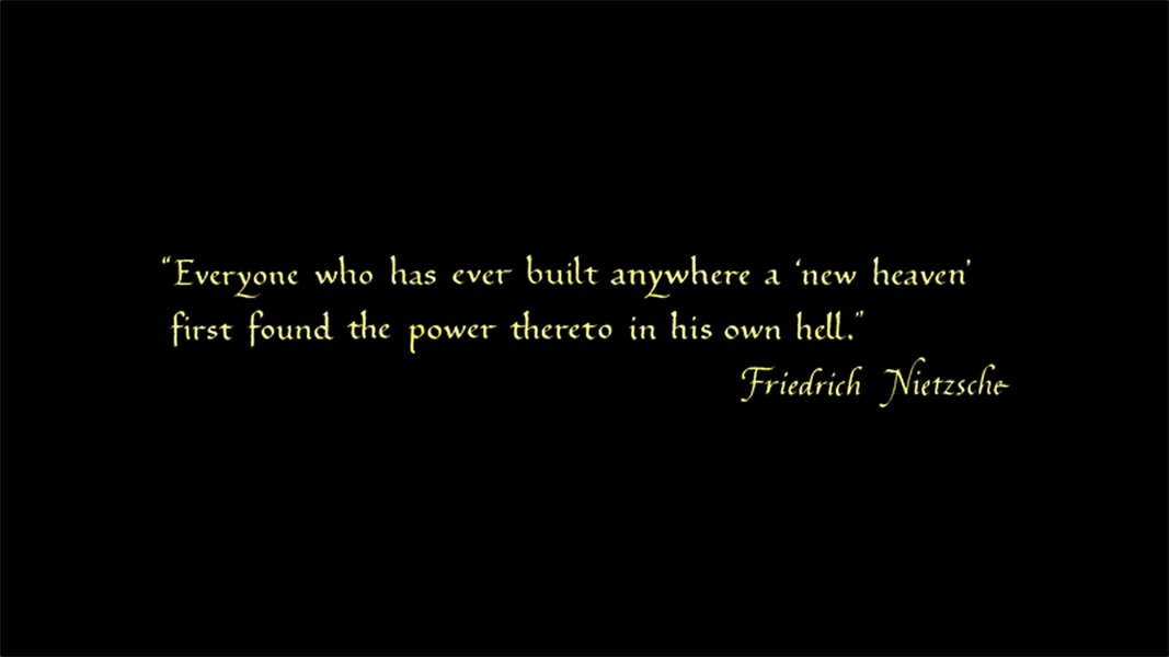
In tandem with this logo design project, the client requested two more sub-projects. The first was the words “Next Episode” in a complementary style to serve as an overlay to the preview of the next episode in the series. The second was a series of quotations and phrases written out in a calligraphy, which would serve as parts of the trailer for the series and to be edited into the episodes themselves.
Here are a couple of samples.
Next Episode:
Quotations:

You must be logged in to post a comment.