L’Albatros

L’Albatros, which is by Baudelaire. The poem describes how the crew of a ship sometimes would catch albatrosses as they followed the ship. Bringing them on board they would laugh at how the once majestic creature would become comical and ugly in walking. Baudelaire then goes on to liken poets to these birds, a rider or storms, laughing at the arrows of archers, yet once grounded, his giant wings prevent him from walking. I wonder what he meant by that. Perhaps he was implying that a poet is one to wander in the skies, metaphorically, and what allows this flight — in the case of the bird, its wings, and in the case of the poet, the mind — is what hinders them from a normal life on the ground. Either way, as you know, the medium is the message, so let’s do away with all this talk of meaning and talk about the media. I did some calligraphy of a poem!

L'Albatros - Baudelaire - Italic - 30-04-2015

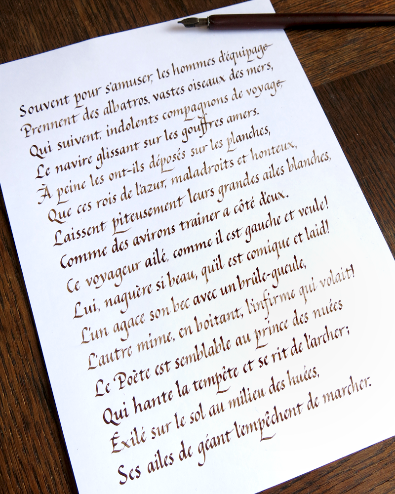
It’s often tempting to do all the fancy things before the boring things. It would be wonderful to use some coloured inks, or gold leaf to spruce up a piece of poetry like this, but the most essential thing in mastering something is to have a good understanding of the basics. That’s why I always make sure to make time for this kind of study. The ink is a neutral walnut, a rich brown that doesn’t catch the eye too much. The layout is simple and understated.

L'Albatros - Baudelaire - Italic - 30-04-2015 Detail

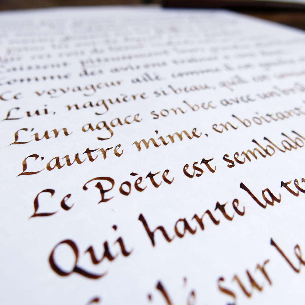
To master a hand is the work of hundreds of hours. There isn’t a short cut to creating the perfect letter form every time: it’s down to training the brain and the muscles to be able to execute it perfectly. One can have a great understanding of what the ideal forms should look like, but in calligraphy, there is both art and craft. The art is the forms, and the craft is being able to create them.

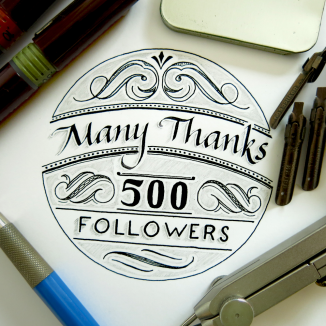
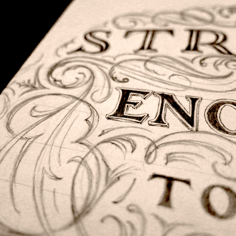
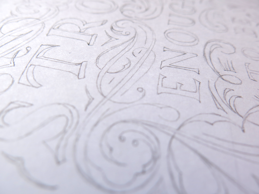
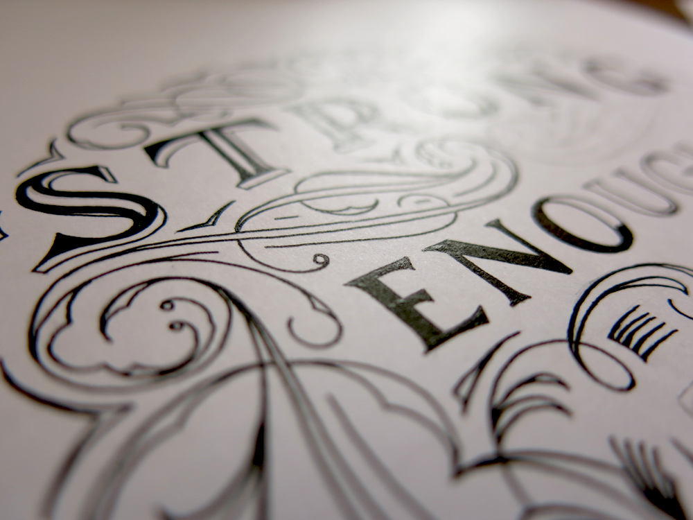
Speaking of understanding forms, lettering differs from calligraphy in the way that it is more forgiving on the execution side of things, but still requires a grasp of the underlying structure that makes letters what they are. Recently, I’ve been having some success promoting my work on Instagram, and so I made this piece to thank the (then) 500 people who follow my account. It’s a mixture of both lettering and calligraphy, using form of Italic calligraphy for the text at the top, under which the other words are lettered.

Many Thanks 500 Followers

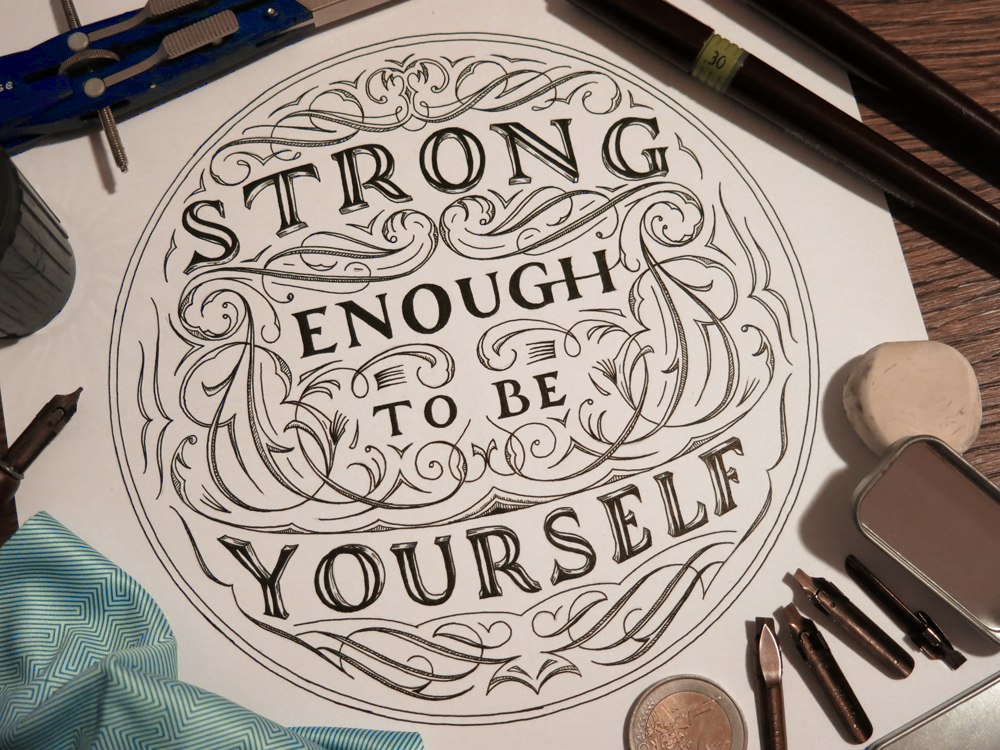
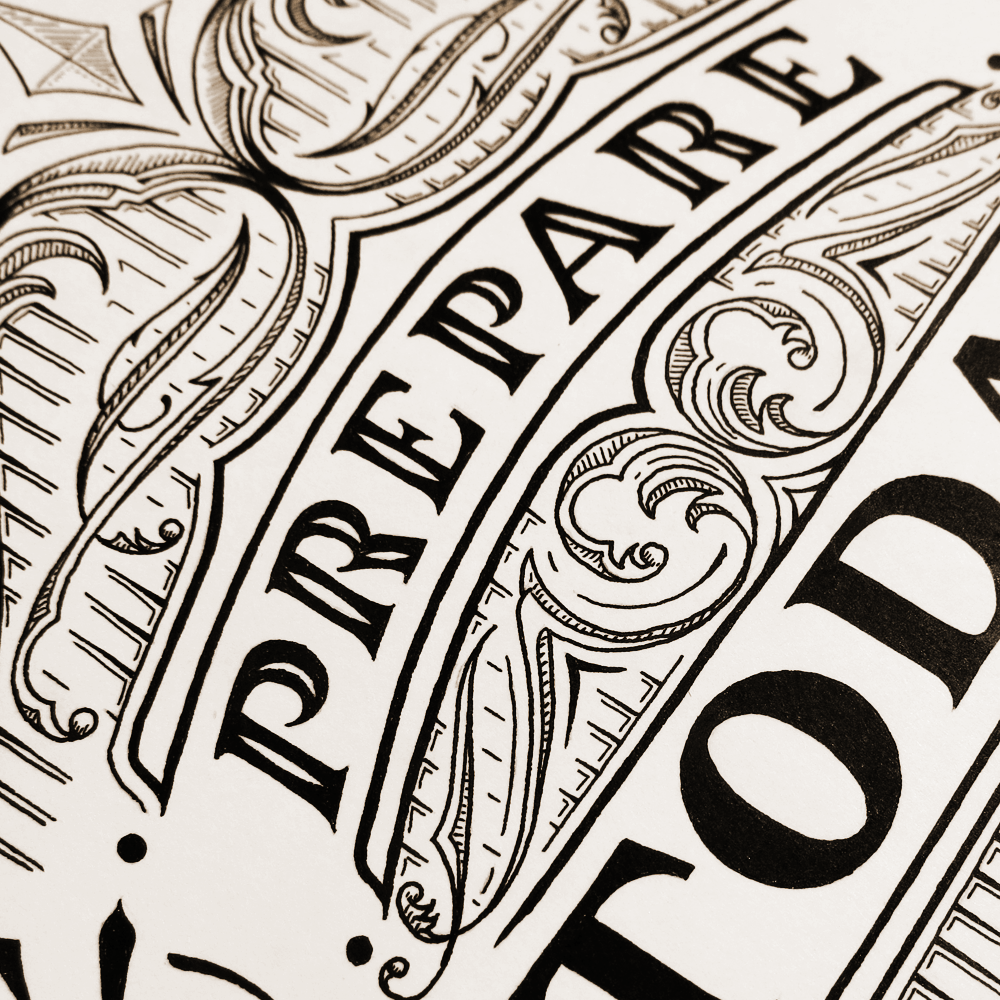
Enjoying the effect created by a combination of ink and graphite, I decided to also explore a little way into the realms of 3D lettering. Here’s a little preview of what I’ve been experimenting with:

LETTER 3D

I’m planning on using this technique in some pieces in the future, so if you enjoy it, you may see some more coming up soon.

Strong Enough To Be Yourself (A study of flourishes)

Flourishing is something that didn’t make it into my repertoire for quite a while. When we start something, we are often ignorant of the depth of it. The way we appreciate something deepens through understanding, and so it’s not surprising that when we don’t have a good understanding it can be hard to appreciate something on more than a superficial level. In terms of lettering, most start out with the desire to understand and create letter forms. Of course, that must be what lettering is all about, mustn’t it? I mean, it’s in the word. Soon, however, you come to realise that the letter forms only work if they are structured well, and so you start to learn about hierarchy and composition. Similarly, flourishing is something that I have been concentrating on lately as an area of study which can improve the pieces I make.

Strong Enough To Be Yourself

If you look back at older pieces, such as The Greatest Victory, which was a piece that I made when I first started to consider the composition of a lettering more, you might notice that the flourishes seem uncomfortable and don’t really know what to do with themselves, almost like teenagers who have grown too fast and haven’t relearned how to use their limbs. They’re there because they are necessary, to an extent, but don’t quite serve the purpose they were created for. Since then, I’ve learned a lot through my study and have applied some of it in this piece.

The piece started just as a sketch of the word “strong”, as I had wanted to try out an certain 3D effect on some letters. I thought of the full phrase and planned out a little more of the structure. From there, I decided to do a little exploration of the space between the words, so, loosening up my arm, I started designing the flourishes using larger gestures controlled by the shoulder muscles rather than the fingers. This advice of using shoulder muscles, often given to those learning calligraphy, can seem daunting to beginners, but when designing flourishes, it really needn’t be. Any detail work or corrections can easily be made later, as graphite is far more forgiving than ink.

Strong Enough Flourish Sketch Progress

One of the most key elements in flourishing is to pay close attention to the negative space. It’s important that no one area becomes too dense, nor too sparse. A roughly equal distribution is attractive, though some variation is pleasing too. Once I was happy with the design, I took from the sketchbook to the paper for the final piece. When it comes to a symmetrical piece like this, it’s convenient to flip the reference material (in this case, the original sketch shown above) so that there aren’t too many irregularities when comparing the two sides.

Strong Enough Pencil Detail

From then on, it’s the same story of inking that you have heard before: a soothing, quiet time spent with paper and ink. Becoming too tense or hurried never helps, as a calm hand creates fewer mistakes. Here’s a little shot of it transitioning between graphite and ink, temporary and permanent:

Strong Enough Inking Progress

Prepare Today for Success Tomorrow

A little while ago a client contacted me requesting a lettering piece. Surprisingly enough, I make more logos and digital pieces than physical lettering projects that get sent off in the mail. This client, however, wanted a custom lettering piece to give as a gift to someone special. The phrase was “Prepare Today for Success Tomorrow”. After many iterations, many design elements, hierarchy re-shuffles and composition tweaks, the piece was designed and inked as you can see below:

Prepare Today for Success Tomorrow

After that comes the part where you have to wrap it up tight and leave it in the hands of the postal service and international shipping companies, and hope that nothing terrible happens to your creation as it hurtles across the ocean. Thankfully enough (and predictably enough) the piece made it there just as it had left and everything was well.

Here’s a little close-up on the detail:

Prepare Today Detail

Though editing and digital manipulation were not part of the commission, I enjoyed working on the piece enough that once it was gone I couldn’t help but do a little more, so I took the piece into the realm of ones and zeros. Several weeks ago, I did some experimentation with using a photograph I had taken of some gold leaf to replace the colour and texture of the letters in a piece, and set it over a black background. The effect turned out well, so I used the same technique on this piece. I used the same gold colour, as it suited the piece’s luxurious style of flourishing.

Prepare Today For Gold Leaf on Black Background

I also experimented a little with adding a wooden texture. It gives a different feel to the piece than the gold does, and I can’t say that one suits it better than the other, just that they would serve different purposes.

Prepare Today For Wooden Texture