For the Love of Letterforms (Part 2)

Last week I showed the first two pieces I made for the Ligature Collective’s “For the Love of Letterforms” competition, the winner of which was to be announced on the 27th. Curiously, no winner has yet been announced, so we’ll just have to wait on that, for whatever reason. Hopefully they haven’t forgotten. Regardless, here are the next two pieces that I made for the competition!

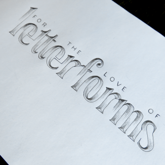
For the Love of Letterforms Illusion

This first one is done in my own style of illusion script, which is an effect that I haven’t seen anywhere else around the web. If there’s anyone else who does this style, I would be very interested to see their work, but as of yet, I can only assume that it’s not common at all, perhaps even being unique to the couple of pieces I’ve used it on. Either way, this style has been very popular on Instagram, and this time I combined it with a very simple monoline sans serif, which sits unobtrusively atop the letters. The particular spacing of the ascenders in the word “letterforms” meant that there was the right distribution of emptiness so that the sans serif could be evenly spaced for consistency.

For the Love of Letterforms Ornate

The second piece I did was in the same style as the very first piece I ever submitted for the Ligature Collective competition series, which was to celebrate their 10K milestone earlier this year. The piece was popular on Instagram, and though it didn’t win the competition, it came in as a runner up and got an honourable mention on their page. The piece combines bold and simple letterforms with a focus on legibility with a highly ornate style of flourishing that informs the piece’s overall composition, and is used to shape the outline of the piece as a whole.

I wonder why the Ligature Collective has remained silent about the competition so far, and when their announcement of the winner will be. So far, they’re a day late, but hopefully they will make an update soon, whether it be to give a reason for the delay, or to announce the winner. Fingers crossed!

For the Love of Letterforms (Part 1)

It’s competition time again! You may recall that a long time ago in a blog post far, far away I wrote about entering a competition to perhaps get into an elite team of superheroes. Well, okay, it was about 23 weeks ago, and instead of superheroes they are letterers, typographers and calligraphers. The Ligature Collective held a contest for Instagram users to submit their best work of art based around the phrase “Ten Thousand Followers” to celebrate, well, you guessed it, getting up to the 10K mark on Instagram. Long story short, I entered, wasn’t one of the 3 winners, but got an honourable mention, along with 8 other lucky artists.

The End.

Or so we thought until now…

For the Love of Letterforms Simple

Suddenly, the Ligature Collective Strikes Back with their next competition, this time in celebration of getting 50 thousand followers! I know, that’s 40,000 followers in 24 weeks, which in case you’re wondering, is just about ten an hour, or about one every six minutes. Whew.

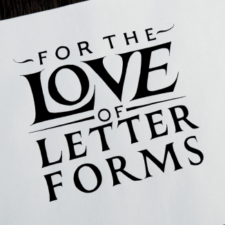
This time, the brief was a piece of lettering of the words “For the Love of Letterforms”. The rules allowed unlimited submissions per person, so I thought I may as well go ahead and do as many as I liked. My goal in doing so was to showcase the variety of styles that I’ve become capable of using over the years and come out with several pieces that differ from each other in feel and appearance as much as possible.

With the first, which you can see above, my intention was to design something that was visually very simple. There is almost no flourishing at all on this piece, and the shape of the composition is made simply through the arrangement of the words themselves.

Here’s the second piece I did:

For the Love of Letterforms Gold

This piece uses a combination of styles, and is reminiscent of the techniques used on old certificates and official documents which employ a combination of heavy blackletter text surrounded by much lighter flourishes and Copperplate accompaniment. The other quite obvious contrast between the pieces is that this one is in gold and white paint on a black background, whereas the other is classic black on white.

Both these pieces, I feel, were a success, and I achieved with them what I had set out to do. The next two, which I will talk about next week, are at great contrast with each other in terms of complexity, but both of which were very popular on Instagram and gathered much attention. Tune in next week to find out what happens! Not only will the next pieces be revealed, but I also will have found out if I got into one of the coveted two available spots on the Ligature Collective team. Fingers crossed!

The Ligature Collective

A couple of weeks ago, I made a post about having recently joined Instagram, and a competition that was being held to draft a new member of something called the Ligature Collective. The competition was to make a piece to celebrate their success on Instagram, and the best submission would lead to the creator becoming a member of the team and have their work displayed to a large audience.

Well, I had sketched up a quick piece, which I posted a fortnight ago, but since then, I had much more time to dedicate to a better thought out piece.

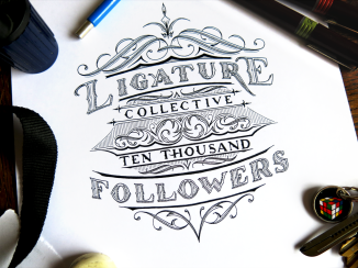
Ligature Collective Ten Thousand Followers Blog Upload

My main goal with this piece was to create a visually interesting piece with lots of little details, but to have a very clear hierarchy, such that the piece was structurally simple. Seeing as the piece was going to be posted to Instagram, it had to work at a small size, and be easily identified. The words “Ligature” and “Followers” worked well as the emphasised words, seeing as they were not only easily legible on small Instagram thumbnails and conveyed the essence of the piece, but also tied the piece up at each end. The piece is symmetrical down through the middle (apart from the words themselves, of course,) and it also has a vague structural symmetry horizontally, too. The words “Ligature” and “Followers” are in the same style, and curve around the piece in the same way, while the smaller central words reflect each other’s style and layout too.

The piece ended up being quite small. I took several photographs of it just on the page on its own, but it always ended up seeming as though it was bigger than it really was. I decided to put some other items in the picture that I uploaded to give a sense of scale. The photograph seemed a little unbalanced with only the lettering piece and a single pen, however, so I scattered a few other objects around it to frame it. Some things, like the camera strap and the rotary lead pointer might not give a very good sense of the size of the piece, but the pens and lead holder should do. Incidentally, these were all things used to make the piece, aside from the keys, of course. But with the keys there, at least I get to show off my funky Rubik’s cube key ring.

After all is said and done (or just done, really; being a letterer is a pretty silent job) the results will be out tomorrow, on April the 7th. There were some truly excellent submissions among the hundreds submitted by other artists on Instagram, so I wouldn’t be at all surprised if they should win. Good luck to everyone else – I’m sure they’re waiting with bated breath for the announcement of the winner. If you’re curious to see the other submissions, click here, or search for “#Ligature10k” on Instagram!

Instagram & Gold

Recently, I got an Instagram account. Follow! In fact, it was over a year ago, but I’ve only recently started using it. There’s quite a nice little lettering community on Instagram, so I’ve been having a nice time looking at all the amazing work of other artists. There are also several popular accounts that curate the works of others who produce calligraphy and type-based work. One of them is a group called the Ligature Collective, who, to give you an idea of their popularity recently got 10,000 followers. To celebrate the fact, they decided to hold a competition to get a new member. The competition is to create an a piece of hand lettered work celebrating their 10K milestone and post it on Instagram.

The Ligature Collective Gold on Black

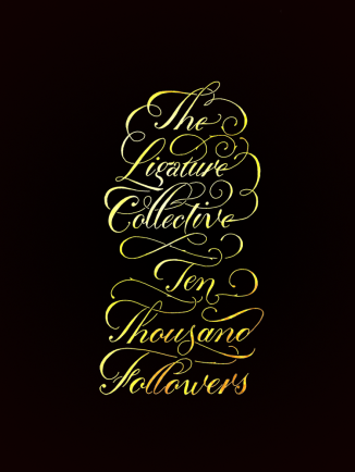
This is a little piece I sketched up when I had a some free time. I’ve been very busy lately, so I haven’t had much time to dedicate to the competition, but hopefully over the next week I will put in some quality design time and come up with something that would put me in the running.

This piece was quickly inked and then taken to the digital side of things. After last week’s foray into coloured work, I decided it would be nice to explore it a bit further. I love the look of gold print posters on a black background, so I decided to try to recreate the effect. I was given some gold leaf as a gift, which up until now has been set aside for a special piece at some point in the future. It served a purpose for this piece, however, even if it was only for digital manipulation: I took a photograph of one of the very delicate gold leaves to use for the colour on the inside of the letters.

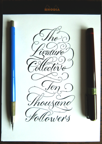
Here’s the piece as it is on the page:

The Ligature Collective

And below, the gold leaf photograph that provides the colour:

Gold Leaf

In combination, they create a quite different feeling than either one alone. It’s also quite pleasing to know that the colour comes from something real. Last week’s piece was done purely through digital manipulation, whereas this time the source is a little more tangible, though only just! It would be easy to believe that this stuff doesn’t even exist. It’s like it’s only a single atom thick. I look forward to the day when I have a piece in mind that’s luxurious enough to warrant its use. Until then, however, I will have to satisfy myself with taking pictures of it.