Le Temps a Laissé Son Manteau – Charles d’Orléans

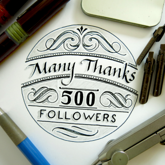
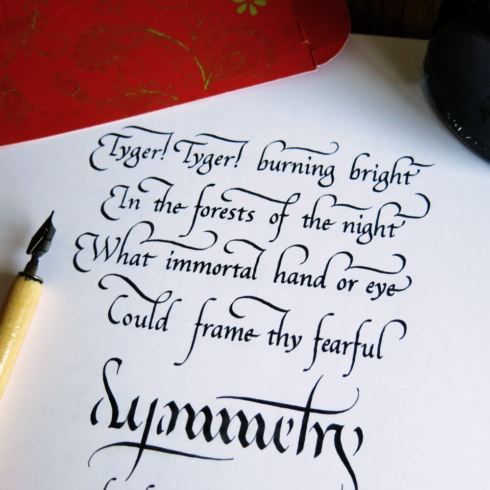
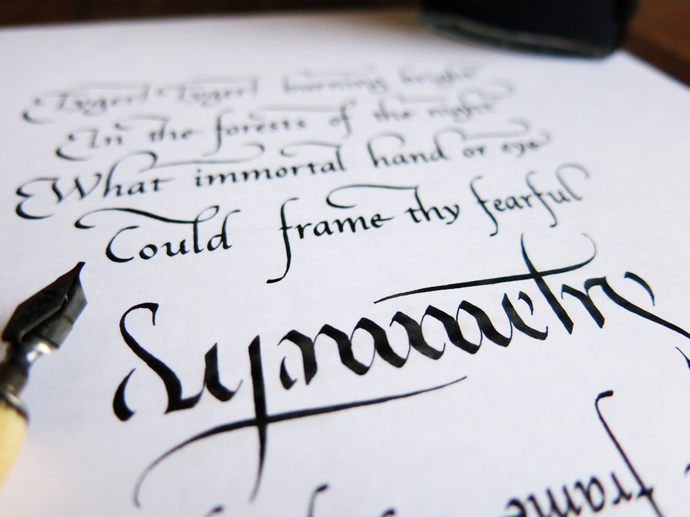
It’s a poetry week this week! And that means it’s also a calligraphy week. Let’s jump straight in!

Argent Detail

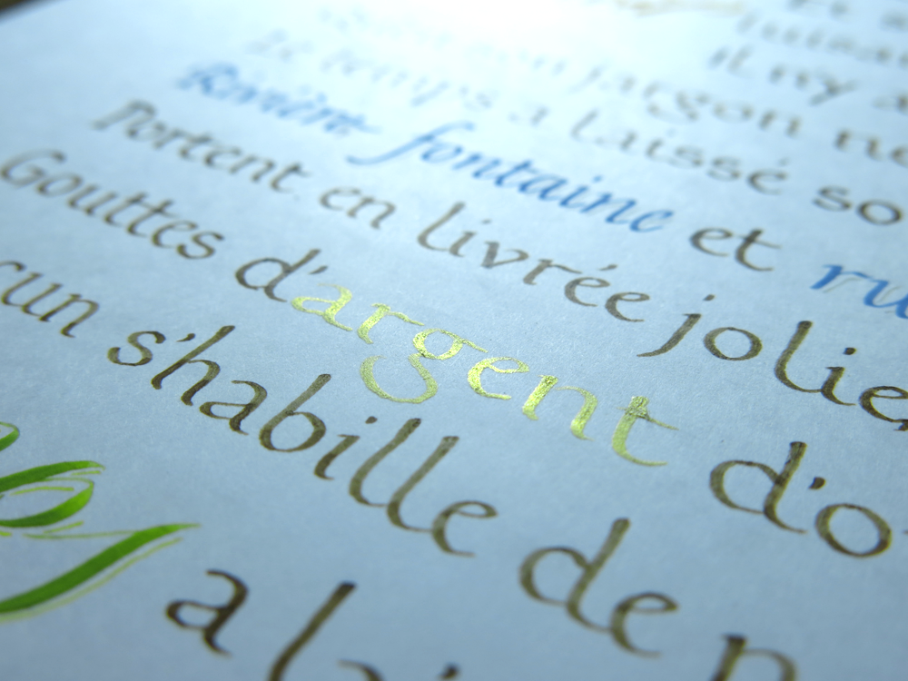
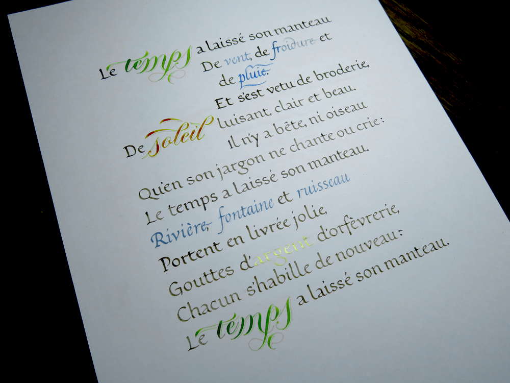
This is a piece in French that I’ve had the idea to write for a long time – a beautiful piece about the change of seasons from winter to spring. In it, there is a lot of beautiful imagery, which is centred around the idea of the seasons taking off their winter coats in the transition to spring. These words afford me, as a calligrapher, fun playgrounds to make the text come alive. Above, you can see the word “argent”, which you may guess means silver, and which is written in gold. If I had any silver paint, I would perhaps have considered using it, but I don’t and so couldn’t, and ended up using my new gold paint for this word, and though it’s slightly at odds with the meaning of the word, I think the effect is superior to what silver paint would give.

Soleil Detail

In this piece, I used a mixture of styles, both with regards to the expressiveness of the calligraphy and with the choice of hands. Three hands are used here, the main one being Foundational. Foundational is a very practical, legible hand, yet it is elegant in an understated kind of way. It’s easy to think of as unimportant, but it really is the backbone of the piece, and does most of the work that you see.

Aside from the Foundational, which is nearly all in walnut ink (except for the “argent” you have already seen), there is also a very expressive and flourished Copperplate. I used Copperplate for these words because it can give so much life to the page, especially when combined with the colours as seen here.

Finally, there are some words in Italic, also in colour, but far less expressive than the Copperplate. These words give some visual interest, and a little break to the texture of the piece, without making a big show of themselves like the Copperplate. Take a look at the full piece below:

Le temps a laissé son manteau

Here’s a translation of the piece:

The season has shed its coat
Of wind, cold and rain,
And embroidered itself
with gleaming sunshine, bright and beautiful.

There is neither beast nor bird
That doesn’t lend its voice to say:
The season has shed its coat.

River, fountain and brook
Wear as handsome garments,
Shining drops of silver;
Everyone dresses anew:
The season has shed its coat.

L’Albatros

L’Albatros, which is by Baudelaire. The poem describes how the crew of a ship sometimes would catch albatrosses as they followed the ship. Bringing them on board they would laugh at how the once majestic creature would become comical and ugly in walking. Baudelaire then goes on to liken poets to these birds, a rider or storms, laughing at the arrows of archers, yet once grounded, his giant wings prevent him from walking. I wonder what he meant by that. Perhaps he was implying that a poet is one to wander in the skies, metaphorically, and what allows this flight — in the case of the bird, its wings, and in the case of the poet, the mind — is what hinders them from a normal life on the ground. Either way, as you know, the medium is the message, so let’s do away with all this talk of meaning and talk about the media. I did some calligraphy of a poem!

L'Albatros - Baudelaire - Italic - 30-04-2015

It’s often tempting to do all the fancy things before the boring things. It would be wonderful to use some coloured inks, or gold leaf to spruce up a piece of poetry like this, but the most essential thing in mastering something is to have a good understanding of the basics. That’s why I always make sure to make time for this kind of study. The ink is a neutral walnut, a rich brown that doesn’t catch the eye too much. The layout is simple and understated.

L'Albatros - Baudelaire - Italic - 30-04-2015 Detail

To master a hand is the work of hundreds of hours. There isn’t a short cut to creating the perfect letter form every time: it’s down to training the brain and the muscles to be able to execute it perfectly. One can have a great understanding of what the ideal forms should look like, but in calligraphy, there is both art and craft. The art is the forms, and the craft is being able to create them.

Speaking of understanding forms, lettering differs from calligraphy in the way that it is more forgiving on the execution side of things, but still requires a grasp of the underlying structure that makes letters what they are. Recently, I’ve been having some success promoting my work on Instagram, and so I made this piece to thank the (then) 500 people who follow my account. It’s a mixture of both lettering and calligraphy, using form of Italic calligraphy for the text at the top, under which the other words are lettered.

Many Thanks 500 Followers

Enjoying the effect created by a combination of ink and graphite, I decided to also explore a little way into the realms of 3D lettering. Here’s a little preview of what I’ve been experimenting with:

LETTER 3D

I’m planning on using this technique in some pieces in the future, so if you enjoy it, you may see some more coming up soon.

Tyger! Tyger!

Ambigrams are funny things. If you don’t know, they’re words that read the same both ways up (or sometimes different things!) It’s never easy to know if a word will make a good ambigram or not. You might have an idea of how you could bend the letters to match each other, but when you try it out, it ends up ugly, or it just doesn’t work. Sometimes, however, you might try to use a word and get an unexpectedly good result.

There’s something magical-seeming about the words that do work. A few days ago, an idea came to my head in a mysterious way. It was almost like a dream, in that there seemed to be a point in time where I had already had the idea, but I couldn’t remember actually having it in the first place. Strange as it is, I ended up making an ambigram of the word “Symmetry” — a fitting word for an ambigram.

Tyger Tyger Square Clutter 1st Verse

Shortly thereafter, I remembered a piece of a poem by William Blake I had used once to practice some calligraphy, and I realised that the poem had the word symmetry at the end of the first stanza. It wasn’t long before I had decided to make a piece with the poem and the ambigram. I looked up the text again, and found that the last stanza also had the word symmetry its end. In fact the first and last stanzas were almost identical.

Symmetry Detail

And so the idea was born to create a whole piece that was an ambigram of sorts. The piece is a combination of the two stanzas, the first on top leading down to the ambigram, which finishes the line, and the last underneath, leading up to the central word. Strangely enough, the piece can’t be symmetrical if it is to have both stanzas, because final line differs between the two. The first reads “Could frame thy fearful symmetry,” and the last “Dare frame thy fearful symmetry.”

Tyger Tyger Square Clutter

How odd the calligraphy looks upside-down. And how odd it is to have a piece so concerned with symmetry, with its subject matter, its composition, and even the very central word all being so symmetrical, and yet not to have it actually be perfectly symmetrical. Let me explain why:

There is some discussion about the rhyming structure in the poem. Reading the lines you might have noticed that the final couplet seems as though it should rhyme, but doesn’t. Surely, you might think, that’s because Blake would have pronounced “symmetry” to rhyme with “hand or eye”, or vice versa. After all, the rhyming structure of the rest of the poem would fit with this explanation. The English language underwent something called the great vowel shift, during which the pronunciation of lots of vowels changed, which resulted in lots of the strange spellings that we have now. However, Blake’s work was written after a time at which “symmetry” and “hand or eye” would have shared a rhyming sound. So, then, either he was drawing from the past in order to cheat the rhyme, or this line is intentionally the only one that doesn’t rhyme. You may notice that it’s also the only line with 8 syllables versus the 7 of all the other lines, which goes further to imply the difference of this line.

That said, there are other convincing arguments to suggest that he did, in fact, intend for the line to rhyme. Either way, it’s a slightly more thought provoking piece to have a difference between the top and bottom, and as it includes both start and end of the poem, it pleased me more to write it that way.

There could be much more to discuss, but I will leave it at that for this week. I will look forward to sharing more calligraphy and calligraphy/lettering-combination pieces with you soon.