Just Wing It

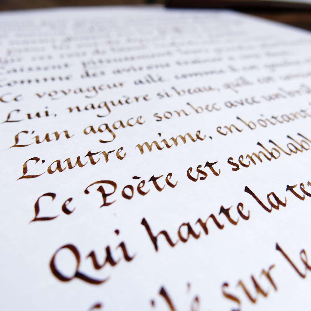
Sometimes you need to stop preparing and jump in at the deep end. This weekend I went for a swim in a lake, and it turned out that the summer hadn’t warmed it up enough to really be hot enough, but the plunge is by far the worst part of it. After you get going with something, it often ends up not being so bad. Some times, you need to just wing it.

Just Wing It

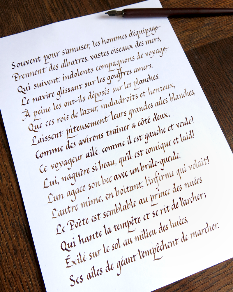
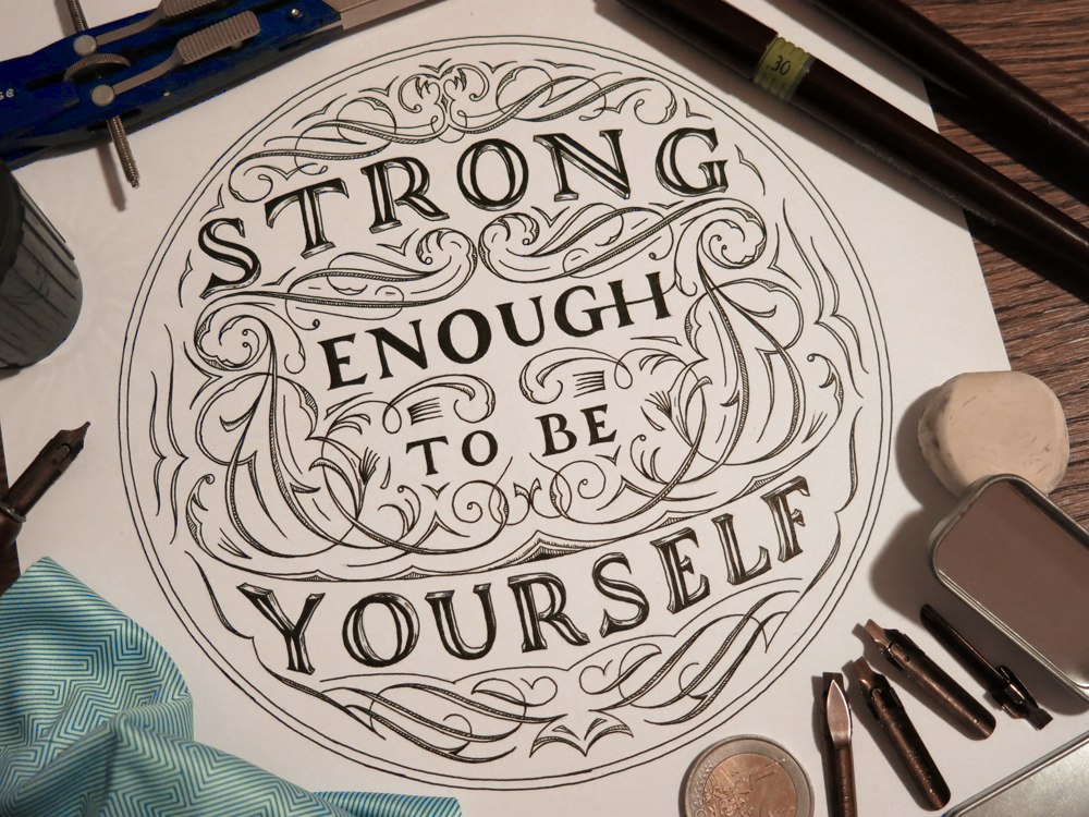
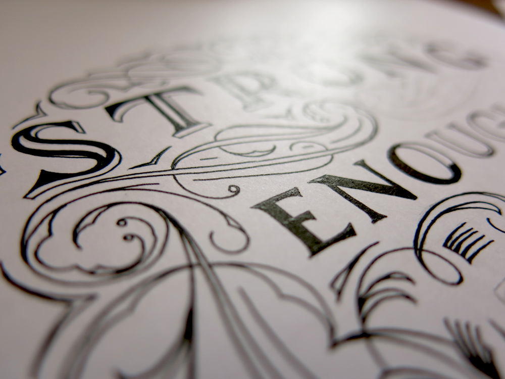
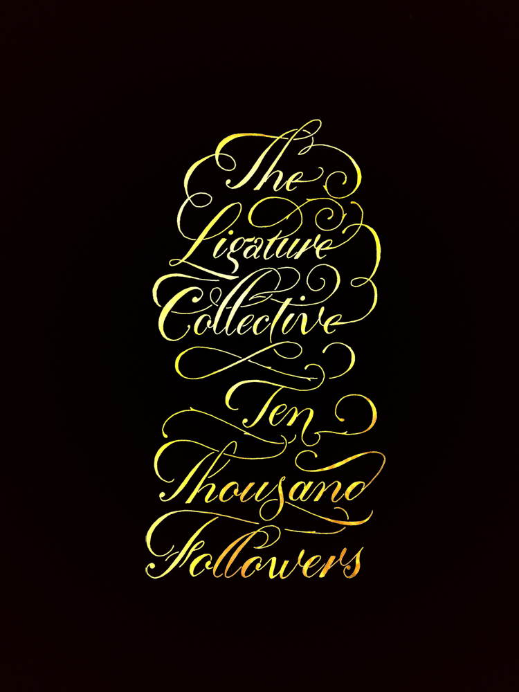
So here’s a little piece that puts into practice the things I’ve been studying about formal Romans, with a little dash of Copperplate thrown in for good measure. All of that is becoming familiar ground for me, however, so where is the proof of the jumping in at the deep end? Well, I decided to finally start a little more serious experimentation with coloured work that isn’t in the digital realm. I bought some gouache and turned this piece into something colourful:

Just Wing It Colour

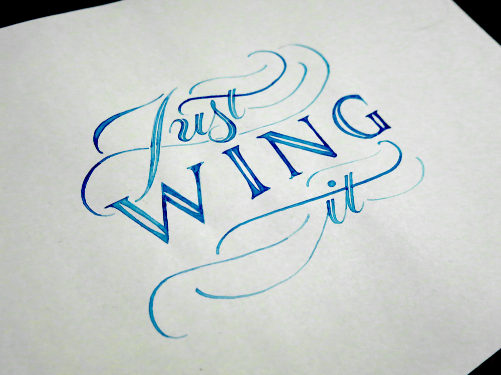
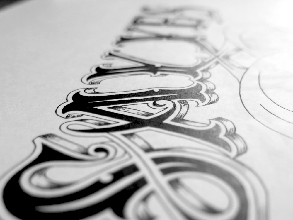
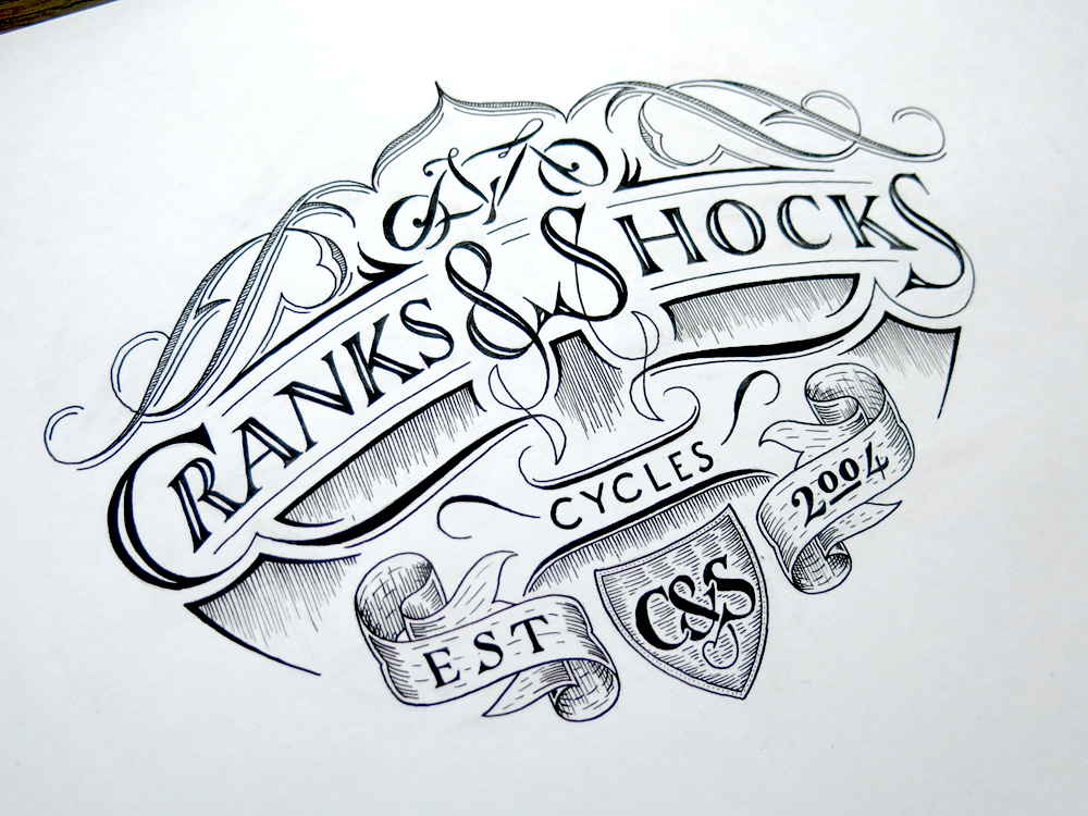
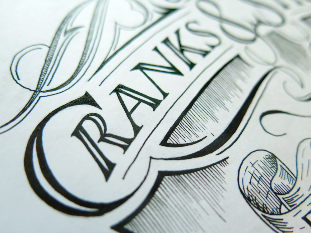
I’m pretty sure that that just about wraps it up for learning blue, so if I just learn the other 6 colours, I should have it all sorted out. In all seriousness, though, this was novel for me in both execution and design. Working with subtly different tones was interesting, but the experience was added to with regards to the tools used. When making something that’s simply black and white I use Rapidograph technical pens, but this piece is one of the first lettering pieces (as opposed to calligraphy pieces) that I’ve created using my traditional calligraphy tools, in the form of a broad tipped dip nib.

Wing

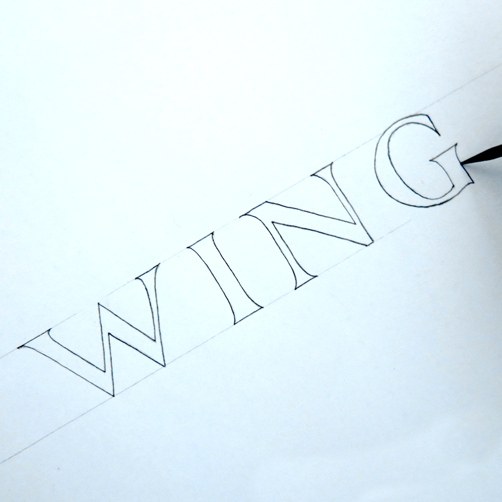
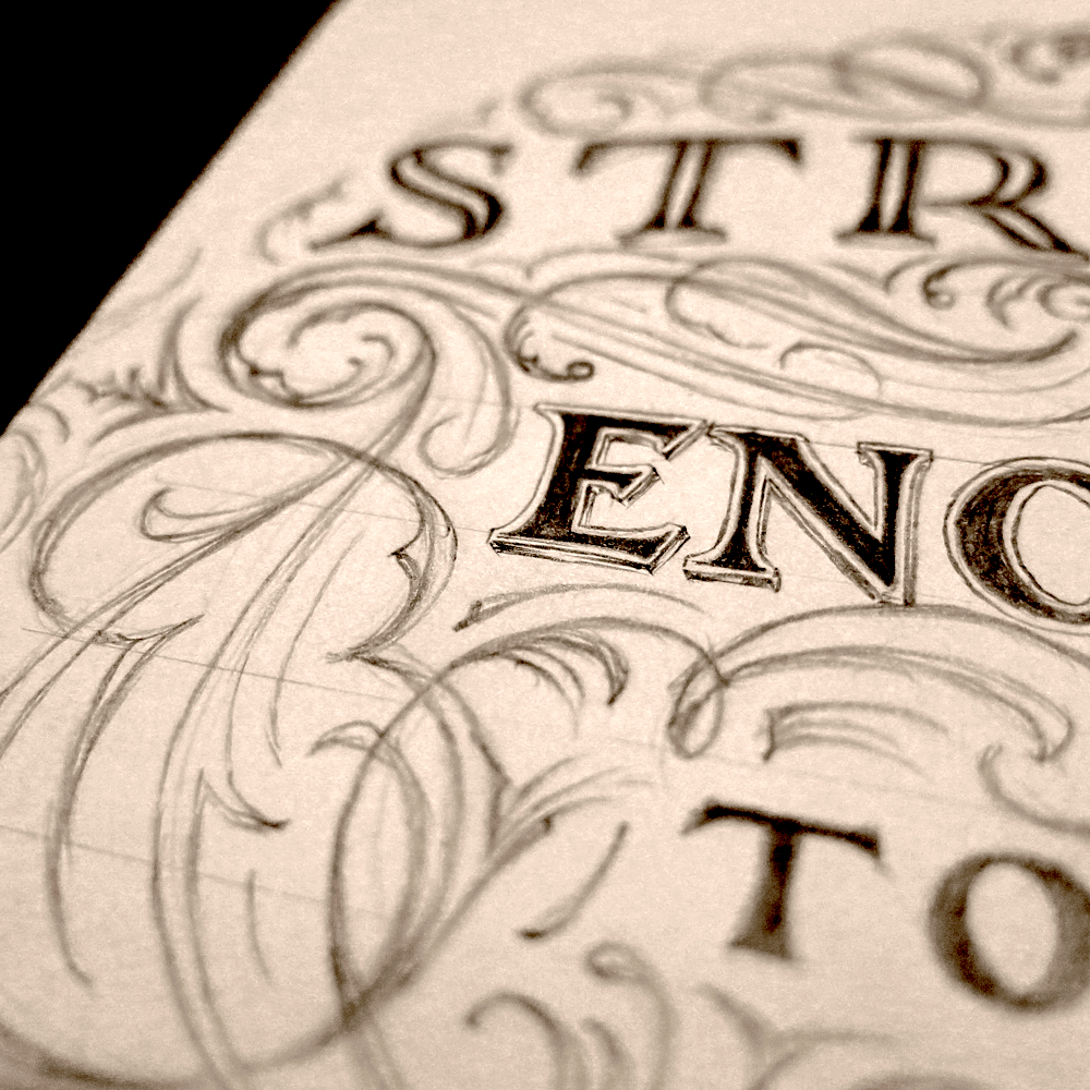
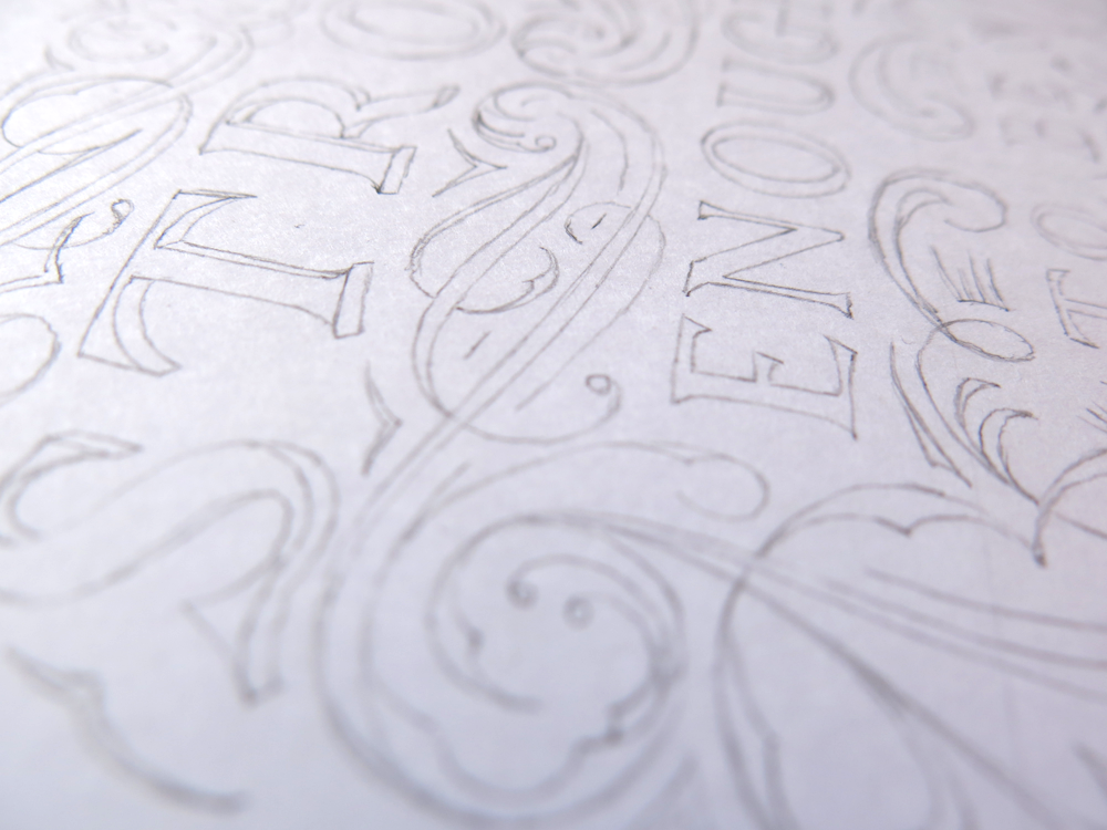
Calligraphy is a great example of an art that is all about the hours of practice vs the minutes, or even seconds of execution that it takes to make a piece. A skilled calligrapher has dedicated thousands of hours to learning the correct letter forms so that they can produce them swiftly at a moment’s notice. This is paying off in my own work, as sketching out Romans like these is becoming something that only takes a few minutes, and is backed up by the time dedicated to acquiring the knowledge that supports the letter forms. The process of this piece, then, is relatively simple, as the first step is shown above. With a couple of guidelines pencilled in with a ruler, the letters are quick to outline. From there, the next stage is designing the Copperplate and flourishes to surround the Romans, and filling the outlines. Lastly, I laid another sheet over the pencil version so that I could trace the letters in paint, and not to have to worry about erasing the guidelines after the paint was applied, all of which means that I end up with two versions of the piece, one graphite and one gouache, as pictured above.

Thank You

There’s a lot to be thankful for, and sometimes it’s easy to forget and get too caught up in worrying about things. Whether you’re thankful for something big or something little, sometimes it’s nice to put it out there and say the words. This week, I’ve been thankful for all the support I’ve received lately on Instagram. I’ve discovered so many amazing artists creating lettering work in so many styles that I never knew existed. It’s easy to think that you already know your own discipline well, and that there aren’t any more forks in the road or changes to come. You know what your favourites are and they’re not going to change. (This feeling is also known as the end of history illusion.) Well, I certainly thought that I had discovered what I thought was my “style”, found the kind of work that suited me, that I wanted to continue to refine and improve upon. Since seeing so many fantastic works by other artists, however, I see that there is still so much to learn, so much to explore and to discover. I’m also thankful for all the people who appreciate my pieces and who have decided to follow my account. I made this piece to thank my followers, who recently got up to 1000 in number. It may seem like few to some social butterflies out there, but for an introverted type like me, it’s really something to be thankful for.

Thank You 1000

This piece is a combination of several things I’ve been working on lately. First of all, for those who keep up with the more technical side of my work, you will recall that lately lots of my study has been dedicated to Romans. This piece is a little departure from the formal calligraphic forms, but every letter is shaped by the knowledge I have gained through study, much more so than my older Romans, which were done before my forays into the past. Little things to note, for example: the spacing between the stems of the T and H – they are almost equidistant; the curves and counter of the O – I definitely favour a fully circular O and a ~30° angle on the counter since studying the formal forms; subtle entasis and understated serifs – inspired by stone carvings of Romans rather than the larger serifs of brush Romans.

The flourishes on this piece aren’t really anything to do with Romans, but they’re inspired by some of the wonderful works I’ve seen lately by other talented artists. If you compare them to the flourishes in other works of mine such as Prepare Today for Success Tomorrow, you can see how they are a departure from the style that I had come to think of as the one I wanted to make my own and develop further, and with this new style comes a new set of principles to learn to make the balance correct and the forms flowing.

Hopefully you have something you’re thankful for, and you can say thank you to someone. Even if it’s something that wouldn’t otherwise have come to mind without you thinking about it, maybe it would be nice to thank someone, even if you don’t know them well, or even if it’s something seemingly inconsequential. For me, today, it’s you, who has taken the time to read my blog; whether you read all my entries, or this is the first, or somewhere in between, I appreciate it. So thank you!

Post Hoc Ergo Propter Hoc

One of the first lettering pieces I ever did was the phrase “correlation does not imply causation”, a piece which has since been lost in moving house, and is probably tucked away in the pages of a notebook hastily thrown into a box with the word “misc.” on the side. This week I decided to revisit the idea that inspired the first piece. The phrase deals with a logical fallacy that leads people to think that because two things happen together that one causes the other. Similarly, it’s easy to think that because one thing happens after another, the first causes the second. This fallacy is called “post hoc ergo propter hoc”, or after this therefore because of this.

Post Hoc Ergo Propter Hoc

Enough of that though, let’s get down to business. The interesting element of this piece, for me, is the Romans. The Copperplate may look flashy and the flourishes fancy, but when it comes to execution of a perfect letter, nothing provides the challenge, the depth and the satisfaction that Roman capitals do. Recently, though my study of Romans, I’ve been examining something called entasis.

Entasis is best know for its applications in architecture, some of it (surprise, surprise) by the Romans. The meaning of the word is a slight curve applied to something that looks mainly straight. When it comes to architecture, it was used to combat a strange optical illusion: perfectly straight columns have a tendency to trick the eye into seeing a curve where there is none. A slight bulge added to the columns is said to do away with the phenomenon and give the impression of straightness. In terms of calligraphy, however, the entasis is applied to the negative space between the letters. That is to say that the upright parts of the Roman capital have a thinning in the centre and widen towards each end. The execution of this with a broad nib or brush when doing calligraphy is a delicate manoeuvre and the effect is meant to be subtle. As this piece is also part of my study of entasis, I also kept the letters as close to traditional as I could, with understated serifs, a long crossbar on the E than you would see in a lot of modern work, and an open P.

Over the past few days I’ve been toying with the idea of starting to include more Gothic/Blackletter styles in my lettering after some study of their forms in calligraphy. As with all forms, I’m sure there is much to learn to inform future lettering pieces, so be on the look out in the future!

Say Yes.

Here’s a little piece I’ve been working on lately. The phrase is “Say Yes”, which is something quite nice and simple. The words also lend themselves to a neat symmetry, being almost the same as each other when reversed. This leads to a mirroring of the S’s at the end and an uncommon formation of double Y’s in the centre.

Say Yes

The Roman Y is an interesting letter. If it were to have no stroke weight, it would be a symmetrical letter. However, due to the calligraphic roots of all letters, there is a difference between the thickness of the branches. The result is that the branches come off the stem at slightly different places, though here it’s slightly obscured by some of the ornamentation. Because of the asymmetry, the negative space between them is also a little asymmetrical.

The execution of a piece like this can be tricky. Most of the ink is simple to put down, especially blocking in the centres of the letters. The finesse comes when creating the 3D effect. The seeming shininess of the sides of the letters is created by many tiny pen strokes. I use Rotring Rapidographs to do my lettering pieces, and one advantage of these pens is that they always produce a line of constant width. This is a great asset when you want consistency across your piece: no matter how hard or lightly you press, or what angle you hold the pen at, you always have the same result. The trouble comes, then, when you want to make a line of inconstant width – a tapering line. To create the effect in this piece, the lines were created with a quick sweeping motion in lifting the pen from the paper so that the ink flowing from it thins as the tip of the pen pulls away from the surface. The problem with this is that to create a tapering form, the lines must be drawn with quite some speed, and the faster the movement of the pen, the harder it is to make each line conform with the curves of the letters, some sharp, some smooth.

Say Yes Detail

Above is a close-and-personal shot of the first letters.

The style of the letter forms in this piece was partly inspired by Tuscan typography, which people might associate with circuses, saloon bars and rodeos. Some of the easiest features to notice are the serifs almost reminiscent of a cowboy boot and the spur and eye ornaments midway up each letter. Along with the Tuscan influence, the piece is informed by my studies of traditional Roman Calligraphy, pointed pen flourishes and a little of my own personal lettering flair.

L’Albatros

L’Albatros, which is by Baudelaire. The poem describes how the crew of a ship sometimes would catch albatrosses as they followed the ship. Bringing them on board they would laugh at how the once majestic creature would become comical and ugly in walking. Baudelaire then goes on to liken poets to these birds, a rider or storms, laughing at the arrows of archers, yet once grounded, his giant wings prevent him from walking. I wonder what he meant by that. Perhaps he was implying that a poet is one to wander in the skies, metaphorically, and what allows this flight — in the case of the bird, its wings, and in the case of the poet, the mind — is what hinders them from a normal life on the ground. Either way, as you know, the medium is the message, so let’s do away with all this talk of meaning and talk about the media. I did some calligraphy of a poem!

L'Albatros - Baudelaire - Italic - 30-04-2015

It’s often tempting to do all the fancy things before the boring things. It would be wonderful to use some coloured inks, or gold leaf to spruce up a piece of poetry like this, but the most essential thing in mastering something is to have a good understanding of the basics. That’s why I always make sure to make time for this kind of study. The ink is a neutral walnut, a rich brown that doesn’t catch the eye too much. The layout is simple and understated.

L'Albatros - Baudelaire - Italic - 30-04-2015 Detail

To master a hand is the work of hundreds of hours. There isn’t a short cut to creating the perfect letter form every time: it’s down to training the brain and the muscles to be able to execute it perfectly. One can have a great understanding of what the ideal forms should look like, but in calligraphy, there is both art and craft. The art is the forms, and the craft is being able to create them.

Speaking of understanding forms, lettering differs from calligraphy in the way that it is more forgiving on the execution side of things, but still requires a grasp of the underlying structure that makes letters what they are. Recently, I’ve been having some success promoting my work on Instagram, and so I made this piece to thank the (then) 500 people who follow my account. It’s a mixture of both lettering and calligraphy, using form of Italic calligraphy for the text at the top, under which the other words are lettered.

Many Thanks 500 Followers

Enjoying the effect created by a combination of ink and graphite, I decided to also explore a little way into the realms of 3D lettering. Here’s a little preview of what I’ve been experimenting with:

LETTER 3D

I’m planning on using this technique in some pieces in the future, so if you enjoy it, you may see some more coming up soon.

Strong Enough To Be Yourself (A study of flourishes)

Flourishing is something that didn’t make it into my repertoire for quite a while. When we start something, we are often ignorant of the depth of it. The way we appreciate something deepens through understanding, and so it’s not surprising that when we don’t have a good understanding it can be hard to appreciate something on more than a superficial level. In terms of lettering, most start out with the desire to understand and create letter forms. Of course, that must be what lettering is all about, mustn’t it? I mean, it’s in the word. Soon, however, you come to realise that the letter forms only work if they are structured well, and so you start to learn about hierarchy and composition. Similarly, flourishing is something that I have been concentrating on lately as an area of study which can improve the pieces I make.

Strong Enough To Be Yourself

If you look back at older pieces, such as The Greatest Victory, which was a piece that I made when I first started to consider the composition of a lettering more, you might notice that the flourishes seem uncomfortable and don’t really know what to do with themselves, almost like teenagers who have grown too fast and haven’t relearned how to use their limbs. They’re there because they are necessary, to an extent, but don’t quite serve the purpose they were created for. Since then, I’ve learned a lot through my study and have applied some of it in this piece.

The piece started just as a sketch of the word “strong”, as I had wanted to try out an certain 3D effect on some letters. I thought of the full phrase and planned out a little more of the structure. From there, I decided to do a little exploration of the space between the words, so, loosening up my arm, I started designing the flourishes using larger gestures controlled by the shoulder muscles rather than the fingers. This advice of using shoulder muscles, often given to those learning calligraphy, can seem daunting to beginners, but when designing flourishes, it really needn’t be. Any detail work or corrections can easily be made later, as graphite is far more forgiving than ink.

Strong Enough Flourish Sketch Progress

One of the most key elements in flourishing is to pay close attention to the negative space. It’s important that no one area becomes too dense, nor too sparse. A roughly equal distribution is attractive, though some variation is pleasing too. Once I was happy with the design, I took from the sketchbook to the paper for the final piece. When it comes to a symmetrical piece like this, it’s convenient to flip the reference material (in this case, the original sketch shown above) so that there aren’t too many irregularities when comparing the two sides.

Strong Enough Pencil Detail

From then on, it’s the same story of inking that you have heard before: a soothing, quiet time spent with paper and ink. Becoming too tense or hurried never helps, as a calm hand creates fewer mistakes. Here’s a little shot of it transitioning between graphite and ink, temporary and permanent:

Strong Enough Inking Progress

The Ligature Collective

A couple of weeks ago, I made a post about having recently joined Instagram, and a competition that was being held to draft a new member of something called the Ligature Collective. The competition was to make a piece to celebrate their success on Instagram, and the best submission would lead to the creator becoming a member of the team and have their work displayed to a large audience.

Well, I had sketched up a quick piece, which I posted a fortnight ago, but since then, I had much more time to dedicate to a better thought out piece.

Ligature Collective Ten Thousand Followers Blog Upload

My main goal with this piece was to create a visually interesting piece with lots of little details, but to have a very clear hierarchy, such that the piece was structurally simple. Seeing as the piece was going to be posted to Instagram, it had to work at a small size, and be easily identified. The words “Ligature” and “Followers” worked well as the emphasised words, seeing as they were not only easily legible on small Instagram thumbnails and conveyed the essence of the piece, but also tied the piece up at each end. The piece is symmetrical down through the middle (apart from the words themselves, of course,) and it also has a vague structural symmetry horizontally, too. The words “Ligature” and “Followers” are in the same style, and curve around the piece in the same way, while the smaller central words reflect each other’s style and layout too.

The piece ended up being quite small. I took several photographs of it just on the page on its own, but it always ended up seeming as though it was bigger than it really was. I decided to put some other items in the picture that I uploaded to give a sense of scale. The photograph seemed a little unbalanced with only the lettering piece and a single pen, however, so I scattered a few other objects around it to frame it. Some things, like the camera strap and the rotary lead pointer might not give a very good sense of the size of the piece, but the pens and lead holder should do. Incidentally, these were all things used to make the piece, aside from the keys, of course. But with the keys there, at least I get to show off my funky Rubik’s cube key ring.

After all is said and done (or just done, really; being a letterer is a pretty silent job) the results will be out tomorrow, on April the 7th. There were some truly excellent submissions among the hundreds submitted by other artists on Instagram, so I wouldn’t be at all surprised if they should win. Good luck to everyone else – I’m sure they’re waiting with bated breath for the announcement of the winner. If you’re curious to see the other submissions, click here, or search for “#Ligature10k” on Instagram!

Instagram & Gold

Recently, I got an Instagram account. Follow! In fact, it was over a year ago, but I’ve only recently started using it. There’s quite a nice little lettering community on Instagram, so I’ve been having a nice time looking at all the amazing work of other artists. There are also several popular accounts that curate the works of others who produce calligraphy and type-based work. One of them is a group called the Ligature Collective, who, to give you an idea of their popularity recently got 10,000 followers. To celebrate the fact, they decided to hold a competition to get a new member. The competition is to create an a piece of hand lettered work celebrating their 10K milestone and post it on Instagram.

The Ligature Collective Gold on Black

This is a little piece I sketched up when I had a some free time. I’ve been very busy lately, so I haven’t had much time to dedicate to the competition, but hopefully over the next week I will put in some quality design time and come up with something that would put me in the running.

This piece was quickly inked and then taken to the digital side of things. After last week’s foray into coloured work, I decided it would be nice to explore it a bit further. I love the look of gold print posters on a black background, so I decided to try to recreate the effect. I was given some gold leaf as a gift, which up until now has been set aside for a special piece at some point in the future. It served a purpose for this piece, however, even if it was only for digital manipulation: I took a photograph of one of the very delicate gold leaves to use for the colour on the inside of the letters.

Here’s the piece as it is on the page:

The Ligature Collective

And below, the gold leaf photograph that provides the colour:

Gold Leaf

In combination, they create a quite different feeling than either one alone. It’s also quite pleasing to know that the colour comes from something real. Last week’s piece was done purely through digital manipulation, whereas this time the source is a little more tangible, though only just! It would be easy to believe that this stuff doesn’t even exist. It’s like it’s only a single atom thick. I look forward to the day when I have a piece in mind that’s luxurious enough to warrant its use. Until then, however, I will have to satisfy myself with taking pictures of it.