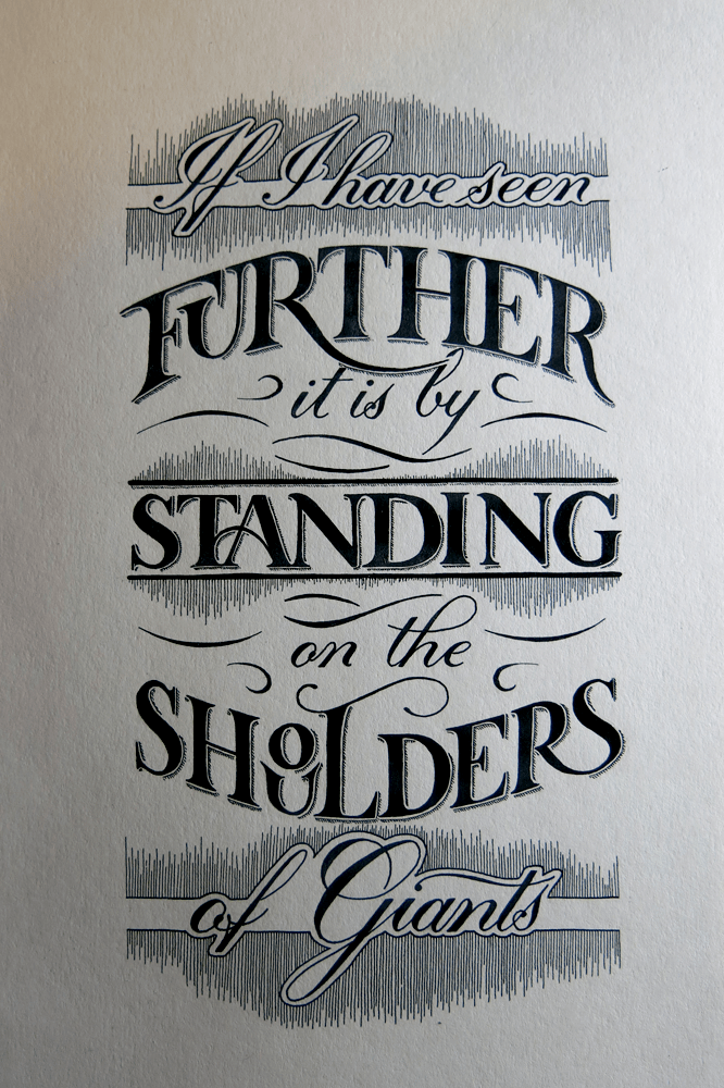
This week, I have been focusing on a lot of things, which sometimes leads to not managing to find a good direction in any one particular thing. However, knowing this, I took a couple of days over the weekend to put aside all other projects and work on a single piece. I think it worked out for the best, seeing as I didn’t distract myself with anything else. The piece is thematically similar in some ways to The Greatest Victory, which I wanted to create a poster-like piece with, and I did the same with this one. It’s a quote originally by Bernard de Chartres, but which is more often attributed to Sir Isaac Newton, who wrote it in a letter as it is phrased here.
With this piece, I focused my efforts on creating something with a minimum of styles. It’s too easy to get carried away with adding in everything that you’ve learnt, but that often leads to something that is too muddled: something I struggled with in my early pieces, and still do sometimes. Here, however, there are only two styles: Copperplate calligraphy and Roman caps. The challenge then, past restricting myself to the use of only these styles, was to find other ways to explore them. Roman caps, particularly, can seem very much like the basic, standard letter forms, and that’s because they are. Because of that, however, you could say that they are too normal, so I took some inspiration from old sign painters’ inclination to use interesting ligatures to fit words into small spaces, with the U in “Further” tucked under the F, and the OU in “Shoulders” arranged in a little stack.
Other than that, I also concentrated on creating a piece that was mirrored in its composition, and didn’t have ornamentation of too many different kinds. I liked how the Copperplate worked out in the previous piece, so I included it here too, which gave me more steady hand practise with lots of little lines.
Here are a couple of close ups:
And just because I enjoyed the negative version of last week’s piece so much, I thought I would give it a go with this piece too. It turned out quite well, and it really does create that chalk-board effect!


