
Let’s talk a little about how pieces get made! I know I’ve shown off plenty of process and progress shots of pieces before, but for this latest piece I made sure to take some nice documentation pictures for any of the curious among you who wonder what goes on in making a piece behind the scenes at Jack Standbridge Lettering nowadays. Whew, that was a long sentence. To business:
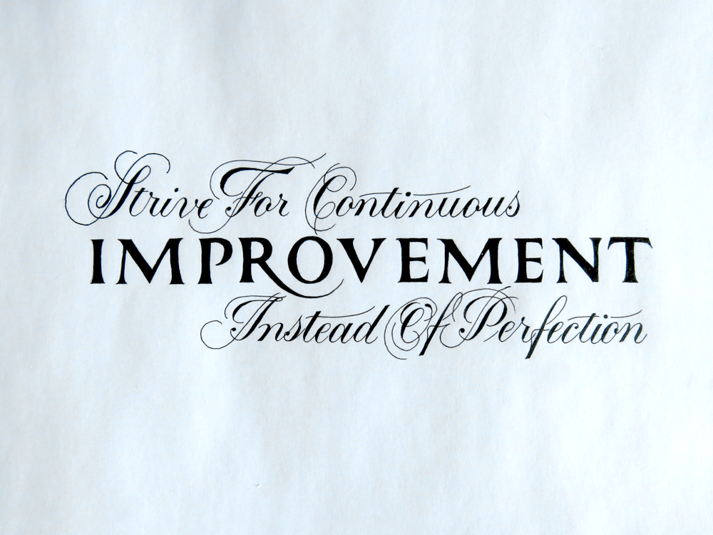
First of all, a picture of the finished piece to placate those impatient readers who though that the first paragraph was already too long and there weren’t enough pictures yet. This piece is about improvement, which refers, of course, to getting better at doing whatever. For me, that means drawing fancy letters, but for the purposes of this blog post, it means the improvement of this piece as I made it. The piece about improvement is about the improvement of the piece about improvement. That’s the process! Get it? Me neither…
Next a nice front on shot so that you can actually see what’s going on. None of that silly from-an-angle business just to look trendy because everyone else is doing it. (Truth is that you can get the words closer. The magic of diagonals, eh? Don’t ask me to figure it out.)
And finally:
This is the picture I’m actually going to talk about. The first two are just to show off.
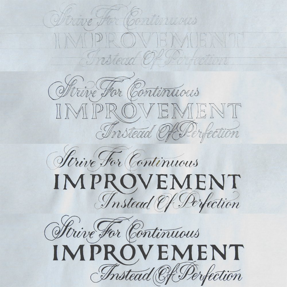
So, as I’ve mentioned about 4 times in just about every blog post for the past 17 years, I’ve been studying Romans lately, and this study has had a great impact on the lettering pieces that I’ve been producing. Through becoming more familiar with the letter forms, I’ve found that sketching out Roman caps like the word “Improvement” in this piece becomes less of a mess of feathery pencil lines, smudged eraser marks and frustration, and more of a precise and calm process of slowly putting to paper what I know the correct forms should look like.
This piece started with such a process. I ruled two lines and let the letters fill the space as they should. I surrounded the word with the rest of the quote in Copperplate, because the styles create a nice contrast, and really emphasise the Romans in comparison with the delicate Copperplate.
Look at the first of the four pictures in the image above; the composition is a little off. The last line doesn’t come up to meet the right margin as the first line meets the left margin. The spacing on the Copperplate and the Romans is a little different from the later versions.
Next up is a version that has everything pushed around into the right places, but is still done with pencil. This version was done by simply putting the first sketch under a blank sheet and shifting the paper around so that the spacing was adjusted as I traced it. (Tracing meaning cheating, of course. Please don’t tell everyone I’m a sham.)
The third picture is what I like to call an ink test. Again, placed a blank sheet over the sketch and traced (i.e. cheating) the piece. This time, instead of tracing it with pencil, however, I quickly filled in the letters with ink. This piece is in Copperplate and Romans, both of which are traditionally done with calligraphy tools, so that’s exactly what I used to do it. A flexible pointed pen nib is used to write the Copperplate, and a stout little broad nib is used for the Romans. In this case, the size of the Romans was just in between the sizes of two of my nibs, so I had to just rough them in with multiple strokes, which leads to the rough and ready look they have. I like to call it “modern”.
The reason for the ink test is to take a look at what the weighting of the piece is like. When you see a letter constructed out of pencil lines like in the first two pictures, it’s tough to know what the balance of the ink will look like on the page. Is there too much ink on one side of the paper? Does the thickness of all the Copperplate strokes match up? It’s hard to see these things when all the pencil lines are the same thickness, when what you really need to look at is the space between the pencil lines, rather than the lines themselves. So, ink test.
After that, it’s the same old same old that you’ve read me write about a hundred (Thousand? Million? How long have I been writing this blog?) times before. Sketch it out in pencil on the final sheet. Try not to get finger smudges anywhere. Seriously, don’t touch the paper! Carefully try to coerce your Rotring Rapidographs into doing what you want and hope that they don’t hate you, and will willingly and smoothly exude their sweet black nectar onto the page. OK, maybe that was a bit weird, but really, the only thing that makes the Rapidographs worth it is how good they are. Other than that, they’re awful.
Well, that’s all folks! I hope you learnt how to make a lettering piece this week, and you can all go and make one yourself now that I’ve spilled the beans and given away all the trade secrets.
