
It’s around this time of year that people start thinking about what their New Year’s resolutions will be. Though it’s better to make serious lifestyle changes rather than half though out plans just because of the time of year, I thought I would make a piece pre-empting the following year.
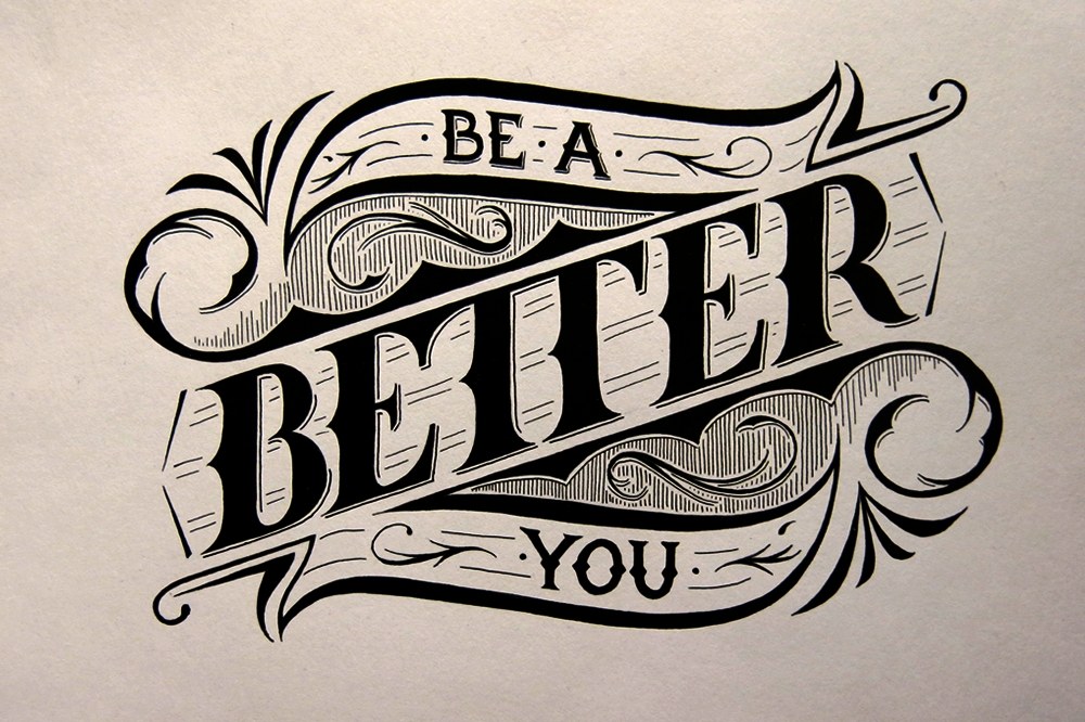
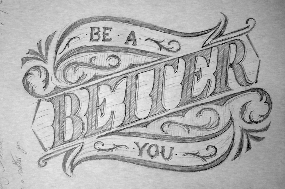
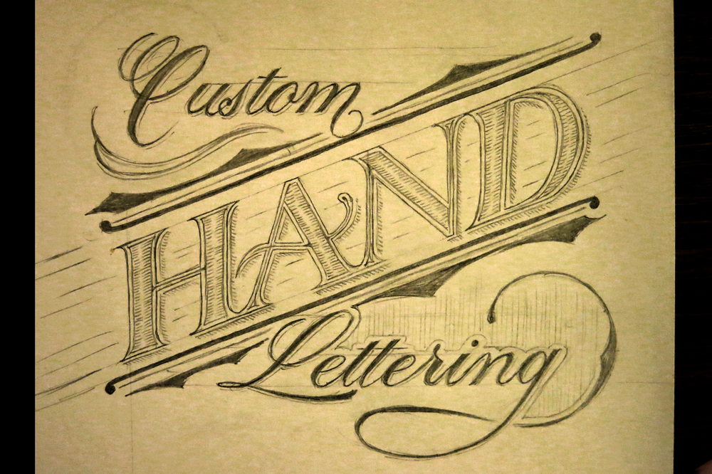
This piece started out as one my daily doodles a little while ago. I enjoyed experimenting with the composition, and used a similar layout for another piece at around the same time, but felt that this one went well with the phrase, so I decided to ink it.
There are a few new elements in this one that I haven’t explored much in other pieces. First of all, it’s one of the few times I have used a monoline style (“BE A” and “YOU”), where there is no real difference in the thickness of the strokes. While I tend to think that a high contrast between thick and thin strokes looks better, there is certainly a place for monoline styles, and here it’s in the less important supporting elements of the piece. One advantage of this is that thin hairlines on letters can often get lost, or hard to make out at smaller sizes, thereby decreasing the legibility of the piece.
The second thing to talk about is the decision to join the ETT in “BETTER”. It’s a bit of an old sign painting trick to join a double T together and save a little space, but I decided to take it a little further and have the serifs of the E and T but up against each other and share a bit of the same space. It’s not really a necessary technique, seeing as I have as much space as I want to play with when designing on blank paper, but it adds a little interest to the piece, and lends a hint of the old sign style lettering that you can sometimes still see painted on the gable ends of old buildings (at least in Europe – I can’t speak for elsewhere.)
With Christmas so close, and days spent travelling and shopping, daily doodles have taken a back seat, and I’m taking a couple of weeks off from doing them. Fear not, however, for they will return soon enough, at the start of the new year.
Merry Christmas!


You must be logged in to post a comment.