
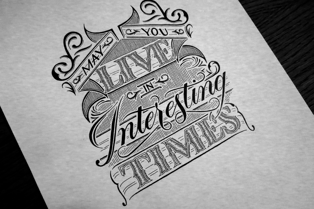
This week’s piece is something I did for a daily doodle a little while ago. I liked the design, so I decided to only show off a part of it when I posted it at the time and save the rest for an inked piece. Here’s the full version!
When I first started making lettering pieces, I focused a lot on learning about letter forms, in the same way that someone learning the guitar might focus on getting the notes to sound nice. While nice notes and good letter forms are important, lately I’ve been more interested in exploring what makes the composition of a piece work well. Every note in a piece may sound perfect, but if they’re in the wrong places, or they don’t complement each other well, then the piece isn’t going to be a success. In the same way, if the hierarchy and combination of styles in a lettering piece aren’t properly thought out, then the piece will fall short of where it could.
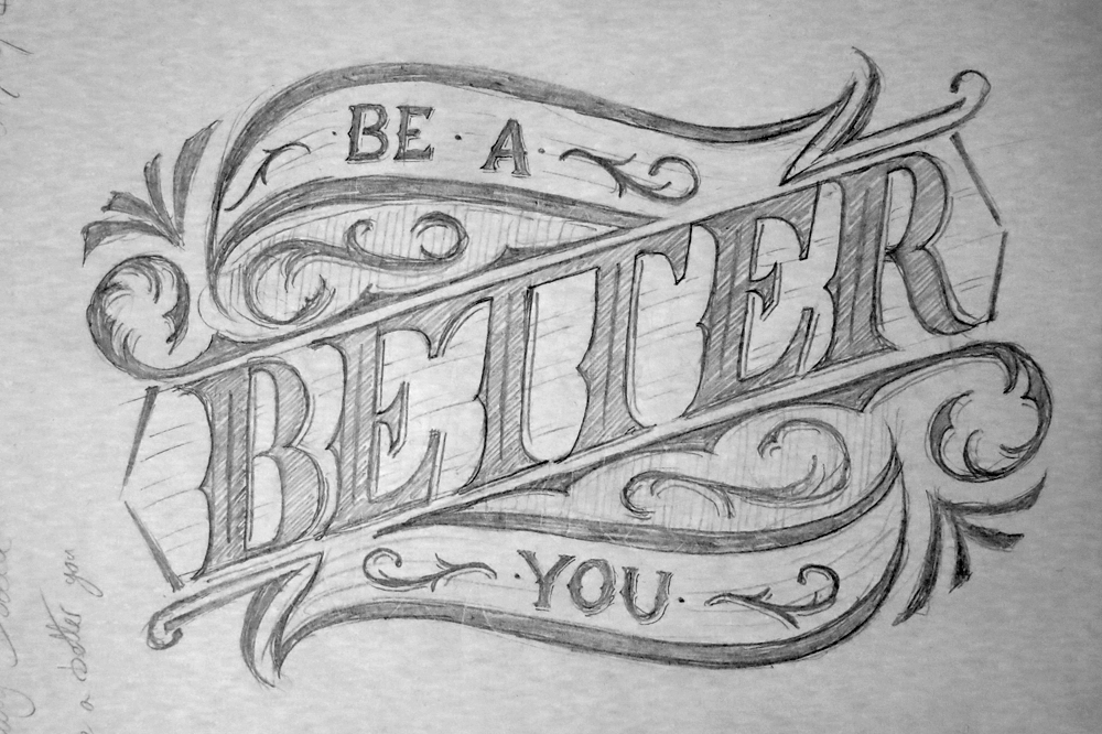
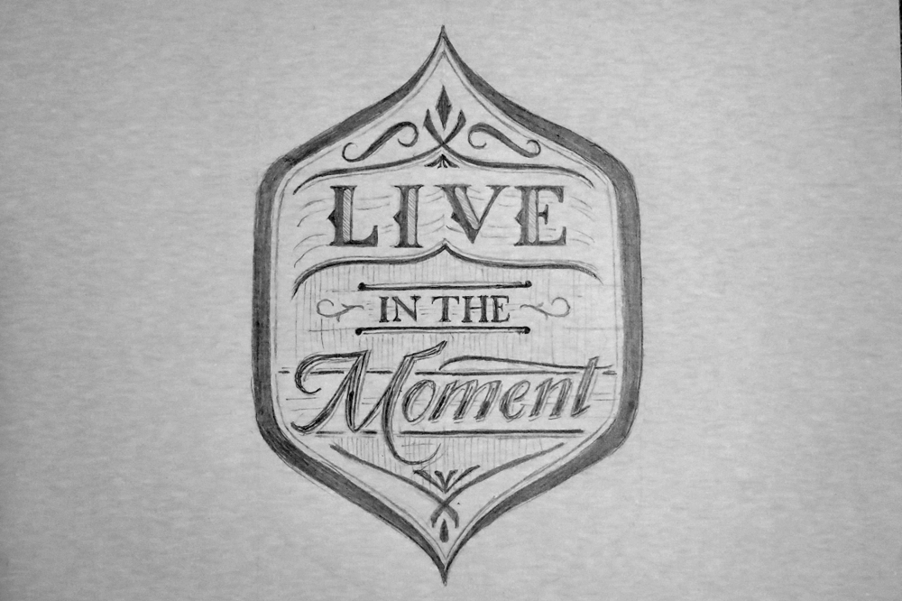
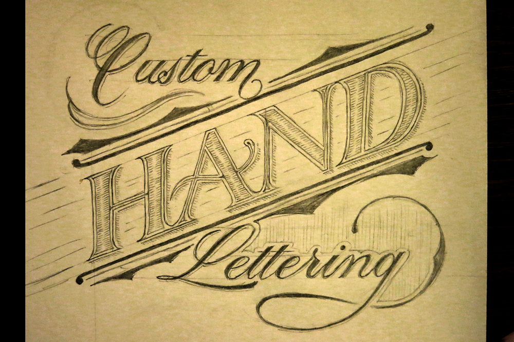
At the same time as all that, I’ve been experimenting with more ornamentation if my pieces, which also helps the composition as a whole. Of course, I have always liked using lots of ornamentation in lettering, but I’ve been including it lately with more of a mind towards using it to tie pieces together. Here are a few examples from my daily doodles this week.
Be a Better You
Live in the Moment
Custom Hand Lettering
L’appel du Vide

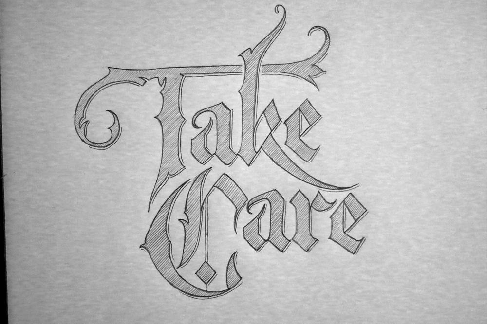
But of course, I still take the time to practice some good old letter forms. Here’s a Gothic piece, Take Care:
I’m going to take a week off from doing daily doodles because of travelling, staying with people and Christmas stuff, but inked pieces will still be coming out at a rate of one a week.
