Wednesday

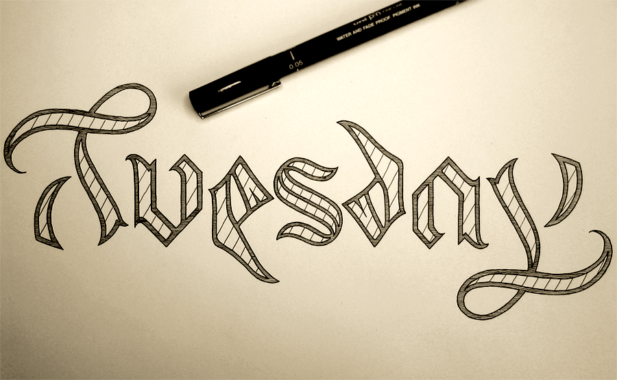
Day 3! Well, in real time, it’s week 3, not day 3, but this is the third day of the Days of the Week series. This one, as you can see, is Wednesday, as I’m still going with the whole chronological approach.

Wednesday

Last week, we had an ambigram, which was great, but I didn’t want to continue with that theme, because while it’s fun, the point of this series is to try to deviate as much as possible from each of the other pieces. The main talking points of this piece are the stippling and the difference in style between the W and the rest of the word. First of all, the stippling, which is shading using lots of little dots. When I was first sketching the piece in pencil, I shaded it so that it was darker at the top, which, of course, is easy when you’re working with graphite. However, it’s not so easy when it comes to ink, when you have the choice of either black or not black. The challenge, then, comes in tricking the eye to think that between the solid black and white there exists something else. Having some experience with stippling, I was keen to put it into practice again to see if it would do the trick. The effect is certainly different from the pencil, and while it’s difficult to exactly imitate the way pencil strokes can be used to shade a piece, I think that the darkness that you can only achieve with ink makes more of an impact.

With the W, I wanted to create the feeling of a drop cap: something ornate and eye catching. However, last week’s piece was in a Gothic style, so while I was content to have the W in a similar style, I’m glad it turned out quite differently than Tuesday did. This style is much more fancy, which was something that wasn’t an option to me when making the ambigram last week, which has a functional side that restricts it in many ways. I also like to imagine the W in colour in the style of an illuminated letter from old Gothic texts, in this case in red and gold. However, I am more concerned about keeping this project purely black and white to focus on the form, but once I have finished the series, perhaps it’s something I will revisit.

Here’s a close-up of the stipples getting done:

Stipples

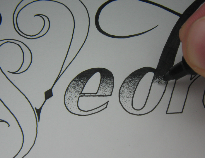
About the specifics of the pen: it’s a 0.05 mm fineliner, though I couldn’t tell you if each stipple is truly 0.05 mm in diameter.

Check back next week for the next in the series, which will be Thursday, uploaded on Monday!

Tuesday

So last week, I uploaded Monday as the first part of my Days of the Week project, which, as you can guess, will be a seven part project. The goal with this project is to explore diversity in lettering and make each piece of the project as different from the last as possible. This week, not to be too predictable, I’ve decided to go chronologically from my starting point. So, here’s Tuesday!

Tuesday

The style is inspired by Blackletter/Gothic calligraphy, but the main defining feature of the piece is that it is an ambigram. Like several of my other pieces, such as Out of my Mind and the word Longer in this piece, this means that it reads the same both ways up! The biggest challenge of the piece was definitely the T/Y combination. The curl of the top of the T certainly lends itself to the loop of the lowercase Y but the rest of it needed quite a bit of work to come up with something that would read well. Fortunately, Blackletter capital T’s often incorporate a half moon shape that curls around the left and underside of the letter. Here, the shape is very understated so as to make the shape of the y neat and stay within the x height of the piece, but it was nice to find a solution that created stronger stylistic consistency.

The lowercase U and A practically solved themselves once I started with the Blackletter style, and the S, of course, falling as it does in the middle of the word was the perfect centre point for an ambigram, it being a rotationally symmetrical letter in the first place. The last puzzle was the E/D combination. With this, again, I felt like I had stumbled across something that seemed almost too convenient due to the Blackletter style. A quick google of Gothic script will show plenty of examples of the lowercase D with a very low, curled form, which simply requires the bottom of the E to cut through the baseline a little way to achieve the right effect.

When creating an ambigram, it is such a restrictive form that it’s almost more like solving a puzzle than creating something. It’s as though you’re looking for something that you’re not sure is there. Trying to see if a rock contains a fossil, and until you spend the time and care chiselling away the outer layers, you can’t say for sure. Sometimes you find nothing, sometimes just some fragments, and sometimes you find a whole dinosaur. A similar comparison is with very restrictive poetic forms. To craft words to a restrictive form and still say what you want to say is a very challenging thing, and as I’m sure proponents of the “Poetry doesn’t translate” movement would hasten to tell you, it’s not only down to the skill of the poet, but also the intricacies of the language that allow the poem to work. In the same way, just as not everything can be expressed through sestinas or haiku, not everything can become an ambigram, as much as you might want it to.

I did go on to make a vector of this piece, mainly because I wanted to make a rotating .gif of the image. Take a look!Tuesday


Monday

It’s Monday! Or at least, yesterday was Monday. In celebration of this fact, here’s something I finished on Sunday!

Monday

I posted it over at reddit a couple of days ago, and it got a good response, but I’ve only just had the time to make a blog post about it. So, what’s the deal? Well, I’m thinking of starting a series called Days of the Week. I’m sure you can guess what will be featured. I’m planning on doing a different style for each one. The goal of the project could be that each piece should be as different from the others as possible. We will have to see how diverse I can make their styles. Striving for diversity is a great way to expand your skills and your portfolio, so it’s a win-win situation!

I think that many people could be afraid that they will produce terrible work, so they never try. People often ask me how I learnt to do things like this, and the answer is really just that I started doing it. I saw that others had done lettering pieces and posted them to the Internet, and I wanted to try too. Practically everything I’ve ever lettered is posted here on the website, and if you take a look through my portfolio, I’m sure you can see how things have progressed. Some of the earlier pieces aren’t so great, and I’ve learnt a lot since then, but I think it’s worth leaving them up there because it’s an honest reminder of where I came from. I think it’s worth being honest about something like that. They are the beginning of a journey that I’m taking, a journey that hopefully has no end. To come to the end would mean that there is nothing left to learn, and no improvement to make, and I’m sure if anyone thinks they are in a place like that, then they are missing something. So, I’m looking forward to finding out where this project will take me!

This project might be punctuated with other pieces, so it might take a while before I have the full-week set uploaded, but stay tuned to see what the rest turn out like!

Here’s a vectored version. I tightened up a couple of lines here and there, but overall, it’s pretty much the same as the inked one above. The main difference is that in digitisation, I have the opportunity to use gradients, so where I used hatching on the sides of the letters to shade them in the inked version, I had a play around with using gradients to achieve a similar effect.

Monday

The Urban Orb

Second in my series of “What was going on a month ago” is a post about the a bigger project that I did. The client wanted 3 things: first, a logo for a series of youtube videos consisting of the words “The Urban Orb”, second, the text “Next Episode” to be shown at the end of each episode during the preview of what will happen next time, and third, a large number of quotations and phrases to be edited into the videos, but to be done in calligraphy, not lettering.

The Urban Orb

The Urban Orb is a streamer who usually broadcasts himself through streaming websites like twitch.tv, but in this case, he wanted to have a series consisting of a challenge run through of the game Dark Souls uploaded to youtube. Though he was unsure exactly which colouring/texture was going to work out best once the videos were edited, we settled on the outline of the project, and I started work. In the end, the client received several different versions to test out on the final videos, allowing for legibility, unobtrusiveness, and thematic consistency. The logo was designed to be easily read, unique in its ligatures, and styled to match the feel of the game it is used to watermark. In the end, to blend unobtrusiveness and legibility against all backgrounds, the final version consisted of a solid black outline with a semi-transparent white fill, allowing the logo to be constantly visible, but never stand out harshly in the way that a solid colour would do.

Next Episode

The Next Episode text was done in a similar style to The Urban Orb logo, but was designed to fit a much larger space. The text was originally intended to be in a calligraphic style that would interact with the ornamentation around it, and though it was sad to leave some of the calligraphic designs by the wayside, I think that the increased legibility and thematic consistency is worth more than the ornamentation’s interaction with the text. As it stands, the text is nested within the ornamentation, which also continues up to surround the in-game interface, thereby integrating the text with the aspects of the game.

Nietzsche Quote Blog Upload

Executing the calligraphy was a very different task to the design and execution of the lettering. To start with, calligraphy is more of an all-or-nothing process, where one mistake in a quotation can mean that you must start again. Some quotations were much longer than these three, so a mistakes could mean that double or triple the time would be needed to get it correct. I used traditional dip nibs and ink to write these – black ink on white paper. Once they were completed, I scanned them into the computer and colourised them digitally, though they are not vectorised, of course, which would take more than one man’s patience worth, I think.

In all, this project was wonderful to work on, not least because I was exposed to so many inspiring quotations, some of which I had read before, but many of which were new to me. Most were on the topic of perseverance, success and failure, which certainly helped me continue past making a mistake towards the end of a long quotation!