Make More Mistakes

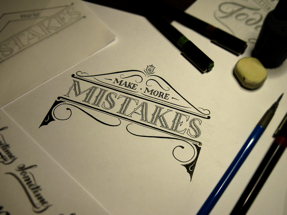
Make more mistakes! Do something wrong. The worst that could happen is that you would die and ruin everything for everyone forever. But that’s extremely unlikely compared with what will probably happen, which is that you will get better at whatever you were trying.

Make More Mistakes

If you start something new, you’re bound to make mistakes. But let’s imagine that you don’t. Let’s imagine that you ace it every time, right from the get-go. Aside from feeling great about yourself, you would probably find out soon enough that you weren’t really progressing in terms of skill. After a little while, you’d stop feeling so great and try to find out what people who could do it better than you were doing. Then you would realise that you weren’t really acing it every time from the start; rather, you were doing decently, but couldn’t see the flaws in what you were doing. So you decide to study the works of the best. The problem with that approach is that more often than not, you only ever see the best of the best. The best people get into the limelight, and once they’re there, all they do is show off the best things that they have created, and what you don’t see is all the discarded paper, deleted documents and failed attempts that they made in learning, and still make all the time. As a result, it’s easy to get disheartened and feel like your work will never be as good as others who are successful.

The point is that to improve you must learn, and to learn you must make mistakes. The more you put yourself in a situation where you can make some mistakes, where you don’t quite know how to do something, where you have to disengage autopilot mode, the more you’ll find that you discover ways to do things and techniques that you didn’t know about.

Don’t be Afraid to Dream

This week is another New-Pen-Week! Last time, I got some Rotring Rapidographs, which I use pretty much the same as the old fine liners I started out with. Not much changed in the style of work I produced, but for me, the process was changed a little. This time, however, I got some Pilot Parallels, which are a kind of fountain pen for broad nibbed calligraphy. I’ve been wanting to start practising some broad nibbed calligraphy for a while now, so that I can further my understanding of Gothic/Blackletter styles, and this week allowed me the chance to give it a go!

Don't be Afraid to Dream

I found a wonderful image that displays a style of Blackletter that I haven’t seen reproduced quite the same anywhere else. The title of the image is “Williams Style of German Text”, which doesn’t seem to bring up much other than the original image, so I don’t have much more information than what you see there. I’m sure there is much to learn in exploring the style, and I’m going to spend the next few weeks trying to understand the intricacies of what makes the letters function in the way they do, but in the mean time, I took some inspiration from the style, as well as several other styles I’ve seen around the web, and came up with the piece above.

The pens came with two inks, which was unexpected, but it provided me with the opportunity to experiment with a bit of colour, which is something I’ve been purposefully avoiding in other works in an effort to focus on form. After all, restrictions are what give us guidance, and having too many directions to explore often leads to little progress. That being said, it’s sometimes refreshing to allow yourself a little deviation. These inks are black and red, though refills are available for all manner of colours, so I’m interested in getting some more in the future. In the mean time, I found neat feature on my camera that replaces individual colours in a photo for others, no photoshopping required. Here, I’ve replaced the red ink with a green, blue, and brighter red. Look how each colour creates a different feel for each piece. Colour matters!

Don't be Afraid to Dream Colours

The speckles that surround the letters were made by pulling on the tip of the nib, and letting it go, which flicks the ink on to the paper. Unfortunately, it also flicks it everywhere else, so I ended up with some red fingers, pens and surfaces. Before I did the speckles, I first drew out some guidelines for the word “Dream”, then wrote in the red parts. Once they were dry, I went over in black to complete the bottom part of each letter, then added in the Copperplate above with a brush pen. The speckles came in last because I didn’t want to get my hands so messy if I ended up making a mistake and discarding the paper!

The Urban Orb

Second in my series of “What was going on a month ago” is a post about the a bigger project that I did. The client wanted 3 things: first, a logo for a series of youtube videos consisting of the words “The Urban Orb”, second, the text “Next Episode” to be shown at the end of each episode during the preview of what will happen next time, and third, a large number of quotations and phrases to be edited into the videos, but to be done in calligraphy, not lettering.

The Urban Orb

The Urban Orb is a streamer who usually broadcasts himself through streaming websites like twitch.tv, but in this case, he wanted to have a series consisting of a challenge run through of the game Dark Souls uploaded to youtube. Though he was unsure exactly which colouring/texture was going to work out best once the videos were edited, we settled on the outline of the project, and I started work. In the end, the client received several different versions to test out on the final videos, allowing for legibility, unobtrusiveness, and thematic consistency. The logo was designed to be easily read, unique in its ligatures, and styled to match the feel of the game it is used to watermark. In the end, to blend unobtrusiveness and legibility against all backgrounds, the final version consisted of a solid black outline with a semi-transparent white fill, allowing the logo to be constantly visible, but never stand out harshly in the way that a solid colour would do.

Next Episode

The Next Episode text was done in a similar style to The Urban Orb logo, but was designed to fit a much larger space. The text was originally intended to be in a calligraphic style that would interact with the ornamentation around it, and though it was sad to leave some of the calligraphic designs by the wayside, I think that the increased legibility and thematic consistency is worth more than the ornamentation’s interaction with the text. As it stands, the text is nested within the ornamentation, which also continues up to surround the in-game interface, thereby integrating the text with the aspects of the game.

Nietzsche Quote Blog Upload

Executing the calligraphy was a very different task to the design and execution of the lettering. To start with, calligraphy is more of an all-or-nothing process, where one mistake in a quotation can mean that you must start again. Some quotations were much longer than these three, so a mistakes could mean that double or triple the time would be needed to get it correct. I used traditional dip nibs and ink to write these – black ink on white paper. Once they were completed, I scanned them into the computer and colourised them digitally, though they are not vectorised, of course, which would take more than one man’s patience worth, I think.

In all, this project was wonderful to work on, not least because I was exposed to so many inspiring quotations, some of which I had read before, but many of which were new to me. Most were on the topic of perseverance, success and failure, which certainly helped me continue past making a mistake towards the end of a long quotation!