
This week is another New-Pen-Week! Last time, I got some Rotring Rapidographs, which I use pretty much the same as the old fine liners I started out with. Not much changed in the style of work I produced, but for me, the process was changed a little. This time, however, I got some Pilot Parallels, which are a kind of fountain pen for broad nibbed calligraphy. I’ve been wanting to start practising some broad nibbed calligraphy for a while now, so that I can further my understanding of Gothic/Blackletter styles, and this week allowed me the chance to give it a go!
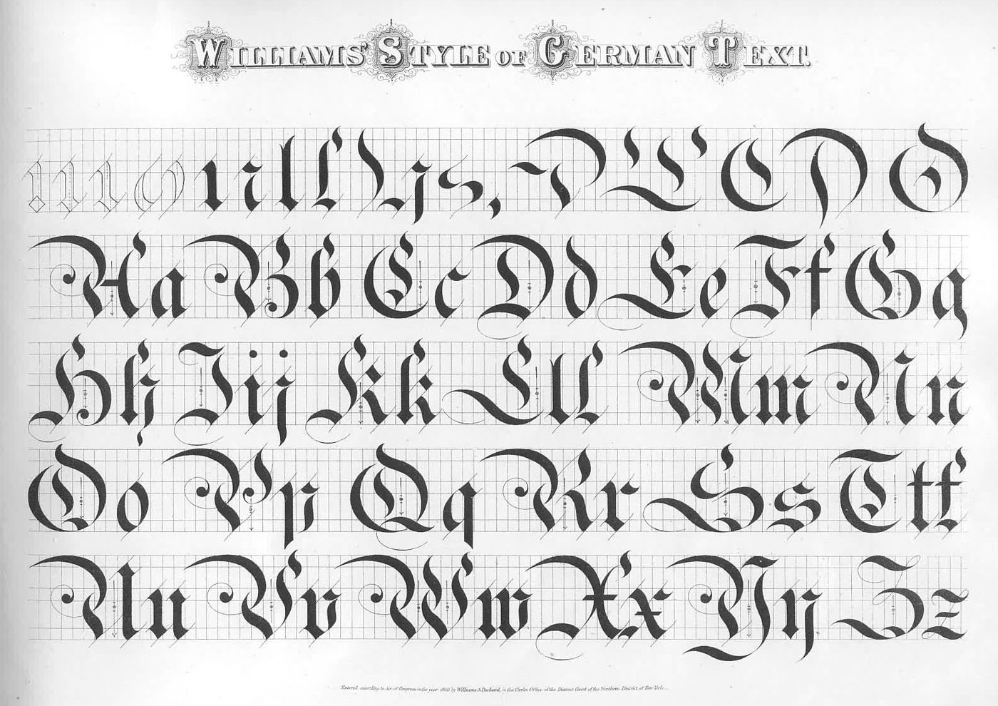
I found a wonderful image that displays a style of Blackletter that I haven’t seen reproduced quite the same anywhere else. The title of the image is “Williams Style of German Text”, which doesn’t seem to bring up much other than the original image, so I don’t have much more information than what you see there. I’m sure there is much to learn in exploring the style, and I’m going to spend the next few weeks trying to understand the intricacies of what makes the letters function in the way they do, but in the mean time, I took some inspiration from the style, as well as several other styles I’ve seen around the web, and came up with the piece above.
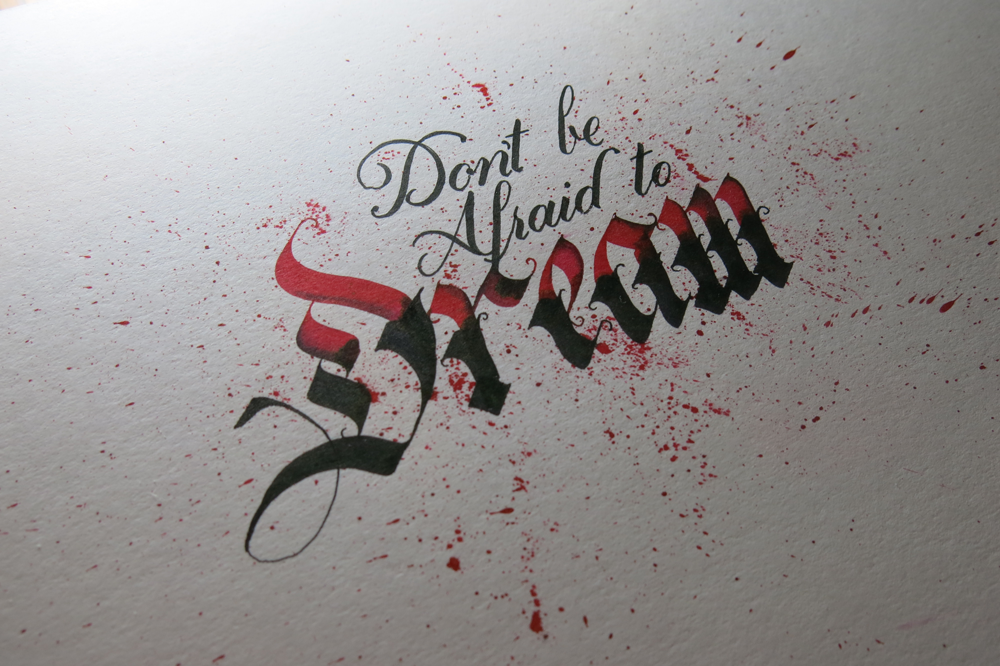
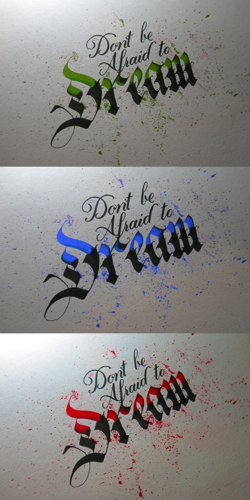
The pens came with two inks, which was unexpected, but it provided me with the opportunity to experiment with a bit of colour, which is something I’ve been purposefully avoiding in other works in an effort to focus on form. After all, restrictions are what give us guidance, and having too many directions to explore often leads to little progress. That being said, it’s sometimes refreshing to allow yourself a little deviation. These inks are black and red, though refills are available for all manner of colours, so I’m interested in getting some more in the future. In the mean time, I found neat feature on my camera that replaces individual colours in a photo for others, no photoshopping required. Here, I’ve replaced the red ink with a green, blue, and brighter red. Look how each colour creates a different feel for each piece. Colour matters!
The speckles that surround the letters were made by pulling on the tip of the nib, and letting it go, which flicks the ink on to the paper. Unfortunately, it also flicks it everywhere else, so I ended up with some red fingers, pens and surfaces. Before I did the speckles, I first drew out some guidelines for the word “Dream”, then wrote in the red parts. Once they were dry, I went over in black to complete the bottom part of each letter, then added in the Copperplate above with a brush pen. The speckles came in last because I didn’t want to get my hands so messy if I ended up making a mistake and discarding the paper!
