
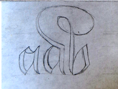
Ambigrams are funny things. If you don’t know, they’re words that read the same both ways up (or sometimes different things!) It’s never easy to know if a word will make a good ambigram or not. You might have an idea of how you could bend the letters to match each other, but when you try it out, it ends up ugly, or it just doesn’t work. Sometimes, however, you might try to use a word and get an unexpectedly good result.
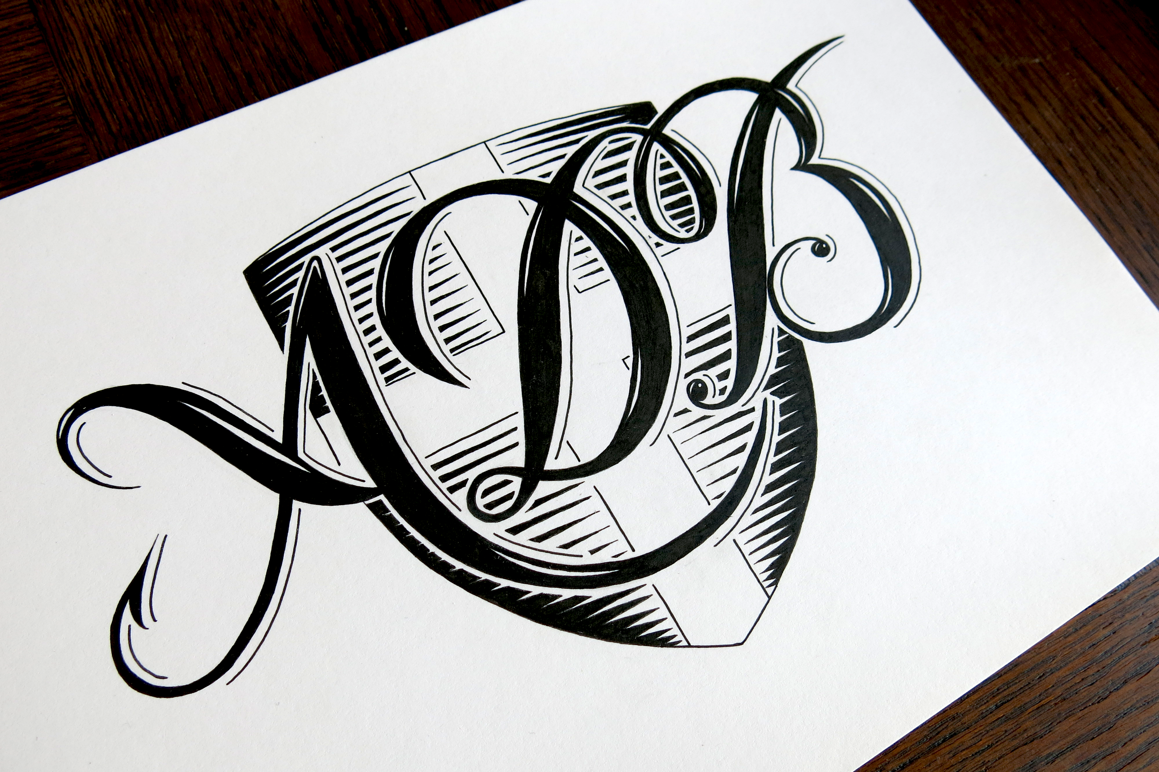
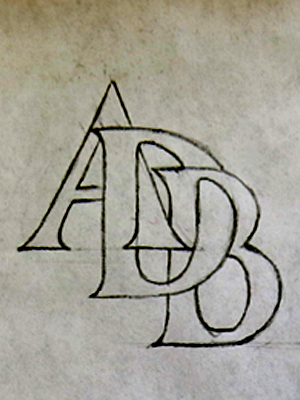
There’s something magical-seeming about the words that do work. A few days ago, an idea came to my head in a mysterious way. It was almost like a dream, in that there seemed to be a point in time where I had already had the idea, but I couldn’t remember actually having it in the first place. Strange as it is, I ended up making an ambigram of the word “Symmetry” — a fitting word for an ambigram.
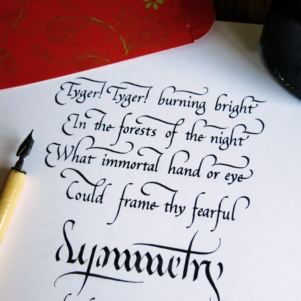
Shortly thereafter, I remembered a piece of a poem by William Blake I had used once to practice some calligraphy, and I realised that the poem had the word symmetry at the end of the first stanza. It wasn’t long before I had decided to make a piece with the poem and the ambigram. I looked up the text again, and found that the last stanza also had the word symmetry its end. In fact the first and last stanzas were almost identical.
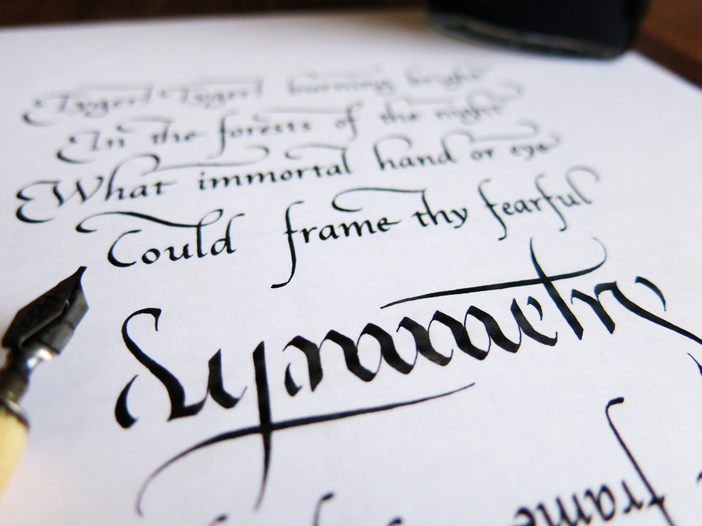
And so the idea was born to create a whole piece that was an ambigram of sorts. The piece is a combination of the two stanzas, the first on top leading down to the ambigram, which finishes the line, and the last underneath, leading up to the central word. Strangely enough, the piece can’t be symmetrical if it is to have both stanzas, because final line differs between the two. The first reads “Could frame thy fearful symmetry,” and the last “Dare frame thy fearful symmetry.”

How odd the calligraphy looks upside-down. And how odd it is to have a piece so concerned with symmetry, with its subject matter, its composition, and even the very central word all being so symmetrical, and yet not to have it actually be perfectly symmetrical. Let me explain why:
There is some discussion about the rhyming structure in the poem. Reading the lines you might have noticed that the final couplet seems as though it should rhyme, but doesn’t. Surely, you might think, that’s because Blake would have pronounced “symmetry” to rhyme with “hand or eye”, or vice versa. After all, the rhyming structure of the rest of the poem would fit with this explanation. The English language underwent something called the great vowel shift, during which the pronunciation of lots of vowels changed, which resulted in lots of the strange spellings that we have now. However, Blake’s work was written after a time at which “symmetry” and “hand or eye” would have shared a rhyming sound. So, then, either he was drawing from the past in order to cheat the rhyme, or this line is intentionally the only one that doesn’t rhyme. You may notice that it’s also the only line with 8 syllables versus the 7 of all the other lines, which goes further to imply the difference of this line.
That said, there are other convincing arguments to suggest that he did, in fact, intend for the line to rhyme. Either way, it’s a slightly more thought provoking piece to have a difference between the top and bottom, and as it includes both start and end of the poem, it pleased me more to write it that way.
There could be much more to discuss, but I will leave it at that for this week. I will look forward to sharing more calligraphy and calligraphy/lettering-combination pieces with you soon.

You must be logged in to post a comment.