Thursday

Good news! Today I got a dribbble invite! If you don’t know what dribbble is, head over to dribbble.com and take a look! It’s a place for designers to share their work and network with other designers. The other good news is that today (at least for another half an hour or so) is Monday. So here’s the new thing:

Thursday

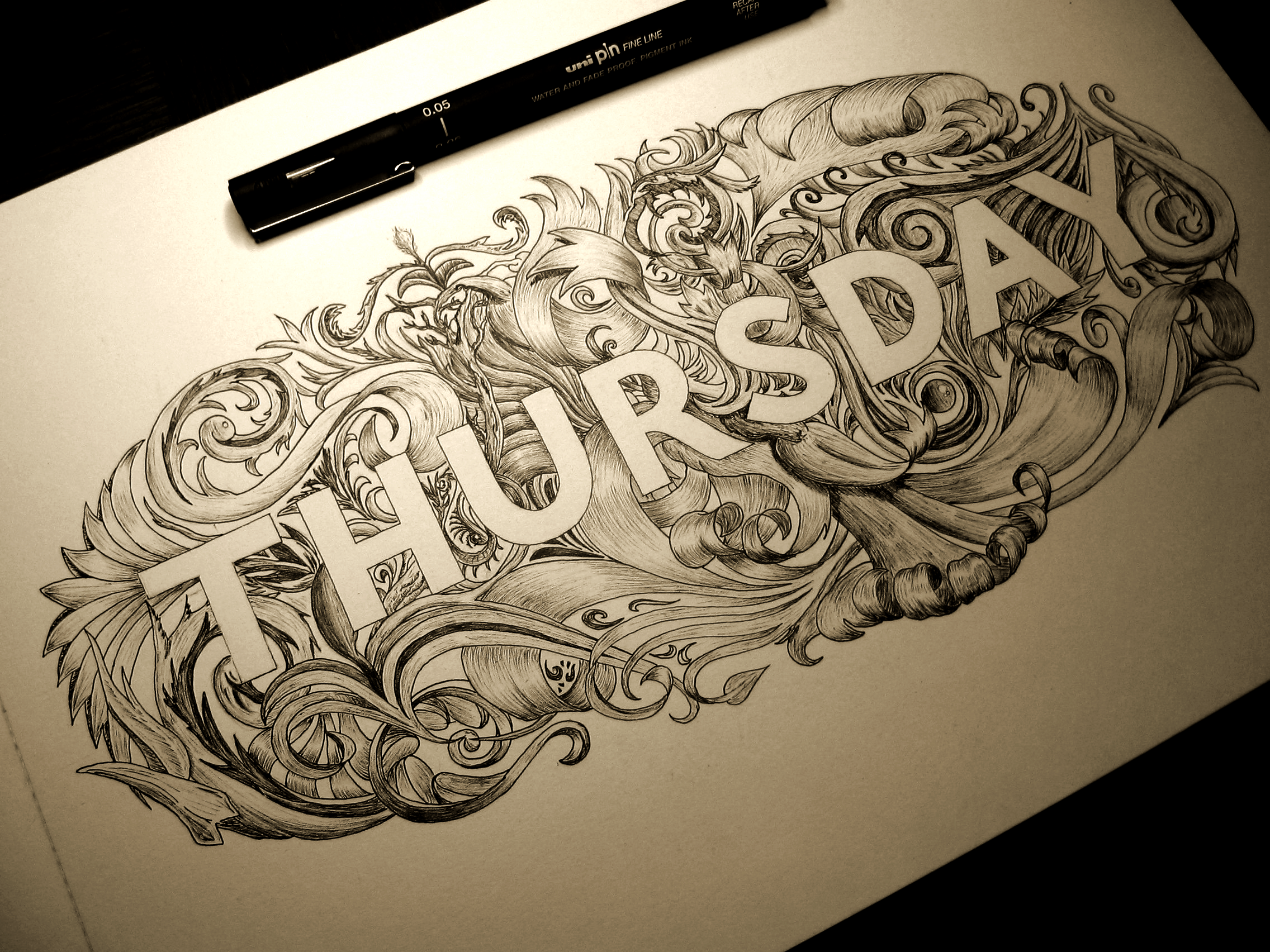
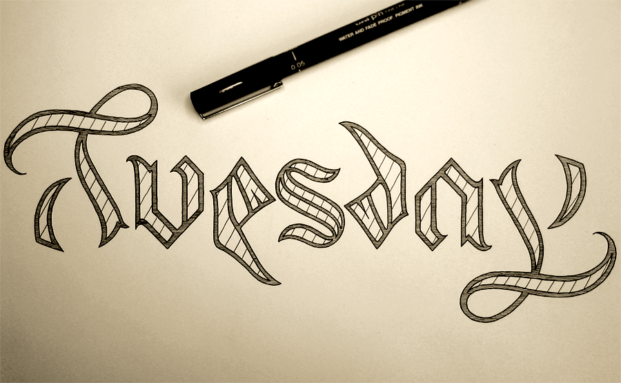
That’s because Mondays are going to be update days from now on until the end of ever, meaning you can always come and check on a Monday (well, on Tuesday, really, because I will update in the evening) to see the next piece. This week’s piece is the 4th in the series of the Days of the Week project I’m currently doing. The goal with this piece was to create something with a filigree feeling to it. I liked the idea of doing something in a filigree style, but I also felt that the piece would benefit more from having the letters be clean and clear, which is what made me settle on letter-spaced sans serif all caps. In doing so, I found that I really haven’t ever produced many works using sans serif letters, and I tend to lean towards script and serif. The piece really called for something strong in contrast to the detailed filigree ornamentation behind it, but standard Roman style all caps just weren’t cutting it. The advantage that I ended up with by using this style is that through even stroke width, it not only creates a great juxtaposition of bold shapes over detail, but also helps out greatly with legibility, which is something that would suffer if the thickness of the letters varied more.

I had originally planned to go with slab serif, but, and not to bash slab serif at all, it feels to me that it’s just sans serif pretending to be serif. I’m sure it has its uses, my original choice to use it was just based on my preference for serif over sans serif, when in fact, what the piece really needed was the simplicity of sans serif. Over all, this piece is mainly an exploration of contrasts. The contrast between strength and fragility, between simplicity and complexity, and between black and white.

If you’re interested in the process of making this piece, here are a few progress shots:

IMG_1801

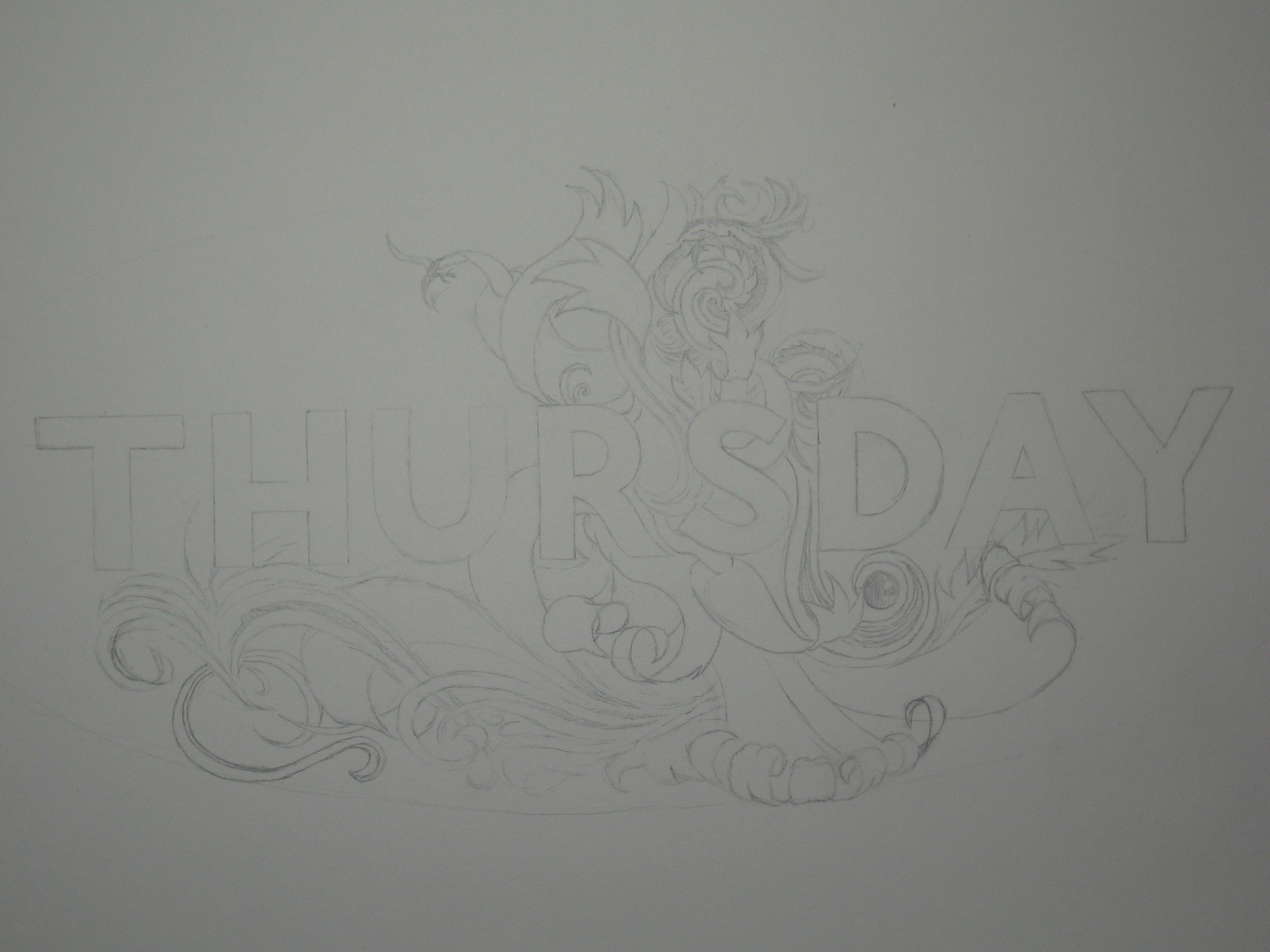
Having measured out and sketched in the letters, next is to start planning out the detail behind them.

IMG_1807

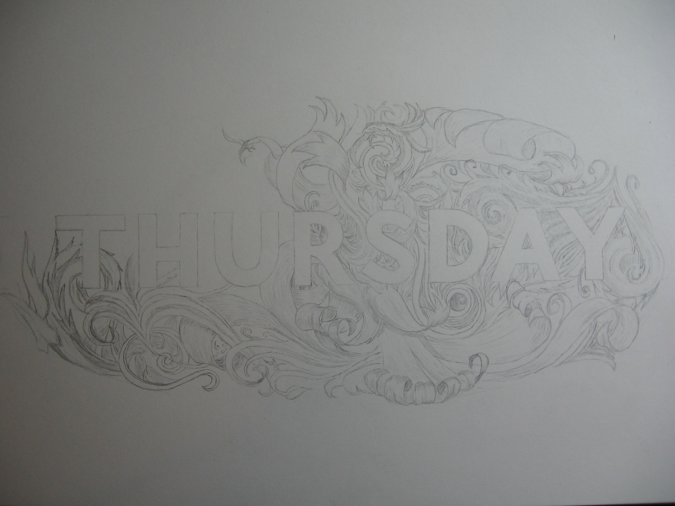
Fleshing out the detail.

IMG_1808

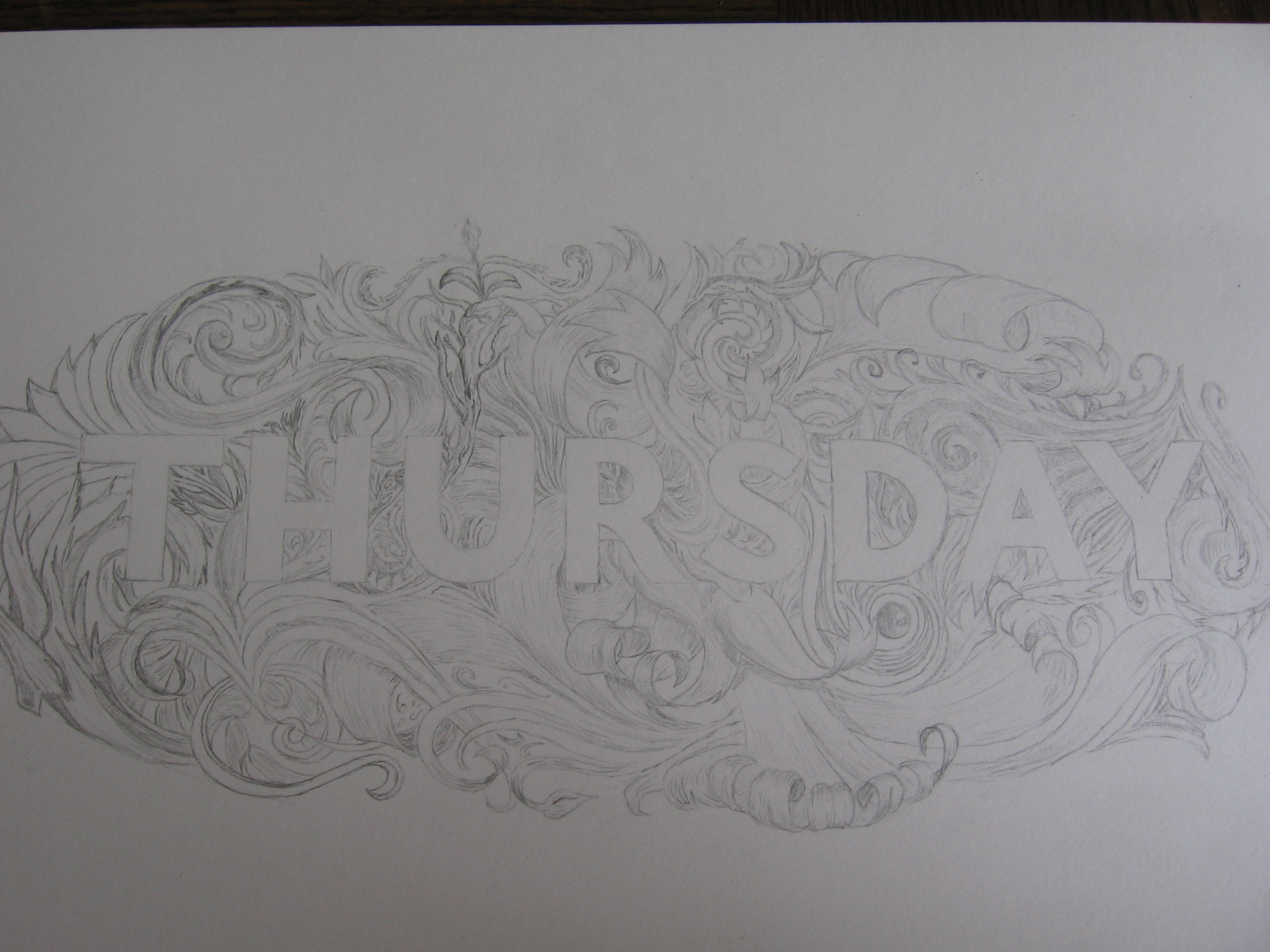
Detail all planned out. From then on, it’s just a story of ink.

See you at the beginning of next week with Friday’s piece.

Tuesday

So last week, I uploaded Monday as the first part of my Days of the Week project, which, as you can guess, will be a seven part project. The goal with this project is to explore diversity in lettering and make each piece of the project as different from the last as possible. This week, not to be too predictable, I’ve decided to go chronologically from my starting point. So, here’s Tuesday!

Tuesday

The style is inspired by Blackletter/Gothic calligraphy, but the main defining feature of the piece is that it is an ambigram. Like several of my other pieces, such as Out of my Mind and the word Longer in this piece, this means that it reads the same both ways up! The biggest challenge of the piece was definitely the T/Y combination. The curl of the top of the T certainly lends itself to the loop of the lowercase Y but the rest of it needed quite a bit of work to come up with something that would read well. Fortunately, Blackletter capital T’s often incorporate a half moon shape that curls around the left and underside of the letter. Here, the shape is very understated so as to make the shape of the y neat and stay within the x height of the piece, but it was nice to find a solution that created stronger stylistic consistency.

The lowercase U and A practically solved themselves once I started with the Blackletter style, and the S, of course, falling as it does in the middle of the word was the perfect centre point for an ambigram, it being a rotationally symmetrical letter in the first place. The last puzzle was the E/D combination. With this, again, I felt like I had stumbled across something that seemed almost too convenient due to the Blackletter style. A quick google of Gothic script will show plenty of examples of the lowercase D with a very low, curled form, which simply requires the bottom of the E to cut through the baseline a little way to achieve the right effect.

When creating an ambigram, it is such a restrictive form that it’s almost more like solving a puzzle than creating something. It’s as though you’re looking for something that you’re not sure is there. Trying to see if a rock contains a fossil, and until you spend the time and care chiselling away the outer layers, you can’t say for sure. Sometimes you find nothing, sometimes just some fragments, and sometimes you find a whole dinosaur. A similar comparison is with very restrictive poetic forms. To craft words to a restrictive form and still say what you want to say is a very challenging thing, and as I’m sure proponents of the “Poetry doesn’t translate” movement would hasten to tell you, it’s not only down to the skill of the poet, but also the intricacies of the language that allow the poem to work. In the same way, just as not everything can be expressed through sestinas or haiku, not everything can become an ambigram, as much as you might want it to.

I did go on to make a vector of this piece, mainly because I wanted to make a rotating .gif of the image. Take a look!Tuesday