Inktober Drop Caps (Part 2)

Inktober rages on! Or at least, slowly advances from my end. Mostly, it consists of lots of sitting in a chair quietly sketching. The raging part, that’s about what you see if you search for #Inktober on Twitter. Inktober is a challenge to artists to make one piece of artwork in ink each day of October. Amidst all the pictures of monsters and anime characters, every now and then, you might catch a glimpse of some typography and calligraphy. So that’s where I come in! Two weeks ago, I posted the first half of my drop cap alphabet (which goes up to M). Though Inktober isn’t finished yet, I’m done with the alphabet and have even started on a few numbers! Here’s the second half:

Dropcap N

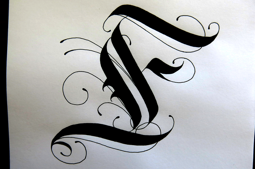
N: I had quite a bit of time to doodle this one, resulting in it being pretty ornate! It uses a kind of shading that is similar to hatching to give it a shiny feel, which worked out quite well.

Dropcap O

O: I spent a lot of time on this one just making sure I had the proportions of the Gothic-style O just how I wanted them. The ornamentation is quite simple, but it gives a bold effect, which is what I was aiming for.

Dropcap P

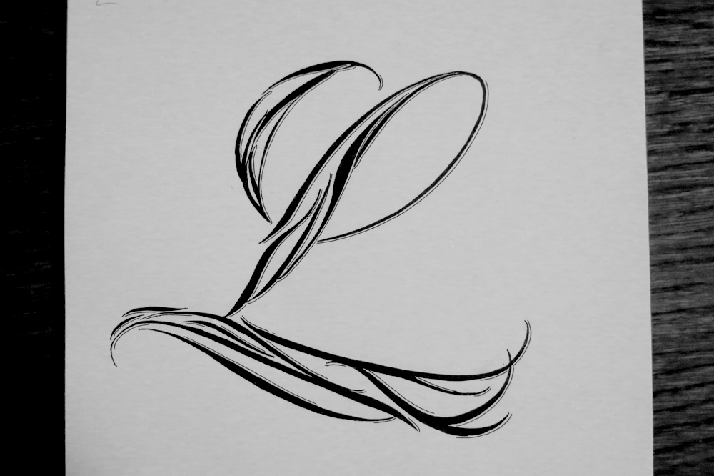
P: This one shares similar ornamentation to the N, but its form is inspired mostly by pointed pen calligraphy rather than Roman caps.

Dropcap Q

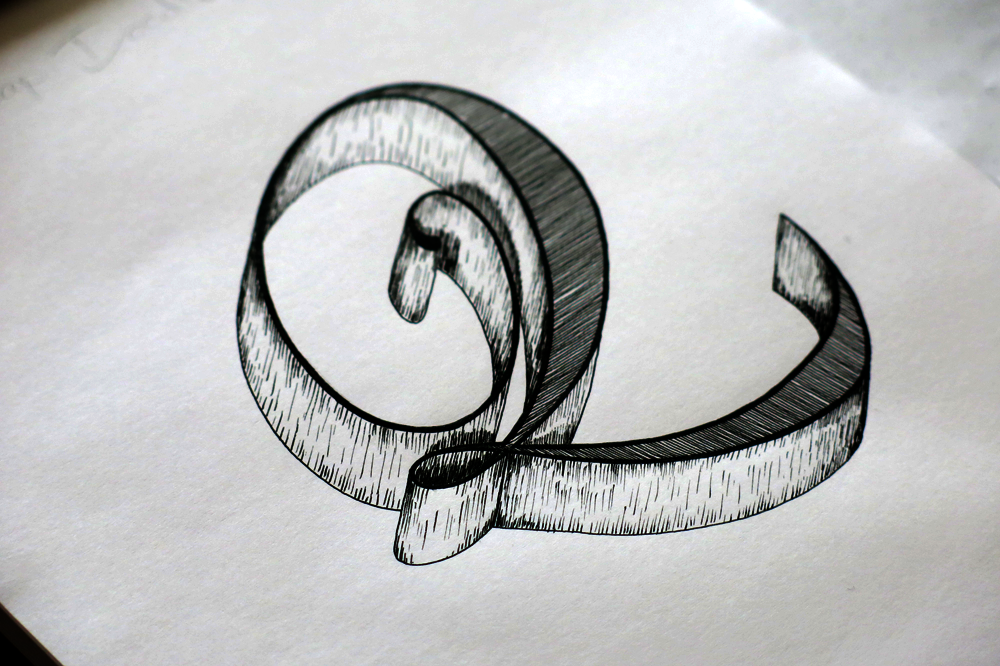
Q: The picture is taken from an angle on this one to complement the 3D effect. Lots of fun doing the shading all around the sides, but a headache to get the angles all correct on the 3D parts.

Dropcap R

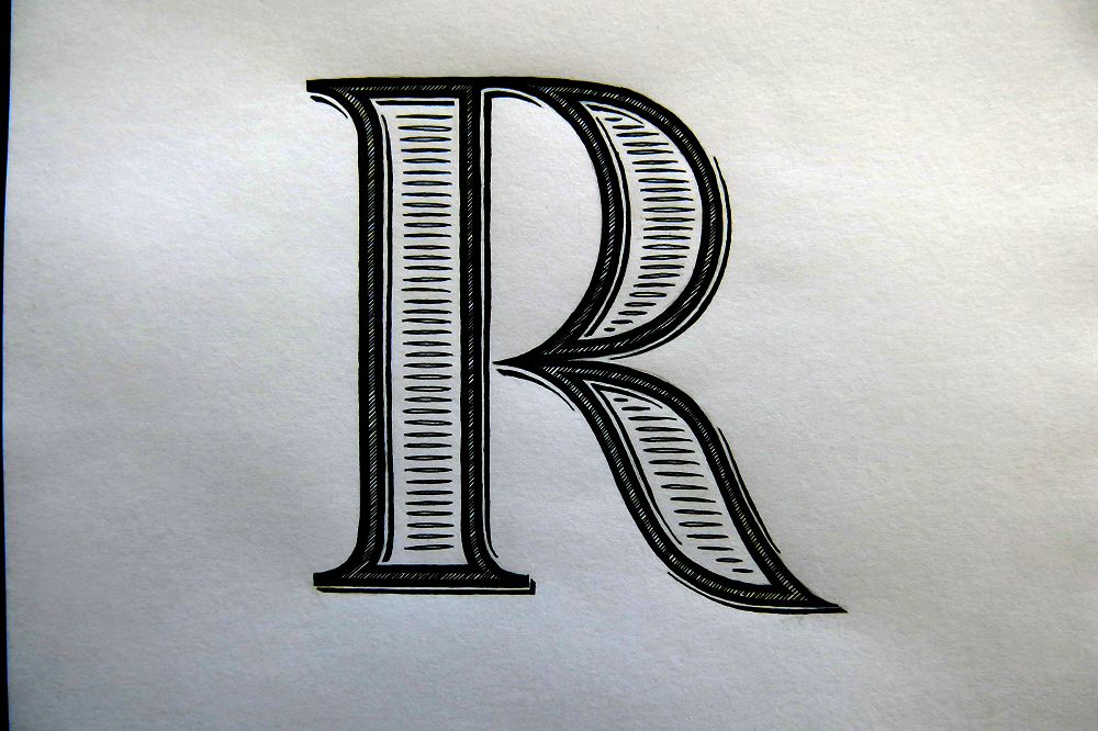
R: Straight up in terms of form. On this one, I was aiming for a simple shape so that I could fit in lots of details, like little drop shadows and hatching.

Dropcap S

S: A little more abstract than others in the set. It’s inspired by calligraffiti and lettering styles I’ve seen in various places. It looks a little like a swan, but also a little like a flame.

Dropcap T

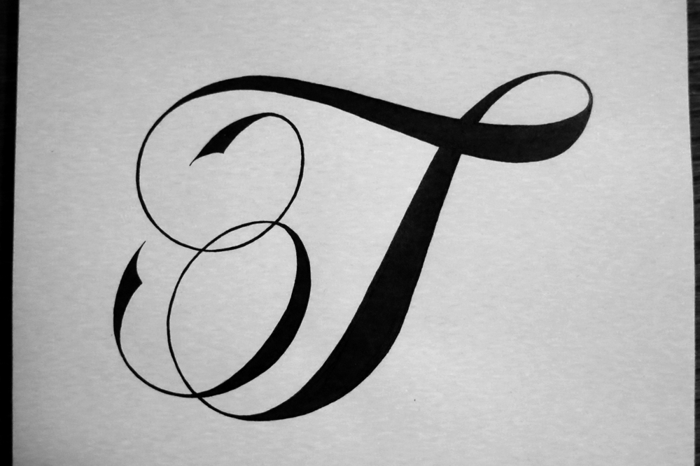
T: Keeping it simple in terms of ornamentation in order to focus on the shape and create a piece reflective of pointed pen calligraphy.

Dropcap U

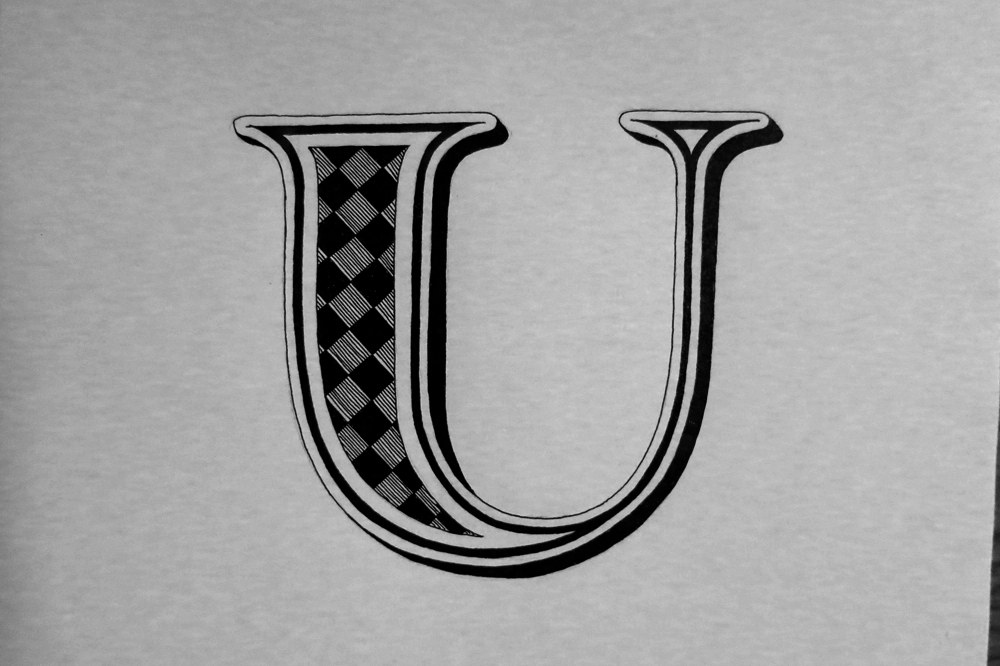
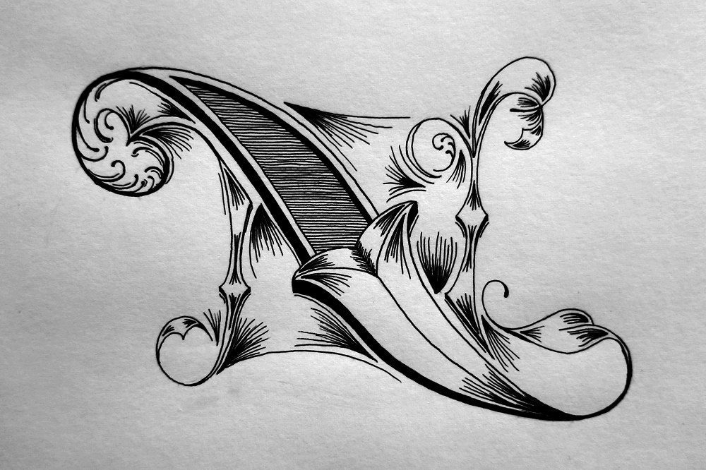
U: Similar to the R, and also the A, this combines elements of each, resulting in a bold and stylized piece. It felt incomplete until I added the outline and the drop shadow, which rounded it off well.

Dropcap V

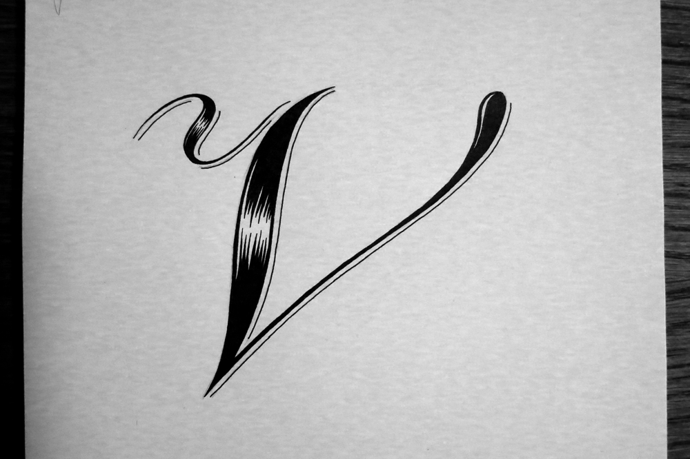
V: Using a kind of shading I did on a piece long ago which I haven’t come back to in a while. The effect is reminiscent of brush calligraphy and pointed pen work.

Dropcap W

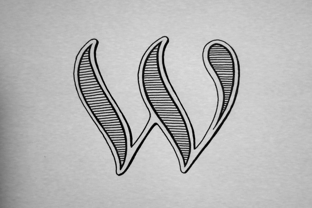
W: A bit of a speed run, so it’s done all with one large nib width, which made for a playful, friendly piece.

Dropcap X


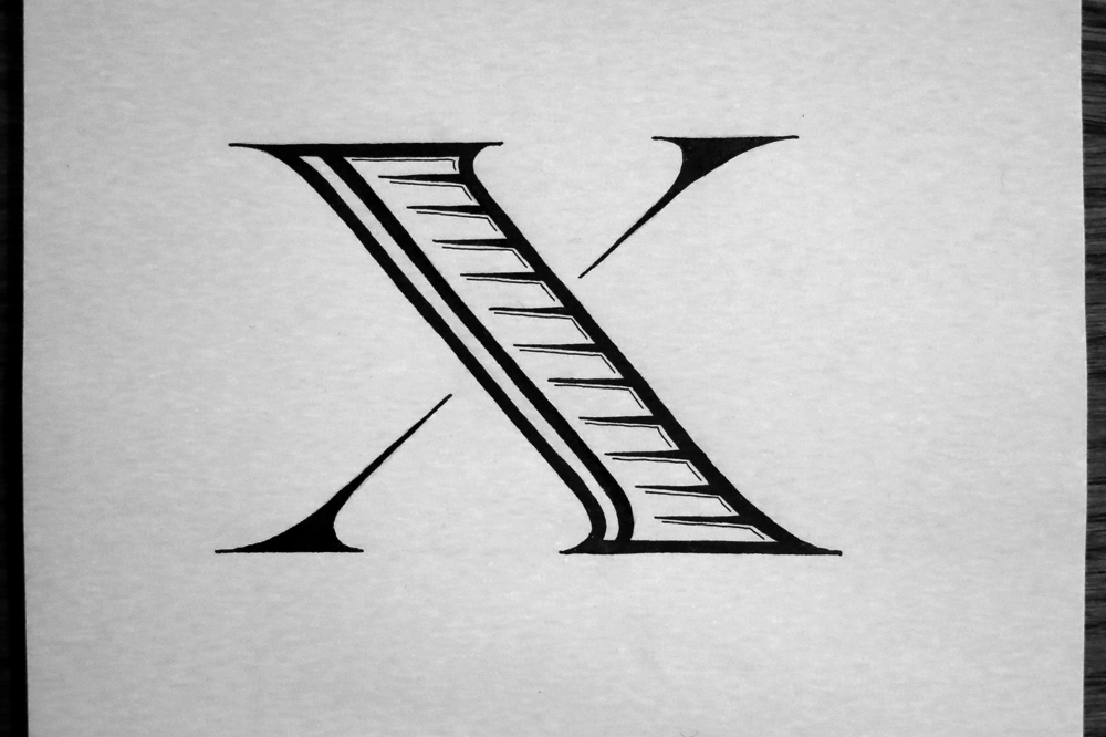
X: Aiming for something a bit nuanced compared to the W. A crisp, sharp form with some delicate ornamentation.

Dropcap Y

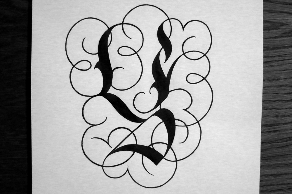
Y: A Gothic style with plentiful ornamentation in a style I haven’t used much in the past. Would be nice to go over some bits with gold ink if I ever got any.

Dropcap Z


Z: Inspired by some old Cadels. It’s the last one in the alphabet, so I thought I would get fancy and try a new style.

Dropcap 1

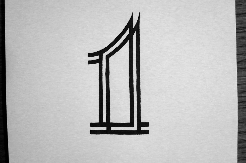
Bonus: 1. A Metropolis/Art Deco style no. 1 to continue Inktober. Drop caps out of the way, numbers will follow as a few bonus pieces.

Dropcap 2

Bonus: 2. Similar to the W, it’s a bold and playful piece inspired by high contrast script pieces.

Dropcap 3

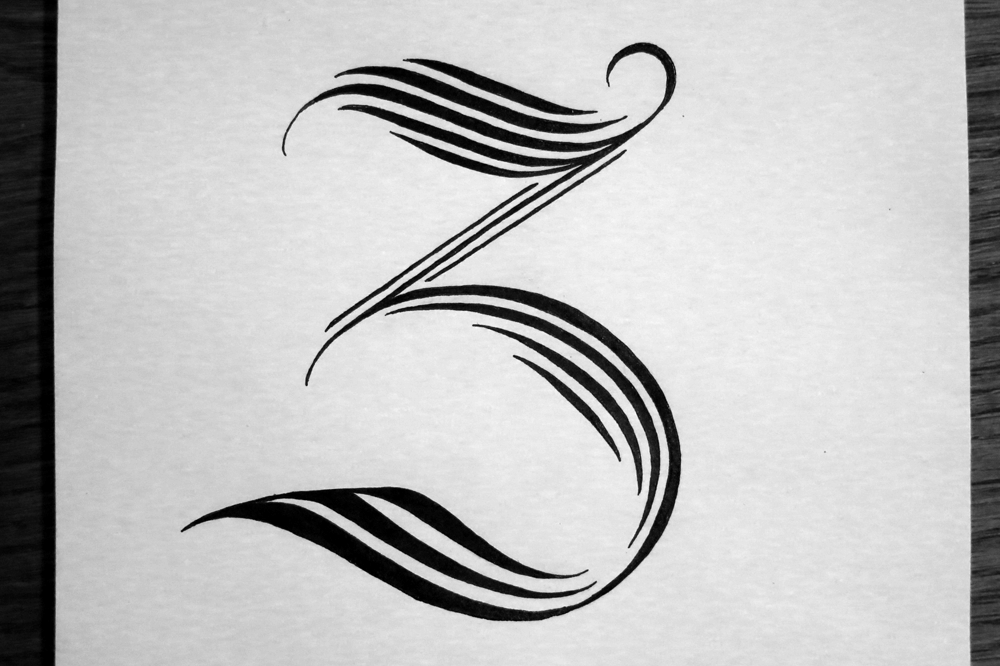
Bonus: 3. Lastly, today’s piece! A swirly detailed 3. Click the picture to take a closer look at all the details.

Inktober Drop Caps (Part 1)

I recently discovered something called Inktober, which is a challenge to artists to produce one piece of work in ink each day of October. Of course, I already work exclusively in ink, so it suits me well in that regard. The daily part, however, is something I haven’t done since my Thing A Day project, which is very close to being one year ago. Back then, I had only just started lettering, and looking back on the posts, I can see so much I would change and so much that I have learnt. So nearly a year later, I find that I’m back to doing a thing a day, though this time I decided to do an exploration of styles in designing drop caps. Similar to my Days of the Week project, I took this opportunity to challenge myself to making each drop cap as different from the others as possible.

At the same time, I’ve been posting each drop cap as it comes to Twitter and having a little fun composing each tweet to start with the same letter as each day’s drop cap.

Here, I will provide a little insight into what I was aiming for with each drop cap and how it turned out.

Dropcap A

A: My goal was what is essentially a Roman capital with a healthy dose of Gothic inspiration informing it. As much as I love Gothic alphabets, the letter A always seems lacking somehow, so it was fun to inject a little of the style into something a bit more aesthetically pleasing and legible.

Dropcap B

B: I looked to create a letter B that fit well with a Copperplate calligraphy style, but had a unique formation. If you follow the stroke of the pen from the curl at the top right (which would be the starting place in writing it) and trace it all the way through the letter you can see that the lower bowl of the B is created before the upper, which is not the normal way round. To complement the odd formation, the decoration is a little Escher-esque.

Dropcap C

C: Going for a kind of 3D style, which is pretty common in lettering, but the tendency seems to be to use either a shadow or a side-on view of a raised letter. If the two are combined (which they sometimes are) then it seems that the shadow is always comes on the same side as the raised effect. In this case, I experimented with making the light source come from (roughly) the same position as the perspective.

Dropcap D

D: A straight up experiment in making things unabashedly swirly. I think that there is a lot more to explore with this style, and I revisit it with the L, later. I think I might experiment further with it in future lettering pieces, too.

Dropcap E

E: This is another example of a raised letter, like the C, but with no shadow. Instead, I endeavoured to make what looks like an inlay made of wood. If it’s hard to see in the small preview, click on the image to get a better look!

Dropcap F

F: The first really Gothic letter I did in the Inktober challenge. The A was an something I wanted to create in a space between traditional styles, but this time, I was aiming for something as more of a calligraffiti-Gothic hybrid.

Dropcap G

G: Sunday is my day off, so I had more time to add more detail and have fun. I was aiming for something ornate and fun, while still adhering to good fundamentals of Roman letter design. It’s important to spend a long time thinking about proportions and form before getting too bogged down in the details.

Dropcap H

H: Bold and strong, inspired by Art Deco power and seeming fascination with trains and forward motion. I used stippling for the first time in what seems like forever to create the effect in the middle.

Dropcap I

I: Similar to the F, this one draws most of its elements from Gothic styles of calligraphy, but its form adheres a little bit more to what we would consider a traditional hand-written capital letter I crossed on the two ends. I think that the little drop shadow outline gives it a nicer effect than what I was going for on the F, so I was pleased with how it turned out.

Dropcap J

J: A bit of an unconventional form with is a combination of a typographic J, which often omits the full curl on the end of the stem, and a hand-written style with a full crossbar on top. The ornamentation is something that I enjoyed doing on a previous lettering piece and wanted to dedicate some time to in one of my drop caps. I did take a lot longer than other letters though!

Dropcap K

K: This one is in a pretty comic-book-like style, which is something that I haven’t explored much before. The form of the letter, the strong drop shadow, and the interior shading come together to make the style, and it ends up standing out as quite different from the other drop caps.

Dropcap L

L: Having enjoyed the D, I decided to create a letter that was made entirely of swirly bits. Before filling in the outline it looked almost as though it was made of feathers, and it does a little still, I suppose.

Dropcap M

M: This one combines quite a few things I’ve done in past lettering pieces. The decoration on the inlay, the fragmented style and the raised sides are all elements I’ve used before, but not quite in this combination, where they end up creating a unique effect.

The rest of the alphabet will be along in a a couple of weeks or so after I’ve finished the Inktober challenge. In fact, I started a couple of days before Inktober, having decided on a whim to do a drop cap a day, so I will run out of letters a few days before the end of October. I’m planning on doing some number-based lettering pieces, or at the very least some ever popular ampersand practice, and other symbols. Why do designers love ampersands so much anyway? What about the poor @ sign, which never gets much love?