No Pressure, No Diamonds

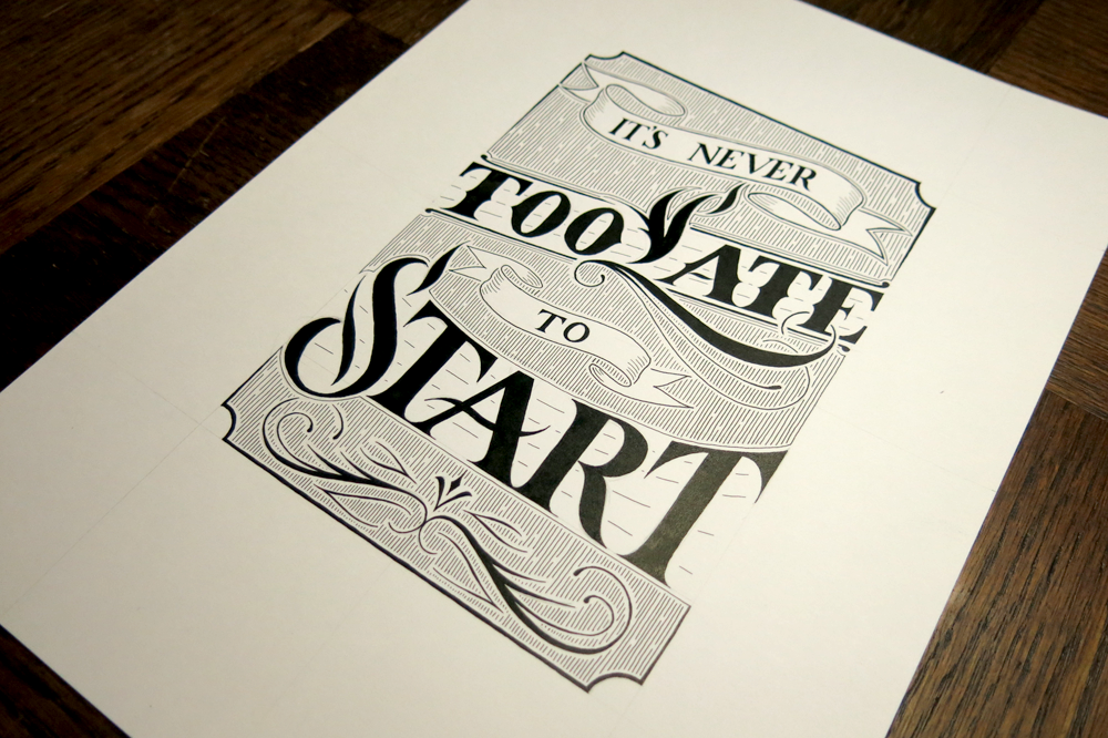
When do you think you produce your best work? Is it when you have all the time in the world to plan and tweak and refine? It has been said that work expands to fill the time allotted, and if you’re a perfectionist, I’m sure you would agree that there’s an element of truth in the saying. It’s also said that you never grow if you never stray from your comfort zone. If your ideal working scenario is comfortable and calm with endless time, it could be that you would benefit most from denying yourself that environment. After all, no diamond was ever created where there was no pressure.

No Pressure No Diamonds Angled

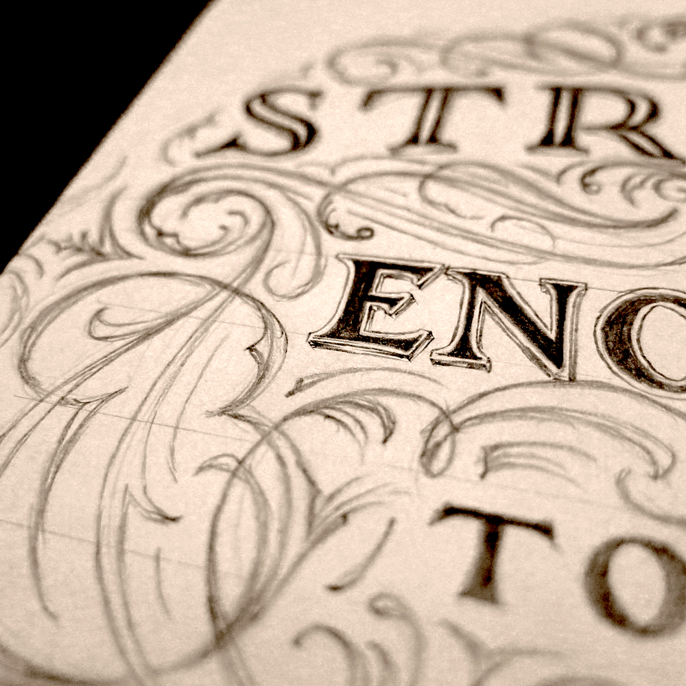
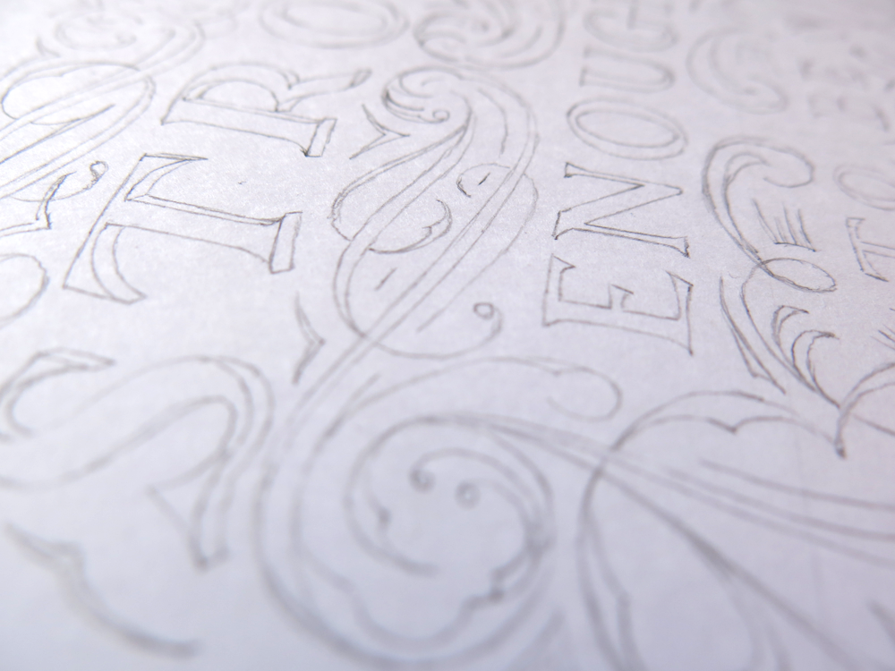
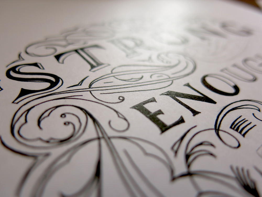
No Pressure, No Diamonds! What does it mean? It means something enough to one person to have it emblazoned on their skin, in fact. This was a client commission for a tattoo that I wanted to share with you for two reasons. The first is to show off my process for tattoo design, and the second is because the subject matter is oddly fitting in this case. The brief for the piece, that is the words themselves and the layout, didn’t seem to lend themselves well to any of the styles that I have been becoming more familiar with. My love for Romans, my penchant for combining styles, tendency to create tiny details in pieces, all were at odds with what this piece needed to be. The text needed to fit within a 11.5 x 6.5 cm space (4.5 x 2.5″), it needed to be well legible at that size, and it needed to (of course) be typographically sound.

Here are some specifications that I included since the piece was being passed from one artist to another (i.e. from me to the tattoo artist who would execute the design):

No Pressure No Diamonds Measurements

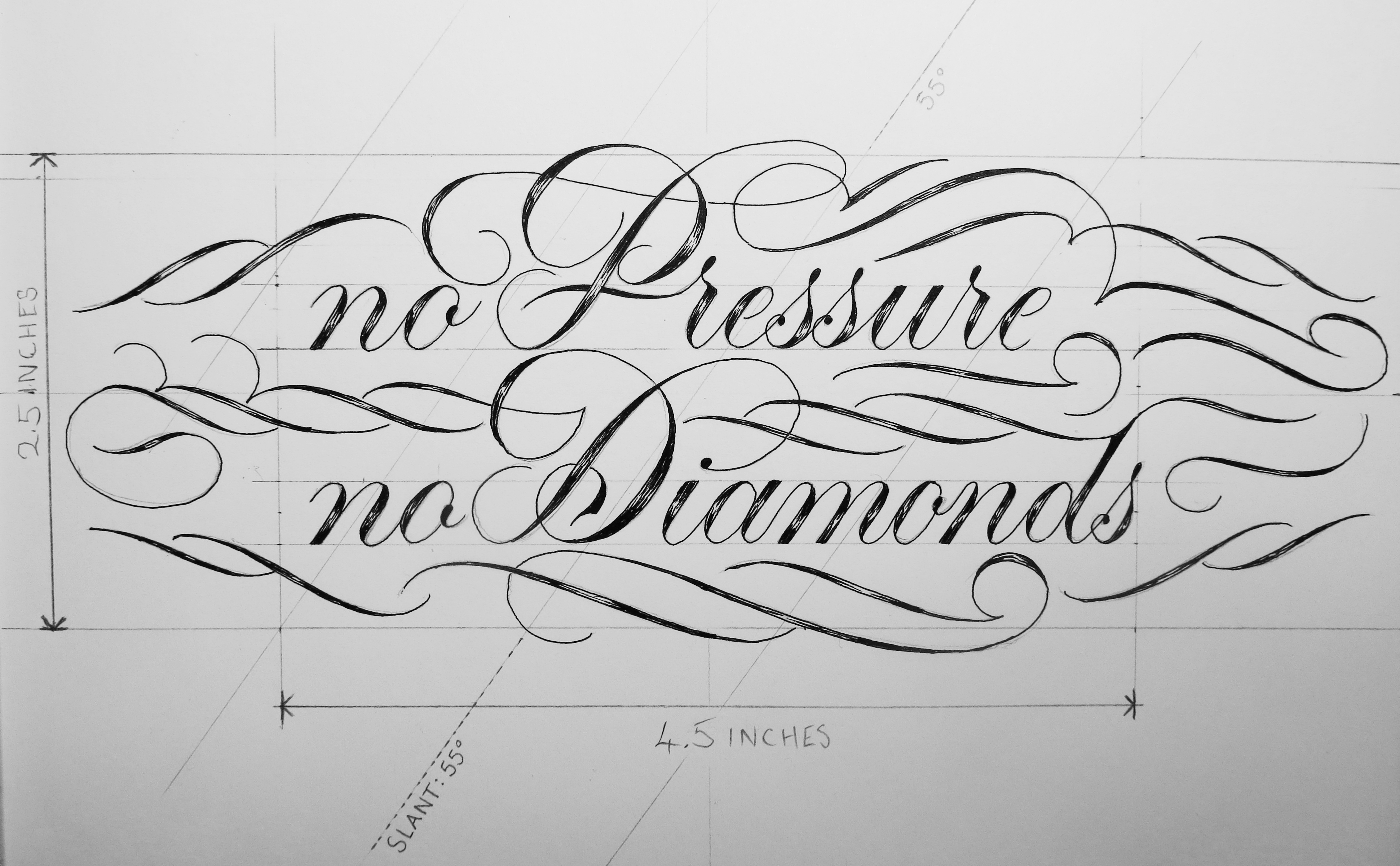
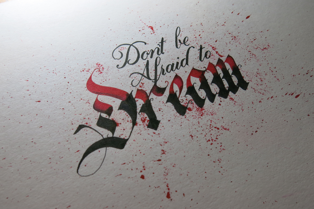
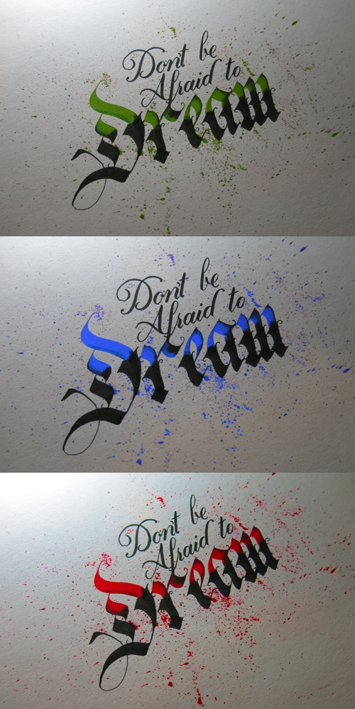
In the early design stages, I had difficulty coming up with anything that would satisfy my standards. One of the main things I had to tackle was the word length. Two very short words and two quite long words. Just by the nature of the phrase, many design possibilities were taken off the table that would normally be there for phrases with more equal letter distribution. Eventually, I managed to create a small selection of designs that I had some interest in taking further. The client had requested something in a fluid kind of script, but I find it best to explore all available options before continuing because there are often solutions hidden in places that don’t seem obvious at first, and closing doors early on is a great way to get stuck. And getting stuck wasn’t something that I needed any more of with this project.

No Pressure No Diamonds Concepts

So what happens at the end of the story? Well, the hero perseveres and comes up with the best design ever, not through luck or coincidence, but through effort and hard work!

Really though, that’s pretty much what happened, minus the hero part. As it turns out, even a project that you feel doesn’t mesh well with your style, or doesn’t seem to fit well with what you would usually like to do can be turned into something you make your own, something you can really put your heart into and work on with as much enthusiasm as any other, and come out at the other end with something you can be proud to write a blog post about.

So one of the reasons I wanted to write about this project in particular was because it was a case where the pressure was on to create a piece that was worthy, and in the end I created a result I was happy with, despite the difficulties, which is kind of the point of the piece I was making. No Pressure, No Diamonds. How meta.

Just Wing It

Sometimes you need to stop preparing and jump in at the deep end. This weekend I went for a swim in a lake, and it turned out that the summer hadn’t warmed it up enough to really be hot enough, but the plunge is by far the worst part of it. After you get going with something, it often ends up not being so bad. Some times, you need to just wing it.

Just Wing It

So here’s a little piece that puts into practice the things I’ve been studying about formal Romans, with a little dash of Copperplate thrown in for good measure. All of that is becoming familiar ground for me, however, so where is the proof of the jumping in at the deep end? Well, I decided to finally start a little more serious experimentation with coloured work that isn’t in the digital realm. I bought some gouache and turned this piece into something colourful:

Just Wing It Colour

I’m pretty sure that that just about wraps it up for learning blue, so if I just learn the other 6 colours, I should have it all sorted out. In all seriousness, though, this was novel for me in both execution and design. Working with subtly different tones was interesting, but the experience was added to with regards to the tools used. When making something that’s simply black and white I use Rapidograph technical pens, but this piece is one of the first lettering pieces (as opposed to calligraphy pieces) that I’ve created using my traditional calligraphy tools, in the form of a broad tipped dip nib.

Wing

Calligraphy is a great example of an art that is all about the hours of practice vs the minutes, or even seconds of execution that it takes to make a piece. A skilled calligrapher has dedicated thousands of hours to learning the correct letter forms so that they can produce them swiftly at a moment’s notice. This is paying off in my own work, as sketching out Romans like these is becoming something that only takes a few minutes, and is backed up by the time dedicated to acquiring the knowledge that supports the letter forms. The process of this piece, then, is relatively simple, as the first step is shown above. With a couple of guidelines pencilled in with a ruler, the letters are quick to outline. From there, the next stage is designing the Copperplate and flourishes to surround the Romans, and filling the outlines. Lastly, I laid another sheet over the pencil version so that I could trace the letters in paint, and not to have to worry about erasing the guidelines after the paint was applied, all of which means that I end up with two versions of the piece, one graphite and one gouache, as pictured above.

Strong Enough To Be Yourself (A study of flourishes)

Flourishing is something that didn’t make it into my repertoire for quite a while. When we start something, we are often ignorant of the depth of it. The way we appreciate something deepens through understanding, and so it’s not surprising that when we don’t have a good understanding it can be hard to appreciate something on more than a superficial level. In terms of lettering, most start out with the desire to understand and create letter forms. Of course, that must be what lettering is all about, mustn’t it? I mean, it’s in the word. Soon, however, you come to realise that the letter forms only work if they are structured well, and so you start to learn about hierarchy and composition. Similarly, flourishing is something that I have been concentrating on lately as an area of study which can improve the pieces I make.

Strong Enough To Be Yourself

If you look back at older pieces, such as The Greatest Victory, which was a piece that I made when I first started to consider the composition of a lettering more, you might notice that the flourishes seem uncomfortable and don’t really know what to do with themselves, almost like teenagers who have grown too fast and haven’t relearned how to use their limbs. They’re there because they are necessary, to an extent, but don’t quite serve the purpose they were created for. Since then, I’ve learned a lot through my study and have applied some of it in this piece.

The piece started just as a sketch of the word “strong”, as I had wanted to try out an certain 3D effect on some letters. I thought of the full phrase and planned out a little more of the structure. From there, I decided to do a little exploration of the space between the words, so, loosening up my arm, I started designing the flourishes using larger gestures controlled by the shoulder muscles rather than the fingers. This advice of using shoulder muscles, often given to those learning calligraphy, can seem daunting to beginners, but when designing flourishes, it really needn’t be. Any detail work or corrections can easily be made later, as graphite is far more forgiving than ink.

Strong Enough Flourish Sketch Progress

One of the most key elements in flourishing is to pay close attention to the negative space. It’s important that no one area becomes too dense, nor too sparse. A roughly equal distribution is attractive, though some variation is pleasing too. Once I was happy with the design, I took from the sketchbook to the paper for the final piece. When it comes to a symmetrical piece like this, it’s convenient to flip the reference material (in this case, the original sketch shown above) so that there aren’t too many irregularities when comparing the two sides.

Strong Enough Pencil Detail

From then on, it’s the same story of inking that you have heard before: a soothing, quiet time spent with paper and ink. Becoming too tense or hurried never helps, as a calm hand creates fewer mistakes. Here’s a little shot of it transitioning between graphite and ink, temporary and permanent:

Strong Enough Inking Progress

It’s Never Too Late to Start

It’s been an interesting week for me. Coming back home from visiting family in another country was going to be fine, but unfortunately the trip back was interrupted by some surprise friends in the form of kidney stones and a cold. In addition to that, my wife suddenly had a new job start, all of which meant that I didn’t get round to doing a piece for this Monday’s blog post. So I could have though it no big deal, and just put it off until next week, but I’ve had a piece that I wanted to do for a while now on the back burner that fit what was going on quite well.

It's Never Too Late to Start

It’s never too late to start. Well, for me, I started pretty late. Past the deadline, in fact. But that doesn’t mean that it didn’t get done. Sometimes it’s too easy to fall into an all-or-nothing mindset where we think that if we slip up or miss something once then there’s no point carrying on. This can often lead to us abandoning the things we had previously told ourselves we would do, whether it be working hard, exercising, or sticking to resolutions. How many people make resolutions each year only to end up not sticking with them? Probably most. And how many of those failed attempts begin to fail right before we give up entirely? I’d say probably most again.

So this piece is me saying that even if I’m late I’m going to keep doing it. I won’t give up just because I hit a bump in the road. Sometimes starting is all you need to do to be able to keep going and get something done. And it’s never too late to start.

Don’t be Afraid to Dream

This week is another New-Pen-Week! Last time, I got some Rotring Rapidographs, which I use pretty much the same as the old fine liners I started out with. Not much changed in the style of work I produced, but for me, the process was changed a little. This time, however, I got some Pilot Parallels, which are a kind of fountain pen for broad nibbed calligraphy. I’ve been wanting to start practising some broad nibbed calligraphy for a while now, so that I can further my understanding of Gothic/Blackletter styles, and this week allowed me the chance to give it a go!

Don't be Afraid to Dream

I found a wonderful image that displays a style of Blackletter that I haven’t seen reproduced quite the same anywhere else. The title of the image is “Williams Style of German Text”, which doesn’t seem to bring up much other than the original image, so I don’t have much more information than what you see there. I’m sure there is much to learn in exploring the style, and I’m going to spend the next few weeks trying to understand the intricacies of what makes the letters function in the way they do, but in the mean time, I took some inspiration from the style, as well as several other styles I’ve seen around the web, and came up with the piece above.

The pens came with two inks, which was unexpected, but it provided me with the opportunity to experiment with a bit of colour, which is something I’ve been purposefully avoiding in other works in an effort to focus on form. After all, restrictions are what give us guidance, and having too many directions to explore often leads to little progress. That being said, it’s sometimes refreshing to allow yourself a little deviation. These inks are black and red, though refills are available for all manner of colours, so I’m interested in getting some more in the future. In the mean time, I found neat feature on my camera that replaces individual colours in a photo for others, no photoshopping required. Here, I’ve replaced the red ink with a green, blue, and brighter red. Look how each colour creates a different feel for each piece. Colour matters!

Don't be Afraid to Dream Colours

The speckles that surround the letters were made by pulling on the tip of the nib, and letting it go, which flicks the ink on to the paper. Unfortunately, it also flicks it everywhere else, so I ended up with some red fingers, pens and surfaces. Before I did the speckles, I first drew out some guidelines for the word “Dream”, then wrote in the red parts. Once they were dry, I went over in black to complete the bottom part of each letter, then added in the Copperplate above with a brush pen. The speckles came in last because I didn’t want to get my hands so messy if I ended up making a mistake and discarding the paper!

The Urban Orb

Second in my series of “What was going on a month ago” is a post about the a bigger project that I did. The client wanted 3 things: first, a logo for a series of youtube videos consisting of the words “The Urban Orb”, second, the text “Next Episode” to be shown at the end of each episode during the preview of what will happen next time, and third, a large number of quotations and phrases to be edited into the videos, but to be done in calligraphy, not lettering.

The Urban Orb

The Urban Orb is a streamer who usually broadcasts himself through streaming websites like twitch.tv, but in this case, he wanted to have a series consisting of a challenge run through of the game Dark Souls uploaded to youtube. Though he was unsure exactly which colouring/texture was going to work out best once the videos were edited, we settled on the outline of the project, and I started work. In the end, the client received several different versions to test out on the final videos, allowing for legibility, unobtrusiveness, and thematic consistency. The logo was designed to be easily read, unique in its ligatures, and styled to match the feel of the game it is used to watermark. In the end, to blend unobtrusiveness and legibility against all backgrounds, the final version consisted of a solid black outline with a semi-transparent white fill, allowing the logo to be constantly visible, but never stand out harshly in the way that a solid colour would do.

Next Episode

The Next Episode text was done in a similar style to The Urban Orb logo, but was designed to fit a much larger space. The text was originally intended to be in a calligraphic style that would interact with the ornamentation around it, and though it was sad to leave some of the calligraphic designs by the wayside, I think that the increased legibility and thematic consistency is worth more than the ornamentation’s interaction with the text. As it stands, the text is nested within the ornamentation, which also continues up to surround the in-game interface, thereby integrating the text with the aspects of the game.

Nietzsche Quote Blog Upload

Executing the calligraphy was a very different task to the design and execution of the lettering. To start with, calligraphy is more of an all-or-nothing process, where one mistake in a quotation can mean that you must start again. Some quotations were much longer than these three, so a mistakes could mean that double or triple the time would be needed to get it correct. I used traditional dip nibs and ink to write these – black ink on white paper. Once they were completed, I scanned them into the computer and colourised them digitally, though they are not vectorised, of course, which would take more than one man’s patience worth, I think.

In all, this project was wonderful to work on, not least because I was exposed to so many inspiring quotations, some of which I had read before, but many of which were new to me. Most were on the topic of perseverance, success and failure, which certainly helped me continue past making a mistake towards the end of a long quotation!