You

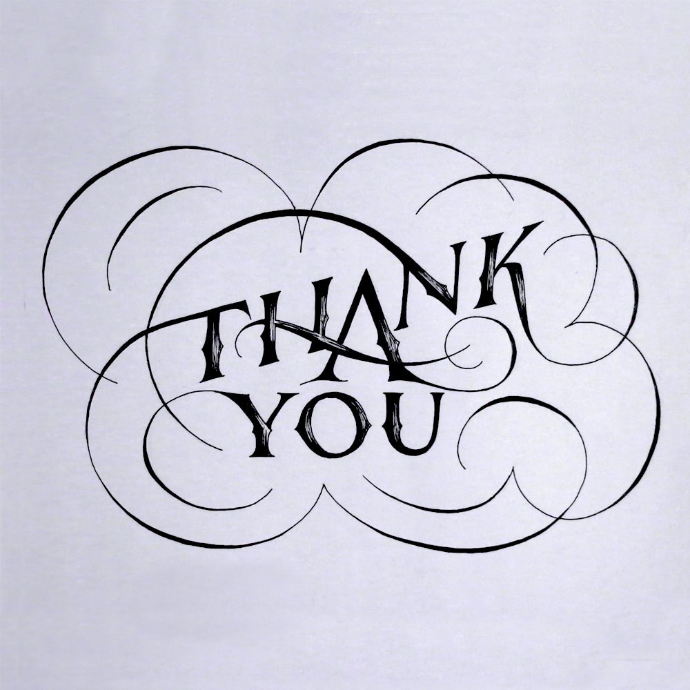
Oh look, it’s you. There you are, reading my blog post. This post is about you. Or at least, it’s about a piece that’s about you. Here it is!

You Main

I made this piece for you because I’ve been thinking about you a lot lately, and I wanted you to know just how much I appreciate you. Now, don’t get me wrong, this piece isn’t about just any old “you”. It could be mistaken for being about whoever reads it, but I just wanted to make sure that you know that it’s about you specifically, not all those other possible “you”s out there.

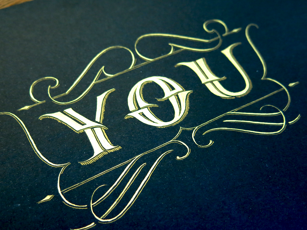
Well, I hope you appreciate all the time I took to make you this special and one of a kind bespoke gift! This is the first piece I’ve done on black paper. “But no!” I hear you cry. “I’ve seen other piece that are white on black on your portfolio page!” It’s true that there are such pieces, but they were, in fact, black on white that was then inverted digitally. This one, however, is true black paper! Hooray! And that gold you see? Well, that’s real gold! And when I say real gold, I do of course mean gold coloured paint.

I got this new paint a little while ago, and I’ve been excited to use it in a piece. Making this super special and unique gift for you was obviously the perfect choice! The body of the letters is done in straight up plain gold paint, whereas the drop shadow that runs around the letters and flourishes is a mixture of gold paint and Higgins Eternal black calligraphy ink. The whole piece was done with pointed pen calligraphy tools, namely an oblique pen holder and a dip nib. Here are a couple of different versions that I came up with before settling on the final design that you see above:

You Doodle

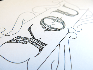
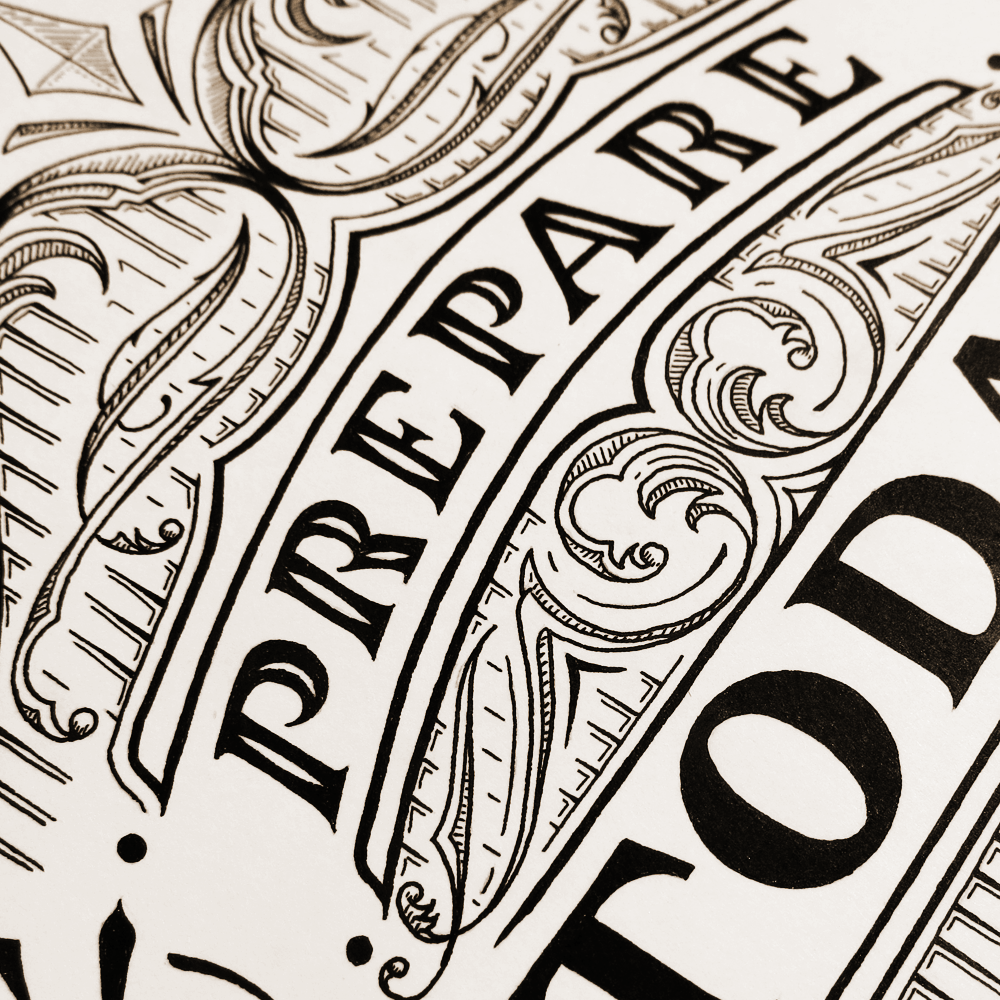
Here’s a black on white pen and ink version done with my usual Rotring Rapidographs. I was going to block the letters in simply with black ink, but just before doing so, I thought I would doodle in some little swirls to give them a bit of character, and I preferred the effect.

You Hatching

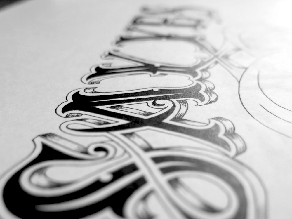
This is a previous incarnation of the final piece. I experimented with filling the letters with a delicate hatching, utilising the finest line that any of my tools are capable of: the upstroke from the pointed pen, the same stroke that forms the hairlines in Copperplate script. This was also before I added the darker drop shadow across the piece.

I also made a little collage of the various in-progress versions and different executions of this piece:

You Progress

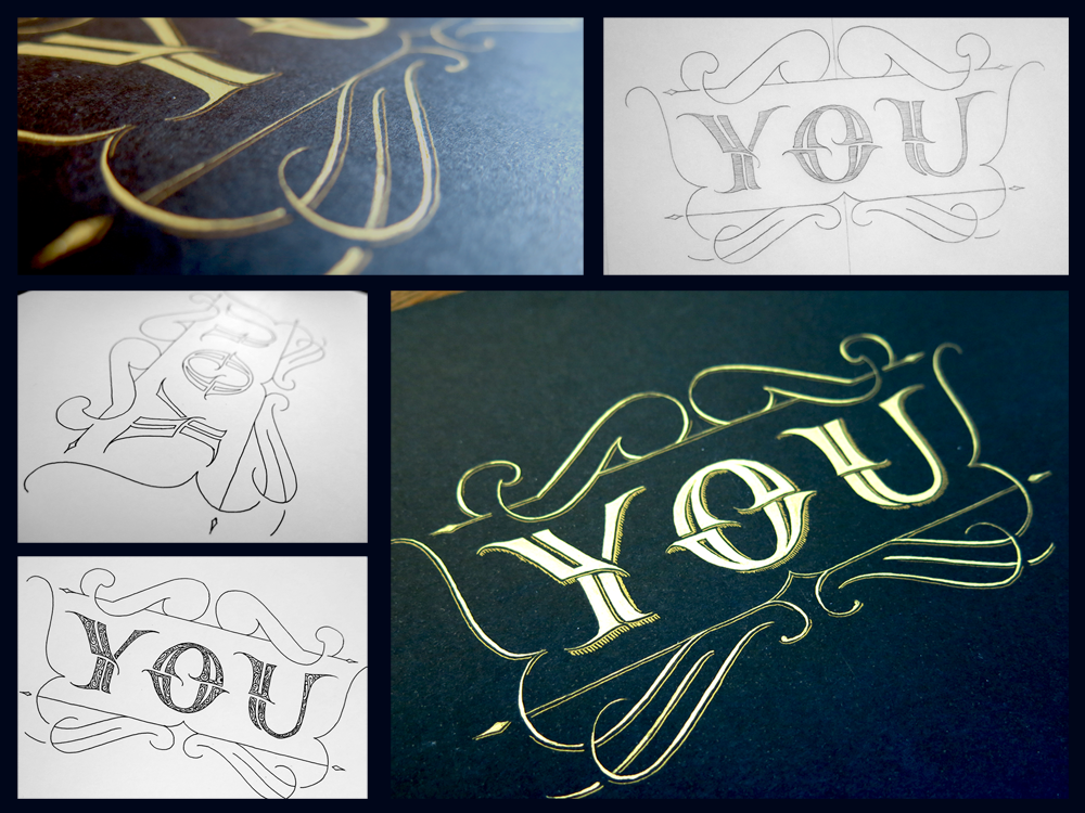
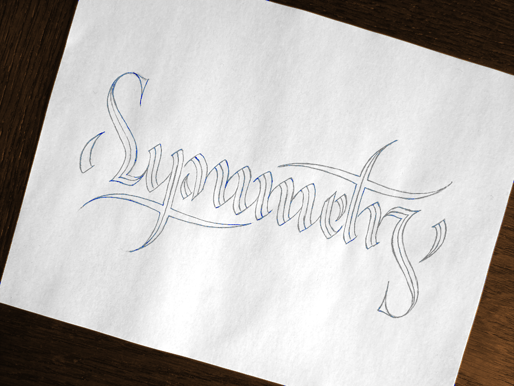
As you can see, it includes the versions already shown above, and also some progress shots. The image on the top right is the first incarnation – the original sketch before which there was only blank paper. Not much changed then, you may notice, between the first sketch and the final version in terms of composition and letter forms. Sometimes when approaching a piece, you only have an idea of what the words to say and the feeling you want the piece to have; other times you get a strong mental image of the specifics of a piece before you set pencil to paper, and this was one of those times where most of the planning of the piece was done mentally before anything ever got sketched. The only thing that I didn’t have planned out before starting work was the set of flourishes across the top. I had originally wanted to try to put something asymmetrical yet balanced along the top, but after a page full of sketches, it seemed that the best solution really was something symmetrical, or the contrast with the symmetry along the bottom of the piece was distracting.

That’s it, folks, signing off for another week. Come back next time! It’s only decent of you to do so, especially after I made you such a nice present. And you didn’t even get me anything! The nerve, eh?

Le Temps a Laissé Son Manteau – Charles d’Orléans

It’s a poetry week this week! And that means it’s also a calligraphy week. Let’s jump straight in!

Argent Detail

This is a piece in French that I’ve had the idea to write for a long time – a beautiful piece about the change of seasons from winter to spring. In it, there is a lot of beautiful imagery, which is centred around the idea of the seasons taking off their winter coats in the transition to spring. These words afford me, as a calligrapher, fun playgrounds to make the text come alive. Above, you can see the word “argent”, which you may guess means silver, and which is written in gold. If I had any silver paint, I would perhaps have considered using it, but I don’t and so couldn’t, and ended up using my new gold paint for this word, and though it’s slightly at odds with the meaning of the word, I think the effect is superior to what silver paint would give.

Soleil Detail

In this piece, I used a mixture of styles, both with regards to the expressiveness of the calligraphy and with the choice of hands. Three hands are used here, the main one being Foundational. Foundational is a very practical, legible hand, yet it is elegant in an understated kind of way. It’s easy to think of as unimportant, but it really is the backbone of the piece, and does most of the work that you see.

Aside from the Foundational, which is nearly all in walnut ink (except for the “argent” you have already seen), there is also a very expressive and flourished Copperplate. I used Copperplate for these words because it can give so much life to the page, especially when combined with the colours as seen here.

Finally, there are some words in Italic, also in colour, but far less expressive than the Copperplate. These words give some visual interest, and a little break to the texture of the piece, without making a big show of themselves like the Copperplate. Take a look at the full piece below:

Le temps a laissé son manteau

Here’s a translation of the piece:

The season has shed its coat
Of wind, cold and rain,
And embroidered itself
with gleaming sunshine, bright and beautiful.

There is neither beast nor bird
That doesn’t lend its voice to say:
The season has shed its coat.

River, fountain and brook
Wear as handsome garments,
Shining drops of silver;
Everyone dresses anew:
The season has shed its coat.

We are all broken. That’s how the light gets in.

“We are all broken. That’s how the light gets in.” You’ll find this quote in various places attributed to Ernest Hemingway, but it’s more likely that it’s just a slightly modified version of a Leonard Cohen lyric from the song Anthem.

We Are All Broken Progress

With the composition of this piece, I wanted to take a little trip into the past and go for something almost completely reliant on the letters themselves, with practically no flourishing. It’s a poplar style for things like posters and T-shirts, and the last time I visited it was really quite some time ago. Since then, having learnt many things regarding letter forms, I wanted to see what the results would yield.

With my recent foray into coloured work, I decided that this piece would be an ideal place to explore further. The fact of the simplicity of the letter forms means that the colours have plenty of space to breathe, and become somewhat the “point” of the piece.

We Are All Broken

It’s almost impossible to look at your own work without a critical eye, so I already know a few things that I will improve upon next time. One of which being that I will change my process slightly. I’m currently using calligraphy tools, namely pointed pens in this case, to get the paint onto the paper, but when using larger quantities that requite multiple strokes, the harsh point of the metal nib catches the fibres in the paper, sometimes leading them to create a rough surface on the piece once it has dried. The advantage of the calligraphy nibs is the supreme accuracy they offer coupled with their versatility in line width. However, the solution to this problems, I suspect, is simply to get a variety of brushes, including some that are very small indeed, which can mimic the tiny strokes possible of a nib. There’s also some benefit in looking into papers that are better suited to the medium. I currently use Bristol paper, which works wonderfully for ink, but when it comes to the far greater liquid quantity of paints, it could be better to invest in some hot pressed watercolour paper, which is designed to take the paint well and has a very smooth surface like the Bristol paper.

Just Wing It

Sometimes you need to stop preparing and jump in at the deep end. This weekend I went for a swim in a lake, and it turned out that the summer hadn’t warmed it up enough to really be hot enough, but the plunge is by far the worst part of it. After you get going with something, it often ends up not being so bad. Some times, you need to just wing it.

Just Wing It

So here’s a little piece that puts into practice the things I’ve been studying about formal Romans, with a little dash of Copperplate thrown in for good measure. All of that is becoming familiar ground for me, however, so where is the proof of the jumping in at the deep end? Well, I decided to finally start a little more serious experimentation with coloured work that isn’t in the digital realm. I bought some gouache and turned this piece into something colourful:

Just Wing It Colour

I’m pretty sure that that just about wraps it up for learning blue, so if I just learn the other 6 colours, I should have it all sorted out. In all seriousness, though, this was novel for me in both execution and design. Working with subtly different tones was interesting, but the experience was added to with regards to the tools used. When making something that’s simply black and white I use Rapidograph technical pens, but this piece is one of the first lettering pieces (as opposed to calligraphy pieces) that I’ve created using my traditional calligraphy tools, in the form of a broad tipped dip nib.

Wing

Calligraphy is a great example of an art that is all about the hours of practice vs the minutes, or even seconds of execution that it takes to make a piece. A skilled calligrapher has dedicated thousands of hours to learning the correct letter forms so that they can produce them swiftly at a moment’s notice. This is paying off in my own work, as sketching out Romans like these is becoming something that only takes a few minutes, and is backed up by the time dedicated to acquiring the knowledge that supports the letter forms. The process of this piece, then, is relatively simple, as the first step is shown above. With a couple of guidelines pencilled in with a ruler, the letters are quick to outline. From there, the next stage is designing the Copperplate and flourishes to surround the Romans, and filling the outlines. Lastly, I laid another sheet over the pencil version so that I could trace the letters in paint, and not to have to worry about erasing the guidelines after the paint was applied, all of which means that I end up with two versions of the piece, one graphite and one gouache, as pictured above.

One Hundred Days

Do something for one hundred days!

Recently, I’ve been making an effort to focus on consistency in putting my work out there. If you come to this blog frequently, you may notice that I post one piece a week without fail, and have been doing so for over a year now. I decided to take this attitude a bit further, and post one piece a day, every day, on my Instagram account. So far it is going well, as you may have read in my last week’s blog post. Just under a week ago marked the one hundredth day of posting a picture a day, and I’m nearly through posting the backlog of pieces that I built up in making this blog. Complex pieces are the kinds of things that take days to execute, and often spend weeks in the concept and design stages, so it’s not possible to post one brand new large piece every day, so there may have to be a little more emphasis on glamour shots and progress pics from here on out, but I’m planning to keep up the consistency.

One Hundred Days

My initial goal was to keep at it for 100 days, partly as a challenge to myself, but also because habit forming is a powerful tool for everyone to use, perhaps most especially for creative types. People may often ask how they can keep up with the creation of a large amount of creative work, often feeling burnt out or failing on the motivation side of things. It is often said that motivation is a welcome visitor, a friend who stops by, but discipline should be your faithful companion who never leaves your side. The reason for that is because if you have discipline, you don’t need willpower to keep going. That is to say that if you have formed good habits, it’s easy to stick to them, and what better way to form a habit than to do something for a hundred days? (Interestingly, willpower is considered as a finite resource in the brain; using it up is something called Ego Depletion.)

For me, self promotion is not something that comes naturally, so my decision was to make it something to focus on. Posting my work on Instagram seemed scary, and I felt like I would rather stick to my nice, familiar blog format, but now that I’ve done it for 3 months, I have no intentions of stopping.

A little on the piece: it’s a mix of calligraphy and lettering all in one. The calligraphy was done in walnut ink, which gives the rich colour and variation in tone. Then I used my lettering tools to outline the calligraphic forms and add some ornamentation. Stylistically, Italic and Romans complement each other very well, so much so that in practically all typefaces, you will find italics used in conjunction WITH THEIR ROMAN COUNTERPARTS. Each is considered an essential element of typography and letter forms. The only difference here being that these are the root forms, the source from which the typography was inspired, though most might not know it, and even hearing the word “italic” would first think of the typographical meaning of slanting letters rather than realising that it was first the name of a script.

So, a little challenge for you: consider a habit that would benefit you, or that you would like to be able to have. Once you have decided, do it for one hundred days. You may find that it’s easier than you think, but one last thing: don’t tell anyone until you’ve finished!

Thank You

There’s a lot to be thankful for, and sometimes it’s easy to forget and get too caught up in worrying about things. Whether you’re thankful for something big or something little, sometimes it’s nice to put it out there and say the words. This week, I’ve been thankful for all the support I’ve received lately on Instagram. I’ve discovered so many amazing artists creating lettering work in so many styles that I never knew existed. It’s easy to think that you already know your own discipline well, and that there aren’t any more forks in the road or changes to come. You know what your favourites are and they’re not going to change. (This feeling is also known as the end of history illusion.) Well, I certainly thought that I had discovered what I thought was my “style”, found the kind of work that suited me, that I wanted to continue to refine and improve upon. Since seeing so many fantastic works by other artists, however, I see that there is still so much to learn, so much to explore and to discover. I’m also thankful for all the people who appreciate my pieces and who have decided to follow my account. I made this piece to thank my followers, who recently got up to 1000 in number. It may seem like few to some social butterflies out there, but for an introverted type like me, it’s really something to be thankful for.

Thank You 1000

This piece is a combination of several things I’ve been working on lately. First of all, for those who keep up with the more technical side of my work, you will recall that lately lots of my study has been dedicated to Romans. This piece is a little departure from the formal calligraphic forms, but every letter is shaped by the knowledge I have gained through study, much more so than my older Romans, which were done before my forays into the past. Little things to note, for example: the spacing between the stems of the T and H – they are almost equidistant; the curves and counter of the O – I definitely favour a fully circular O and a ~30° angle on the counter since studying the formal forms; subtle entasis and understated serifs – inspired by stone carvings of Romans rather than the larger serifs of brush Romans.

The flourishes on this piece aren’t really anything to do with Romans, but they’re inspired by some of the wonderful works I’ve seen lately by other talented artists. If you compare them to the flourishes in other works of mine such as Prepare Today for Success Tomorrow, you can see how they are a departure from the style that I had come to think of as the one I wanted to make my own and develop further, and with this new style comes a new set of principles to learn to make the balance correct and the forms flowing.

Hopefully you have something you’re thankful for, and you can say thank you to someone. Even if it’s something that wouldn’t otherwise have come to mind without you thinking about it, maybe it would be nice to thank someone, even if you don’t know them well, or even if it’s something seemingly inconsequential. For me, today, it’s you, who has taken the time to read my blog; whether you read all my entries, or this is the first, or somewhere in between, I appreciate it. So thank you!

Post Hoc Ergo Propter Hoc

One of the first lettering pieces I ever did was the phrase “correlation does not imply causation”, a piece which has since been lost in moving house, and is probably tucked away in the pages of a notebook hastily thrown into a box with the word “misc.” on the side. This week I decided to revisit the idea that inspired the first piece. The phrase deals with a logical fallacy that leads people to think that because two things happen together that one causes the other. Similarly, it’s easy to think that because one thing happens after another, the first causes the second. This fallacy is called “post hoc ergo propter hoc”, or after this therefore because of this.

Post Hoc Ergo Propter Hoc

Enough of that though, let’s get down to business. The interesting element of this piece, for me, is the Romans. The Copperplate may look flashy and the flourishes fancy, but when it comes to execution of a perfect letter, nothing provides the challenge, the depth and the satisfaction that Roman capitals do. Recently, though my study of Romans, I’ve been examining something called entasis.

Entasis is best know for its applications in architecture, some of it (surprise, surprise) by the Romans. The meaning of the word is a slight curve applied to something that looks mainly straight. When it comes to architecture, it was used to combat a strange optical illusion: perfectly straight columns have a tendency to trick the eye into seeing a curve where there is none. A slight bulge added to the columns is said to do away with the phenomenon and give the impression of straightness. In terms of calligraphy, however, the entasis is applied to the negative space between the letters. That is to say that the upright parts of the Roman capital have a thinning in the centre and widen towards each end. The execution of this with a broad nib or brush when doing calligraphy is a delicate manoeuvre and the effect is meant to be subtle. As this piece is also part of my study of entasis, I also kept the letters as close to traditional as I could, with understated serifs, a long crossbar on the E than you would see in a lot of modern work, and an open P.

Over the past few days I’ve been toying with the idea of starting to include more Gothic/Blackletter styles in my lettering after some study of their forms in calligraphy. As with all forms, I’m sure there is much to learn to inform future lettering pieces, so be on the look out in the future!

Say Yes.

Here’s a little piece I’ve been working on lately. The phrase is “Say Yes”, which is something quite nice and simple. The words also lend themselves to a neat symmetry, being almost the same as each other when reversed. This leads to a mirroring of the S’s at the end and an uncommon formation of double Y’s in the centre.

Say Yes

The Roman Y is an interesting letter. If it were to have no stroke weight, it would be a symmetrical letter. However, due to the calligraphic roots of all letters, there is a difference between the thickness of the branches. The result is that the branches come off the stem at slightly different places, though here it’s slightly obscured by some of the ornamentation. Because of the asymmetry, the negative space between them is also a little asymmetrical.

The execution of a piece like this can be tricky. Most of the ink is simple to put down, especially blocking in the centres of the letters. The finesse comes when creating the 3D effect. The seeming shininess of the sides of the letters is created by many tiny pen strokes. I use Rotring Rapidographs to do my lettering pieces, and one advantage of these pens is that they always produce a line of constant width. This is a great asset when you want consistency across your piece: no matter how hard or lightly you press, or what angle you hold the pen at, you always have the same result. The trouble comes, then, when you want to make a line of inconstant width – a tapering line. To create the effect in this piece, the lines were created with a quick sweeping motion in lifting the pen from the paper so that the ink flowing from it thins as the tip of the pen pulls away from the surface. The problem with this is that to create a tapering form, the lines must be drawn with quite some speed, and the faster the movement of the pen, the harder it is to make each line conform with the curves of the letters, some sharp, some smooth.

Say Yes Detail

Above is a close-and-personal shot of the first letters.

The style of the letter forms in this piece was partly inspired by Tuscan typography, which people might associate with circuses, saloon bars and rodeos. Some of the easiest features to notice are the serifs almost reminiscent of a cowboy boot and the spur and eye ornaments midway up each letter. Along with the Tuscan influence, the piece is informed by my studies of traditional Roman Calligraphy, pointed pen flourishes and a little of my own personal lettering flair.