
Last week, I posted an ambigram, and several weeks ago, I posted this ambigram. So what’s the deal? This week sees another ambigram, but in fact, it’s the same as an old one! Well, I’m revisiting this ambigram. I wanted to come back to it and give it a little bit of a make over and dedicate some more time to its development. Looking back at the original ambigram, I feel that it served its purpose, but that there was more potential in the design.
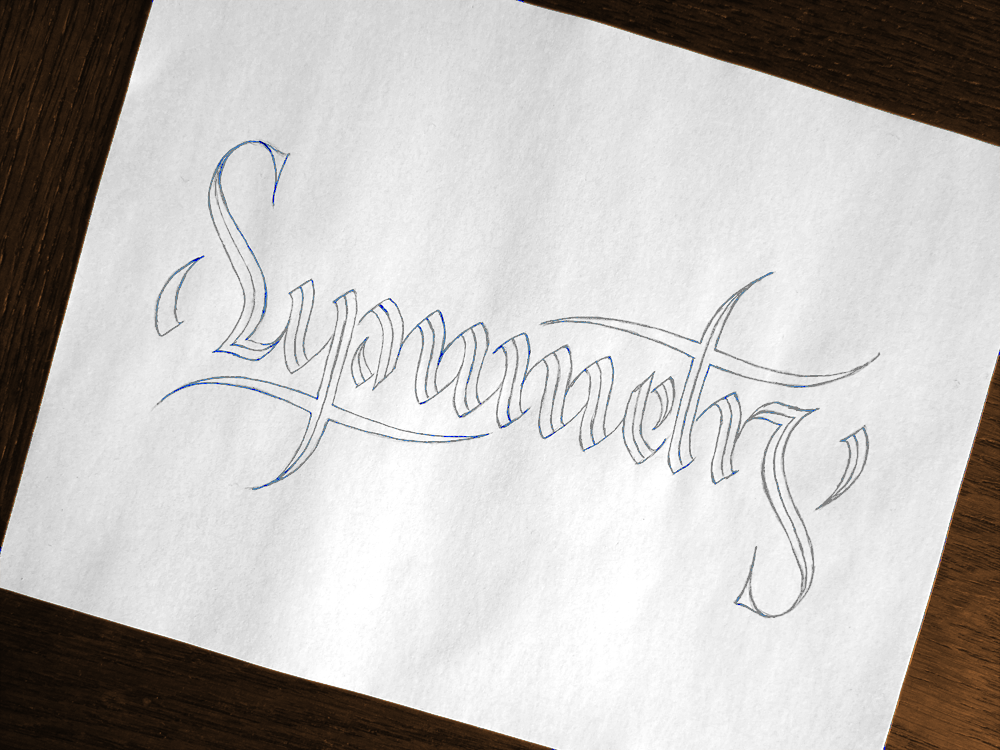
So I took this idea back to stage one, which consists of two parallel lines drawn across the paper for the baseline and x-height, and started to redesign it. My main focus was to have more stylistic consistency across the letters, but also to change the style slightly to something that better reflects the meaning of the word. To start with, all the strokes are split into two pieces, and you’ll notice that many of them are mirror images of each other. Take the two strokes that make up part of the M in the centre, for instance (the ones that the crossbar of the T comes to point at,) and you’ll see that if you rotated them 180 degrees, they would form the same shape. This was the fundamental stroke that I designed first, and upon which all the other strokes are modelled. Of course, plenty of tweaking had to take place for each individual case, but starting with a solid stroke form is important.
The style itself is something that leans slightly more towards Gothic than Italic, but is certainly a rounded Gothic with plenty of Italic influence thrown in to arrive at something caught midway between the two. The E, for instance, only works because of its Gothic influence, and the T is far from what you would see in a traditional Italic hand, yet the S and the M’s take more from Italic than they do Gothic, with the Y’s and R being something of both.
My plan, eventually, is perhaps to use this piece in another design. Up until this point, I haven’t done any merchandising of my work, but I can’t help but think that a piece like this would do well on something like a T-shirt or coaster, though perhaps framed differently than how it was in the original Tyger! Tyger! piece, or than how it is on its own here. As ever, finding the perfect way to display an ambigram is a puzzle, but in the end I think that I will find the perfect solution to this piece. I will find the piece that was meant to surround it, complement its letter forms and highlight its symmetry. Until then, however, I will have to amuse myself with experimenting with gouache paint as in the first image, which it seems is a wonder to apply with traditional pointed pen calligraphy tools.
