
A little while ago, I was contacted by someone who had seen a reddit submission for my Friday piece and was interested in getting a piece of custom lettering to be used as a logo. The piece consisted of the initials “ADB” for a French group, and stands for “Les Amis du Brochet”. It’s strange to think that it was through reddit that I came into contact with a client who lives so close geographically.
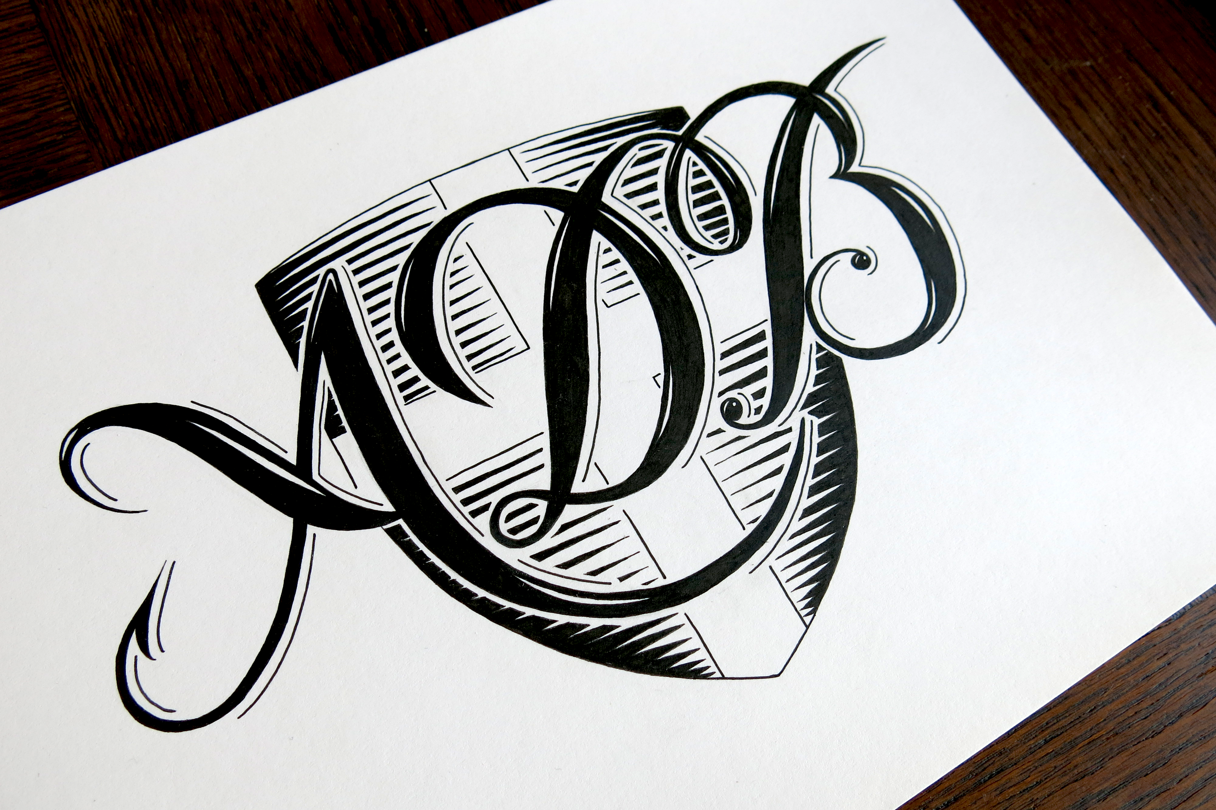
The initials were to be set over the background of the Savoy Flag (and in this case in the shape of a shield). That part being predetermined, my role was to find a suitable lettering style to complement the backdrop. I went through several different styles, mainly based around Copperplate calligraphy and Roman capitals, though I had a play around with some black letter and abstract styles before settling on what you see above. France is a country that puts great store in handwriting, much more so than most English speaking countries, with handwriting practised rigorously on special lined paper called “seyès” with five horizontal lines per vertical line. This leads to people saying that all French people have the same handwriting, and while it’s not really true, there is a higher standard to be upheld. As a result, France is a country that boasts a wide array of calligraphic signage and logotypes. If you’re ever in France, take a walk in the streets and look up at the shop fronts to see what I mean.
A Copperplate calligraphy inspired piece, then, was the perfect choice in the end, for this logo. It blends the French dedication to the written letter form with the Savoy flag (and a little of my own lettering flair,) situating the logo not only in a country, but also in a specific region. As a little side note: the client requested a fish hook as one of the details to be included in the piece, which you can see on the lower left stroke of the A.
Here are a couple of the other design ideas I had narrowed it down to before it was time to choose the final style:
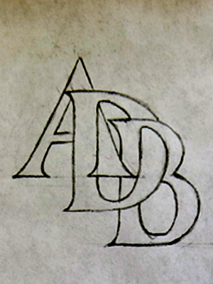
A Roman style interlinking monogram.
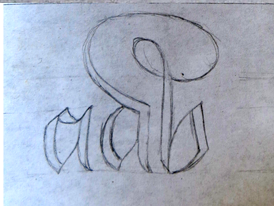
A lowercase black letter style with a flourished ligature.


You must be logged in to post a comment.