L’Appel du Vide

With a similar theme but a different style to a piece I did a while ago (Vertigo) today’s piece is “l’Appel du Vide,” a French phrase that translates as something like “the Call of the Void.” What exactly le vide is, whether it be the void, the abyss, emptiness, is not exactly clear. Nevertheless, it refers to the feeling people sometimes get at great heights or in risky situations where some strange call tempts them to jump.

L'Appel du Vide Angle

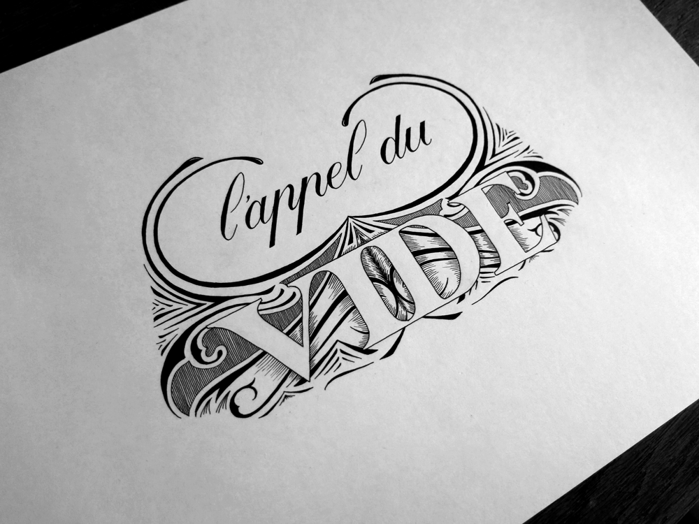
Stylistically, this piece is similar to another piece I created a long time ago (Thursday). I felt that the style fit well with the meaning of the phrase. The negative space of the word Vide indicates whatever it is conjured by its meaning as abyss or void, the busy surrounds emphasising the effect. The flourishes also show a kind of swirling movement pattern, which is in keeping with the idea of dizziness or vertigo.

The first two words are in a Copperplate style, notably with French style P’s. Seeing as the phrase is in French, I felt it was appropriate to use the French variation, even though to an English speaking audience they can often look like N’s with a strange elongated left foot. The word Vide is done with strong Roman caps, meant to make the word more impactful and make it stand out against the fluidity of the flourishes behind it. As such, the word is in contrast with its background in both tone and form in order to preserve legibility, similar to the choice of letter style in the linked Thursday piece.

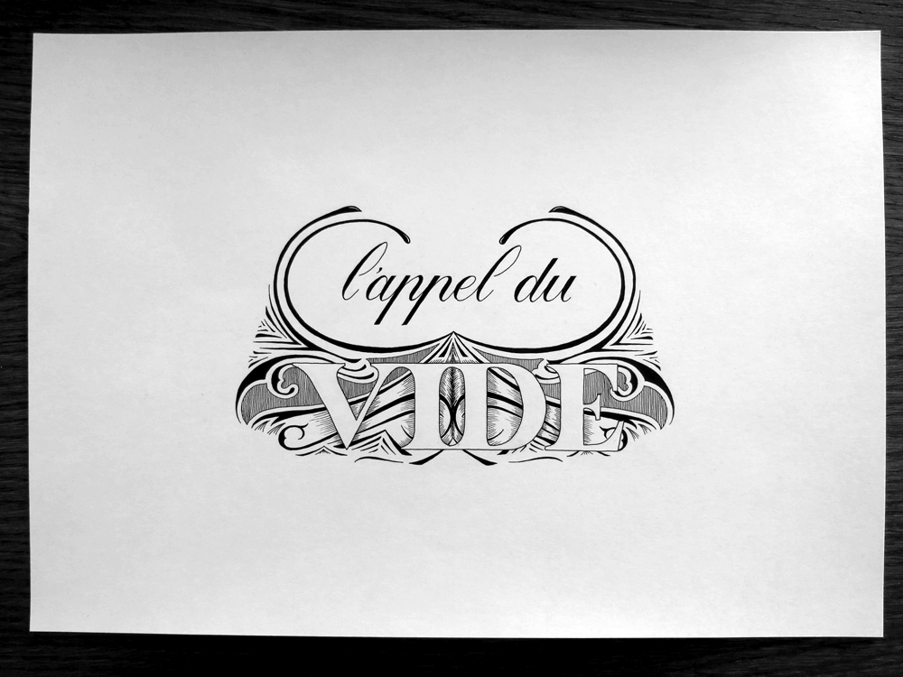
Here’s a front shot to give an idea of the composition of the piece on the page, too.

L'Appel du Vide

May You Live in Interesting Times

This week’s piece is something I did for a daily doodle a little while ago. I liked the design, so I decided to only show off a part of it when I posted it at the time and save the rest for an inked piece. Here’s the full version!

May You Live in Interesting Times Angled

When I first started making lettering pieces, I focused a lot on learning about letter forms, in the same way that someone learning the guitar might focus on getting the notes to sound nice. While nice notes and good letter forms are important, lately I’ve been more interested in exploring what makes the composition of a piece work well. Every note in a piece may sound perfect, but if they’re in the wrong places, or they don’t complement each other well, then the piece isn’t going to be a success. In the same way, if the hierarchy and combination of styles in a lettering piece aren’t properly thought out, then the piece will fall short of where it could.

At the same time as all that, I’ve been experimenting with more ornamentation if my pieces, which also helps the composition as a whole. Of course, I have always liked using lots of ornamentation in lettering, but I’ve been including it lately with more of a mind towards using it to tie pieces together. Here are a few examples from my daily doodles this week.

Be a Better You

Be a Better You

Live in the Moment

Live in the Moment

Custom Hand Lettering

Custom Hand Lettering

L’appel du Vide

L'appel du Vide

But of course, I still take the time to practice some good old letter forms. Here’s a Gothic piece, Take Care:

Take Care

I’m going to take a week off from doing daily doodles because of travelling, staying with people and Christmas stuff, but inked pieces will still be coming out at a rate of one a week.