
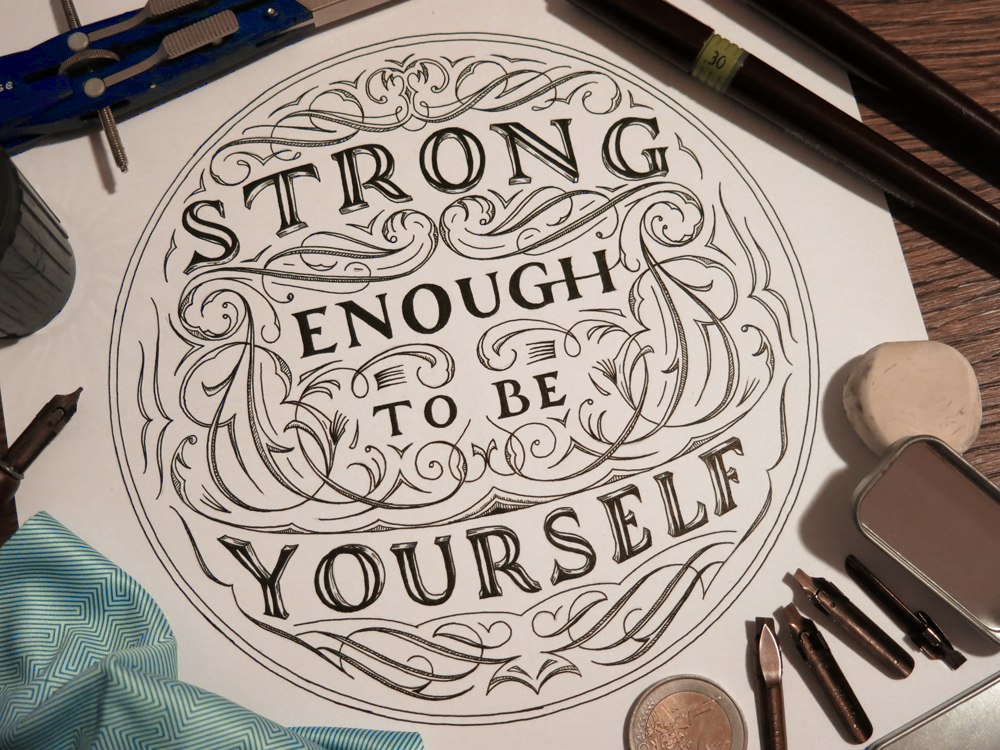
Time to count the legs on the elephant!
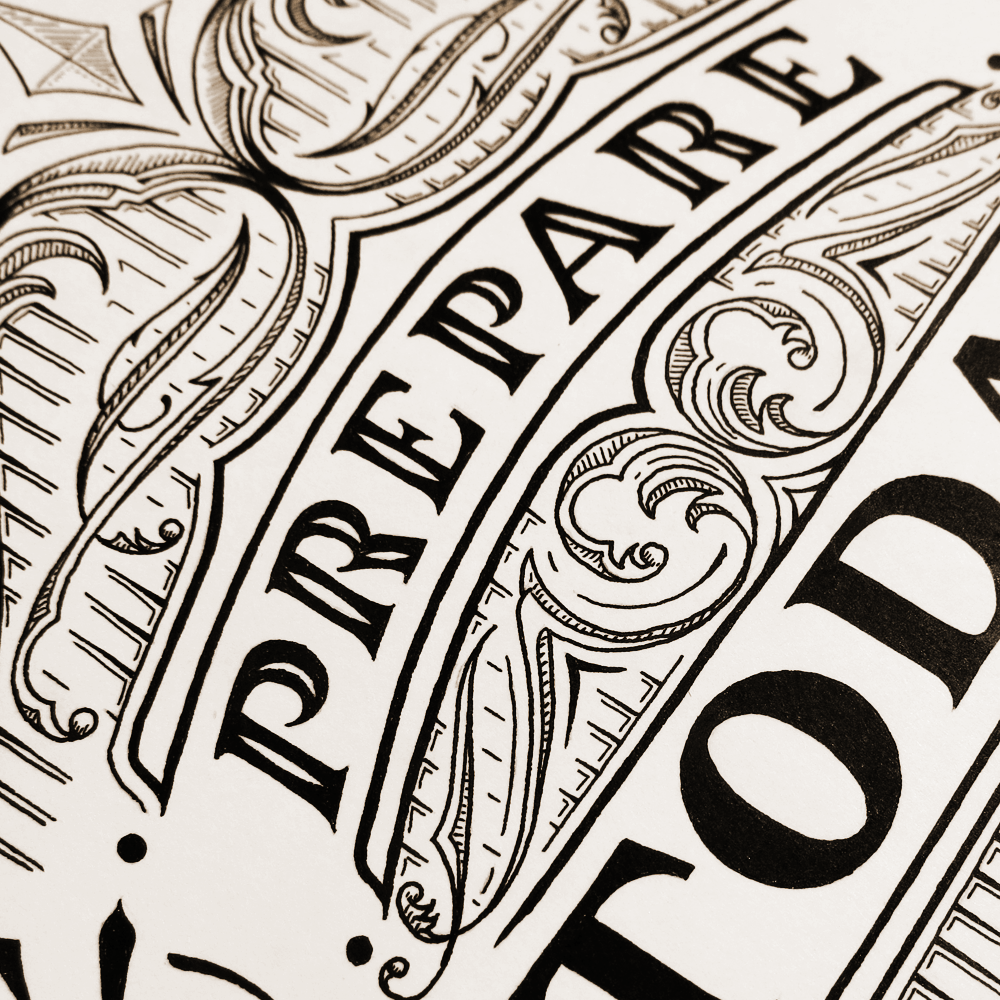
What am I talking about? Take a look at this piece and follow the letters from top to bottom:

You may have found it a little tricky to get a good idea of which bit is part of each letter, and that’s because this piece makes use of a technique found in an old optical illusion involving an elephant that either does or doesn’t have too many legs. Talk about Schrödinger’s elephant!
In the elephant illusion, the fun part is trying to see how many legs and feet the elephant has. It looks like it has 5 feet, but only 4 legs, and that’s because it uses the negative space between the legs to create an extra leg. Similarly, with this lettering piece, it’s the negative space between the tops of the letters that goes on to form the bottoms of the letters. The effect is not to create any kind of “extra leg” illusion, but simply to give the eye a little bit of a confusing time while trying to read the word.
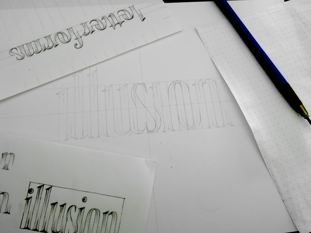
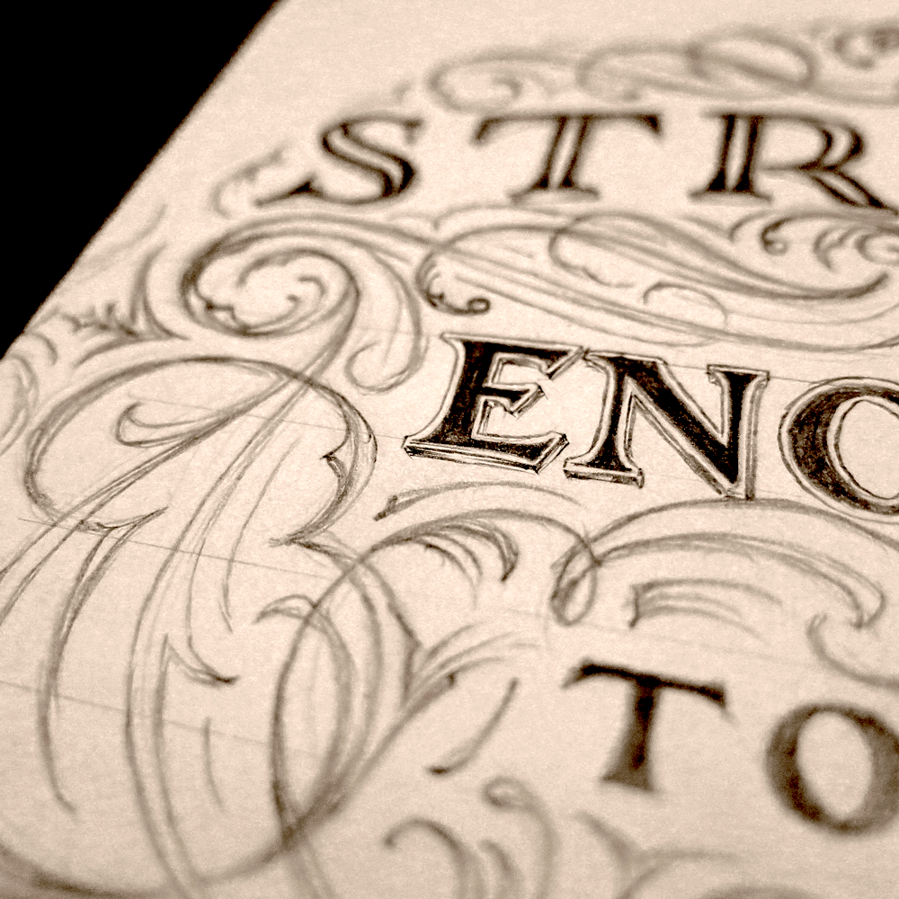
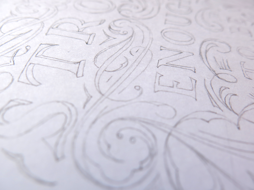
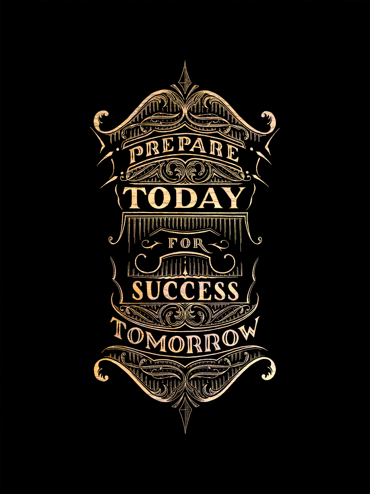
Above, you can see the design going from initial sketch to being pencilled in at full size. The curious stipulation about this type of illusion is that it is necessary for the negative space between the letters, that is the inter-letter and intra-letter space both, to be of equal to the width of the strokes of the letters. If there were too much space between one letter and the next, the design would fail, as it would force the corresponding upper or lower section of the letter to become too wide. As a little bonus, there’s the word “letterforms” upside-down at the top.
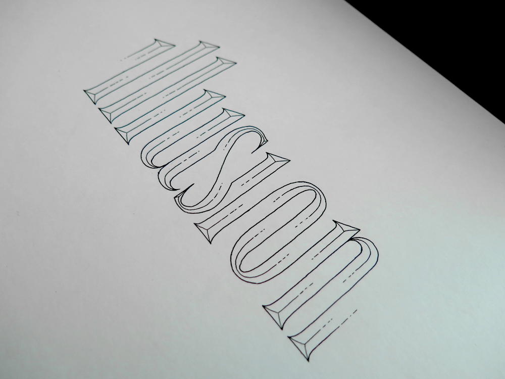
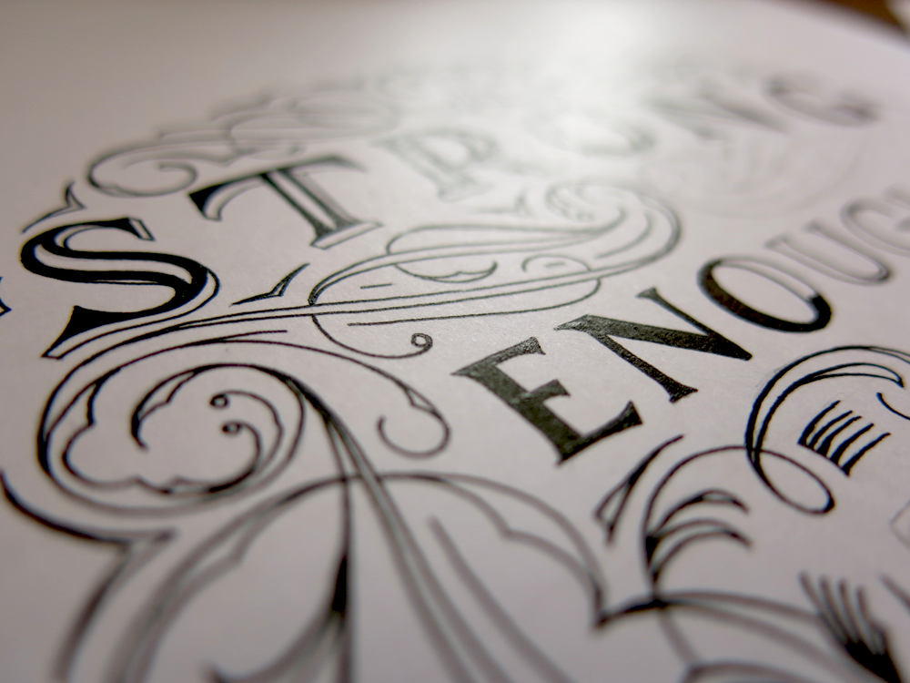
Here’s the design in a minimalist stage midway through the inking process:
Another quirk of this style is that not every word can be done in this way. The way that the letters are split in half means that they need an even number of elements on the top and on the bottom. All these letters have either a single stem that runs from the top of the x-height down to the base line, or they have two. The S is a little strange, in that it only has one stem but takes up more room than other single stem letters, such as the I’s and L’s, but with a little jiggery-pokery, we can make it work. Other letters, however, are not so fortunate as to be able to be included in a design such as this. Consider an upper case letter L. To create this effect, the bottom half of all the letters is simply shifted across one stem’s thickness so that it lines up with the negative space. The upper case L, however, has a single stem, but has a double wide base. As such, there is a gap created at the top that would leave the line of another letter shooting off into space with nothing to join onto. Other letters are simply too complex to maintain legibility when distorting their form so much: the letter K, for instance, with its combination of verticals and opposing diagonals wouldn’t do well in a design such as this.


You must be logged in to post a comment.