The Urban Orb

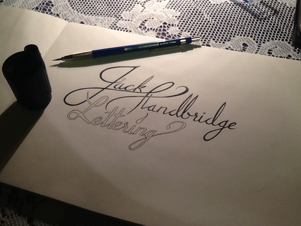
Second in my series of “What was going on a month ago” is a post about the a bigger project that I did. The client wanted 3 things: first, a logo for a series of youtube videos consisting of the words “The Urban Orb”, second, the text “Next Episode” to be shown at the end of each episode during the preview of what will happen next time, and third, a large number of quotations and phrases to be edited into the videos, but to be done in calligraphy, not lettering.

The Urban Orb

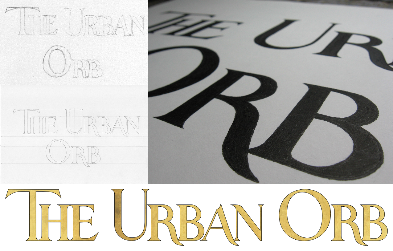
The Urban Orb is a streamer who usually broadcasts himself through streaming websites like twitch.tv, but in this case, he wanted to have a series consisting of a challenge run through of the game Dark Souls uploaded to youtube. Though he was unsure exactly which colouring/texture was going to work out best once the videos were edited, we settled on the outline of the project, and I started work. In the end, the client received several different versions to test out on the final videos, allowing for legibility, unobtrusiveness, and thematic consistency. The logo was designed to be easily read, unique in its ligatures, and styled to match the feel of the game it is used to watermark. In the end, to blend unobtrusiveness and legibility against all backgrounds, the final version consisted of a solid black outline with a semi-transparent white fill, allowing the logo to be constantly visible, but never stand out harshly in the way that a solid colour would do.

Next Episode

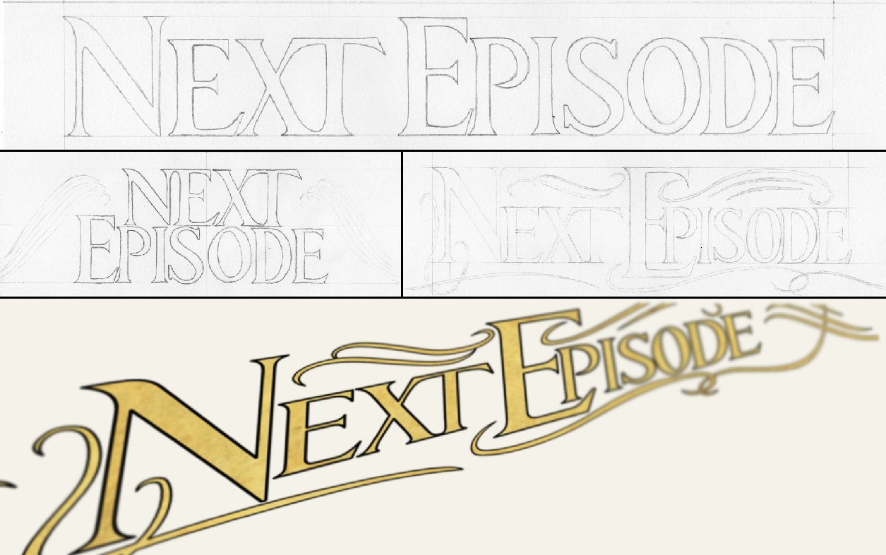
The Next Episode text was done in a similar style to The Urban Orb logo, but was designed to fit a much larger space. The text was originally intended to be in a calligraphic style that would interact with the ornamentation around it, and though it was sad to leave some of the calligraphic designs by the wayside, I think that the increased legibility and thematic consistency is worth more than the ornamentation’s interaction with the text. As it stands, the text is nested within the ornamentation, which also continues up to surround the in-game interface, thereby integrating the text with the aspects of the game.

Nietzsche Quote Blog Upload

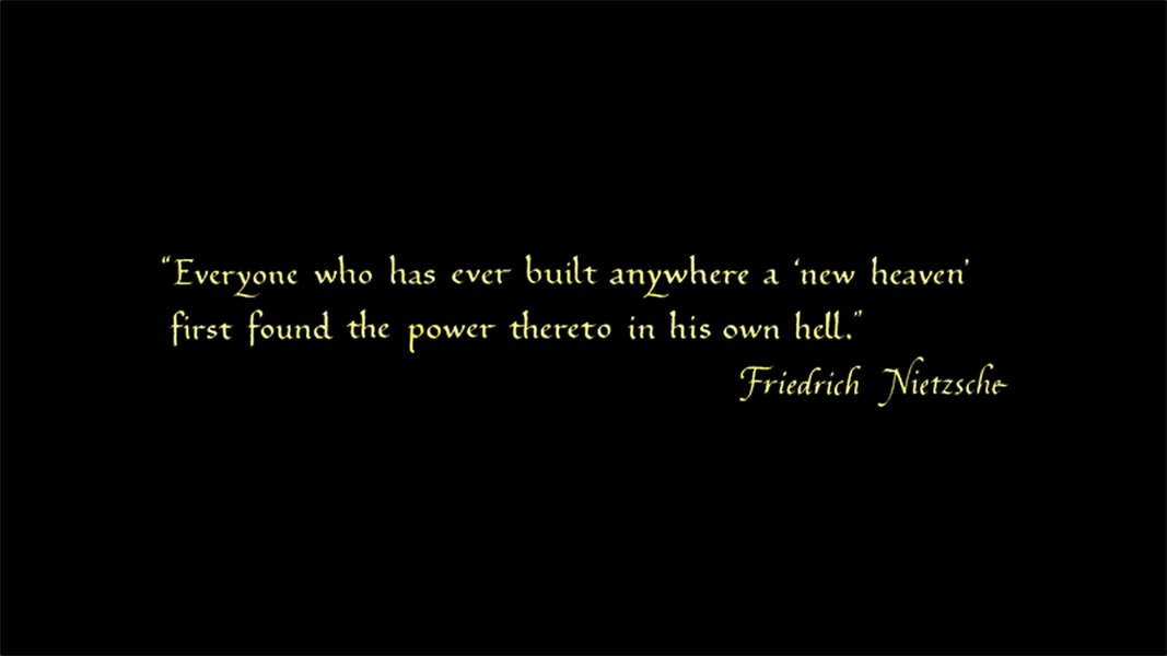
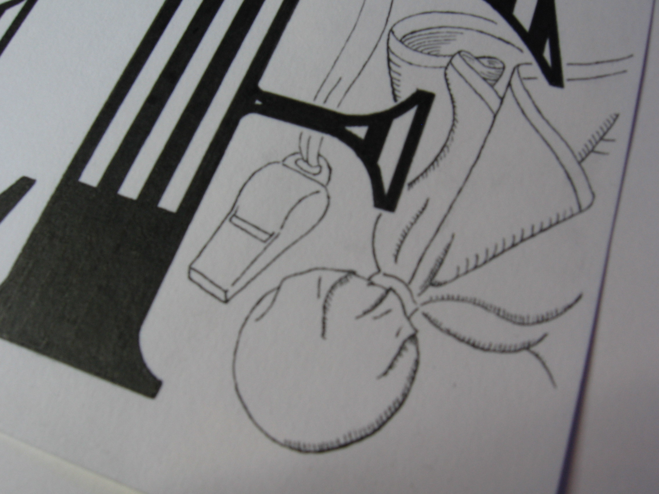
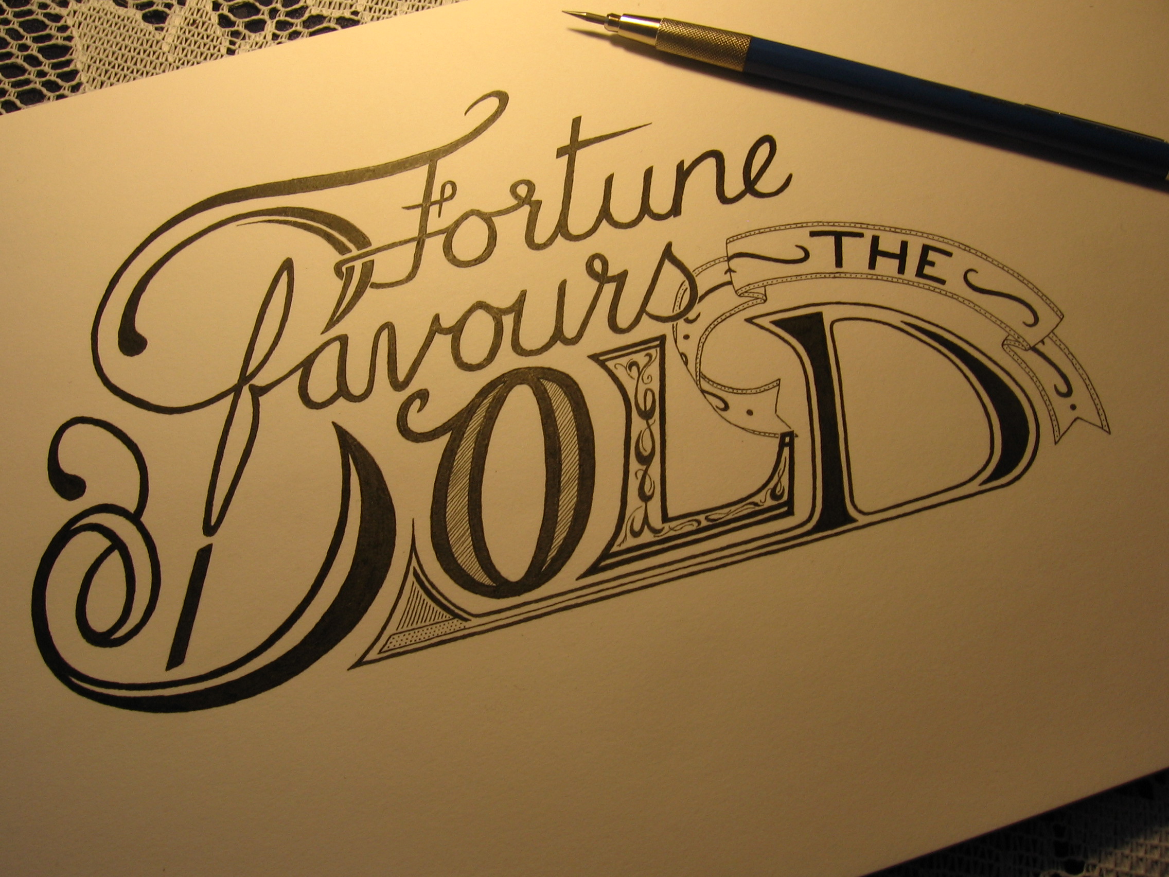
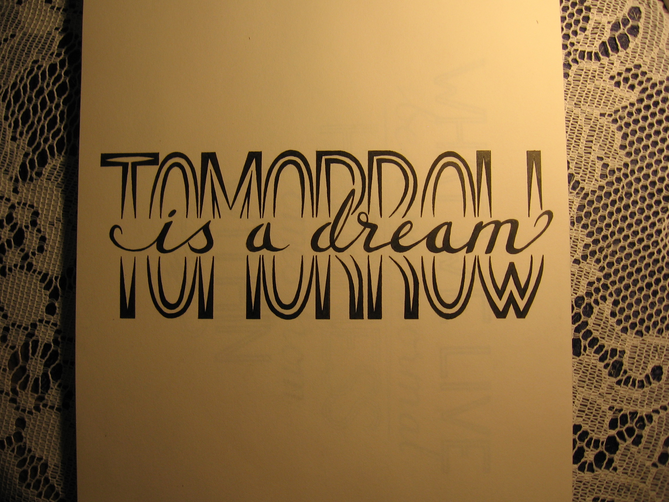
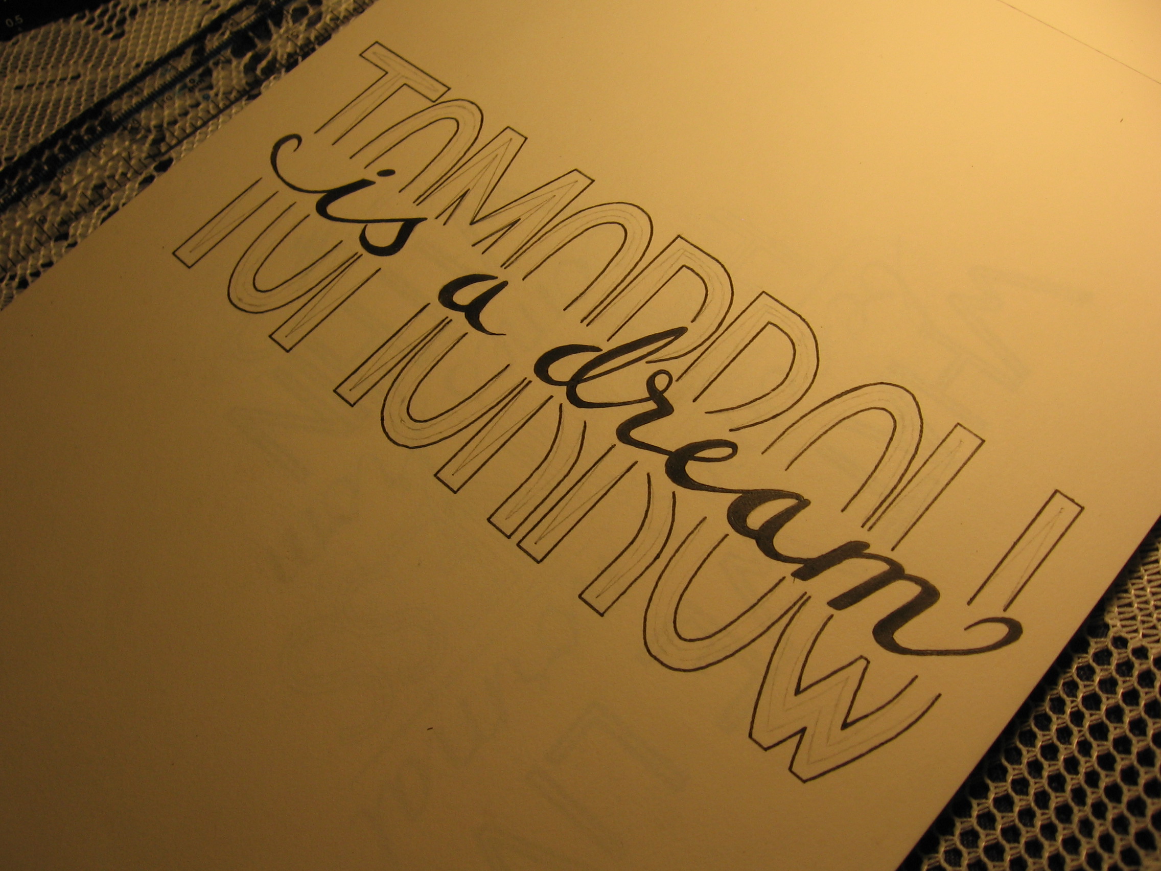
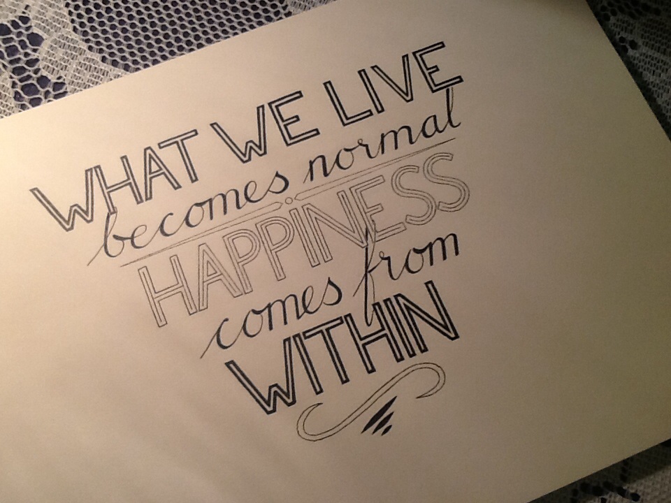
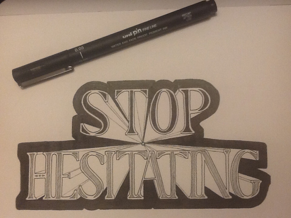
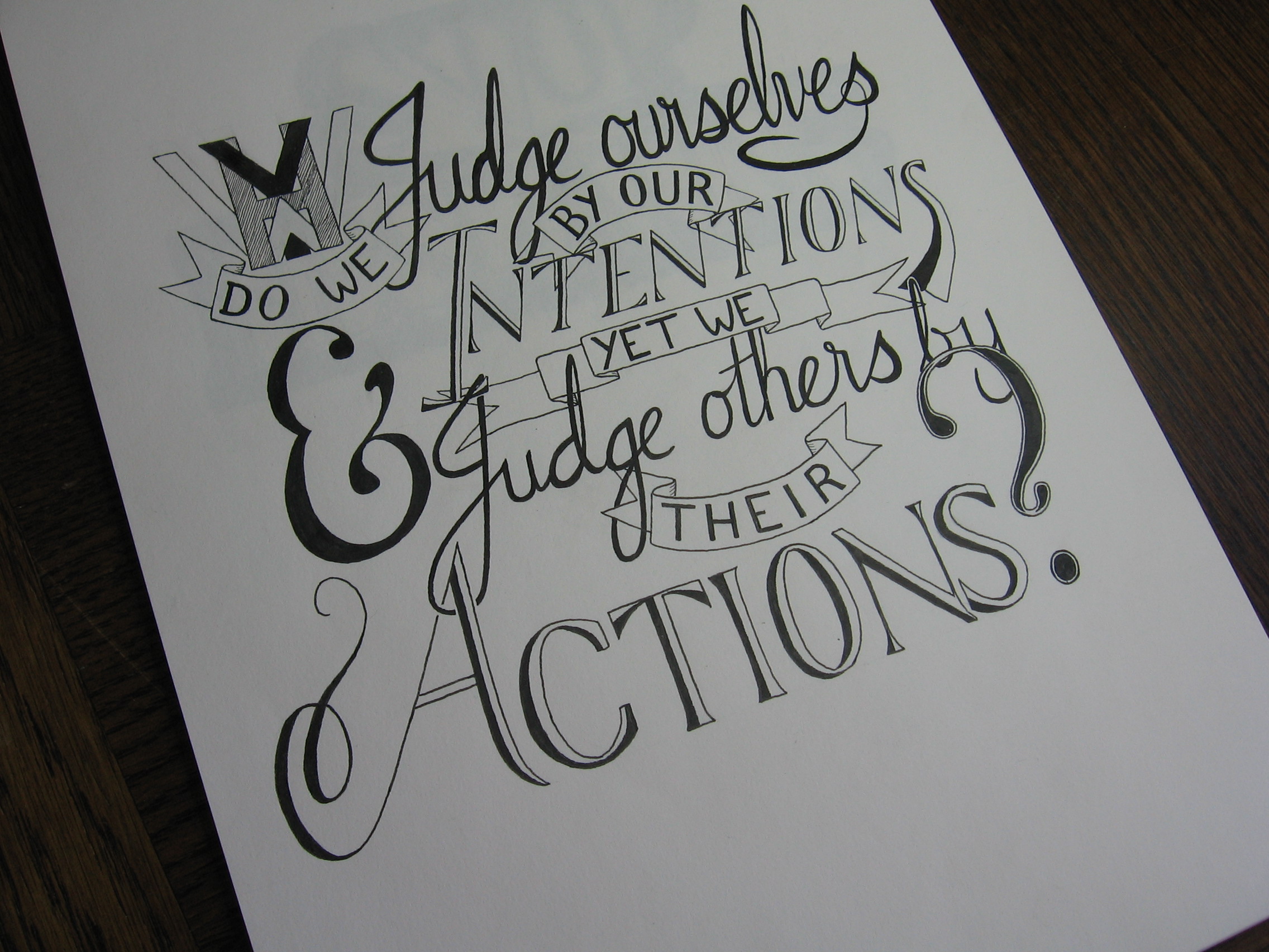
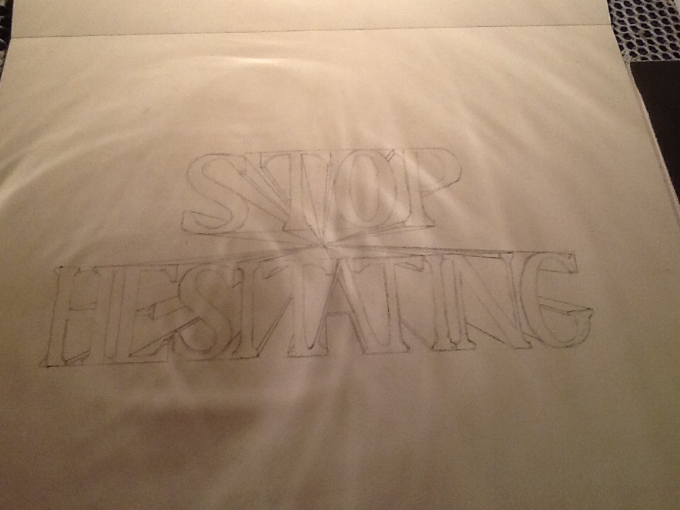
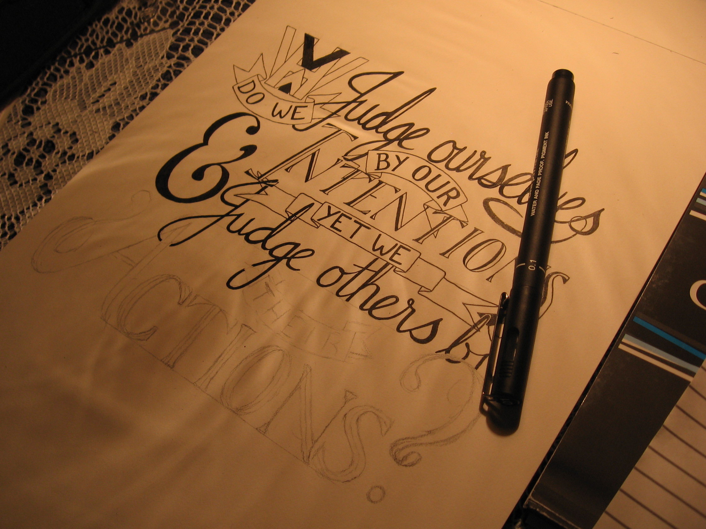
Executing the calligraphy was a very different task to the design and execution of the lettering. To start with, calligraphy is more of an all-or-nothing process, where one mistake in a quotation can mean that you must start again. Some quotations were much longer than these three, so a mistakes could mean that double or triple the time would be needed to get it correct. I used traditional dip nibs and ink to write these – black ink on white paper. Once they were completed, I scanned them into the computer and colourised them digitally, though they are not vectorised, of course, which would take more than one man’s patience worth, I think.

In all, this project was wonderful to work on, not least because I was exposed to so many inspiring quotations, some of which I had read before, but many of which were new to me. Most were on the topic of perseverance, success and failure, which certainly helped me continue past making a mistake towards the end of a long quotation!

Don’t mess with the Ref

Hello again, it’s been a while. Things got side tracked in various ways, and I haven’t been around to update this bit, but I’ve been busy (sometimes very) with various commissions and other projects. So, finally, I have got round to doing a bit more in terms of updating, first with a piece I did more than a month ago!

IMG_1568

This piece was commissioned more than a month ago as a Christmas gift for someone. The theme (as I’m sure you can guess) is that of a football referee. The word ref is coloured to match a ref’s uniform, and the piece is decorated with their tools, being a whistle and a flag. Coming from the UK, I was unfamiliar with these aspects of refereeing in American football, so it was interesting to incorporate them into a lettering piece, particularly the flag, which was a pleasure to design, and which functions as the full-stop (or period) for the sentence. Here’s a close up of the illustration:

IMG_1570

Unfortunately. the piece has been shipped, and is halfway across the world, so I don’t have a chance to take any more pictures or scans of a better quality, but I guess that’s how it goes.

I have a few other pieces to upload and blog about, one of which I have already posted on my logos page, which should also be getting a few new submissions soon enough!

Thing a Day (Day 7)

It’s here. Day 7. I feel like I should have some grand words to write. Some great insight. Instead, I’m sitting here with orange peel on my lap. The good news is that I fixed the computer, so everything should be tip top from now on! The other good news is that I designed AND inked a large piece today, which is more than I had planned, but I thought that finishing the final day with a pencil sketch would be a let down. And the best news is that it’s nearly bed time! I stayed up far too late getting this finished.

Well, anyway, let’s take a look at it.

Fortune favours the bold.

Fortune favours the bold! Or at least, let’s hope it does. And yes, it’s the British spelling of “favour”, what can I say. As for what happened with this piece, I can say that it’s an idea that I had yesterday, and everything was going smoothly until the word “the” became unstuck in time and space and refused to settle back into normality, therefore making it impossible to fit into the design. Fortunately, I had the bright idea of placing it within a ribbon. As you can see, the dots around the edge are to keep it in. Let’s just hope it doesn’t slip out of the end.

Thing a Day. What can I say? It was pretty tough to keep up to my own standards, and it certainly used up vast chunks of time, but I would certainly say that it was worth it. Thing a Day will stop now, and I will upload on a less (but still) frequent basis. It will also give me more time to explore things that are more experimental.

Lastly, I can say that Thing a Day will be back! Sometime in the near future, there will be more things, and more days, and they will go hand in hand.

Thing a Day (Day 1)

Thing a Day (Day 2)

Thing a Day (Day 3)

Thing a Day (Day 4)

Thing a Day (Day 5)

Thing a Day (Day 6)

Thing a Day (Day 6)

Thing a Day! Here it is, my thing for today. Today’s thing started out as the underdog, the discarded idea, the shunned orphan of the lettering world. Fortunately, a kind man came along and lifted him from the slums of his relegation in the back of a notebook and put him into the sketchbook for inking.

Tomorrow is a dream.

I had the idea yesterday, but didn’t see how it could work out well in terms of spacing. I needed to have the word “tomorrow” very tall and thin for the proportions to fit, but it seemed lanky and weird when I first tried some sketches. Feeling discouraged, and for want of anything else to do for today’s thing, I decided to give it a proper sketch out anyway. It was . . . OK.

Here it is in vanilla form.

IMG_1497

It didn’t seem to work all that well to me, so I knew I needed something else. What I ended up trying was something that I initially thought might ruin it, but there’s no point not trying when it’s just the work of a single day. In the end, it seems that the you can never know until you try, and fortune favours the bold.

On another note, you may notice that my header has been upgraded in image quality. I couldn’t stand how terrible it looked, so I borrowed someone else’s computer to upload some photos from my camera. It worked out great! Hooray!

Tomorrow is the last day of Thing a Day, so I’m hoping I’ll be able to come up with a good one! Come and check it out.

Thing a Day (Day 1)

Thing a Day (Day 2)

Thing a Day (Day 3)

Thing a Day (Day 4)

Thing a Day (Day 5)

Thing a Day (Day 7)

Thing a Day (Day 5)

So, today, my new lead holder and leads arrived, meaning I can finally sketch with a sharp pencil again. And the lead pointer really does the trick! Now, all I need is my computer fixed, a large and wealthy customer base, and I’ll be all set for being a professional graphic designer. Well, we’ll see what we can do about the second one.

Anyway, in yesterday’s Thing a Day, I mentioned that my ideas for today’s thing would be to improve the site a little. I’m sure that you will have noticed the change already, as it’s right there at the top of the page! Well, as you can see, it’s a lettered header to replace the old boring one. Unfortunately, iPad attacks! Oh my grainy! Well, we’ll see what we can do once the computer is fixed.

This thing didn’t take much in terms of the concept of it, seeing as it’s just my signature and the word lettering, but the proportions and arranging of the letters was quite tricky.

Take a look from another angle:

Jack Standbridge Lettering

Odd to think that there are only two days left of my Thing a Day challenge. It will certainly free up a lot more time for me to do ILT (Important Life Things), but it’s teaching me a thing or two about giving myself a lot to do, and how to be productive even when not in too creative a mood.

Come back tomorrow for the penultimate Thing a Day!

Thing a Day (Day 1)

Thing a Day (Day 2)

Thing a Day (Day 3)

Thing a Day (Day 4)

Thing a Day (Day 6)

Thing a Day (Day 7)

Thing a Day (Day 4)

Well, I’m past half way through my thing a day week. Over yesterday and today, I was planning and inking one larger piece, the planning being yesterday’s thing and inking being today’s.

I’m quite pleased with how it’s turned out having started from this:image

Today’s thing is a little different from other things. It uses bolder shapes and no serifs. It’s an experiment with an unconventional shape. It is two sentences, and it’s the first piece with no hatching.

And aside from anything else, it looks taller than it is wide, yet it is wider than it is tall. Strange.

What we live becomes normal. Happiness comes from within.

Would you believe that it’s seven inches wide, but only five and a half tall? One of my stumbling blocks in designing it was that I was trying to sketch it out in portrait, when in fact it needed to be landscape.

As for tomorrow’s thing, I have some ideas already. Something to make the site a little more appealing, hopefully. Stay tuned!

Thing a Day (Day 1)

Thing a Day (Day 2)

Thing a Day (Day 3)

Thing a Day (Day 5)

Thing a Day (Day 6)

Thing a Day (Day 7)

Thing a Day (Day 3)

Wow! Day 3 is here and thing 3 is surely around here somewhere too. Yesterday’s thing was more time consuming than I had expected. I thought that it being smaller than other pieces would mean that it would be quicker to finish, but not so!

Stop Hesitating.

That out of the way, let’s think about today. Seeing as yesterday’s thing was so time consuming I decided that I would plan a large piece and not ink it for today’s thing. Image quality is definitely suffering, however, so please forgive the iPad’s inferior lens capabilities.

The subject matter for today’s lettering is reflective of my mood, I suppose. My computer screen being smashed is the kind of thing that would usually get me down, but I’m taking an optimistic approach, which is made easier as I am having so much fun lettering! Take a look:

image

Thing a Day (Day 1)

Thing a Day (Day 2)

Thing a Day (Day 4)

Thing a Day (Day 5)

Thing a Day (Day 6)

Thing a Day (Day 7)

Thing a Day (Day 2)

Whew, what a day. Broke the computer, burnt my finger, and ran out of pencil lead! However, first things first: yesterday’s completed thing!

IMG_1777


Setbacks aside, I’m on my way to having thing 2 finished. Seeing as the computer is out of action, I’m having to post from the iPad, so photos aren’t going to be so great. (Updated now!)

Today’s thing is a small design, meaning I’m aiming to have it done completely by the end of today. That’ll make two complete things in two days! How novel. Anyway, here’s proof of my homework. Let’s just hope the dog doesn’t eat it and make things worse…

image

It’ll be a few days (or weeks!) before my computer is back up, so site updates might be slow in general, but Thing a Day will be a priority. It might be hard, but if I take my own advice, everything will work out. Stop Hesitating!

Thing a Day (Day 1)

Thing a Day (Day 3)

Thing a Day (Day 4)

Thing a Day (Day 5)

Thing a Day (Day 6)

Thing a Day (Day 7)

Thing a Day (Day 1)

So in the spirit of productivity, I’m going to try something one of my favourite musicians and comedians, Jonathan Coulton did. He set himself a challenge to produce 52 things in a year, at a rate of one a week. By things he did not mean full songs, though he did come out with some. He didn’t limit himself to making anything fantastic or polished. He just set himself to making a “thing”. Whether that “thing” was an epic story song or a piece of experimental music depended on what inspiration he managed to find in that week.

My challenge to myself will be shorter, spanning just one week (starting today). Each day I will either plan out a large design (see You will never wait longer for what I mean by large,) ink a large design, or plan and ink a small design.

Well, you say, today is the first day of the challenge, so where is the result? My answer to that is that I’m inking a large design that I planned out yesterday. Here’s my proof!

IMG_1499

As you can tell, my poor old camera doesn’t live up to modern standards, and I certainly need to get a different bulb for my desk lamp (look at those lines it throws!) but the design is well on its way to being completed. My deadline is midnight tonight, so I have another 4 hours to whip it into shape. The finished article will be uploaded by tomorrow, or I’ll have broken my own promise on the first day! And that won’t do.

Thing a Day (Day 2)

Thing a Day (Day 3)

Thing a Day (Day 4)

Thing a Day (Day 5)

Thing a Day (Day 6)

Thing a Day (Day 7)