
Today, I have a riddle for you. Take a look and see if you can figure it out.
The riddle, then, is who is “this man”?
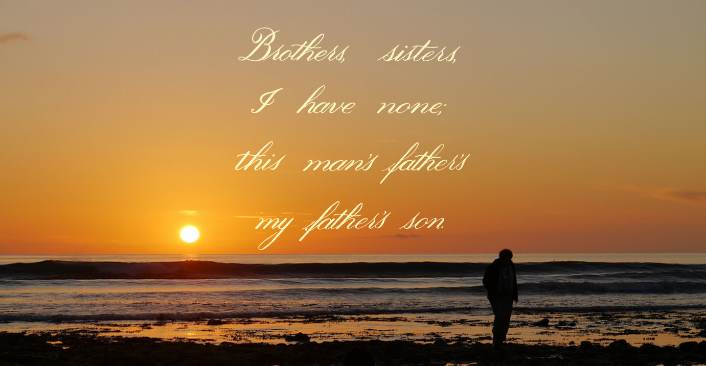
Recently, I started out on a foray into the world of brush pens, and found myself going back to what had originally got me into lettering in the first place: copperplate. Copperplate is a kind of calligraphy that uses a thin flexible nib to create varying thickness in the letter strokes by applying pressure and spreading the tines, setting it apart from broad nib calligraphy like Gothic. Once I had bought a brush pen a few weeks ago, I found myself trying to recreate the elegance of copperplate without the hassle of having to use dip nibs and an ink well, and the messiness that goes along with it. However, I had the wrong pen, and it was terrible. Then, I bought a couple of Tombow Fudenosuke pens, and after an agonizing 2 week wait as they were shipped from Japan, they got here. I really can’t recommend them enough.
I’ve been practising with them for a week or two now, and I’m getting to grips with how they work. At the same time, I’ve been exploring using a bit of photo wizardry to transfer the lettering to sit on top of photographs, as you can see above. Regarding the riddle, seeing as it’s a family matter, I chose a photo of my father, taken by my mother. That’s not a hint though! You’ll have to figure out the answer on your own. If you’re really stuck, a quick google will tell you the answer, but it’s a fun piece of mental gymnastics to go through to figure out the answer, much like phrases such as “I couldn’t fail to disagree with you less” and those sentences with the same word over and over again that still make grammatical sense.
Take a look at the unadulterated version of the lettering below to get more of an insight into what the original looks like:


You must be logged in to post a comment.