
This week I’ve been working a logo design case study for whisky bottle branding. It’s given me the chance to do some more exploration of the digital side of logo design, as most of the work was put in at the vectorization stage. After some initial pencil sketch designs to get an idea of the right direction for the piece, I quickly transitioned to working with the piece in terms of nodes and Bézier handles.
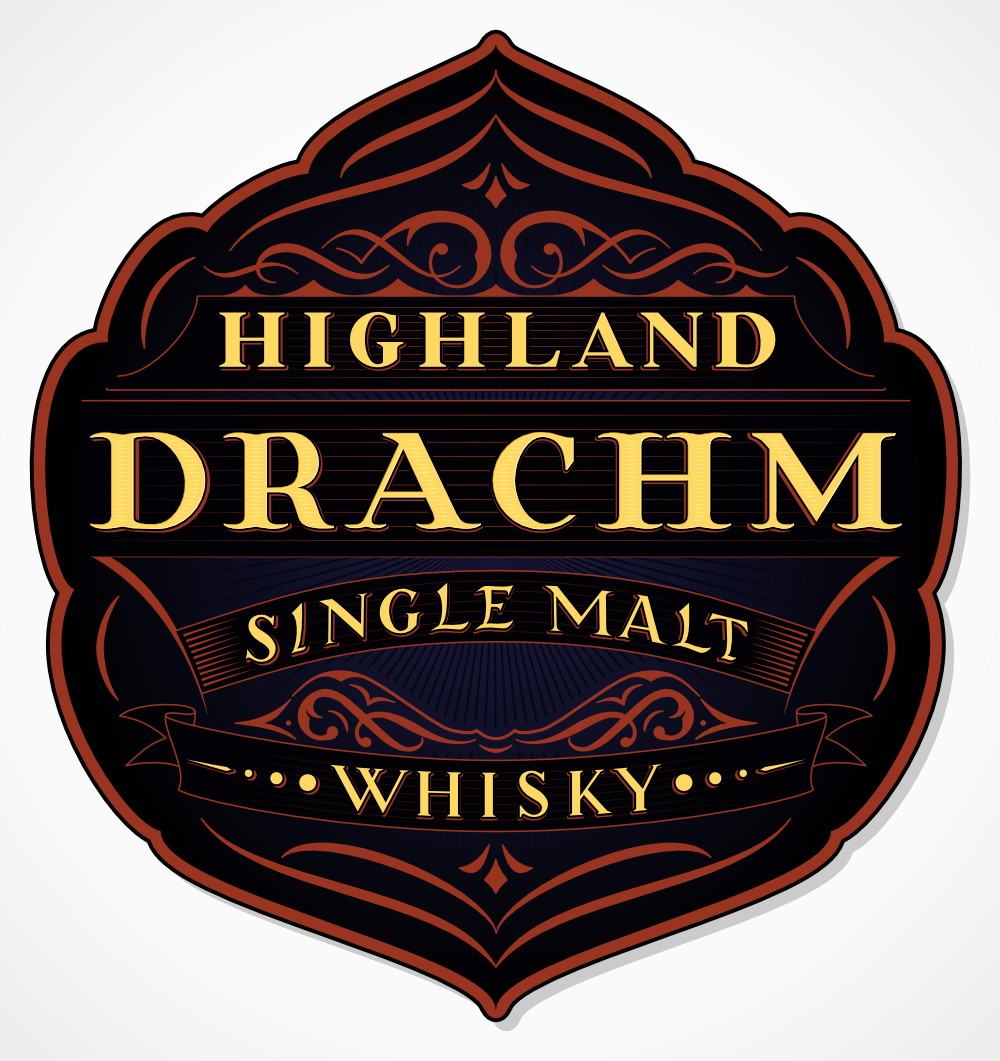
The goal of the piece was to create something through which I could explore some aspects of coloured work that would produce a usable end product. In terms of the lettering on the piece, it’s a blend of rustic, traditional and modern Roman Capitals. The mixture of styles gives an impression of not only modernity but also timelessness and an artisan influence. This piece would be ideal for a smaller company looking to update their branding as part of growing their business and reputation while maintaining the impression of hand craftsmanship and traditional techniques.
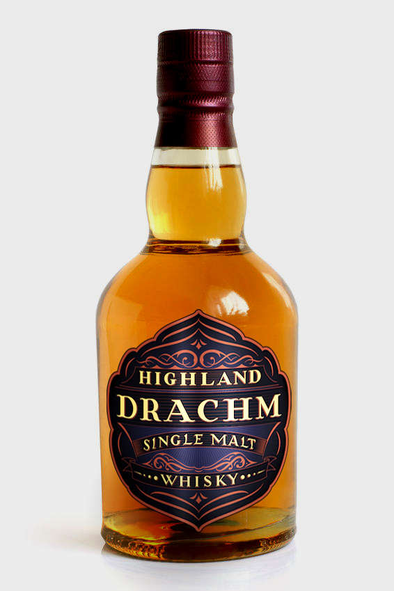
Here’s a little preview of the piece as it would appear on the label of a bottle:

You must be logged in to post a comment.