
Here’s another case study that I did recently. The brief was a bike shop looking to incorporate some stylishness to their brand, and also include an antiquated feel. An establishment looking to up their game and cement their position as a permanent fixture on the map, while catching more eyes with something that gives a more unique feel.
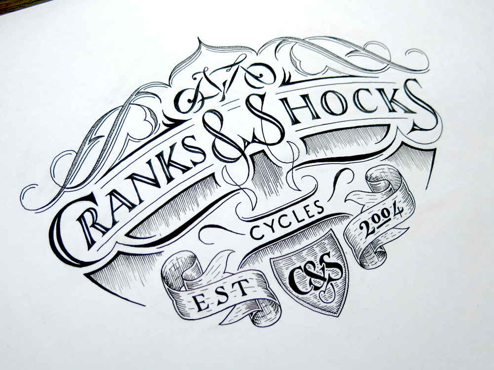
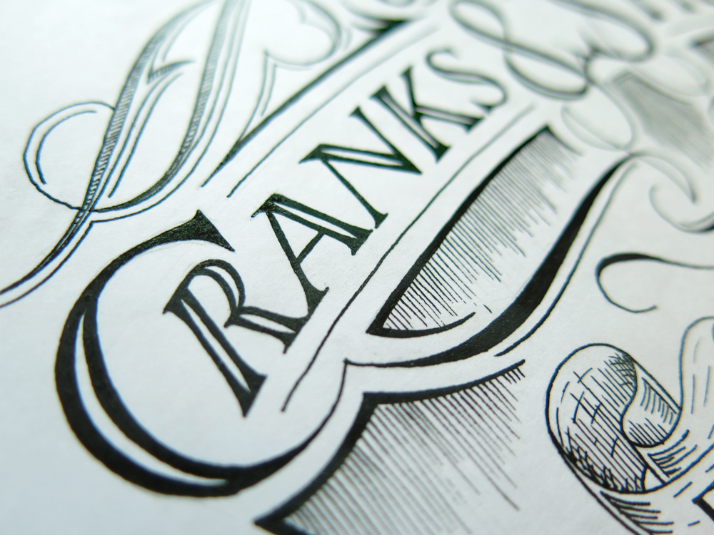
I started with planning out the symmetry in the text across the middle. Having an ampersand and an S next to each other is convenient in that they share similar elements. After several iterations, and having found something I was pleased with, I started work on the other elements. The monogram in the bottom centre is loosely based on the letters from the main text, but needed some obvious adjustments. The flourishes at the top also lead to a fun design in the middle: a bike made of flourishes. After planning the ribbons, I also worked in some additional flourishes in the negative space below the main text.
Each of these elements is suited well to being extracted and used in different places. For example, the monogram is convenient for a logo on a document or as a watermark, while the flourish bicycle functions well as a logo on a letterpress business card or promotional stickers. The main text can be lifted out to form the header on documents, and to suit any other uses such as banners or printed straight on narrow surfaces. The full design fits well on the side of a vehicle and on the window of the business.


You must be logged in to post a comment.