For the Love of Letterforms (Part 1)

It’s competition time again! You may recall that a long time ago in a blog post far, far away I wrote about entering a competition to perhaps get into an elite team of superheroes. Well, okay, it was about 23 weeks ago, and instead of superheroes they are letterers, typographers and calligraphers. The Ligature Collective held a contest for Instagram users to submit their best work of art based around the phrase “Ten Thousand Followers” to celebrate, well, you guessed it, getting up to the 10K mark on Instagram. Long story short, I entered, wasn’t one of the 3 winners, but got an honourable mention, along with 8 other lucky artists.

The End.

Or so we thought until now…

For the Love of Letterforms Simple

Suddenly, the Ligature Collective Strikes Back with their next competition, this time in celebration of getting 50 thousand followers! I know, that’s 40,000 followers in 24 weeks, which in case you’re wondering, is just about ten an hour, or about one every six minutes. Whew.

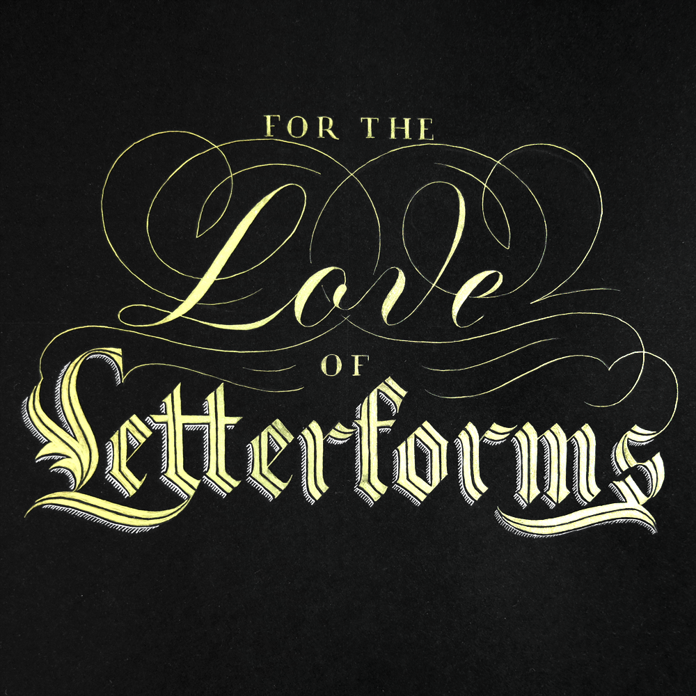
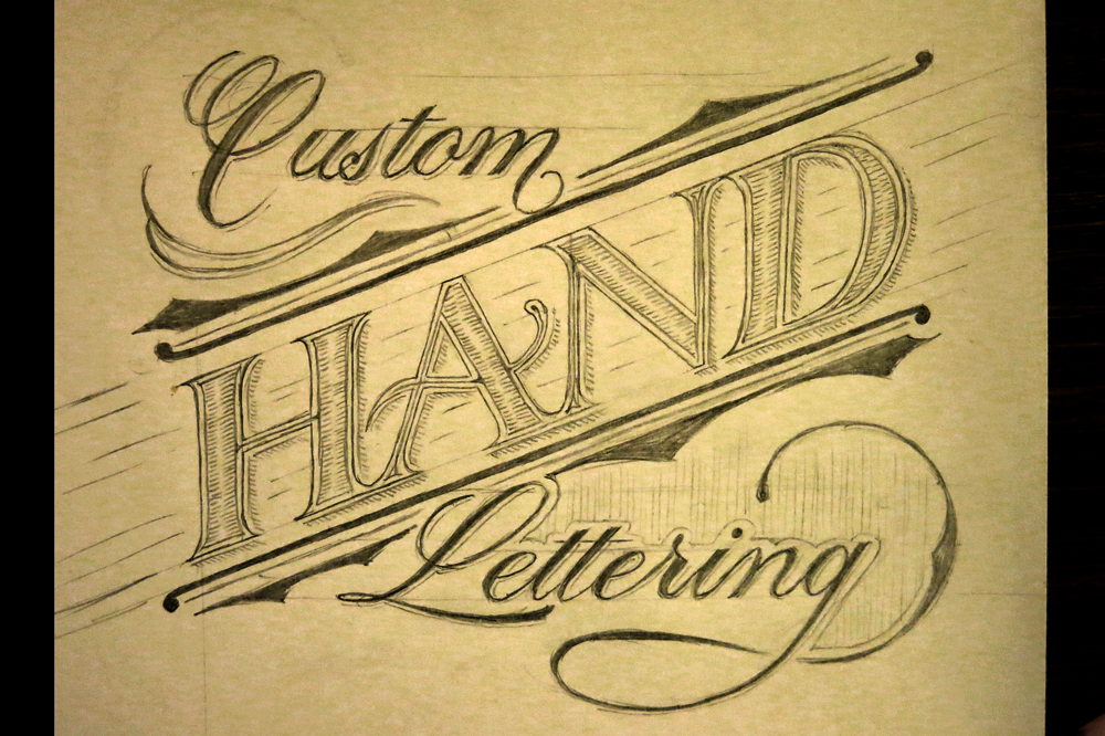
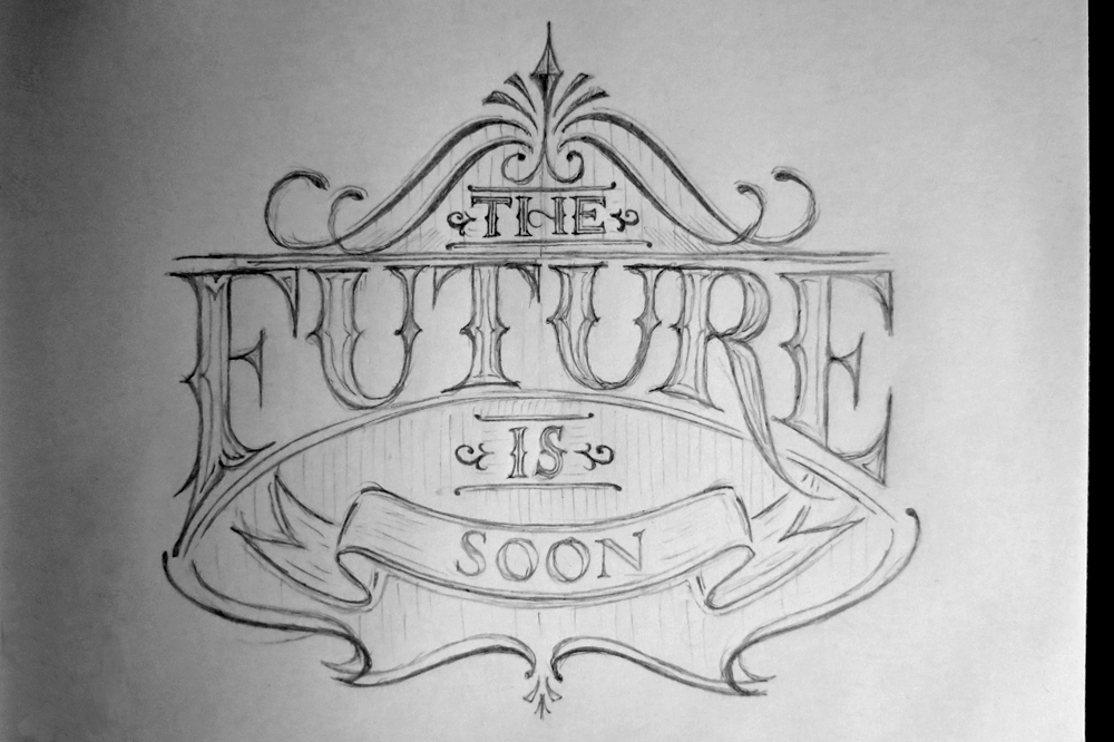
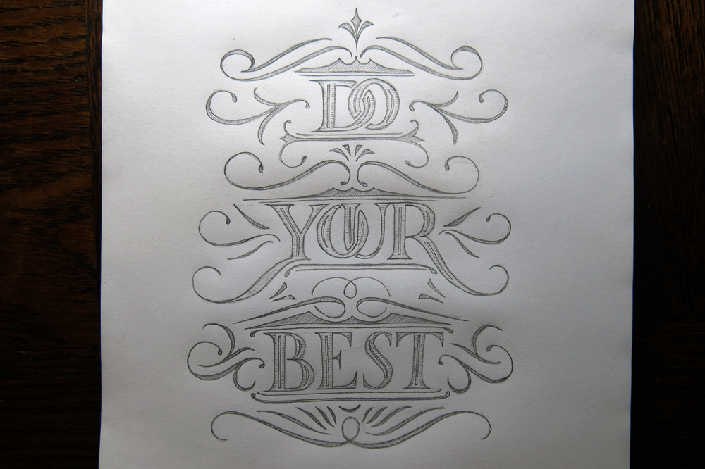
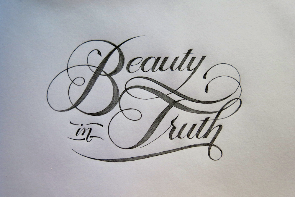
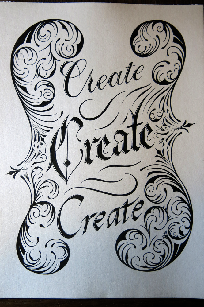
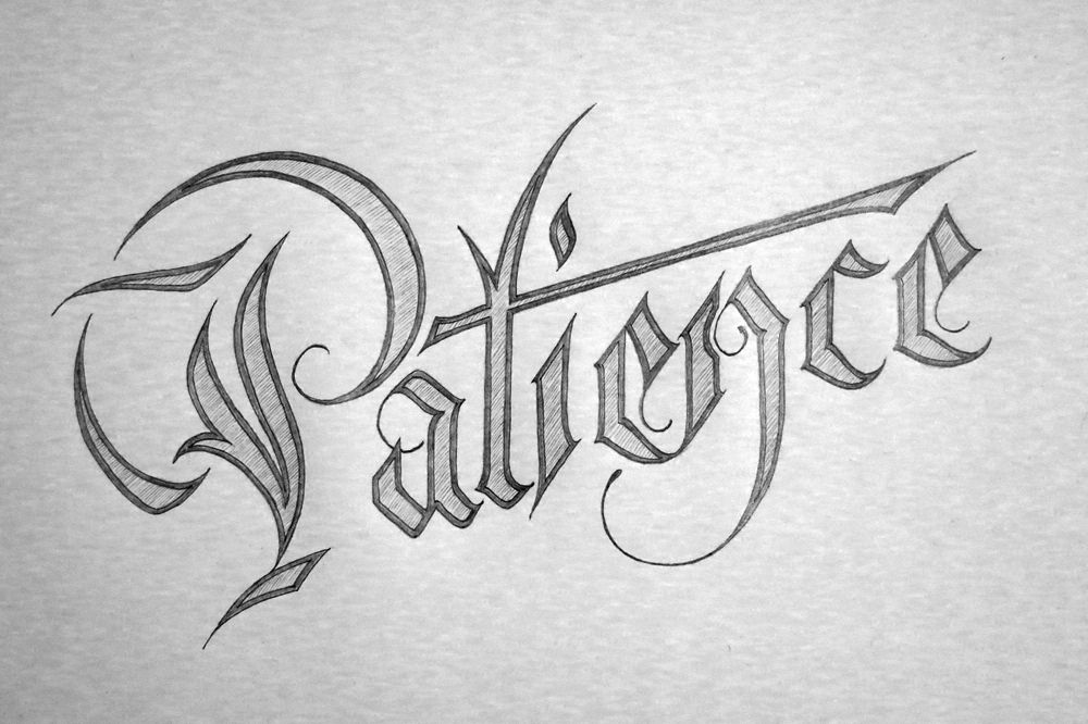
This time, the brief was a piece of lettering of the words “For the Love of Letterforms”. The rules allowed unlimited submissions per person, so I thought I may as well go ahead and do as many as I liked. My goal in doing so was to showcase the variety of styles that I’ve become capable of using over the years and come out with several pieces that differ from each other in feel and appearance as much as possible.

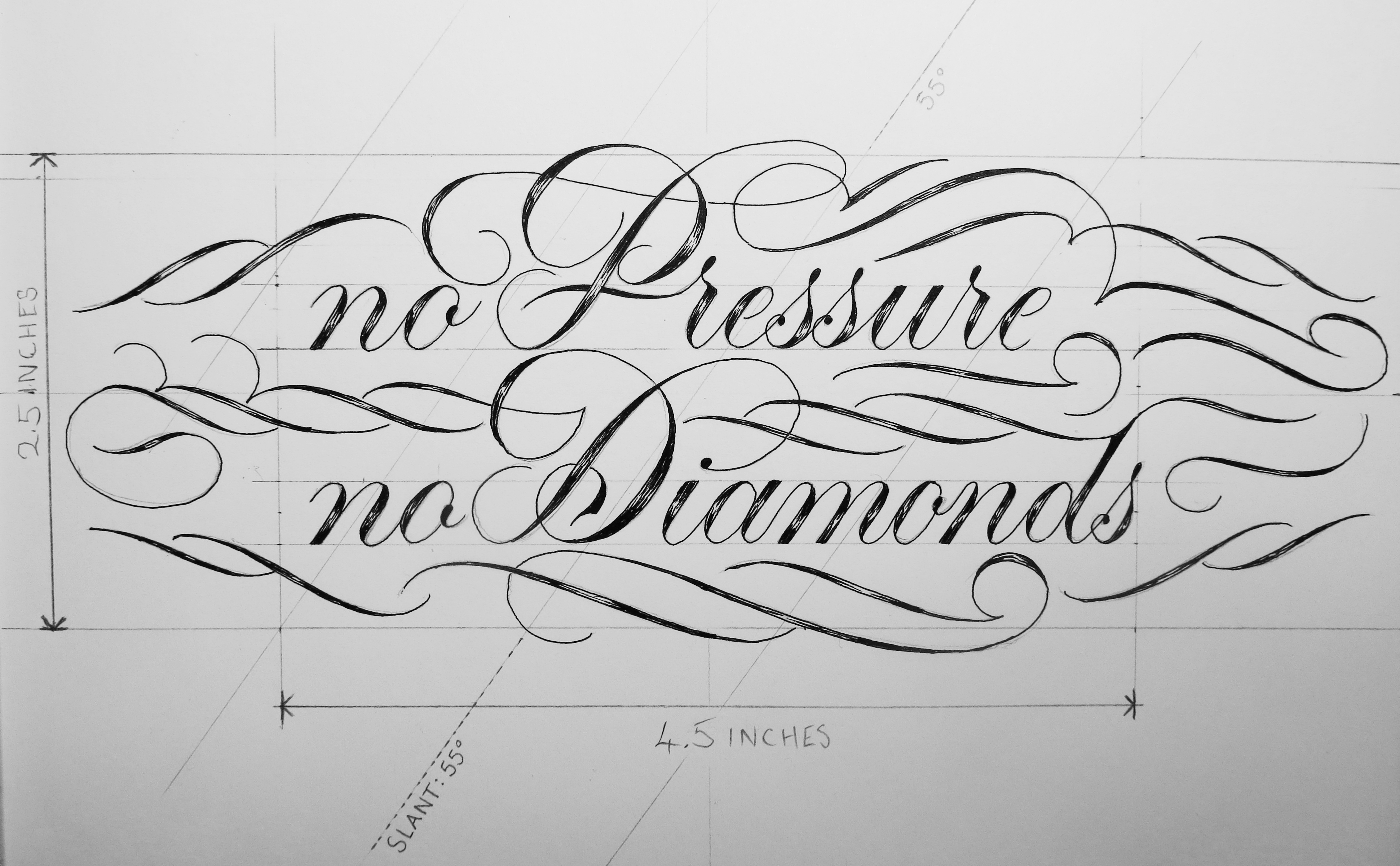
With the first, which you can see above, my intention was to design something that was visually very simple. There is almost no flourishing at all on this piece, and the shape of the composition is made simply through the arrangement of the words themselves.

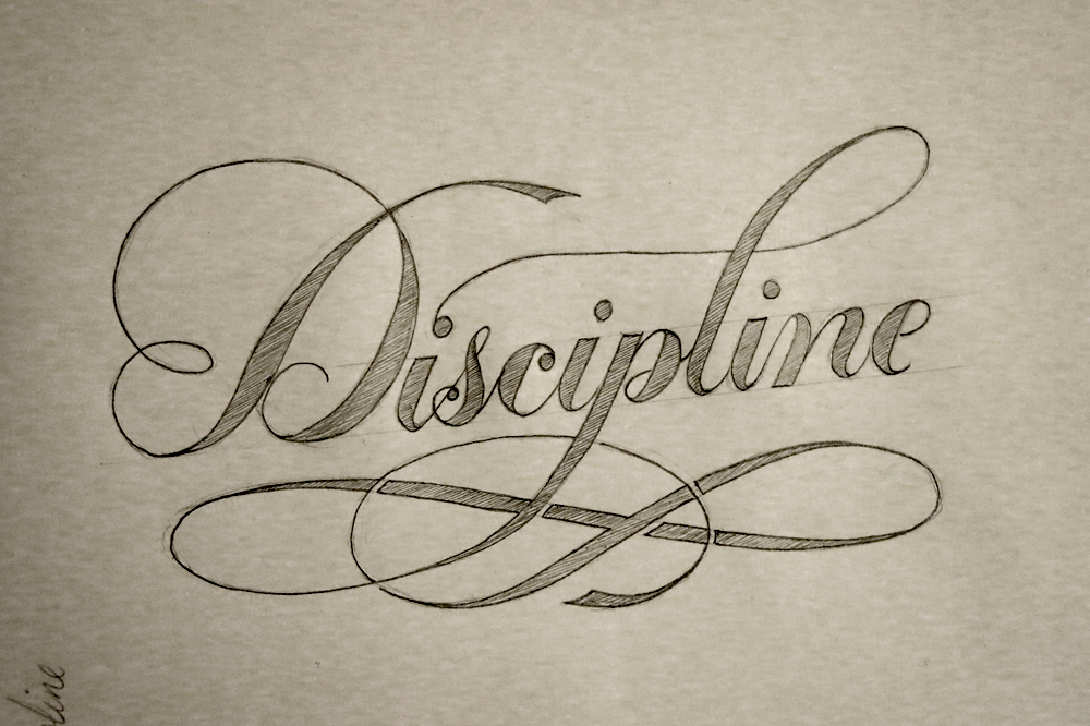
Here’s the second piece I did:

For the Love of Letterforms Gold

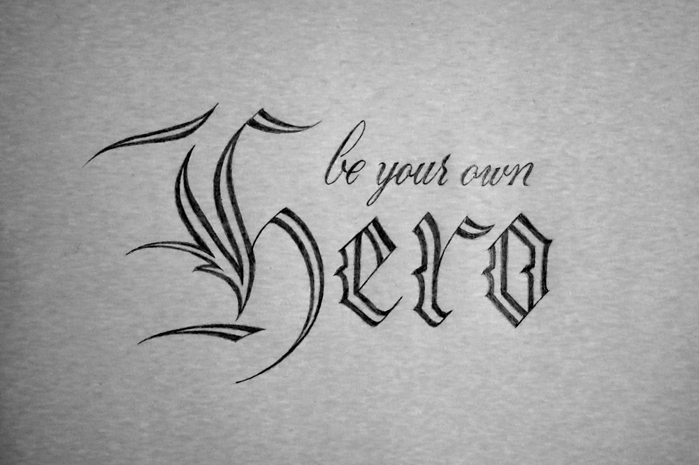
This piece uses a combination of styles, and is reminiscent of the techniques used on old certificates and official documents which employ a combination of heavy blackletter text surrounded by much lighter flourishes and Copperplate accompaniment. The other quite obvious contrast between the pieces is that this one is in gold and white paint on a black background, whereas the other is classic black on white.

Both these pieces, I feel, were a success, and I achieved with them what I had set out to do. The next two, which I will talk about next week, are at great contrast with each other in terms of complexity, but both of which were very popular on Instagram and gathered much attention. Tune in next week to find out what happens! Not only will the next pieces be revealed, but I also will have found out if I got into one of the coveted two available spots on the Ligature Collective team. Fingers crossed!

No Pressure, No Diamonds

When do you think you produce your best work? Is it when you have all the time in the world to plan and tweak and refine? It has been said that work expands to fill the time allotted, and if you’re a perfectionist, I’m sure you would agree that there’s an element of truth in the saying. It’s also said that you never grow if you never stray from your comfort zone. If your ideal working scenario is comfortable and calm with endless time, it could be that you would benefit most from denying yourself that environment. After all, no diamond was ever created where there was no pressure.

No Pressure No Diamonds Angled

No Pressure, No Diamonds! What does it mean? It means something enough to one person to have it emblazoned on their skin, in fact. This was a client commission for a tattoo that I wanted to share with you for two reasons. The first is to show off my process for tattoo design, and the second is because the subject matter is oddly fitting in this case. The brief for the piece, that is the words themselves and the layout, didn’t seem to lend themselves well to any of the styles that I have been becoming more familiar with. My love for Romans, my penchant for combining styles, tendency to create tiny details in pieces, all were at odds with what this piece needed to be. The text needed to fit within a 11.5 x 6.5 cm space (4.5 x 2.5″), it needed to be well legible at that size, and it needed to (of course) be typographically sound.

Here are some specifications that I included since the piece was being passed from one artist to another (i.e. from me to the tattoo artist who would execute the design):

No Pressure No Diamonds Measurements

In the early design stages, I had difficulty coming up with anything that would satisfy my standards. One of the main things I had to tackle was the word length. Two very short words and two quite long words. Just by the nature of the phrase, many design possibilities were taken off the table that would normally be there for phrases with more equal letter distribution. Eventually, I managed to create a small selection of designs that I had some interest in taking further. The client had requested something in a fluid kind of script, but I find it best to explore all available options before continuing because there are often solutions hidden in places that don’t seem obvious at first, and closing doors early on is a great way to get stuck. And getting stuck wasn’t something that I needed any more of with this project.

No Pressure No Diamonds Concepts

So what happens at the end of the story? Well, the hero perseveres and comes up with the best design ever, not through luck or coincidence, but through effort and hard work!

Really though, that’s pretty much what happened, minus the hero part. As it turns out, even a project that you feel doesn’t mesh well with your style, or doesn’t seem to fit well with what you would usually like to do can be turned into something you make your own, something you can really put your heart into and work on with as much enthusiasm as any other, and come out at the other end with something you can be proud to write a blog post about.

So one of the reasons I wanted to write about this project in particular was because it was a case where the pressure was on to create a piece that was worthy, and in the end I created a result I was happy with, despite the difficulties, which is kind of the point of the piece I was making. No Pressure, No Diamonds. How meta.

May You Live in Interesting Times

This week’s piece is something I did for a daily doodle a little while ago. I liked the design, so I decided to only show off a part of it when I posted it at the time and save the rest for an inked piece. Here’s the full version!

May You Live in Interesting Times Angled

When I first started making lettering pieces, I focused a lot on learning about letter forms, in the same way that someone learning the guitar might focus on getting the notes to sound nice. While nice notes and good letter forms are important, lately I’ve been more interested in exploring what makes the composition of a piece work well. Every note in a piece may sound perfect, but if they’re in the wrong places, or they don’t complement each other well, then the piece isn’t going to be a success. In the same way, if the hierarchy and combination of styles in a lettering piece aren’t properly thought out, then the piece will fall short of where it could.

At the same time as all that, I’ve been experimenting with more ornamentation if my pieces, which also helps the composition as a whole. Of course, I have always liked using lots of ornamentation in lettering, but I’ve been including it lately with more of a mind towards using it to tie pieces together. Here are a few examples from my daily doodles this week.

Be a Better You

Be a Better You

Live in the Moment

Live in the Moment

Custom Hand Lettering

Custom Hand Lettering

L’appel du Vide

L'appel du Vide

But of course, I still take the time to practice some good old letter forms. Here’s a Gothic piece, Take Care:

Take Care

I’m going to take a week off from doing daily doodles because of travelling, staying with people and Christmas stuff, but inked pieces will still be coming out at a rate of one a week.

The Future is Soon

Lately, I have been working on composing pieces with more ornamentation and flourishes. My goal has been to get a better understanding of how to create lettering pieces that aren’t based solely on the letter forms and the shapes of the words. Doing a daily doodle has given me some nice time to focus on exploring different options, and so for this week’s piece, I’ve used one of my daily designs.

The Future is Soon

“The Future is Soon.” I’m pretty excited about the future, and thankfully, it’s coming pretty soon. At times, the future has been much further away, but at the moment, the future is the closest it has ever been. That is to say that in the past, things didn’t change much for a really long time. Nowadays, however, things are changing much more. Change is, if nothing else, interesting, and though “may you live in interesting times” is often said to be a curse, I can’t help but feel excited.

The phrase “may you live in interesting times” is said to come from Chinese, though no source has been found. The nearest related expression translates to “better to live as a dog in an era of peace than a man in times of war.” And speaking of the future, it’s likely to have the least amount of war since pretty much forever. People often say that the world is going downhill, but in fact, we live in a time of peace and prosperity greater than any other. It seems like the future will be a pretty good time to live; that said, no day is better than today.

Here are some of the daily doodles I’ve done this week:

The Future is Soon

“The Future is Soon.” The sketch I made into an inked piece today.

Winter

“Winter.” A piece I made yesterday, the last day of November, in an effort to be a little seasonal.

Do Your Best

“Do Your Best.” A little piece to motivate myself to do well, but also to know that doing your best is always something you can do if you put in the time.

Golden

“Golden.” A single word piece to practice some flourishes and some tall letters in a circular design.

In other news, I got through the first of the nice A5 Rhodia pads of paper I bought a while ago. I started on just for daily doodles and the drop caps I did in Inktober. The “Golden” sketch was the last piece in this one, with “Do Your Best” being the first of a new pad. Here’s a picture of all the pieces I made with this pad:

Notebook 1

There are 57 designs here, and the pads come with 80 pages, which means I used 23 pages for sketching, tracing, ideas and as guard sheets.

Daily Doodles

At the moment, and for the foreseeable future, I’m doing something called Daily Doodles. That means that I’m creating one new piece of lettering, sometimes in ink, usually in pencil, always in a day. Last week I wrote a little about it as an addendum to my Create Create Create post. This week, I started putting a bit more time and thought into the pieces – not necessarily in the execution of each, as a day isn’t a long amount of time to create something, but in the exploration of styles, and composition. Sometimes I get so carried away with finding new styles to use in lettering pieces that I don’t ever spend enough time actually exploring a style before I move onto the next. It’s partially due to curiosity about the possibilities, but also due to not wanting to produce things that seem too lacking in variety.

They say that it takes 10 000 hours to become good at something. And that’s a lot of hours. A lot of time doing the same thing over and over again, rehashing, going over, trying again, failing, and learning what to do better next time. Because of that, I decided that using my time doodling a new piece each day would be well spent not only exploring new styles, but exploring styles I’ve used before. Here are a few from the last week:

Air

Air: practising Roman capitals, the root of the letter forms we use today. Though originally a form of calligraphy, the historical records of them are stone engravings. The letters are still written today, however, with broad edged pens and brushes, and hold a lot of mysteries. Unlike learning some Italic or Gothic script, Romans require some difficult techniques to pull off through calligraphy. Sketching them, of course, is easier, providing you know how they are meant to be formed. (Let me give you a hint: that’s the hard part. Hence the practise.)

Beauty in Truth

Beauty in Truth: some experimentation with flourishing and ornamentation in a Copperplate style. I also incorporated the style of B I used in my Drop Cap a Day Inktober project.

Trust

Trust: a Gothic piece, drawing inspiration from several scripts that I’m sure have names, but I can’t remember right now. Though Gothic scripts are pretty straight forward, and easy to sketch in pencil especially, I’m still finding plenty to learn with each piece.

Alive

Alive: some more simple Copperplate calligraphy style letters here. I used ink and pencil on this piece to give it a little drop shadow to make it pop. The effect works quite well, and makes me consider investing in some grey inks to get a more reliable and lasting medium that gives the same feel.

Earth

Earth: similar to the Air piece in style and ornamentation. I think it should be a letterer’s mantra that you can never know too much about Roman capitals. And if you do, please start teaching others.

Be Your Own Hero

Be your own hero: combining two styles here – Copperplate and Gothic. The composition came out as I wanted, but I can’t help but feel it would be nice if the words had allowed for a letter with an ascender at the end of the last word so that the Copperplate would be nested between the Gothic on each side.

Better Together

Better Together: sometimes simple & elegant is all you need, and what better way to achieve it than a Copperplate-style script piece? It’s my wife’s birthday today, so I made her this little sketch to show her my appreciation, and took the time to doodle out some flourishes while I was at it.

Some of these pieces might pop up again later, or elements from them, at least, in later posts. I’m thinking of making a piece around the Earth/Air/Water/Fire “elements” after having watched a TV show called Avatar, so the other two will probably be along at some point, but they may be in a different style as I explore ideas for the piece. As always, if you’re interested in staying up to date with these daily doodles as they come, follow me on Instagram.

Create Create Create

What if you had to make a new thing every day? It might be easy to start with, but after a little while, you would run out of ideas. Maybe you’d struggle to think of new things to make. You’d wish you hadn’t wasted good ideas when your execution wasn’t good enough to do them justice. You’d get burnt out and get fed up with doing it and eventually give up. Now imagine if you had to go running every day. At the start, it would be hard to do, and you would feel like you were no good at it. After a while, you would start to feel some improvement; maybe you would be able to run a little further each day, or a little faster. Eventually, you would be much better at running than you were before.

The thing is that creativity isn’t how I described it in the first paragraph: it’s just the same as how I described running. The more you practice something, the better you get. The more you do something, the more your brain understands how it works and how to do it. When it comes to creative things, there isn’t some magic element, some mysterious gift, some much-coveted spark. It’s all down to practice. Do you want to get better at something? Then do that thing a whole lot, and soon enough, you will find that you are seeing improvement.

Create Create Create

Recently, I’ve been focusing on improving creativity though practice. I don’t wait for an idea to strike, or motivation to come along and help me out. Instead, I look to discipline and structure to guide my way. The nice thing about that is that motivation is fickle, and sitting around waiting for it means that more often than not you don’t get anything done, whereas discipline is something that you can build as a habit over time, and strengthen every time you do exercise it. As part of my learning, I’ve been studying calligraphy in order to better understand the roots of lettering. This piece combines 3 of my favourite styles: Copperplate, Gothic, and Italic.

Having a piece with just 3 words, each in a different style, could lead to an inconsistency in the structure. To counteract this, the piece finds consistency through ornamentation, form, and subject matter. Each word has the same left facing shine to the letters, the ornamentation is self reflective, and the words all say the same thing. The repetitive nature of the words also implies the importance of not just creating one thing and being done with it, but creating as a process that continues independently of the pieces being produced.

Create Create Create Detail

Aside from exploring calligraphy, I’ve been dedicating some time every day to making a pencil sketch every day of a few words or phrases. If they turn out well, I may recycle the ideas in inked pieces, and if they don’t turn out well, then I have learnt something valuable in making some mistakes. Here are a few from the last week:

Nihil est Fortuitum

A request someone posted to reddit: Nihil est Fortuitum – Nothing happens by chance. I took the challenge because I liked the phrase; after all, it is true: cause and effect are in everything!

Silence

Silence: Using the composition and the negative space to add some expression to the word.

Balance

Balance: Experimenting with a 3D effect, some drop shadows, and a Gothic style I’ve been experimenting with, which was also seen in Break the Rules.

Don't Look Down

Don’t Look Down: Some simple Italic, and some fun with linking the letters together. Though Italic is quick to perform with a broad nibbed pen, I find it takes a long time to sketch just right with a pencil, unlike Gothic styles and Copperplate, which seem easy to reproduce in graphite.


Break the Rules (Sometimes)

Rules rule! Right? Right! Except sometimes it’s fun to break the rules, or at least to play with them and find out what happens. Of course, I’m not talking about the kind of rules that keep the world running well, like don’t steal stuff, or, say, gravity. Well, I suppose those are more laws than rules, but they’re similar, anyway. I am, however, talking about the rules you learn about how to do something well. One of the great things about consciously breaking the rules is that first of all, you must learn the rules. A good understanding of the rules is that leads you to make informed decisions when making something.

Break the Rules (Sometimes)

This piece, then is about breaking the rules, but only sometimes. If you broke the rules all the time, everything would end up looking terrible. Trust me, the way letters are constructed work because they’re based on rules. Some of the rules can be bent, and even broken, and you can end up with some very stylized typography. For example, Art Deco typography eschewed some of what you could consider traditional rules for letter construction in favour of geometry and symmetry. However, I often see people unintentionally breaking the rules in lettering because they don’t know them yet. In their minds, they are not breaking the rules because they are unaware that what they are doing isn’t right. In that case, it’s a great thing to first learn the rules, and then experiment with breaking them in order to find out why they work and what happens if you don’t follow them.

Break the Rules (Angled)

Well, with this piece, what rules did I break? Well, none, as far as I’m aware. My first idea was to create a piece that had the weighting of all the letters reversed i.e. thick strokes where there should be thin, and vice versa. The problem was that it looked awful. Though I already understand the rules about the weighting of letters, it renewed my appreciation of their importance. Instead, I decided to go with a fun Gothic style for the “Break the Rules” part, followed by a tame typographical “sometimes”. In starting, I did a few quick experiments with a broad calligraphy nib (as you can see below), just to get an idea of what I wanted out of the letter forms. Then I quickly moved on to fitting the letters into the composition I wanted for the piece, and worked on some ornamentation to go beneath. Finally I scaled everything up by drawing a grid on a larger sheet and matching it to the sketches I had made. This is a very convenient way to translate pieces between size, especially seeing as I had done my initial sketches on dot-grid paper. Once the piece was sketched out fully, and then later inked, I removed the pencil grid and was left with what you see above.

Break the Rules Progress

What else is new? What has been happening since Inktober finished? Well, I’m still doing a piece a day, which you can always catch on my twitter page. Having finished the alphabet of drop caps, numbers, I did a couple of ampersands and then moved on to doing a pencil sketch each day. Take a look:

Ampersand 1:

Dropcap &1

Ampersand 2:

Dropcap &2

Patience:

Patience

Discipline:

Discipline

Spades:

Spades