The Future is Soon

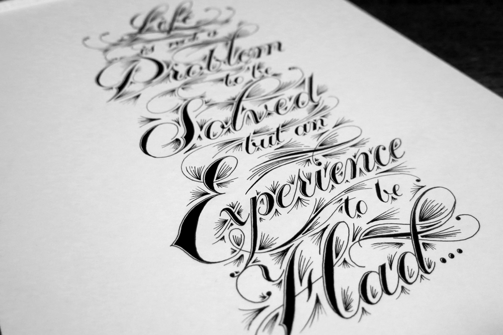
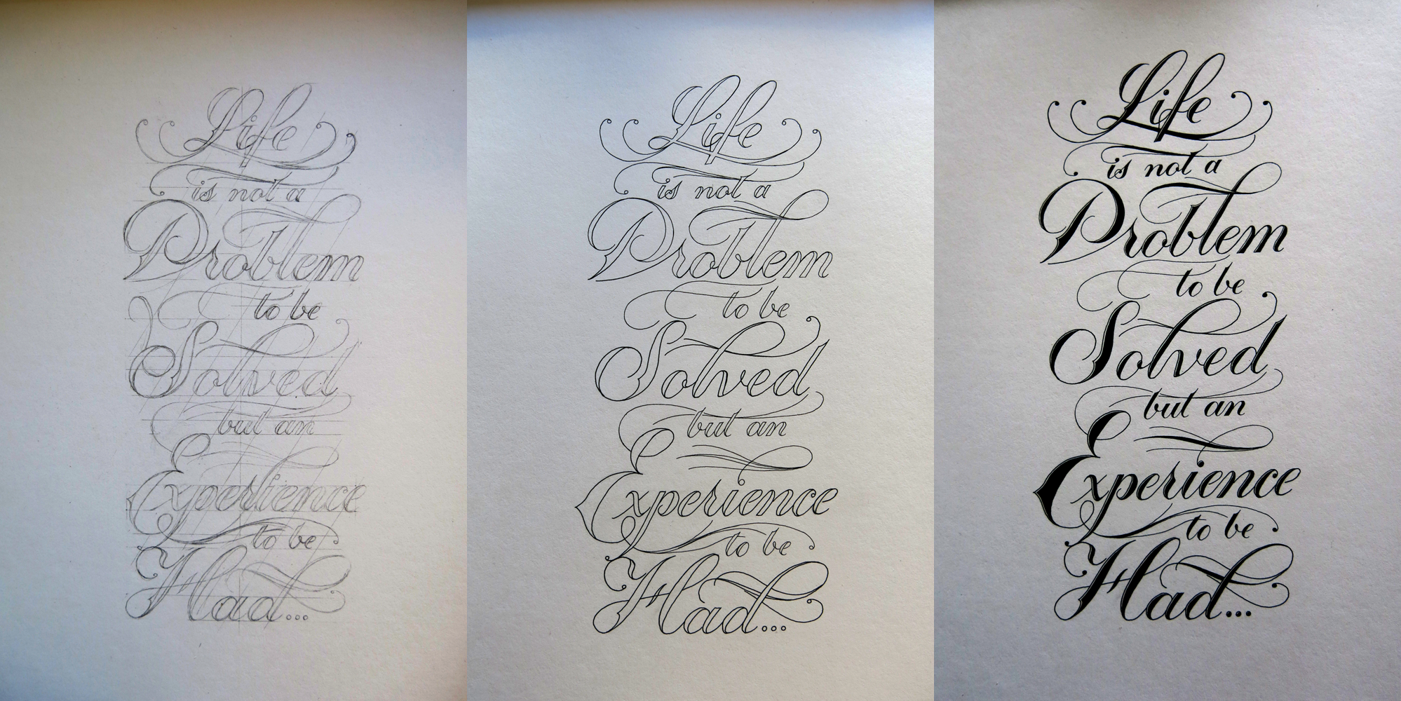
Lately, I have been working on composing pieces with more ornamentation and flourishes. My goal has been to get a better understanding of how to create lettering pieces that aren’t based solely on the letter forms and the shapes of the words. Doing a daily doodle has given me some nice time to focus on exploring different options, and so for this week’s piece, I’ve used one of my daily designs.

The Future is Soon

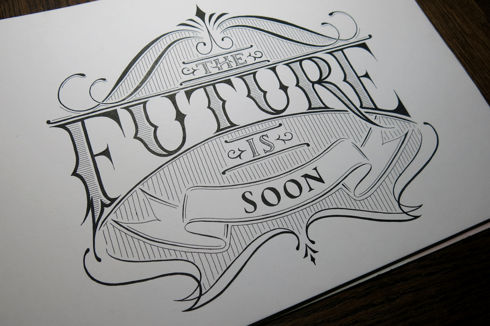
“The Future is Soon.” I’m pretty excited about the future, and thankfully, it’s coming pretty soon. At times, the future has been much further away, but at the moment, the future is the closest it has ever been. That is to say that in the past, things didn’t change much for a really long time. Nowadays, however, things are changing much more. Change is, if nothing else, interesting, and though “may you live in interesting times” is often said to be a curse, I can’t help but feel excited.

The phrase “may you live in interesting times” is said to come from Chinese, though no source has been found. The nearest related expression translates to “better to live as a dog in an era of peace than a man in times of war.” And speaking of the future, it’s likely to have the least amount of war since pretty much forever. People often say that the world is going downhill, but in fact, we live in a time of peace and prosperity greater than any other. It seems like the future will be a pretty good time to live; that said, no day is better than today.

Here are some of the daily doodles I’ve done this week:

The Future is Soon

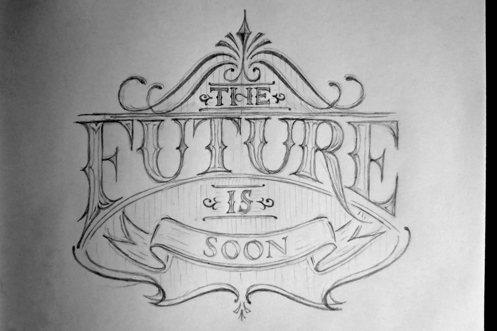
“The Future is Soon.” The sketch I made into an inked piece today.

Winter

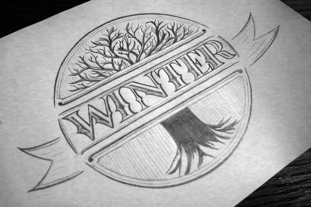
“Winter.” A piece I made yesterday, the last day of November, in an effort to be a little seasonal.

Do Your Best

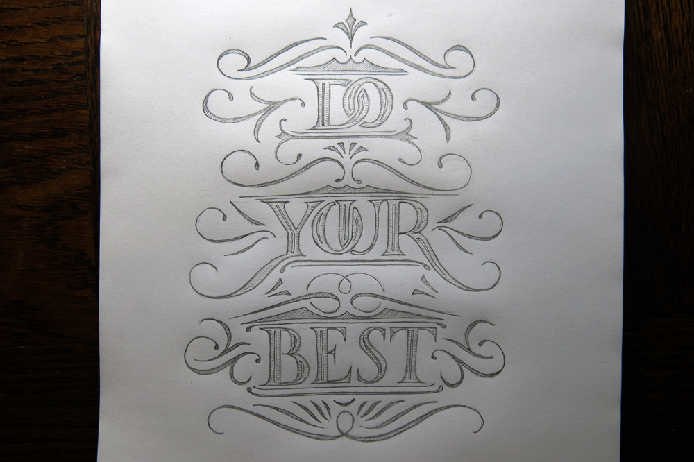
“Do Your Best.” A little piece to motivate myself to do well, but also to know that doing your best is always something you can do if you put in the time.

Golden

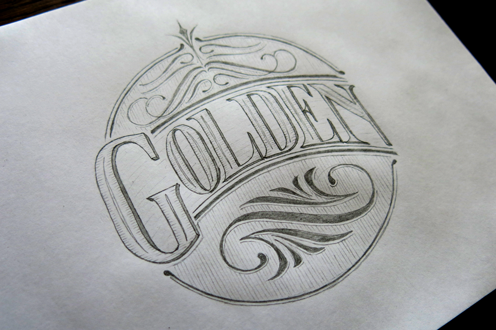
“Golden.” A single word piece to practice some flourishes and some tall letters in a circular design.

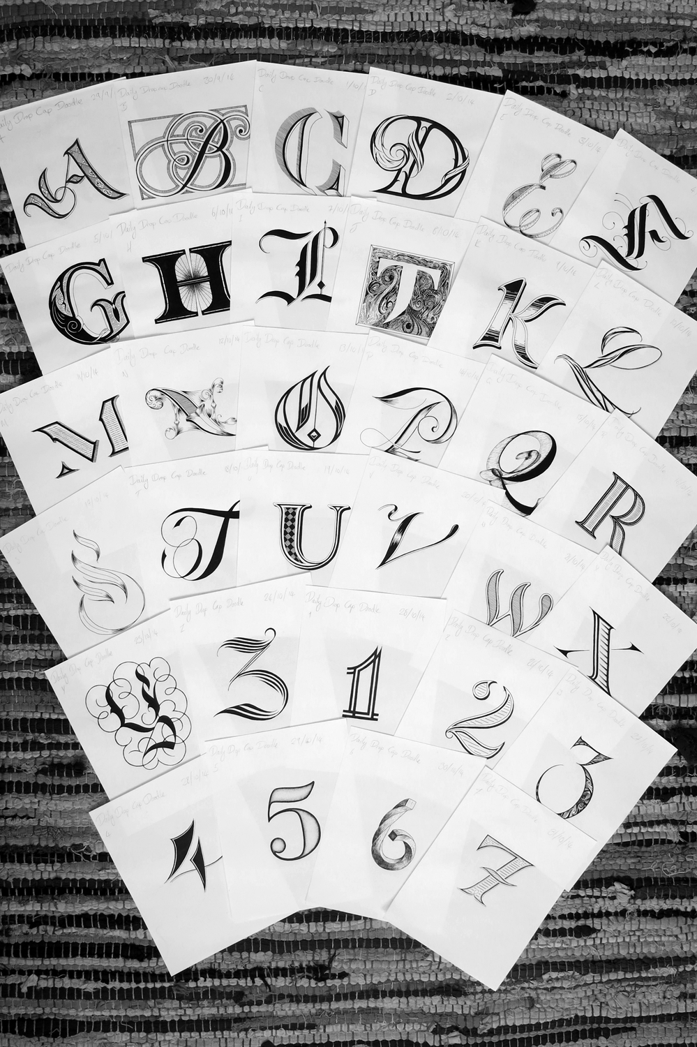
In other news, I got through the first of the nice A5 Rhodia pads of paper I bought a while ago. I started on just for daily doodles and the drop caps I did in Inktober. The “Golden” sketch was the last piece in this one, with “Do Your Best” being the first of a new pad. Here’s a picture of all the pieces I made with this pad:

Notebook 1

There are 57 designs here, and the pads come with 80 pages, which means I used 23 pages for sketching, tracing, ideas and as guard sheets.

Life is not a Problem to be Solved but an Experience to be Had

Sometimes it’s too easy to get caught up in avoiding the bad things that we miss all the good things. This piece that sums up the message quite well. It’s a quote that seems to be attributed to a few different people, and has a few variations; however, a message should be valued based on its content rather than who first said it.

Life is not a Problem

I have enjoyed pieces lately that make use of a single style of text and focus more on a solid composition and hierarchy. This piece makes use of a copperplate style of calligraphy, with a few extra elements thrown in. My focus was on reducing the complexity of the piece in terms of the styles used, so there are only two sizes of text, the smaller size having little decoration, and the larger with only minimal decoration (the inner white line and spur on the capitals being the only ornamentation on the letters themselves.) This meant that the piece was open to a lot of fun with flourishing and ornamentation between the text.

Here is an angled shot which has the whole piece in frame but fits it into a landscape layout:

Life is not a Problem detail

Most of the time spent on this pieces was not in the execution, though it may seem detailed, but in the planning. I wanted to make sure that the composition was solid, with good consistency throughout the piece. The word “Experience” in particular, being so long took some time to get centred well without it seeming to hang off the edge of the border. Of course, I could have made the text smaller, but my goal was to have only two sizes of text, so I wanted to stick to it. It’s often easy to over complicate something and take an additive approach to the search of perfection, but in fact, more frequently, perfection can be found through subtraction. That is to say that the more minimal a design, the better. So to in planning a piece, it is important to focus on the basics above all, as they underpin the whole piece. The execution of the piece, in the end, was relatively quick.

Here are a few pictures of the piece as it went along:

Life is not a Problem Progress

I would show you the sheet where I planned out several different ideas for the quote, but it seems to have gone missing. I’m sure it’s here somewhere, but really, you should see my desk. So many papers…

In other news, with Inktober all finished up here’s a fun snap of all the pieces up to the 31st together:

Dropcaps (Inktober)

The number was done on the 31st, which was the last day of Inktober. What about the other numbers though? Well, I started doing these drop caps just before October started, and I hadn’t heard of Inktober at the time, so it was more of a convenient surprise, really. The project continues on my twitter page! Today sees us up to zero in numbers, which means that tomorrow will probably be some fun punctuation like an & or @. After that, I’m debating whether to do a pencil sketched phrase a day or come back to the beginning of the alphabet and do some more drop caps. Follow me on twitter to find out if you’re curious!

All Will Come Right

Last week, I did a piece that was part of a Churchill quote. This week, I have done the second half! The two pieces are designed to fit in a square shaped layout, and be displayed next to each other. Eventually (perhaps not next week, but at some point) they will be joined by a third piece which will fit beneath them, being twice as wide as it is high, so that the whole ensemble creates a larger square to complete the whole quotation.

All Will Come Right

I’ve inverted it here to give it a nice chalk board style look. It’s visually very similar to the piece last week (of course, that’s the point!) so to create a little contrast, I thought it would be nice to see it in white-on-black. It’s so simple to make it a negative, and it almost feels like cheating, because you end up with something that feels so different. Sometimes I see work done by others and I can’t tell if they’ve done it on black paper with chalk or or some other white medium or whether it’s a simple inversion, so it’s interesting to finally get round to doing so with a piece of my own.

Here are the two pieces in the same photo so you can compare:

Lift Up Your Hearts, All Will Come Right

The goal was to make these pieces resemble each other as much as possible. The obvious choice is to have them structured the same, and to used the same styles. Of course, the similar sentence structure is not only useful as a tool of great rhetoric, but also helps with keeping the two pieces the same. It’s simple enough to see that the styles are the same, and that the banner in the middle is the same shape with the same Tuscan font, but there are also a few other structural similarities that I’ve worked into the pieces to keep them consistent. For instance, the underside of the first line swoops down, then up, in order to match the banner beneath it. Both pieces also have a semicircle in the centre at the top, and have a similar shape at the bottom with the leg of the H/R respectively.

Lift Up Your Hearts

Following on from last week, this week has seen a lot of broad nibbed calligraphy practice, which means burning through paper at an alarming rate! The good news is that I bought 20 nice A5 Rhodia notebooks a few weeks ago, half of them with a dot-grid pattern and the other half plain. The dot grid is great for sketching out ideas without having to worry about marking out boundaries and guidelines; unfortunately, the spacing between the dots don’t quite match the width of any of the broad nibbed pens I bought, so it doesn’t help too much with calligraphy practice.

Lift Up Your Hearts

This piece is the first in a two (maybe three) part series that I’m going to do. The plan is to have them structurally as similar as possible. This one is half of a sentence spoken by Winston Churchill on June 12, 1941 in his speech to the Allied Delegates. I first heard it when it gained some popularity due to being auto tuned into a funny little song, but the meaning of the message stuck with me. The full phrase is “Lift up your hearts; all will come right.” It’s then followed with “Out of the depths of sorrow and of sacrifice will be born again the glory of mankind.” It’s stirring to think of the context in which those words were spoken. The Second World War had been going for two years, and would continue for another four. Knowing what we do now lends a feeling of gravity to the words, but I feel it’s a message that holds meaning in many contexts.

Here’s a shot that is a little closer and shows the banner and the Tuscan style lettering of the word “your”.

Lift Up Your Hearts Detail

The piece has quite bold and simple shapes on the top and bottom, so I kept the banner from being too detailed so that it doesn’t distract from other elements, whereas usually I like to include a bit more detail. The main reason I’m keeping it as simple as it is, however, is that for it to work side by side with the next piece in the series, being too detailed could make the composition look too busy. I may make a 3rd piece with the phrase “Out of the depths of sorrow and of sacrifice will be born again again the glory of mankind,” which would be a wider piece to fit beneath the first two above.

Don’t be Afraid to Dream

This week is another New-Pen-Week! Last time, I got some Rotring Rapidographs, which I use pretty much the same as the old fine liners I started out with. Not much changed in the style of work I produced, but for me, the process was changed a little. This time, however, I got some Pilot Parallels, which are a kind of fountain pen for broad nibbed calligraphy. I’ve been wanting to start practising some broad nibbed calligraphy for a while now, so that I can further my understanding of Gothic/Blackletter styles, and this week allowed me the chance to give it a go!

Don't be Afraid to Dream

I found a wonderful image that displays a style of Blackletter that I haven’t seen reproduced quite the same anywhere else. The title of the image is “Williams Style of German Text”, which doesn’t seem to bring up much other than the original image, so I don’t have much more information than what you see there. I’m sure there is much to learn in exploring the style, and I’m going to spend the next few weeks trying to understand the intricacies of what makes the letters function in the way they do, but in the mean time, I took some inspiration from the style, as well as several other styles I’ve seen around the web, and came up with the piece above.

The pens came with two inks, which was unexpected, but it provided me with the opportunity to experiment with a bit of colour, which is something I’ve been purposefully avoiding in other works in an effort to focus on form. After all, restrictions are what give us guidance, and having too many directions to explore often leads to little progress. That being said, it’s sometimes refreshing to allow yourself a little deviation. These inks are black and red, though refills are available for all manner of colours, so I’m interested in getting some more in the future. In the mean time, I found neat feature on my camera that replaces individual colours in a photo for others, no photoshopping required. Here, I’ve replaced the red ink with a green, blue, and brighter red. Look how each colour creates a different feel for each piece. Colour matters!

Don't be Afraid to Dream Colours

The speckles that surround the letters were made by pulling on the tip of the nib, and letting it go, which flicks the ink on to the paper. Unfortunately, it also flicks it everywhere else, so I ended up with some red fingers, pens and surfaces. Before I did the speckles, I first drew out some guidelines for the word “Dream”, then wrote in the red parts. Once they were dry, I went over in black to complete the bottom part of each letter, then added in the Copperplate above with a brush pen. The speckles came in last because I didn’t want to get my hands so messy if I ended up making a mistake and discarding the paper!

Thing a Day (Day 4)

Well, I’m past half way through my thing a day week. Over yesterday and today, I was planning and inking one larger piece, the planning being yesterday’s thing and inking being today’s.

I’m quite pleased with how it’s turned out having started from this:image

Today’s thing is a little different from other things. It uses bolder shapes and no serifs. It’s an experiment with an unconventional shape. It is two sentences, and it’s the first piece with no hatching.

And aside from anything else, it looks taller than it is wide, yet it is wider than it is tall. Strange.

What we live becomes normal. Happiness comes from within.

Would you believe that it’s seven inches wide, but only five and a half tall? One of my stumbling blocks in designing it was that I was trying to sketch it out in portrait, when in fact it needed to be landscape.

As for tomorrow’s thing, I have some ideas already. Something to make the site a little more appealing, hopefully. Stay tuned!

Thing a Day (Day 1)

Thing a Day (Day 2)

Thing a Day (Day 3)

Thing a Day (Day 5)

Thing a Day (Day 6)

Thing a Day (Day 7)

Thing a Day (Day 3)

Wow! Day 3 is here and thing 3 is surely around here somewhere too. Yesterday’s thing was more time consuming than I had expected. I thought that it being smaller than other pieces would mean that it would be quicker to finish, but not so!

Stop Hesitating.

That out of the way, let’s think about today. Seeing as yesterday’s thing was so time consuming I decided that I would plan a large piece and not ink it for today’s thing. Image quality is definitely suffering, however, so please forgive the iPad’s inferior lens capabilities.

The subject matter for today’s lettering is reflective of my mood, I suppose. My computer screen being smashed is the kind of thing that would usually get me down, but I’m taking an optimistic approach, which is made easier as I am having so much fun lettering! Take a look:

image

Thing a Day (Day 1)

Thing a Day (Day 2)

Thing a Day (Day 4)

Thing a Day (Day 5)

Thing a Day (Day 6)

Thing a Day (Day 7)