
Here’s a little piece I’ve been working on lately. The phrase is “Say Yes”, which is something quite nice and simple. The words also lend themselves to a neat symmetry, being almost the same as each other when reversed. This leads to a mirroring of the S’s at the end and an uncommon formation of double Y’s in the centre.
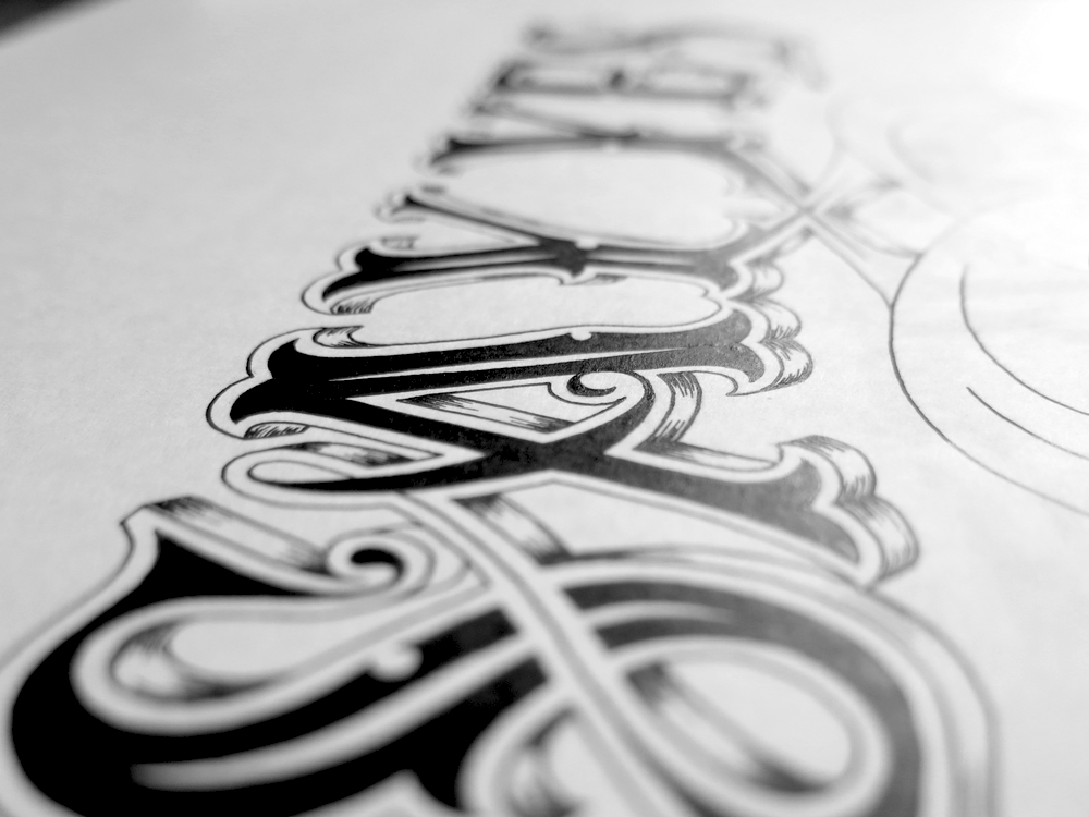
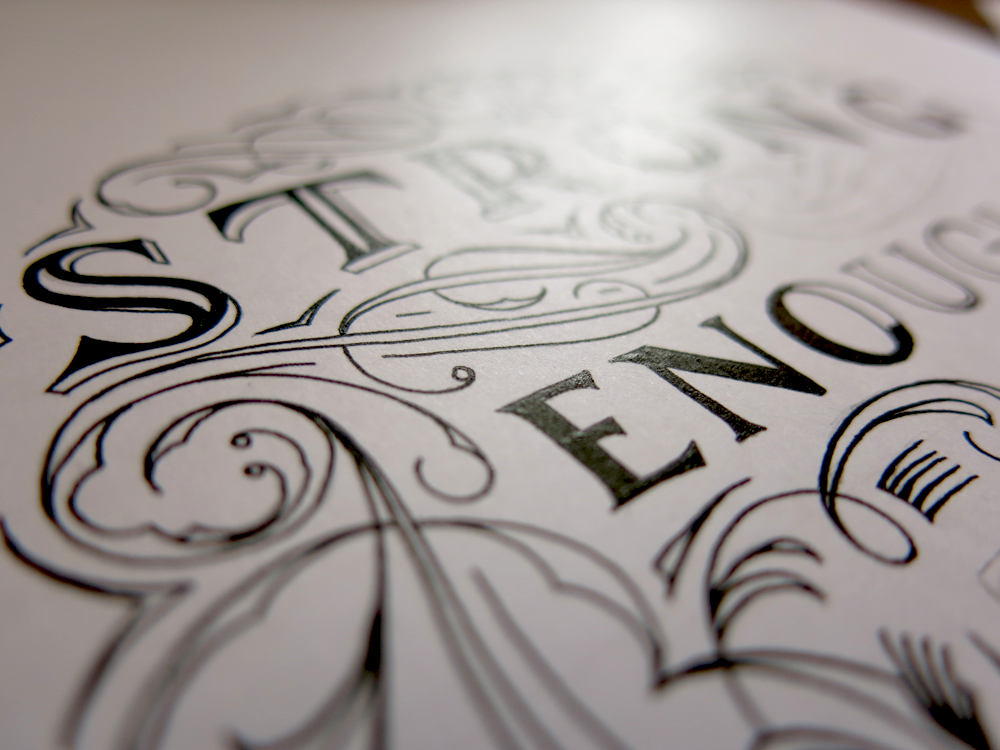
The Roman Y is an interesting letter. If it were to have no stroke weight, it would be a symmetrical letter. However, due to the calligraphic roots of all letters, there is a difference between the thickness of the branches. The result is that the branches come off the stem at slightly different places, though here it’s slightly obscured by some of the ornamentation. Because of the asymmetry, the negative space between them is also a little asymmetrical.
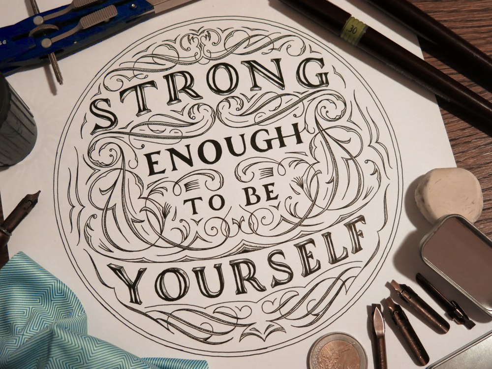
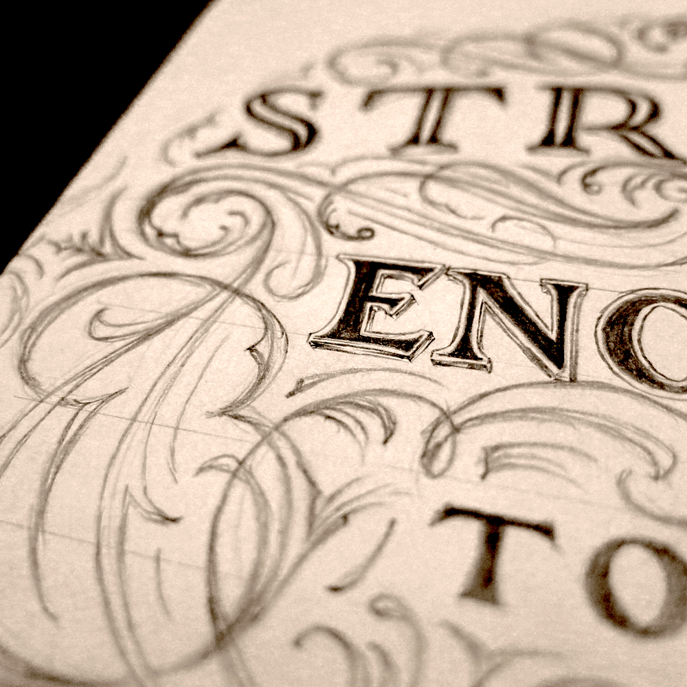
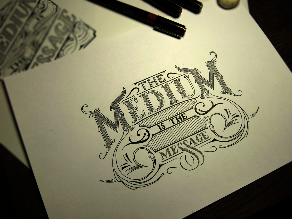
The execution of a piece like this can be tricky. Most of the ink is simple to put down, especially blocking in the centres of the letters. The finesse comes when creating the 3D effect. The seeming shininess of the sides of the letters is created by many tiny pen strokes. I use Rotring Rapidographs to do my lettering pieces, and one advantage of these pens is that they always produce a line of constant width. This is a great asset when you want consistency across your piece: no matter how hard or lightly you press, or what angle you hold the pen at, you always have the same result. The trouble comes, then, when you want to make a line of inconstant width – a tapering line. To create the effect in this piece, the lines were created with a quick sweeping motion in lifting the pen from the paper so that the ink flowing from it thins as the tip of the pen pulls away from the surface. The problem with this is that to create a tapering form, the lines must be drawn with quite some speed, and the faster the movement of the pen, the harder it is to make each line conform with the curves of the letters, some sharp, some smooth.
Above is a close-and-personal shot of the first letters.
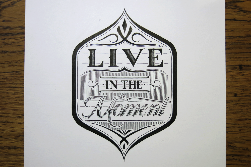
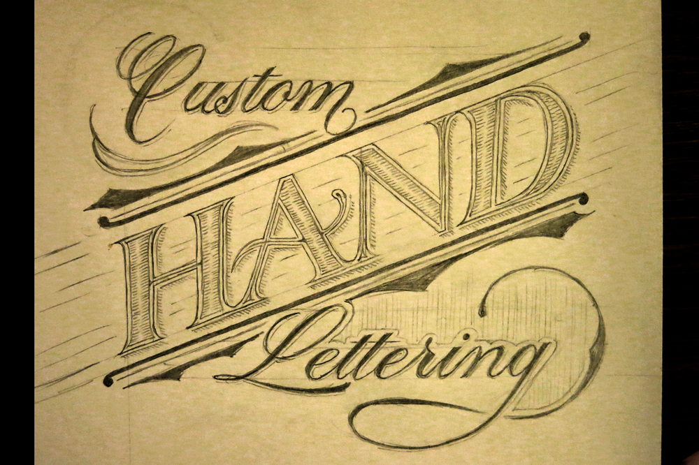
The style of the letter forms in this piece was partly inspired by Tuscan typography, which people might associate with circuses, saloon bars and rodeos. Some of the easiest features to notice are the serifs almost reminiscent of a cowboy boot and the spur and eye ornaments midway up each letter. Along with the Tuscan influence, the piece is informed by my studies of traditional Roman Calligraphy, pointed pen flourishes and a little of my own personal lettering flair.


You must be logged in to post a comment.