Take Your Time…

Here’s a piece that started out being dumped into the Daily Doodles folder on my computer, or at least the parts of it did. A doodle of the words “Take Your Time” done in a flourished style with a slight slant to the composition. After a little while the phrase came back to me and brought a few friends, and together they formed some lyrics from long ago. Twenty-four years ago, in fact. In 1991 Nirvana released the song Come As You Are, containing the lyrics “Take your time / Hurry up / Choice is yours / Don’t be late.”

Take Your Time, Hurry Up, Choice Is Yours, Don't Be Late

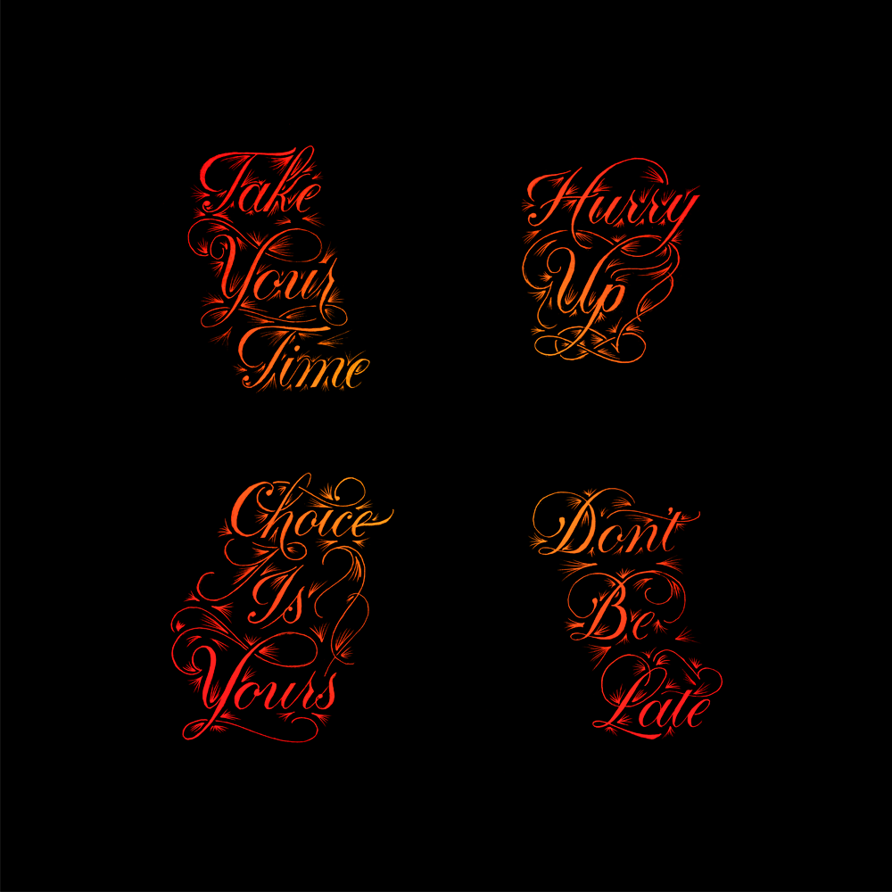
All four pieces were done on separate pieces of paper, and aren’t inked – they’re just pencil sketches. I took a picture of each one and arranged them digitally. After a little experimentation with some colours, I settled on going for something with a warm feel. There’s definitely a clash between the visual style and the sound of the music that the words come from, but it’s differences like that that are often the most interesting.

Stylistically, the pieces are Copperplate calligraphy with a lot of flourishing. The flourishes help retain consistency through the four sections, but also serve to fill out the spaces that make the lines different. For instance, the first line, “Take Your Time” fills its own space very well, having three four-letter words. The other lines, however, all have one two-letter word, and the second line is only two words long. Though they do make the shapes less inconsistent, I didn’t want the flourishes to force the shape of each section to be identical, as it might look strange, and it would detract from the differences in shape due to the lines. These differences are what make lettering unique and beautiful, and they also add an interesting asymmetrical negative space between the blocks.

This is one of the few forays into coloured work that I’ve done to date, but enjoyed the process and the result, so hopefully there will be a few more splashes of colour coming in the future.

The Medium is the Message is the Medium…

If one thing is equal to another, then the other thing must be equal to the first. Similarly, Euclid explained two things that equal the same thing must equal one another. So if the medium is the message, we can deduce that the message is the medium, and anything the medium is equal to is also equal to the message. What third thing would that be – the thing that both the message and medium are? Why, today’s piece, of course!

The Medium is the Message is..

This one plays a little game with the idea that if one thing is another, then the other is also the first. After all, if A=B, then B=A. Seems simple enough, right? But what is really the meaning behind this message? It seems to imply, as I said two weeks ago, that the message, as the creator saw it, should be disregarded and tossed aside in favour of the study of the medium itself. That implied that what the creator had to say was less important than the way they said it. In effect, it meant discarding one thing and replacing it with another. But if we take the phrase more literally as I did four weeks ago, it implies that the two things are the same.

In language, unlike in mathematics, you could easily say that there are cases where A=B but B≠A. For example, “The ink is the colour black,” but not “The colour black is the ink”. It’s a little contrived, but you could make the argument. I have much more fun, however, taking the word “is” to mean the same as an equals sign, which leads me to come up with pieces like this.

A fun compositional technique that calligraphers sometimes use is to write in a circle or spiral, especially if the subject matter fits thematically with the composition. Usually, however the piece has a break in it to indicate the start and end of the phrase. This piece is fun because due to the simplicity of the sentence structure it allows for the piece to join onto itself and have no defined endpoint. That being said, the eye of the reader naturally arrives on the upper left part of the piece, so the word “The” fills the position of the start of the sentence before the reader sees that it loops, having no end.

Here are the 3 pieces all next to each other:The Mediums are the Messages

With each of them, I’ve tried conveying a slightly different meaning, a slightly different take on the phrase, doing so by changing the layout to get the point across, and keeping the phrase the same (for the most part). So does that mean that the medium really is the message? I’m not convinced that that’s all there is to it, but it’s interesting to consider that layout, presentation, the medium and the way we communicate can sometimes lead to greater insight than what is actually being said. After all, how many articles or blogs (this one included) do you think there are where people skim lightly over the text, but what stays with them, or what they pay attention to is the images?

L’Appel du Vide

With a similar theme but a different style to a piece I did a while ago (Vertigo) today’s piece is “l’Appel du Vide,” a French phrase that translates as something like “the Call of the Void.” What exactly le vide is, whether it be the void, the abyss, emptiness, is not exactly clear. Nevertheless, it refers to the feeling people sometimes get at great heights or in risky situations where some strange call tempts them to jump.

L'Appel du Vide Angle

Stylistically, this piece is similar to another piece I created a long time ago (Thursday). I felt that the style fit well with the meaning of the phrase. The negative space of the word Vide indicates whatever it is conjured by its meaning as abyss or void, the busy surrounds emphasising the effect. The flourishes also show a kind of swirling movement pattern, which is in keeping with the idea of dizziness or vertigo.

The first two words are in a Copperplate style, notably with French style P’s. Seeing as the phrase is in French, I felt it was appropriate to use the French variation, even though to an English speaking audience they can often look like N’s with a strange elongated left foot. The word Vide is done with strong Roman caps, meant to make the word more impactful and make it stand out against the fluidity of the flourishes behind it. As such, the word is in contrast with its background in both tone and form in order to preserve legibility, similar to the choice of letter style in the linked Thursday piece.

Here’s a front shot to give an idea of the composition of the piece on the page, too.

L'Appel du Vide

The Medium is still the Message

The title of the post isn’t quite what it says in the piece, but that’s because what it says in the piece is the same as it was in a different piece two weeks ago. The Medium is the Message. For me, the medium is very much the message. As such, what we usually consider to be the message (the words) could be said not to be the message at all. As a fun way of exploring the idea, I remade the piece from two weeks ago with a completely different composition.

The Medium is the Message 2

This one is still vertical, and it still has flourishes, and it’s still in black and white, but other than that, it’s visually quite different. In this piece, I’ve given the word “Medium” a strong emphasis. In the original piece I did (which you can see blurrily off to the left, the words “Medium” and “Message” had equal importance. In fact, they were almost mirror images of each other, from the style to the layout to the flourishes around them. This was to show that they are the same thing, as the phrase suggests.

The phrase is a little confusing, however. The confusion comes from the double meaning of the word “Message”. In this case, you can approach the phrase from two angles. The first being that it implies that medium and message are one and the same, that the format is the words, the words are the meaning and the meaning is the layout, which is the format. The second being that what we often call the “Message”, i.e. the words, is unimportant, and that the true message is the medium itself. Phew! Confusing stuff. Either way, what that means is that while the first piece I did showed similarity and reflection, this one’s hierarchy is such that it shows the importance of the medium over that of the words, and implies that the words are not where the message lies.

You know, maybe I’m over-thinking the message in the words and missing the point entirely… The medium is the message, after all.

The Medium is the Message

I learnt about an idea recently that the way in which a message is conveyed often tells us more than the actual content of the message. Certainly, there was a story a little while ago about a man who decided to hand write all his tweets and take photographs of them instead of typing them out. He didn’t change the things he was tweeting about, but he changed the way he was presenting the content. Needless to say, it attracted a lot of attention, and I heard about it through some of the lettering and writing channels I pay attention to.

The Medium is the Message

For me, much of what I do is about the medium rather than the message. I spend my hours and days crafting the letter forms and composition in ways that complement the message I have chosen, but the actual subject matter of the words comes under much less scrutiny throughout the process. The phrase “The Medium is the Message” could imply that the the two things are one and the same, and are inseparable from each other, but in this context I would say that it means that the medium is not just a delivery system for the content, but that is more significant than the content itself. Of course, if I only had the words to communicate, I could simply write them down and take a picture like the twitter user, so it would be true to say that it applies to what I do.

Make No More Excuses in 2015

So it’s a new year, but I decided to wait to do this piece until we were a little bit of the way into it so that it didn’t come of as a New Year’s Resolution. It’s pretty easy to make excuses for why we don’t do things. Sometimes it’s things we might even want to do, but it’s hard to motivate ourselves to do, and instead we end up mindlessly consuming media instead of doing anything productive. It’s what our brains seems to desire, but not what they need. The virtual equivalent of junk food, so to speak.

Make No More Excuses in 2015

So, this year, I’m only going to make one more excuse, and then after that, no more. So what’s my excuse? “Sorry, I have to stick to my plans.”  My excuse is to keep to my commitments. After all, what’s more fulfilling than achieving things?

Incidentally, this piece was also a little experiment for me to see how I have progressed since I started lettering. When I first gave it a go, I did a piece a day for a week. To measure up to what I came up with in that week, I decided to do this piece in a day, too. Starting from scratch with the phrase “No Excuses” I sketched out several designs before I found that I preferred having something a bit longer, and lengthened the phrase. From then, I moved onto sketching the piece out at full size and inked it all today!

Do Your Best

Everyone likes to do their best, even if it’s hard. Even if you do it and then you get nowhere, at least at the end of it you know that you did your best. After it’s finished, you can tell yourself that even if you had tried, you couldn’t have done any better, because what you did was your best. Who can feel bad about that?

Do Your Best

Sometimes your best isn’t very good. Or maybe it’s good, but it’s not quite good enough. In those times, it can be hard not to give up, too, but if you keep doing your best, eventually your best stops being bad, or it becomes good enough. It sounds simple enough, doesn’t it? Keep doing your best until your best becomes good enough. In fact, the structure of it is pretty simple, even if the act might not be. The act of doing something might be the most gruelling and difficult thing you can imagine, but if you stick to the rights structure, it tends to end up with your best being good enough. So what is the structure? It’s turning up and doing it all the time. It doesn’t matter too much when or where, but if you do your best all the time, then it’s pretty certain that it will work.

So what does it mean to do your best? Well, sometimes, it’s not just plugging away at something as furiously as possible. Doing your best doesn’t always mean putting in as much effort as you can. To do your best sometimes means to figure out a way to do something more easily or more efficiently. Sometimes it means spending a lot of extra time now in order to learn how to save a little time consistently in the future, which adds up to make a saving. But more often than not, doing your best starts with doing.

Are you doing it?

It’s Never Too Late to Start

It’s been an interesting week for me. Coming back home from visiting family in another country was going to be fine, but unfortunately the trip back was interrupted by some surprise friends in the form of kidney stones and a cold. In addition to that, my wife suddenly had a new job start, all of which meant that I didn’t get round to doing a piece for this Monday’s blog post. So I could have though it no big deal, and just put it off until next week, but I’ve had a piece that I wanted to do for a while now on the back burner that fit what was going on quite well.

It's Never Too Late to Start

It’s never too late to start. Well, for me, I started pretty late. Past the deadline, in fact. But that doesn’t mean that it didn’t get done. Sometimes it’s too easy to fall into an all-or-nothing mindset where we think that if we slip up or miss something once then there’s no point carrying on. This can often lead to us abandoning the things we had previously told ourselves we would do, whether it be working hard, exercising, or sticking to resolutions. How many people make resolutions each year only to end up not sticking with them? Probably most. And how many of those failed attempts begin to fail right before we give up entirely? I’d say probably most again.

So this piece is me saying that even if I’m late I’m going to keep doing it. I won’t give up just because I hit a bump in the road. Sometimes starting is all you need to do to be able to keep going and get something done. And it’s never too late to start.

Live in the Moment

A little while ago, I did a quick sketch of a design for a daily doodle, which I decided to make into an inked piece this week.

I’ve been taking a while off from doing a piece every day because of travelling and visiting family, but I’m still keeping up with weekly updates on inked pieces. Fortunately for me, I have lots of designs available to play with from having done so many daily pieces. Here’s the initial sketch:Live in the Moment

With this piece, I wanted to make it look like something you might see on a badge or fabric patch, so I started by choosing the shape I wanted to go for, then working around that to fit in the lettering and the ornamentation. The phrase is pretty short, and the length of the words lends itself well to giving the piece a sensible hierarchy.

Be A Better You

It’s around this time of year that people start thinking about what their New Year’s resolutions will be. Though it’s better to make serious lifestyle changes rather than half though out plans just because of the time of year, I thought I would make a piece pre-empting the following year.

Be a Better You

This piece started out as one my daily doodles a little while ago. I enjoyed experimenting with the composition, and used a similar layout for another piece at around the same time, but felt that this one went well with the phrase, so I decided to ink it.

There are a few new elements in this one that I haven’t explored much in other pieces. First of all, it’s one of the few times I have used a monoline style (“BE A” and “YOU”), where there is no real difference in the thickness of the strokes. While I tend to think that a high contrast between thick and thin strokes looks better, there is certainly a place for monoline styles, and here it’s in the less important supporting elements of the piece. One advantage of this is that thin hairlines on letters can often get lost, or hard to make out at smaller sizes, thereby decreasing the legibility of the piece.

The second thing to talk about is the decision to join the ETT in “BETTER”. It’s a bit of an old sign painting trick to join a double T together and save a little space, but I decided to take it a little further and have the serifs of the E and T but up against each other and share a bit of the same space. It’s not really a necessary technique, seeing as I have as much space as I want to play with when designing on blank paper, but it adds a little interest to the piece, and lends a hint of the old sign style lettering that you can sometimes still see painted on the gable ends of old buildings (at least in Europe – I can’t speak for elsewhere.)

With Christmas so close, and days spent travelling and shopping, daily doodles have taken a back seat, and I’m taking a couple of weeks off from doing them. Fear not, however, for they will return soon enough, at the start of the new year.

Merry Christmas!