Lose track of time

What would the world be like if we stopped keeping time? Probably a lot harder to make appointments, but there is something to be said for not looking at the clock. We’re surrounded by numbers that we get can get too carried away with. Nowadays, it’s like-counts and numbers of follows, but the king of them all is the clock. Sometimes it’s nice to just do something and not worry about how long it’s taking or when you have to finish, put away the screens and stop looking at the clock.

Do Something that Makes You Lose Track of Time

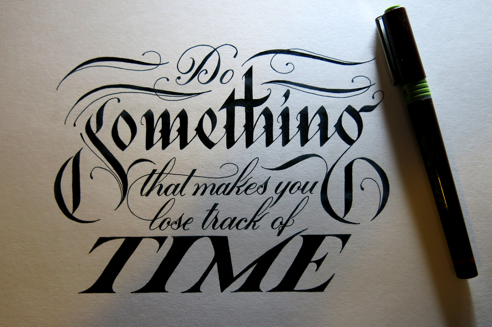
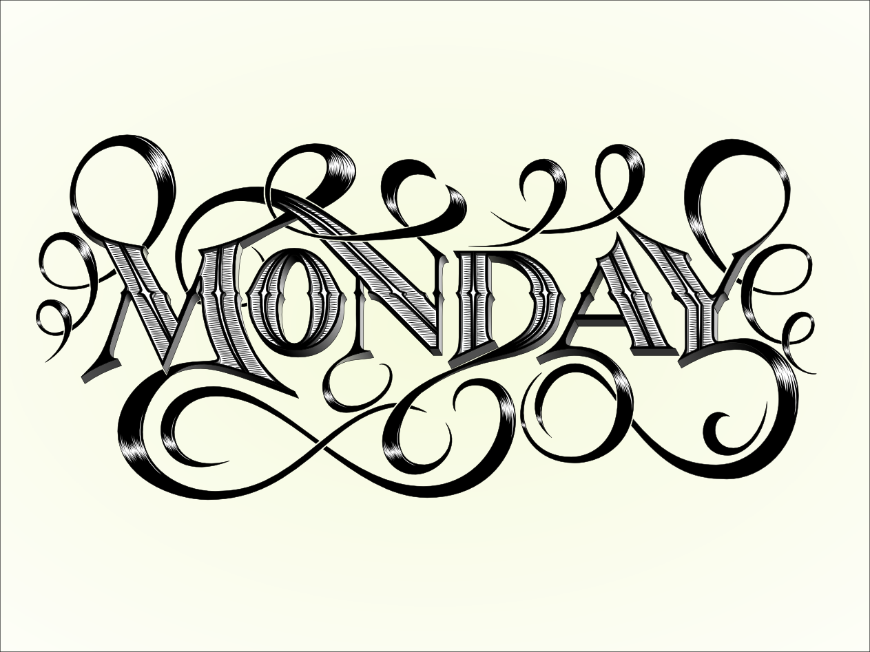
That being said, you may notice that I still put this up in time for Monday’s deadline. Consistency is nice too.

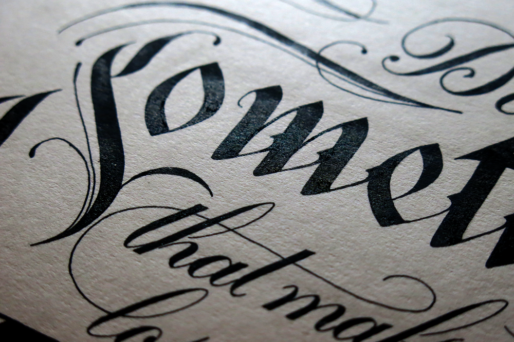
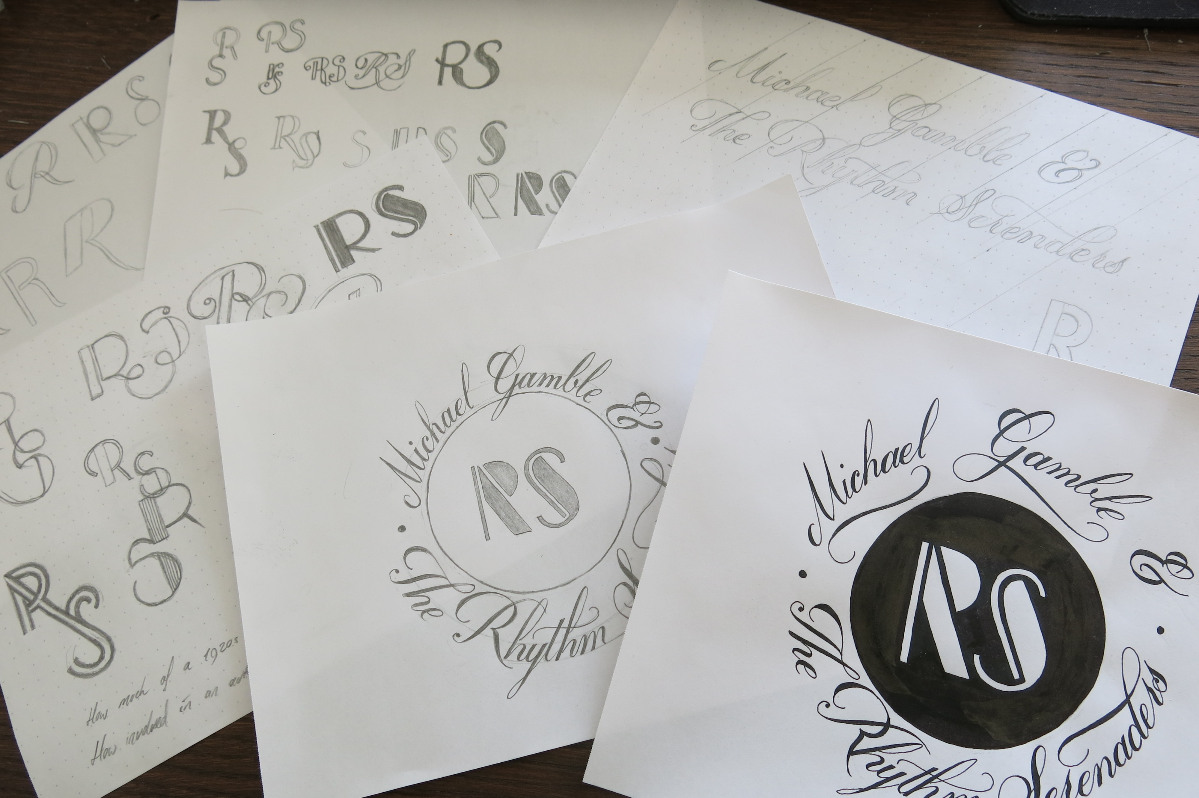
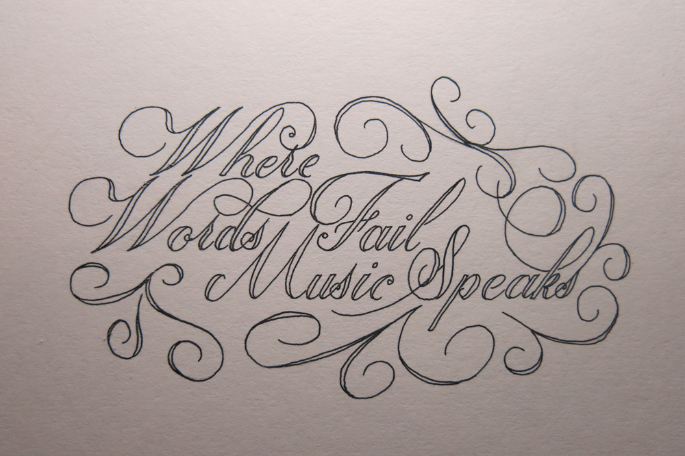
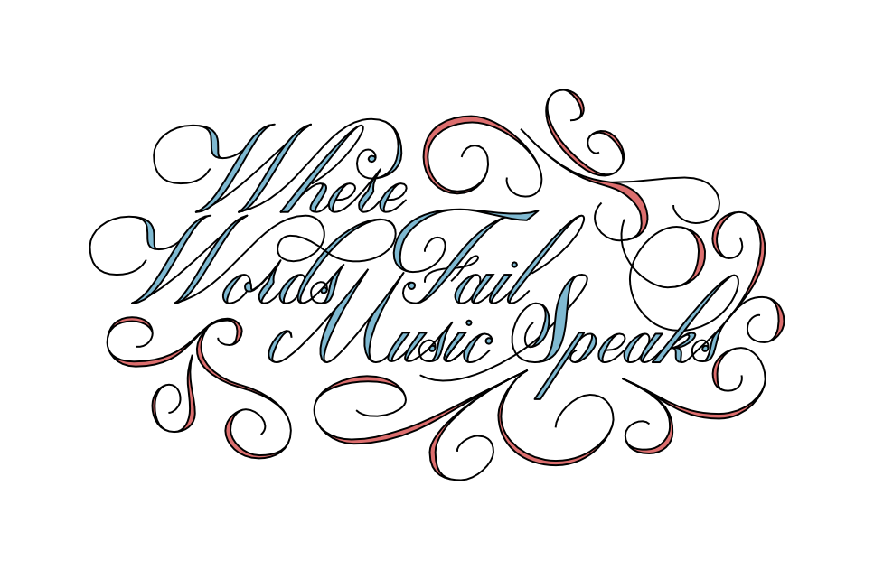
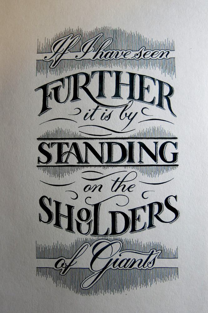
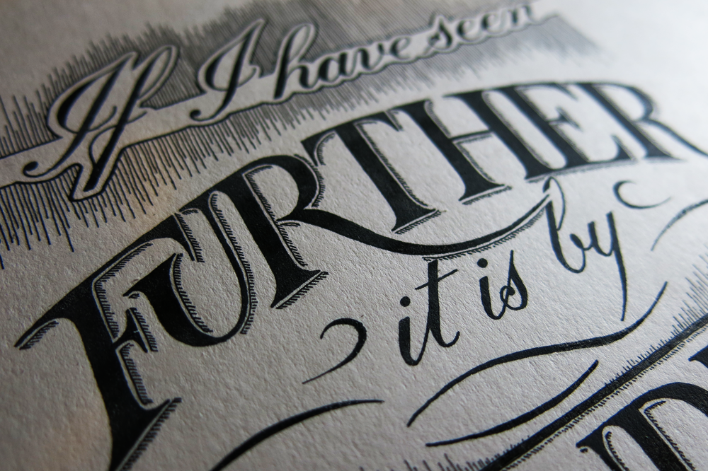
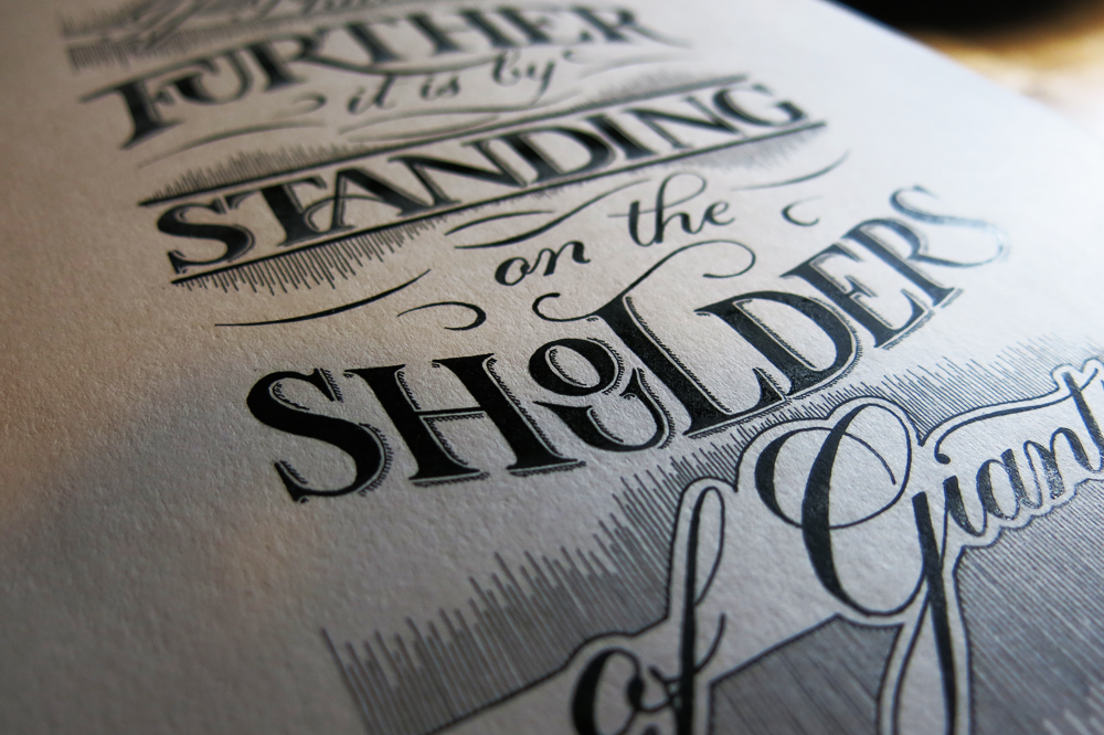
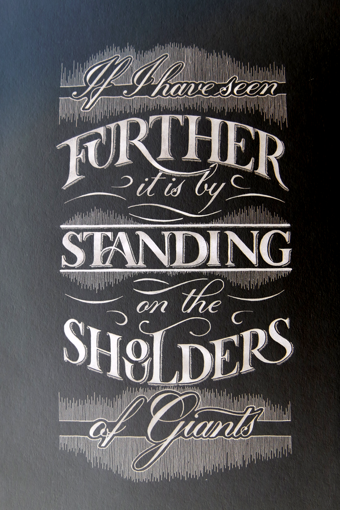
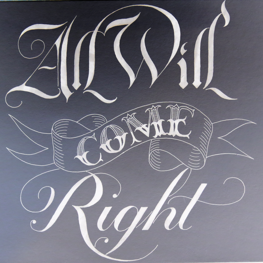
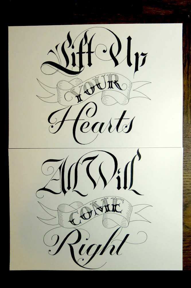
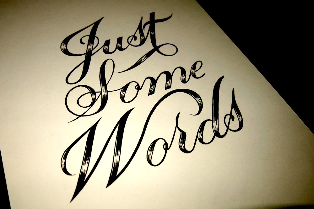
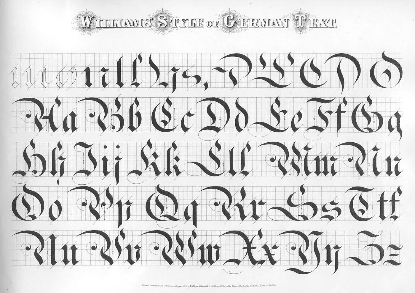
This piece is a bit of a blend between a few styles of calligraphy. The Roman caps you see at the bottom come from a style that was originally a kind of calligraphy done with a wide brush. The Copperplate, (how could I not include it?) is done with a flexible pointed pen, and the Gothic inspired “calligraffiti” is one of the newer styles I’ve been experimenting with using my pilot parallel broad edged fountain pens. All in all, it’s not only a mix of hands, but a mix of instruments. Of course, here, everything was done with the pen in the picture, which is more of a fine liner than any of those other things are.

Lose Track of Time Closeup

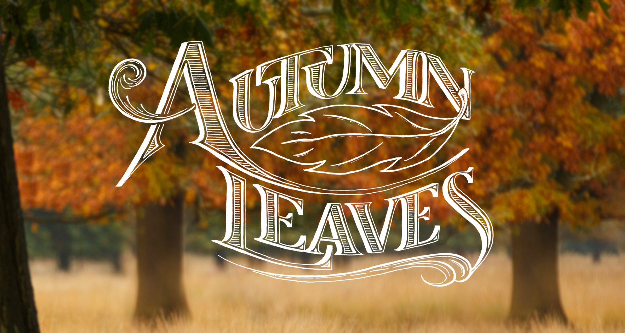
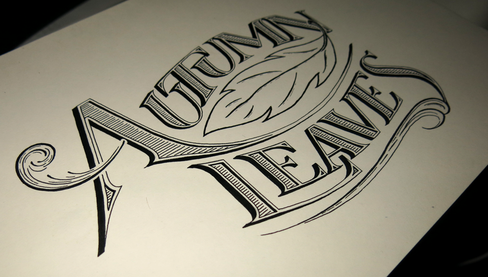
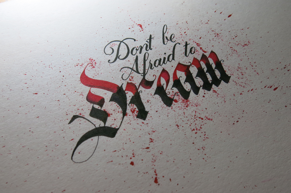
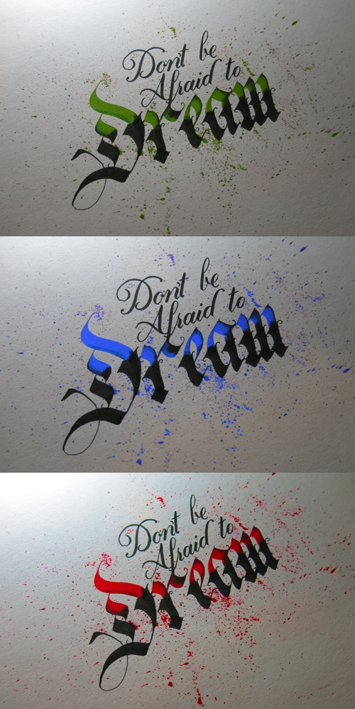
In learning about calligraphy, and practising the scripts themselves, you can certainly get a better understanding of the letter forms and how they work. It’s an important thing to learn for a letterer, but nothing quite beats meticulously planning out the piece and carefully constructing it. A similar effect could be done through calligraphy, of course, but there are all the little touches that you can add in being free from the restrictions of your tools that make lettering a different art.

Autumn Leaves

Autumn is here. The leaves are piling up. The night is getting colder. It’s getting light later and later in the morning, and I’m not looking forward to my morning bike ride in the dark, which I’m sure will start happening soon. However, currently, it’s still nice enough to be enjoying the last of the warm weather, so I thought I’d do a piece with a seasonal feel.

Autumn Leaves

I had fun fitting the design around a little drawing of a leaf, and incorporating some bits and pieces to give a windy feel, like the crossbar of the A, or the ornamentation under the word “Leaves”. I was aiming for a piece that would incorporate some of the techniques I employed in Standing on the Shoulders of Giants, where I experimented with some ways to save space without making the piece seem too cramped. Here, I have made use of the convenient “UTU” in “Autumn” to nestle everything close together. I did consider joining the lower right serif of the first E in “Leaves” with the foot of the neighbouring A, but I think that the spacing works out well enough without having to do so. One of the great things about working with Roman capitals is that they retain their legibility even if you make them do all sorts of gymnastics. I also wanted to add a splash of colour, so it was nice to set the piece onto some autumn colours. I found a great tutorial a few months ago, which showed how to isolate text from a lettering piece and set it over an image, which made things quick and fun, and really sped up the process.

Here’s a little shot of what the piece looks like on paper:

Autumn Leaves Snap

In other news, this week, I have started a daily drop cap doodle, which you can check out if you follow me on twitter. I should think that I will post them all here at some point, whether all together once the alphabet is complete or in a few instalments, but if you’re curious, check back to my twitter page each day to see what the next drop cap!

Where Words Fail Music Speaks

This is a little piece I threw together this week. When I say little, I mean it! It’s pretty small. The x height is about 5mm, which for calligraphy isn’t so tiny, but compared to the lettering pieces I usually do, it’s quite small.

Where Words Fail Music Speaks

What I was aiming for with this piece was to go for a relatively simple calligraphic style and try to capture the feeling that I’ve seen in lots of progress pictures of lettering pieces that seems to get lost in the final piece. During the design stages the letters are often sketched out, and perhaps filled in lightly with pencil, but usually have darker outlines. Once the piece is inked, the feel of the letters and the overall impression of the piece becomes very different. Having the outline stand out somehow makes the piece feel a lot more spacious and delicate.

This piece is in fact a quote from Hans Christian Andersen. Being a musician and an awkward English person, I often feel that words can fall short whereas music is something that provides a different kind of connection between people. I saw the quote and decided that it would make a nice piece in a calligraphic style. Compositionally it suits a piece that is all in the same style rather than a grand, type-mixing poster. The message itself is about the inadequacy of words, and yet the message is in words itself, so it also suits a relatively understated style.

Recently, I’ve been digitizing more pieces (some to come in a few weeks, too,) so I thought I would quickly throw this piece through the digital assembly line to add a splash of colour. I have a few coloured inks, so I should quite like to add some colour to the physical piece, but the colours didn’t really match up with composition, so I will have to wait until I get some other colours. Here’s the digital version:

Where Words Fail Music Speaks 2


Shoulders of Giants

This week, I have been focusing on a lot of things, which sometimes leads to not managing to find a good direction in any one particular thing. However, knowing this, I took a couple of days over the weekend to put aside all other projects and work on a single piece. I think it worked out for the best, seeing as I didn’t distract myself with anything else. The piece is thematically similar in some ways to The Greatest Victory, which I wanted to create a poster-like piece with, and I did the same with this one. It’s a quote originally by Bernard de Chartres, but which is more often attributed to Sir Isaac Newton, who wrote it in a letter as it is phrased here.

Shoulders of Giants

With this piece, I focused my efforts on creating something with a minimum of styles. It’s too easy to get carried away with adding in everything that you’ve learnt, but that often leads to something that is too muddled: something I struggled with in my early pieces, and still do sometimes. Here, however, there are only two styles: Copperplate calligraphy and Roman caps. The challenge then, past restricting myself to the use of only these styles, was to find other ways to explore them. Roman caps, particularly, can seem very much like the basic, standard letter forms, and that’s because they are. Because of that, however, you could say that they are too normal, so I took some inspiration from old sign painters’ inclination to use interesting ligatures to fit words into small spaces, with the U in “Further” tucked under the F, and the OU in “Shoulders” arranged in a little stack.

Other than that, I also concentrated on creating a piece that was mirrored in its composition, and didn’t have ornamentation of too many different kinds. I liked how the Copperplate worked out in the previous piece, so I included it here too, which gave me more steady hand practise with lots of little lines.

Here are a couple of close ups:

Shoulders of Giants Detail 2

Shoulders of Giants Detail

And just because I enjoyed the negative version of last week’s piece so much, I thought I would give it a go with this piece too. It turned out quite well, and it really does create that chalk-board effect!

Shoulders of Giants Negative


All Will Come Right

Last week, I did a piece that was part of a Churchill quote. This week, I have done the second half! The two pieces are designed to fit in a square shaped layout, and be displayed next to each other. Eventually (perhaps not next week, but at some point) they will be joined by a third piece which will fit beneath them, being twice as wide as it is high, so that the whole ensemble creates a larger square to complete the whole quotation.

All Will Come Right

I’ve inverted it here to give it a nice chalk board style look. It’s visually very similar to the piece last week (of course, that’s the point!) so to create a little contrast, I thought it would be nice to see it in white-on-black. It’s so simple to make it a negative, and it almost feels like cheating, because you end up with something that feels so different. Sometimes I see work done by others and I can’t tell if they’ve done it on black paper with chalk or or some other white medium or whether it’s a simple inversion, so it’s interesting to finally get round to doing so with a piece of my own.

Here are the two pieces in the same photo so you can compare:

Lift Up Your Hearts, All Will Come Right

The goal was to make these pieces resemble each other as much as possible. The obvious choice is to have them structured the same, and to used the same styles. Of course, the similar sentence structure is not only useful as a tool of great rhetoric, but also helps with keeping the two pieces the same. It’s simple enough to see that the styles are the same, and that the banner in the middle is the same shape with the same Tuscan font, but there are also a few other structural similarities that I’ve worked into the pieces to keep them consistent. For instance, the underside of the first line swoops down, then up, in order to match the banner beneath it. Both pieces also have a semicircle in the centre at the top, and have a similar shape at the bottom with the leg of the H/R respectively.

Don’t be Afraid to Dream

This week is another New-Pen-Week! Last time, I got some Rotring Rapidographs, which I use pretty much the same as the old fine liners I started out with. Not much changed in the style of work I produced, but for me, the process was changed a little. This time, however, I got some Pilot Parallels, which are a kind of fountain pen for broad nibbed calligraphy. I’ve been wanting to start practising some broad nibbed calligraphy for a while now, so that I can further my understanding of Gothic/Blackletter styles, and this week allowed me the chance to give it a go!

Don't be Afraid to Dream

I found a wonderful image that displays a style of Blackletter that I haven’t seen reproduced quite the same anywhere else. The title of the image is “Williams Style of German Text”, which doesn’t seem to bring up much other than the original image, so I don’t have much more information than what you see there. I’m sure there is much to learn in exploring the style, and I’m going to spend the next few weeks trying to understand the intricacies of what makes the letters function in the way they do, but in the mean time, I took some inspiration from the style, as well as several other styles I’ve seen around the web, and came up with the piece above.

The pens came with two inks, which was unexpected, but it provided me with the opportunity to experiment with a bit of colour, which is something I’ve been purposefully avoiding in other works in an effort to focus on form. After all, restrictions are what give us guidance, and having too many directions to explore often leads to little progress. That being said, it’s sometimes refreshing to allow yourself a little deviation. These inks are black and red, though refills are available for all manner of colours, so I’m interested in getting some more in the future. In the mean time, I found neat feature on my camera that replaces individual colours in a photo for others, no photoshopping required. Here, I’ve replaced the red ink with a green, blue, and brighter red. Look how each colour creates a different feel for each piece. Colour matters!

Don't be Afraid to Dream Colours

The speckles that surround the letters were made by pulling on the tip of the nib, and letting it go, which flicks the ink on to the paper. Unfortunately, it also flicks it everywhere else, so I ended up with some red fingers, pens and surfaces. Before I did the speckles, I first drew out some guidelines for the word “Dream”, then wrote in the red parts. Once they were dry, I went over in black to complete the bottom part of each letter, then added in the Copperplate above with a brush pen. The speckles came in last because I didn’t want to get my hands so messy if I ended up making a mistake and discarding the paper!

Just Some Words

Just some words, just for fun. Another piece inspired by the brush pen style of Copperplate calligraphy that I’ve been doing recently, which has been steadily infiltrating my lettering work.

Just Some Words

I thought, with this piece, that I would keep it as simple as possible. I love to create fine details in all of my pieces, so recently, I’ve been focusing a bit more on simplicity, in order to concentrate more on form. So this piece was going to be filled in with solid black, but when it came down to it, I thought I would add in some of the “shine” elements that I had included on the ornamentation on Monday. I thought that there’s no reason not to, and if I wanted to, I could fill it in after I had finished, so that it was fully black, but I think the effect suits the piece well.

Something else to mention with this piece is that it’s not a combination of typographic or calligraphic styles, which is something I do in most pieces that involve more than one word. The reason for this is that having more than one style in a piece naturally gives it a hierarchy, or at least some contrast in the way you view the words. With this piece, however, I felt that seeing as the word length was so similar, and there being no really strong focal point of the phrase, it would be best to have it all in one style. Aside from anything, the meaning of the phrase is such that it lends itself to something that seems more casual, so it would seem odd to have “Just Some” in a weaker style that “Words”, which would probably be the way it would work out if you wanted to give any of the words more weight. In that case, the word “Words” would seem too important make it seem that it wasn’t, in fact, just some words.

Monday

It’s Monday! Or at least, yesterday was Monday. In celebration of this fact, here’s something I finished on Sunday!

Monday

I posted it over at reddit a couple of days ago, and it got a good response, but I’ve only just had the time to make a blog post about it. So, what’s the deal? Well, I’m thinking of starting a series called Days of the Week. I’m sure you can guess what will be featured. I’m planning on doing a different style for each one. The goal of the project could be that each piece should be as different from the others as possible. We will have to see how diverse I can make their styles. Striving for diversity is a great way to expand your skills and your portfolio, so it’s a win-win situation!

I think that many people could be afraid that they will produce terrible work, so they never try. People often ask me how I learnt to do things like this, and the answer is really just that I started doing it. I saw that others had done lettering pieces and posted them to the Internet, and I wanted to try too. Practically everything I’ve ever lettered is posted here on the website, and if you take a look through my portfolio, I’m sure you can see how things have progressed. Some of the earlier pieces aren’t so great, and I’ve learnt a lot since then, but I think it’s worth leaving them up there because it’s an honest reminder of where I came from. I think it’s worth being honest about something like that. They are the beginning of a journey that I’m taking, a journey that hopefully has no end. To come to the end would mean that there is nothing left to learn, and no improvement to make, and I’m sure if anyone thinks they are in a place like that, then they are missing something. So, I’m looking forward to finding out where this project will take me!

This project might be punctuated with other pieces, so it might take a while before I have the full-week set uploaded, but stay tuned to see what the rest turn out like!

Here’s a vectored version. I tightened up a couple of lines here and there, but overall, it’s pretty much the same as the inked one above. The main difference is that in digitisation, I have the opportunity to use gradients, so where I used hatching on the sides of the letters to shade them in the inked version, I had a play around with using gradients to achieve a similar effect.

Monday