Push Your Boundaries

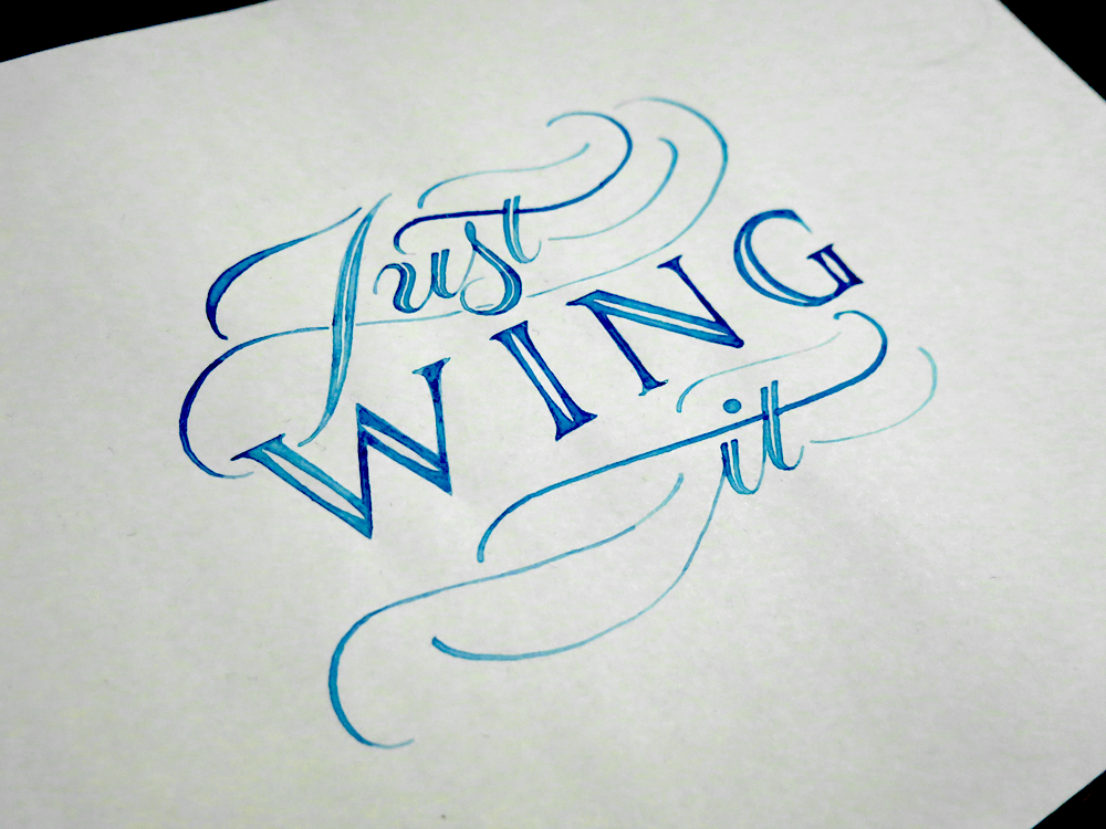
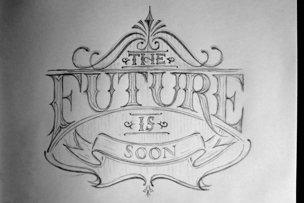
A bit of a fun piece this week. Many lettering pieces have vague yet encouraging sayings as the content, which is understandably popular. It’s the kind of thing that people like to see in a lettering piece. “Be Bold”. “Keep Moving Forward”. “Adventure Is Out There”. It makes them feel good and is quickly digestible as far as media goes. This piece is a little tongue-in-cheek look at that trend, with the phrase “Push your boundaries. Or don’t. Whatever. I can’t tell you what to do.”

Push Your Boundaries

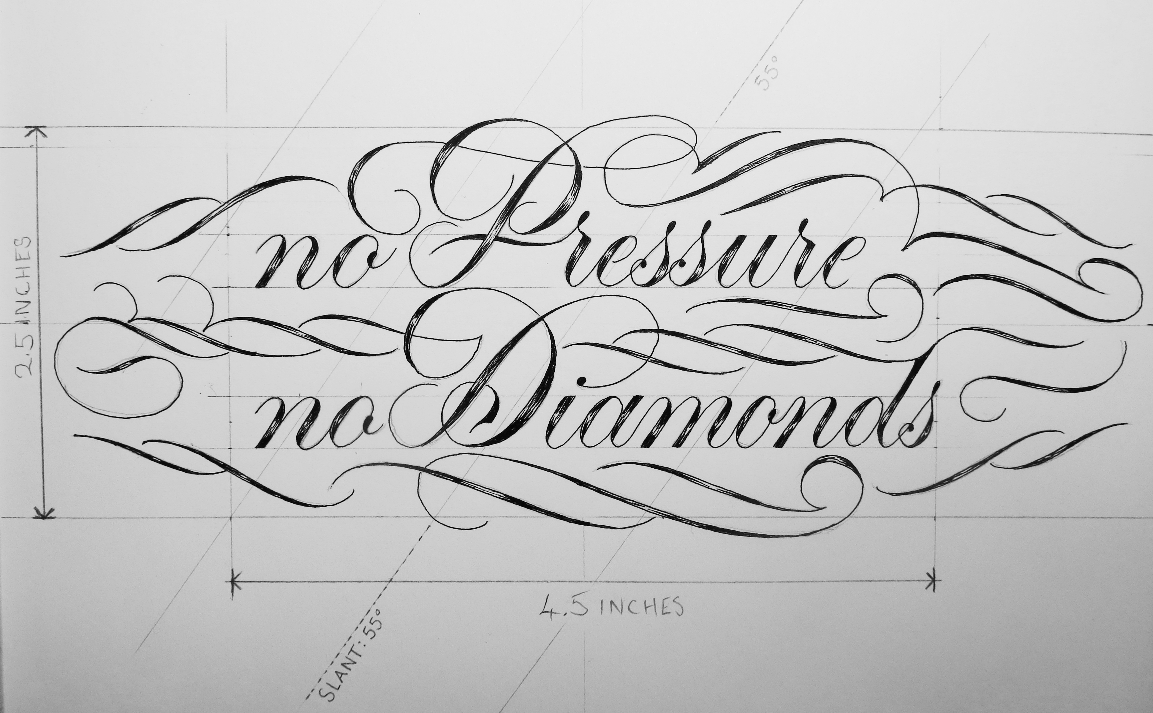
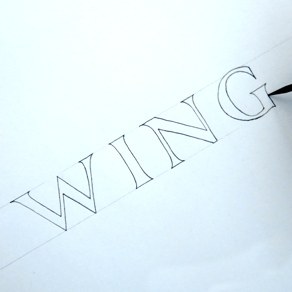
Typographically, this piece contains quite a high number of styles. Centrally, of course, are Romans. Eye catching, legible, functional, timeless, all the things we know Romans to be. Above the Romans is a flourished Copperplate style script. There is more Copperplate further down, but it’s a much more functional style that features short ascenders and descenders. It’s the kind of Copperplate that is best suited for text of low hierarchical standing: not intrusive, nor showy, but retains that distinct Copperplate flavour, providing a nice contrast with the text around it. Text in the final style, which is a monoline sans serif.

The section from “or don’t” onwards acts as a subtitle to the piece, and as such can be treated thematically more like a section to contrast with the main text. The main text is flourished, and where it’s not flourished, it’s serifed and grand. When pairing typefaces, a quick-and-dirty rule is that a serif and a sans serif of similar styles will do well together. Here, you can see that with the differences between the large Romans and the monoline sans serif (which are Romans too, Romans simply meaning what we often call capital letters nowadays.) In this way, it’s as if the Romans in the title are reflected in the sans serif of the subtitle, and the Copperplate in the title is tied, of course, to the Copperplate in the subtitle.

So why pair Copperplate with Copperplate? Why not throw in some Blackletter or some Italic or something? Risk of the piece becoming cluttered with too many styles aside, when it comes to pairing scripts it’s important to consider how they are made. In this piece we already have Romans, which are a broad edge creation. Copperplate, on the other hand, is made with a pointed pen. So we have a broad edge script and a pointed pen script in the title. Seeing as we already have the sans serif (which ultimately stems from the same source as the Romans – i.e. broad edge) in the subtitle, it would be a mistake to include another broad edge script. There would be nothing in the subtitle that reflected the Copperplate in the title. So to complement the Copperplate, we want another pointed pen script, and when it comes to pointed pen scripts, traditionally, the choice is rather sparse. Popularly, you can choose from Copperplate or Spencerian, and Spencerian is really better suited to longer texts, as it’s more of a business hand than a display hand. So we’re left with Copperplate and Copperplate. See how we got here? Fortunately for us, Copperplate lends itself quite well to having extravagant flourishes or to being toned down to sit meekly in its place between the sans serif, meaning it’s an ideal script to use to pair with itself.

No Pressure, No Diamonds

When do you think you produce your best work? Is it when you have all the time in the world to plan and tweak and refine? It has been said that work expands to fill the time allotted, and if you’re a perfectionist, I’m sure you would agree that there’s an element of truth in the saying. It’s also said that you never grow if you never stray from your comfort zone. If your ideal working scenario is comfortable and calm with endless time, it could be that you would benefit most from denying yourself that environment. After all, no diamond was ever created where there was no pressure.

No Pressure No Diamonds Angled

No Pressure, No Diamonds! What does it mean? It means something enough to one person to have it emblazoned on their skin, in fact. This was a client commission for a tattoo that I wanted to share with you for two reasons. The first is to show off my process for tattoo design, and the second is because the subject matter is oddly fitting in this case. The brief for the piece, that is the words themselves and the layout, didn’t seem to lend themselves well to any of the styles that I have been becoming more familiar with. My love for Romans, my penchant for combining styles, tendency to create tiny details in pieces, all were at odds with what this piece needed to be. The text needed to fit within a 11.5 x 6.5 cm space (4.5 x 2.5″), it needed to be well legible at that size, and it needed to (of course) be typographically sound.

Here are some specifications that I included since the piece was being passed from one artist to another (i.e. from me to the tattoo artist who would execute the design):

No Pressure No Diamonds Measurements

In the early design stages, I had difficulty coming up with anything that would satisfy my standards. One of the main things I had to tackle was the word length. Two very short words and two quite long words. Just by the nature of the phrase, many design possibilities were taken off the table that would normally be there for phrases with more equal letter distribution. Eventually, I managed to create a small selection of designs that I had some interest in taking further. The client had requested something in a fluid kind of script, but I find it best to explore all available options before continuing because there are often solutions hidden in places that don’t seem obvious at first, and closing doors early on is a great way to get stuck. And getting stuck wasn’t something that I needed any more of with this project.

No Pressure No Diamonds Concepts

So what happens at the end of the story? Well, the hero perseveres and comes up with the best design ever, not through luck or coincidence, but through effort and hard work!

Really though, that’s pretty much what happened, minus the hero part. As it turns out, even a project that you feel doesn’t mesh well with your style, or doesn’t seem to fit well with what you would usually like to do can be turned into something you make your own, something you can really put your heart into and work on with as much enthusiasm as any other, and come out at the other end with something you can be proud to write a blog post about.

So one of the reasons I wanted to write about this project in particular was because it was a case where the pressure was on to create a piece that was worthy, and in the end I created a result I was happy with, despite the difficulties, which is kind of the point of the piece I was making. No Pressure, No Diamonds. How meta.

Just Wing It

Sometimes you need to stop preparing and jump in at the deep end. This weekend I went for a swim in a lake, and it turned out that the summer hadn’t warmed it up enough to really be hot enough, but the plunge is by far the worst part of it. After you get going with something, it often ends up not being so bad. Some times, you need to just wing it.

Just Wing It

So here’s a little piece that puts into practice the things I’ve been studying about formal Romans, with a little dash of Copperplate thrown in for good measure. All of that is becoming familiar ground for me, however, so where is the proof of the jumping in at the deep end? Well, I decided to finally start a little more serious experimentation with coloured work that isn’t in the digital realm. I bought some gouache and turned this piece into something colourful:

Just Wing It Colour

I’m pretty sure that that just about wraps it up for learning blue, so if I just learn the other 6 colours, I should have it all sorted out. In all seriousness, though, this was novel for me in both execution and design. Working with subtly different tones was interesting, but the experience was added to with regards to the tools used. When making something that’s simply black and white I use Rapidograph technical pens, but this piece is one of the first lettering pieces (as opposed to calligraphy pieces) that I’ve created using my traditional calligraphy tools, in the form of a broad tipped dip nib.

Wing

Calligraphy is a great example of an art that is all about the hours of practice vs the minutes, or even seconds of execution that it takes to make a piece. A skilled calligrapher has dedicated thousands of hours to learning the correct letter forms so that they can produce them swiftly at a moment’s notice. This is paying off in my own work, as sketching out Romans like these is becoming something that only takes a few minutes, and is backed up by the time dedicated to acquiring the knowledge that supports the letter forms. The process of this piece, then, is relatively simple, as the first step is shown above. With a couple of guidelines pencilled in with a ruler, the letters are quick to outline. From there, the next stage is designing the Copperplate and flourishes to surround the Romans, and filling the outlines. Lastly, I laid another sheet over the pencil version so that I could trace the letters in paint, and not to have to worry about erasing the guidelines after the paint was applied, all of which means that I end up with two versions of the piece, one graphite and one gouache, as pictured above.

Prepare Today for Success Tomorrow

A little while ago a client contacted me requesting a lettering piece. Surprisingly enough, I make more logos and digital pieces than physical lettering projects that get sent off in the mail. This client, however, wanted a custom lettering piece to give as a gift to someone special. The phrase was “Prepare Today for Success Tomorrow”. After many iterations, many design elements, hierarchy re-shuffles and composition tweaks, the piece was designed and inked as you can see below:

Prepare Today for Success Tomorrow

After that comes the part where you have to wrap it up tight and leave it in the hands of the postal service and international shipping companies, and hope that nothing terrible happens to your creation as it hurtles across the ocean. Thankfully enough (and predictably enough) the piece made it there just as it had left and everything was well.

Here’s a little close-up on the detail:

Prepare Today Detail

Though editing and digital manipulation were not part of the commission, I enjoyed working on the piece enough that once it was gone I couldn’t help but do a little more, so I took the piece into the realm of ones and zeros. Several weeks ago, I did some experimentation with using a photograph I had taken of some gold leaf to replace the colour and texture of the letters in a piece, and set it over a black background. The effect turned out well, so I used the same technique on this piece. I used the same gold colour, as it suited the piece’s luxurious style of flourishing.

Prepare Today For Gold Leaf on Black Background

I also experimented a little with adding a wooden texture. It gives a different feel to the piece than the gold does, and I can’t say that one suits it better than the other, just that they would serve different purposes.

Prepare Today For Wooden Texture

Stop Hesitating

If you’ve been following my blog since I started, or if you’ve lurked through everything I’ve uploaded (I know you’re there, lurkers!) then this piece might ring a bell. When I did my first Thing A Day, the second thing on the second day was a piece called Stop Hesitating. This time, I decided to redesign the piece completely and approach the phrase with a few new styles and techniques I’ve picked up since that time.

Stop Hesitating

It was interesting to revisit an idea, even if it was to completely redesign it. I considered simply re-executing the same design, and trying to tweak it in a few places, but I thought it would be more exciting to see what new ideas I could come up with. I went through a few different iterations before settling on this, and though the layout is similar to the original, the style and overall presentation are very different.

One of the reasons I decided to revisit this piece was because I liked the message. It stands as a little reminder that sometimes it’s all too easy to hesitate and be apprehensive before doing something, and more often than not, once you actually start doing whatever it is that you’re thinking about, it’s not nearly as bad as you had originally thought. That being said, I had a good time redesigning an old piece, so I may consider giving some of my other early pieces a bit of a rehash to see what good can come of them.

Make No More Excuses in 2015

So it’s a new year, but I decided to wait to do this piece until we were a little bit of the way into it so that it didn’t come of as a New Year’s Resolution. It’s pretty easy to make excuses for why we don’t do things. Sometimes it’s things we might even want to do, but it’s hard to motivate ourselves to do, and instead we end up mindlessly consuming media instead of doing anything productive. It’s what our brains seems to desire, but not what they need. The virtual equivalent of junk food, so to speak.

Make No More Excuses in 2015

So, this year, I’m only going to make one more excuse, and then after that, no more. So what’s my excuse? “Sorry, I have to stick to my plans.”  My excuse is to keep to my commitments. After all, what’s more fulfilling than achieving things?

Incidentally, this piece was also a little experiment for me to see how I have progressed since I started lettering. When I first gave it a go, I did a piece a day for a week. To measure up to what I came up with in that week, I decided to do this piece in a day, too. Starting from scratch with the phrase “No Excuses” I sketched out several designs before I found that I preferred having something a bit longer, and lengthened the phrase. From then, I moved onto sketching the piece out at full size and inked it all today!

Do Your Best

Everyone likes to do their best, even if it’s hard. Even if you do it and then you get nowhere, at least at the end of it you know that you did your best. After it’s finished, you can tell yourself that even if you had tried, you couldn’t have done any better, because what you did was your best. Who can feel bad about that?

Do Your Best

Sometimes your best isn’t very good. Or maybe it’s good, but it’s not quite good enough. In those times, it can be hard not to give up, too, but if you keep doing your best, eventually your best stops being bad, or it becomes good enough. It sounds simple enough, doesn’t it? Keep doing your best until your best becomes good enough. In fact, the structure of it is pretty simple, even if the act might not be. The act of doing something might be the most gruelling and difficult thing you can imagine, but if you stick to the rights structure, it tends to end up with your best being good enough. So what is the structure? It’s turning up and doing it all the time. It doesn’t matter too much when or where, but if you do your best all the time, then it’s pretty certain that it will work.

So what does it mean to do your best? Well, sometimes, it’s not just plugging away at something as furiously as possible. Doing your best doesn’t always mean putting in as much effort as you can. To do your best sometimes means to figure out a way to do something more easily or more efficiently. Sometimes it means spending a lot of extra time now in order to learn how to save a little time consistently in the future, which adds up to make a saving. But more often than not, doing your best starts with doing.

Are you doing it?

It’s Never Too Late to Start

It’s been an interesting week for me. Coming back home from visiting family in another country was going to be fine, but unfortunately the trip back was interrupted by some surprise friends in the form of kidney stones and a cold. In addition to that, my wife suddenly had a new job start, all of which meant that I didn’t get round to doing a piece for this Monday’s blog post. So I could have though it no big deal, and just put it off until next week, but I’ve had a piece that I wanted to do for a while now on the back burner that fit what was going on quite well.

It's Never Too Late to Start

It’s never too late to start. Well, for me, I started pretty late. Past the deadline, in fact. But that doesn’t mean that it didn’t get done. Sometimes it’s too easy to fall into an all-or-nothing mindset where we think that if we slip up or miss something once then there’s no point carrying on. This can often lead to us abandoning the things we had previously told ourselves we would do, whether it be working hard, exercising, or sticking to resolutions. How many people make resolutions each year only to end up not sticking with them? Probably most. And how many of those failed attempts begin to fail right before we give up entirely? I’d say probably most again.

So this piece is me saying that even if I’m late I’m going to keep doing it. I won’t give up just because I hit a bump in the road. Sometimes starting is all you need to do to be able to keep going and get something done. And it’s never too late to start.

Be A Better You

It’s around this time of year that people start thinking about what their New Year’s resolutions will be. Though it’s better to make serious lifestyle changes rather than half though out plans just because of the time of year, I thought I would make a piece pre-empting the following year.

Be a Better You

This piece started out as one my daily doodles a little while ago. I enjoyed experimenting with the composition, and used a similar layout for another piece at around the same time, but felt that this one went well with the phrase, so I decided to ink it.

There are a few new elements in this one that I haven’t explored much in other pieces. First of all, it’s one of the few times I have used a monoline style (“BE A” and “YOU”), where there is no real difference in the thickness of the strokes. While I tend to think that a high contrast between thick and thin strokes looks better, there is certainly a place for monoline styles, and here it’s in the less important supporting elements of the piece. One advantage of this is that thin hairlines on letters can often get lost, or hard to make out at smaller sizes, thereby decreasing the legibility of the piece.

The second thing to talk about is the decision to join the ETT in “BETTER”. It’s a bit of an old sign painting trick to join a double T together and save a little space, but I decided to take it a little further and have the serifs of the E and T but up against each other and share a bit of the same space. It’s not really a necessary technique, seeing as I have as much space as I want to play with when designing on blank paper, but it adds a little interest to the piece, and lends a hint of the old sign style lettering that you can sometimes still see painted on the gable ends of old buildings (at least in Europe – I can’t speak for elsewhere.)

With Christmas so close, and days spent travelling and shopping, daily doodles have taken a back seat, and I’m taking a couple of weeks off from doing them. Fear not, however, for they will return soon enough, at the start of the new year.

Merry Christmas!

The Future is Soon

Lately, I have been working on composing pieces with more ornamentation and flourishes. My goal has been to get a better understanding of how to create lettering pieces that aren’t based solely on the letter forms and the shapes of the words. Doing a daily doodle has given me some nice time to focus on exploring different options, and so for this week’s piece, I’ve used one of my daily designs.

The Future is Soon

“The Future is Soon.” I’m pretty excited about the future, and thankfully, it’s coming pretty soon. At times, the future has been much further away, but at the moment, the future is the closest it has ever been. That is to say that in the past, things didn’t change much for a really long time. Nowadays, however, things are changing much more. Change is, if nothing else, interesting, and though “may you live in interesting times” is often said to be a curse, I can’t help but feel excited.

The phrase “may you live in interesting times” is said to come from Chinese, though no source has been found. The nearest related expression translates to “better to live as a dog in an era of peace than a man in times of war.” And speaking of the future, it’s likely to have the least amount of war since pretty much forever. People often say that the world is going downhill, but in fact, we live in a time of peace and prosperity greater than any other. It seems like the future will be a pretty good time to live; that said, no day is better than today.

Here are some of the daily doodles I’ve done this week:

The Future is Soon

“The Future is Soon.” The sketch I made into an inked piece today.

Winter

“Winter.” A piece I made yesterday, the last day of November, in an effort to be a little seasonal.

Do Your Best

“Do Your Best.” A little piece to motivate myself to do well, but also to know that doing your best is always something you can do if you put in the time.

Golden

“Golden.” A single word piece to practice some flourishes and some tall letters in a circular design.

In other news, I got through the first of the nice A5 Rhodia pads of paper I bought a while ago. I started on just for daily doodles and the drop caps I did in Inktober. The “Golden” sketch was the last piece in this one, with “Do Your Best” being the first of a new pad. Here’s a picture of all the pieces I made with this pad:

Notebook 1

There are 57 designs here, and the pads come with 80 pages, which means I used 23 pages for sketching, tracing, ideas and as guard sheets.