
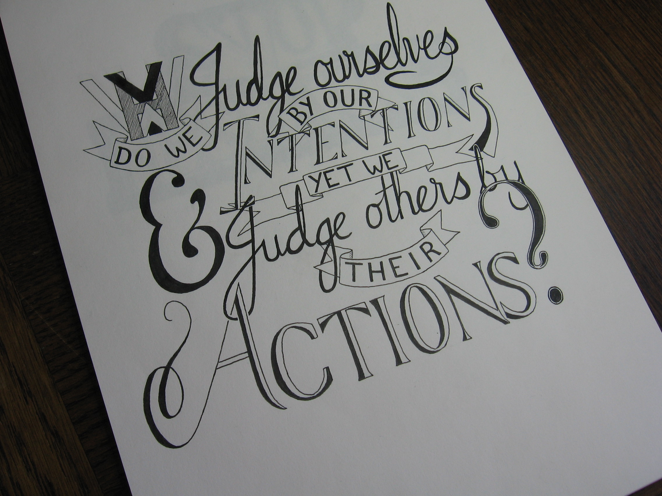
About a year ago, I discovered a thing called hand lettering. Having an interest in calligraphy, I had stumbled upon something that seemed similar. Custom designed and hand drawn pieces consisting of letters and words. An art form that centred around calligraphy and typography, constructed in pencil and ink. I started to notice more about the designs of letters I saw around me, and took an interest in what made something a good or bad design. Soon, I began making my own lettering pieces. I didn’t know much, at that point, and looking back now, I can see how far I have come. At the same time, the further I go, the further I see I have to go. Each new thing learnt opens doors and makes me ask new questions.

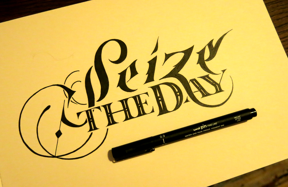
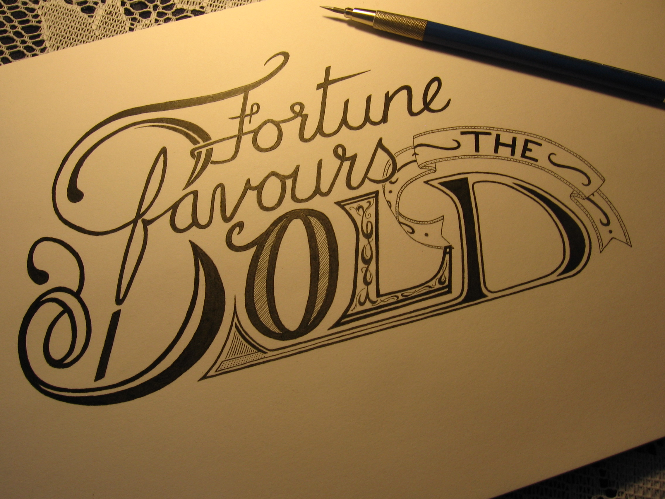
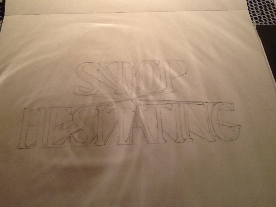
This is a piece I’ve been planning for a couple of weeks now, but only just got around to creating a final version. Having enjoyed making a few pieces that would suit a poster/T-shirt design, I have been keen to make some more in a similar style. I did experiment with some of the fun sign painting space saving techniques that I used in Standing on the Shoulders of Giants, but in the end the piece was better suited to a more standard layout. However, I did take the chance to combine script letters with Roman capitals, (here the J in Journey, and the S in Step). Keeping the decorative style the same helps the letters look like they belong where they are, and allows their differences to add a bit of flair to the piece without standing out too much.
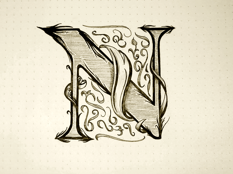
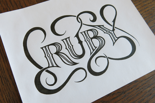
In other news, Inktober will be drawing to a close soon, and with it my daily drop caps will have their second instalment ready. Today saw V as the latest piece, so you can wait expectantly for next week to see what they all look like, or check out my twitter page to see daily updates of each piece. Recently, I have also been studying Italic calligraphy in an effort to learn more about the origins of script style lettering and the finer (or in this case blunter) points of broad nibbed pens. As such, you may see a bit of a shift towards Italic inspired styles. Up until now, I have preferred to base script pieces off Copperplate, (as you can see with this one), but I think it would be nice to see how some Italic pieces will fare.


You must be logged in to post a comment.