Lift Up Your Hearts

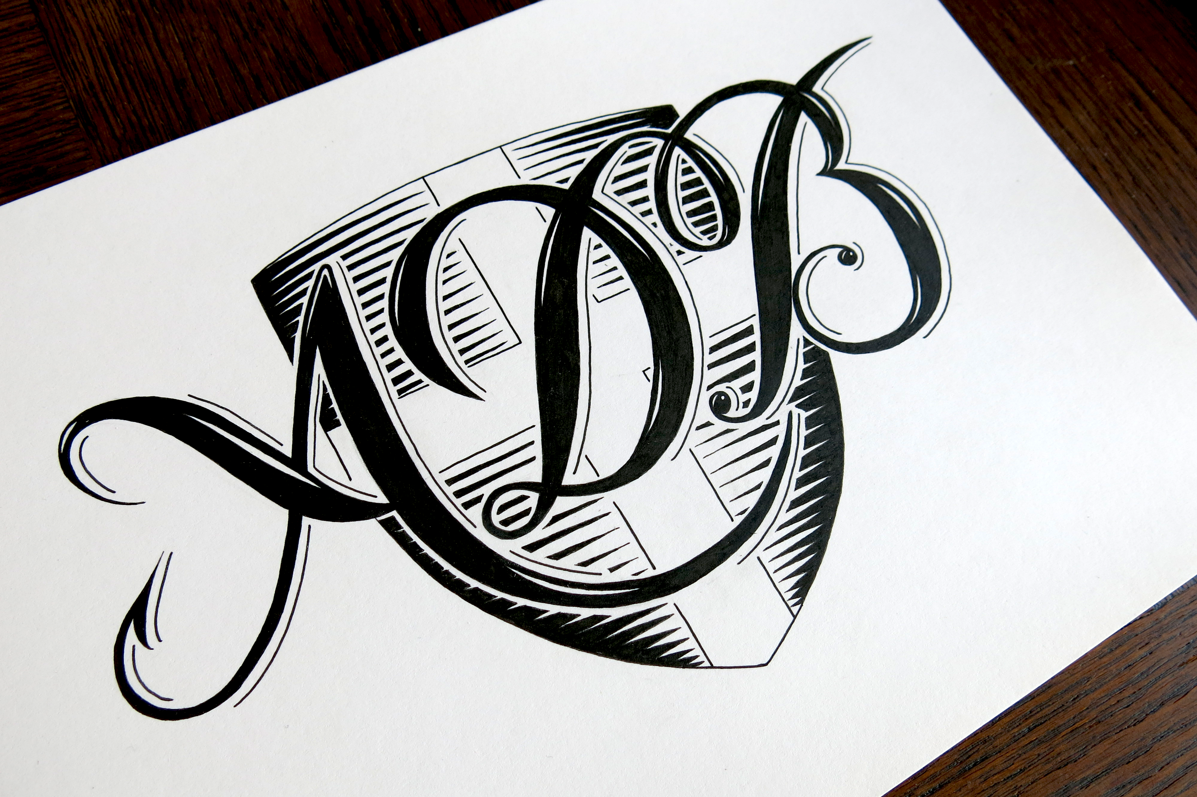
Following on from last week, this week has seen a lot of broad nibbed calligraphy practice, which means burning through paper at an alarming rate! The good news is that I bought 20 nice A5 Rhodia notebooks a few weeks ago, half of them with a dot-grid pattern and the other half plain. The dot grid is great for sketching out ideas without having to worry about marking out boundaries and guidelines; unfortunately, the spacing between the dots don’t quite match the width of any of the broad nibbed pens I bought, so it doesn’t help too much with calligraphy practice.

Lift Up Your Hearts

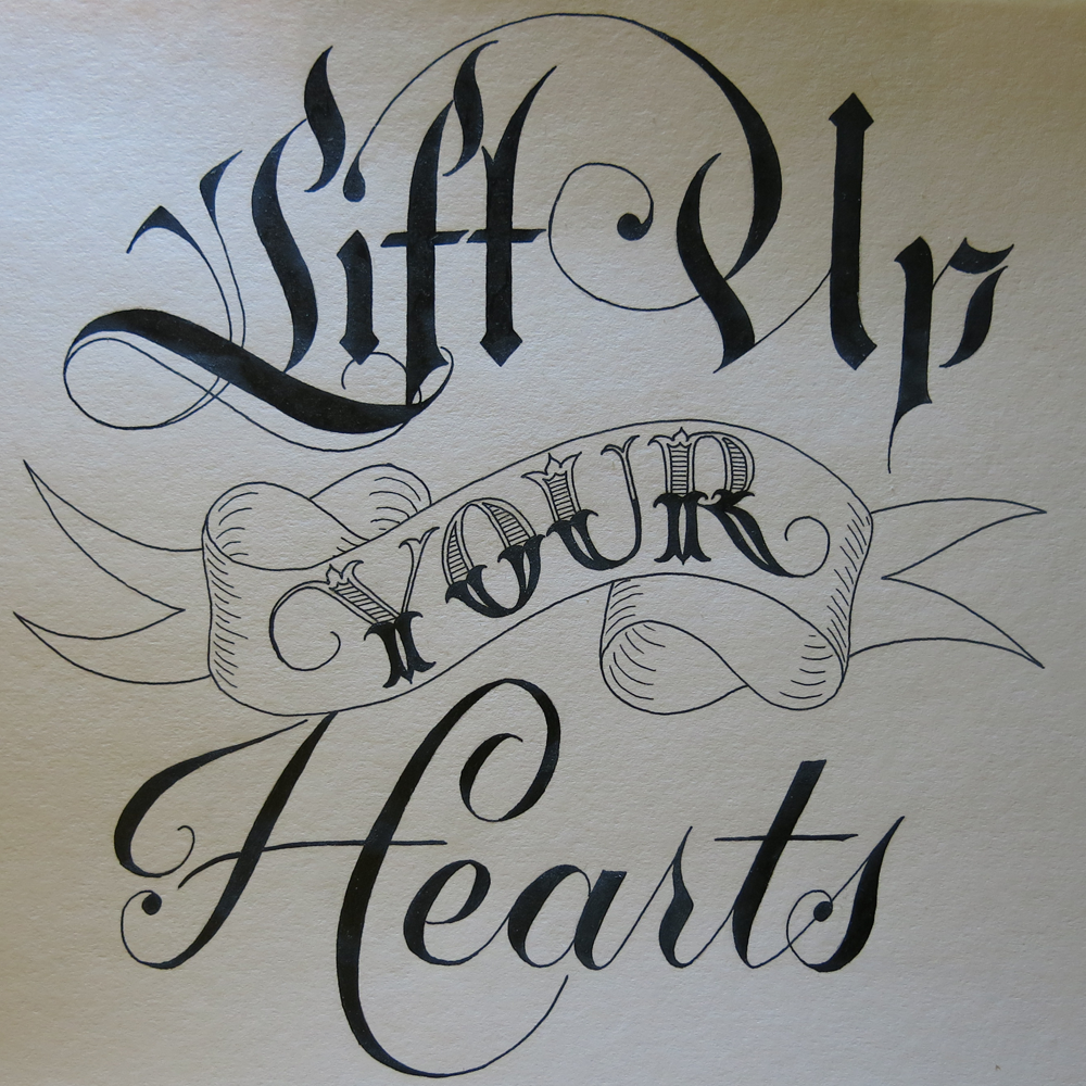
This piece is the first in a two (maybe three) part series that I’m going to do. The plan is to have them structurally as similar as possible. This one is half of a sentence spoken by Winston Churchill on June 12, 1941 in his speech to the Allied Delegates. I first heard it when it gained some popularity due to being auto tuned into a funny little song, but the meaning of the message stuck with me. The full phrase is “Lift up your hearts; all will come right.” It’s then followed with “Out of the depths of sorrow and of sacrifice will be born again the glory of mankind.” It’s stirring to think of the context in which those words were spoken. The Second World War had been going for two years, and would continue for another four. Knowing what we do now lends a feeling of gravity to the words, but I feel it’s a message that holds meaning in many contexts.

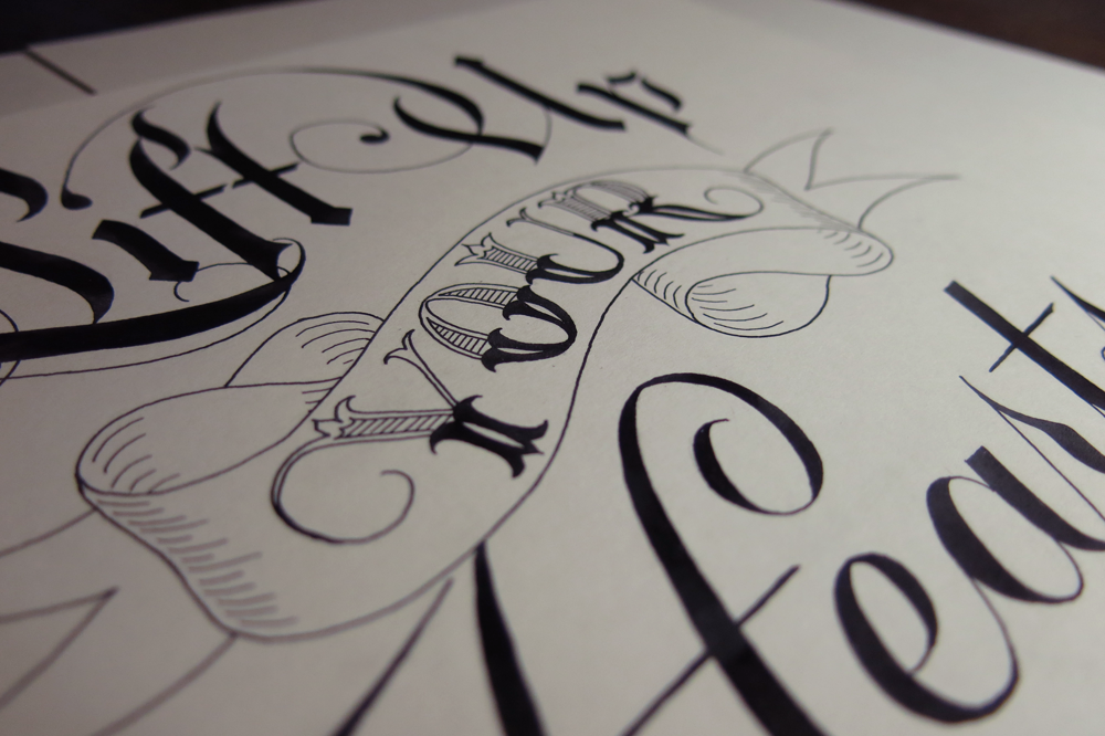
Here’s a shot that is a little closer and shows the banner and the Tuscan style lettering of the word “your”.

Lift Up Your Hearts Detail

The piece has quite bold and simple shapes on the top and bottom, so I kept the banner from being too detailed so that it doesn’t distract from other elements, whereas usually I like to include a bit more detail. The main reason I’m keeping it as simple as it is, however, is that for it to work side by side with the next piece in the series, being too detailed could make the composition look too busy. I may make a 3rd piece with the phrase “Out of the depths of sorrow and of sacrifice will be born again again the glory of mankind,” which would be a wider piece to fit beneath the first two above.

Don’t be Afraid to Dream

This week is another New-Pen-Week! Last time, I got some Rotring Rapidographs, which I use pretty much the same as the old fine liners I started out with. Not much changed in the style of work I produced, but for me, the process was changed a little. This time, however, I got some Pilot Parallels, which are a kind of fountain pen for broad nibbed calligraphy. I’ve been wanting to start practising some broad nibbed calligraphy for a while now, so that I can further my understanding of Gothic/Blackletter styles, and this week allowed me the chance to give it a go!

Don't be Afraid to Dream

I found a wonderful image that displays a style of Blackletter that I haven’t seen reproduced quite the same anywhere else. The title of the image is “Williams Style of German Text”, which doesn’t seem to bring up much other than the original image, so I don’t have much more information than what you see there. I’m sure there is much to learn in exploring the style, and I’m going to spend the next few weeks trying to understand the intricacies of what makes the letters function in the way they do, but in the mean time, I took some inspiration from the style, as well as several other styles I’ve seen around the web, and came up with the piece above.

The pens came with two inks, which was unexpected, but it provided me with the opportunity to experiment with a bit of colour, which is something I’ve been purposefully avoiding in other works in an effort to focus on form. After all, restrictions are what give us guidance, and having too many directions to explore often leads to little progress. That being said, it’s sometimes refreshing to allow yourself a little deviation. These inks are black and red, though refills are available for all manner of colours, so I’m interested in getting some more in the future. In the mean time, I found neat feature on my camera that replaces individual colours in a photo for others, no photoshopping required. Here, I’ve replaced the red ink with a green, blue, and brighter red. Look how each colour creates a different feel for each piece. Colour matters!

Don't be Afraid to Dream Colours

The speckles that surround the letters were made by pulling on the tip of the nib, and letting it go, which flicks the ink on to the paper. Unfortunately, it also flicks it everywhere else, so I ended up with some red fingers, pens and surfaces. Before I did the speckles, I first drew out some guidelines for the word “Dream”, then wrote in the red parts. Once they were dry, I went over in black to complete the bottom part of each letter, then added in the Copperplate above with a brush pen. The speckles came in last because I didn’t want to get my hands so messy if I ended up making a mistake and discarding the paper!

The Truth Shall Make You Free

Since I did the Days of the Week project, I haven’t thought of a new series of pieces to do yet, but I seem have done a few inspirational-ish quotes lately, so I thought I would continue the trend. This one is part of the unofficial motto of the CIA. Doesn’t sound like it would be so inspirational, does it! In fact, the full motto is “And you shall know the truth, and the truth shall make you free” which comes from a bible verse. The official motto is “The Work of a Nation. The Center of Intelligence,” which didn’t seem like it would make a good lettering piece, so I thought I’d go for the unofficial one.

The Truth Shall Make You Free

With this piece, I wanted to achieve something similar to what I was going for with Just Some Words. I’ve seen plenty of pieces around that make no attempt at combinations of styles, but rather focus on the form of the piece, and keep the words all in the same style. I feel like I got closer with this piece than I did with the other one; it’s a style I would like to explore further in the future, so there may see what I can do to make a few pieces thematically linked as a nice little series.

Here’s a little look at the pieces of paper that lead up to the final piece:

The Truth Process

I recently became a mod over at /r/lettering, and seeing the quite frequent posts asking for advice for how to begin, I was thinking that I might post a blog post soon that is aimed towards providing some insight into the process. I usually make some comments about what happened on the way to each piece, but a more general tutorial might be a good place to direct people who are looking for some window to how to go from a blank piece of paper to a finished piece. Above, you can see a little bit of what went into designing this piece from initial sketches to trying out some ligatures for the word “The” to making a full pencil sketch to see how it would look at the right size.

Never give up & never surrender

Here’s a little piece I did just recently. Something motivational which should help to look at any time it seems like it would be easier to stop trying with something. When it comes to finding inspiration, it can be a problem for many people, so this is a nice little mantra. Never give up! Never surrender!

Never give up & never surrender

Surrender to what, though? It’s not exactly a battle, is it? Well, maybe it is, in a way. A battle between the person who wants to get things done and the temptation to give up. One thing that you can say for certain about successful people is that they would say “No” to the question “Did you ever surrender to your doubts?” It can seem daunting when you’re trying your hardest and feeling like you’re getting nowhere. They say “Rome wasn’t built in a day”, which is a neat little cliché. The reason things become clichés, however, is because they’re true. If it weren’t something that resonated with a lot of people, it wouldn’t get said again and again until it was over used. I, on the other hand, am not building Rome, so what am I building? At the moment, it s a portfolio. But it’s also consistency. I’m holding myself to the promise of weekly updates, and though they may end up a few hours late some weeks, I’m not going to let myself fail. I will never give up, and never surrender, even if it seems like it would be easy to do so. You are also not building Rome, unless you are, in which case, well done. But if you’re not, what are you building? What won’t you give up on?

The art of war (a rapidograph experiment)

This week I received some new pens which I hope to use in place of the Unipin and Micron fine liners that I’ve been using up until now. These new pens are Rotring Rapidographs, which are a kind of technical pen. What that means is that I won’t have to go out all the time to buy new fine liners, (though of course they will need ink refills,) and I won’t have to worry about the slow blunting of the tip. These pens have a mechanical tip that never dulls, unlike the felt of the fine liners, so barring them being stamped on, they should be just the same in 20 years!

The greatest victory is that which requires no battle

This piece was my first with these new pens aside from a few test scraps to get used to the different feel. I wanted to do a piece that would test out a few different uses for them, including hatching and filling in large sections. In all, they worked out really well, giving very consistent line thickness. The ink seems to be better than that of the fine liners, too, creating a much better matte surface that doesn’t seem to suffer at all from reflecting camera flashes or other lights, leading to great straight shots.

The piece itself is a quotation from the Art of War by Sun Tzu, which seems to contain a lot of wisdom. Though the quote is about victory and battles, coming from a book about war, it has quite a pacifist sentiment to it, which I found quite interesting. Of the quotes I found, this one suited my needs well. I wanted to continue to explore into the world of Gothic lettering, which is something I haven’t examined as closely as other styles, my main areas of study being Roman and Copperplate calligraphy. In this piece, there is a combination of all three! This being my first real quotation piece in a long time, I also wanted to do something with an interesting visual hierarchy so as to make it the kind of thing you might see on a poster.

Take a look at a few progress shots:

IMG_3594

Sketching out the top half after the space was measured out.

IMG_3599

Pencil version complete.

IMG_3600

Half way through inking.

Auto pilot engaged

Sometimes I have one of those days when I can’t quite get my mind in gear. Wouldn’t it be nice to just have an auto pilot mode? Well when you have a timetable to stick to, sometimes you just have to do it anyway! Searching for inspiration can be tough, so in light of that, I made this piece this week:

I can't brain today. I have the dumb.

I can’t remember when I heard the phrase, but it’s suited the feeling. I decided to make a light hearted, quick piece that wasn’t too complicated. After all, it’s been a pretty hectic week! Last week I did the words of the week challenge on the lettering subreddit. This week, there was a drop cap challenge, so I decided to do a bit of a speed challenge! I tried to focus more on the fluidity of the lines and less on minute, precise details. I often get bogged down in the details of something, so once I zoom in, it’s often hard to zoom out again and look at the piece as a whole. Maybe it’s a trap a lot of perfectionists fall into, or maybe it’s just me, but the solution is to force yourself out of the usual conditions so that you can’t succumb.

Dropcap N

Having some lovely Rhodia dot grid notepaper really helped in diving straight in and not over thinking things. More time that I’m willing to admit usually goes into measuring out the space on the page before I even make a pencil mark for most pieces. Sketching out the design took about half an hour, followed by roughly an hour for inking. That’s much faster than the turn over for a typical piece of mine, so I’d say that the challenge was a success. I’m pleased with the piece, too.

Aside from those two pieces, I also wrapped up a little client project for a tattoo design this week. The brief was to have the word “Ruby” in a similar style as Monday. The dimensions to work with turned out to be perfect for the word. As it was just for a basic design, the client opted to have a slightly less detailed piece than Monday, so you’ll notice a few dissimilarities.

Angled shot small

The next lettering challenge isn’t up yet on the lettering subreddit (where are you mods?) so I don’t know if it’s something I’d like to do next week, but I’m thinking that I might make a thing of doing the drop caps, which come up every fortnight. I think it would make a good series!

Just Some Words

Just some words, just for fun. Another piece inspired by the brush pen style of Copperplate calligraphy that I’ve been doing recently, which has been steadily infiltrating my lettering work.

Just Some Words

I thought, with this piece, that I would keep it as simple as possible. I love to create fine details in all of my pieces, so recently, I’ve been focusing a bit more on simplicity, in order to concentrate more on form. So this piece was going to be filled in with solid black, but when it came down to it, I thought I would add in some of the “shine” elements that I had included on the ornamentation on Monday. I thought that there’s no reason not to, and if I wanted to, I could fill it in after I had finished, so that it was fully black, but I think the effect suits the piece well.

Something else to mention with this piece is that it’s not a combination of typographic or calligraphic styles, which is something I do in most pieces that involve more than one word. The reason for this is that having more than one style in a piece naturally gives it a hierarchy, or at least some contrast in the way you view the words. With this piece, however, I felt that seeing as the word length was so similar, and there being no really strong focal point of the phrase, it would be best to have it all in one style. Aside from anything, the meaning of the phrase is such that it lends itself to something that seems more casual, so it would seem odd to have “Just Some” in a weaker style that “Words”, which would probably be the way it would work out if you wanted to give any of the words more weight. In that case, the word “Words” would seem too important make it seem that it wasn’t, in fact, just some words.