The 4L Boys

Today is the first week on new projects after the Days of the Week series. This week is a piece of lettering based around logo design. The client is a French rock band looking to go pro called The 4L Boys.

The 4L Boys 2

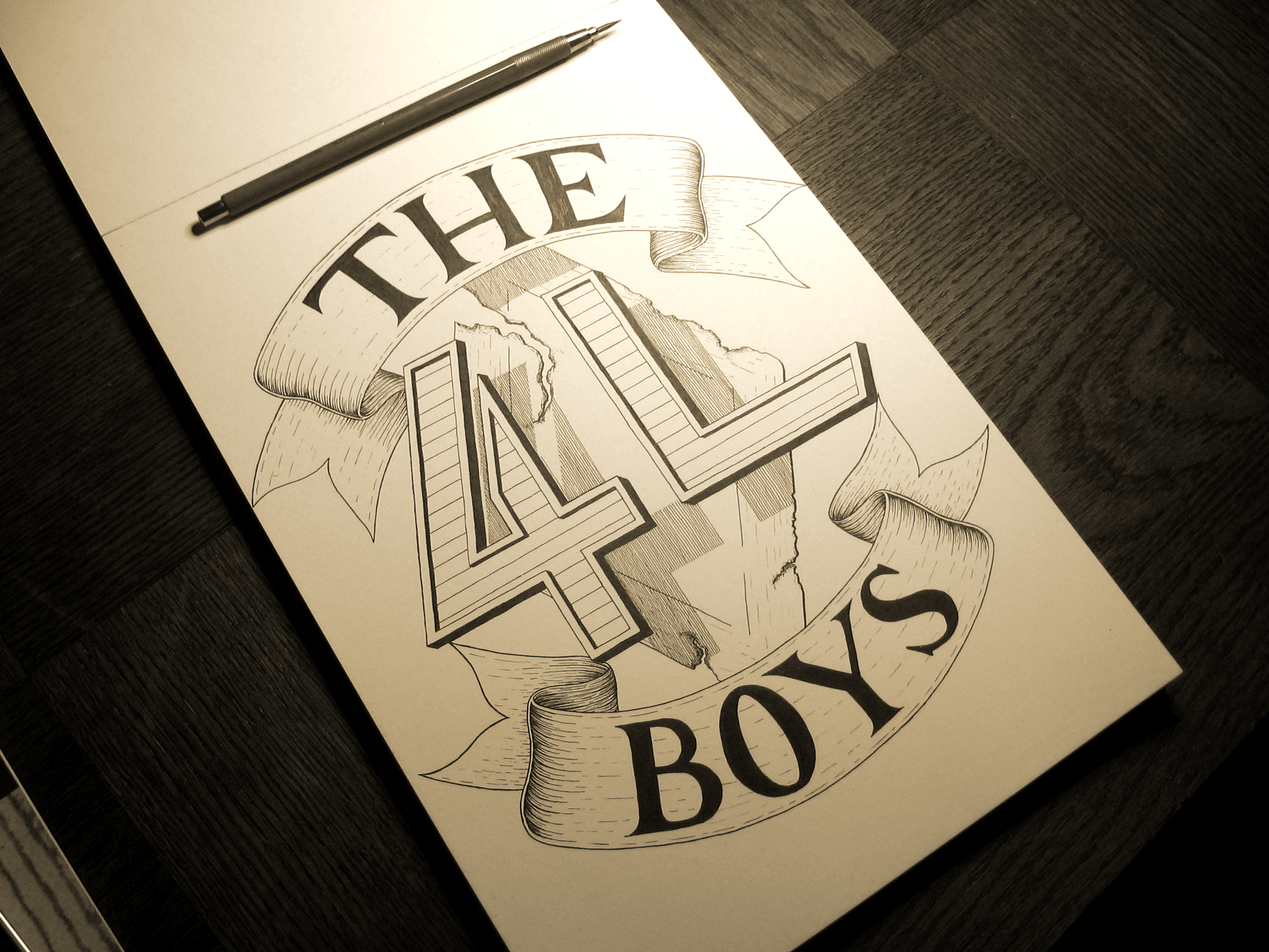
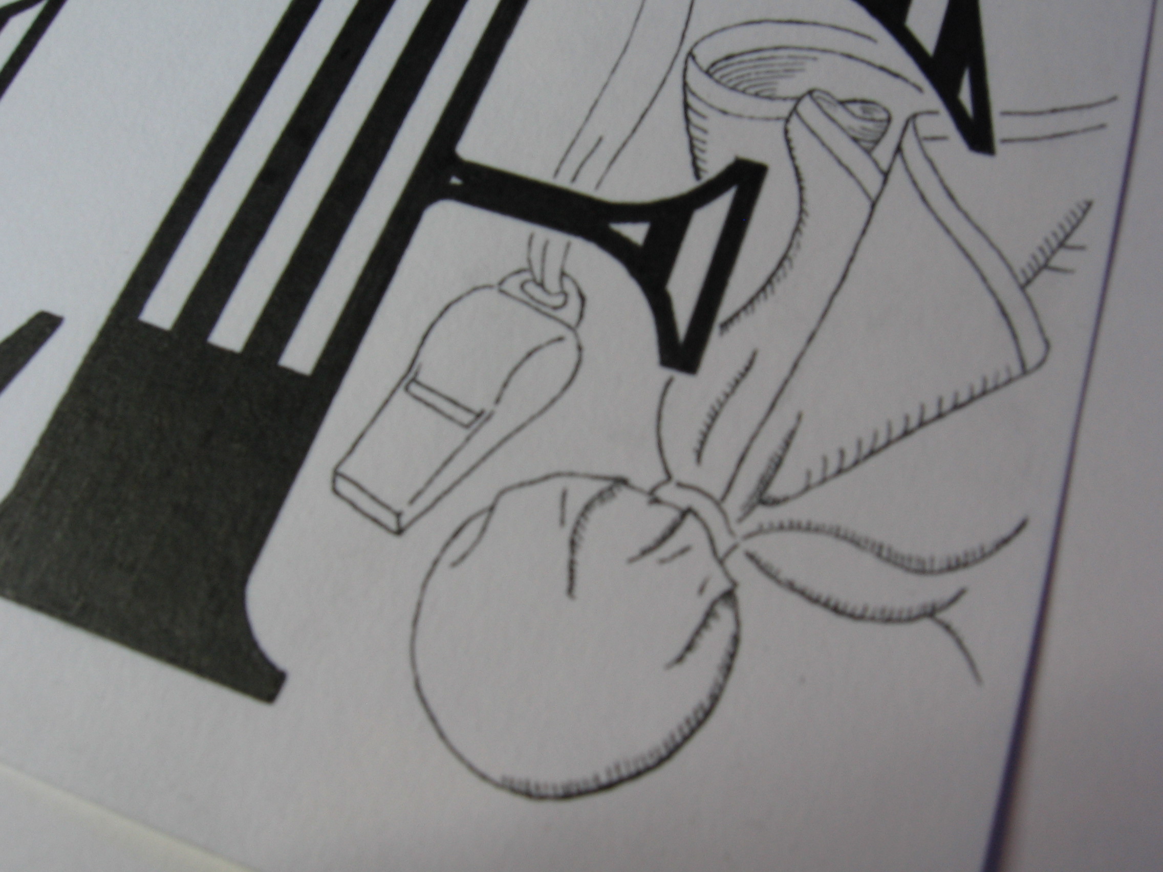
The project consists of making a logo that can be used at a variety of sizes and positions, so the final files will include several far less detailed versions for display on social media sites etc. The aim of the logo was to have the 4L as the centre-piece floating in front of  a diamond shaped road sign that has been eroded away and become rusty. One of my main focuses for this piece was to create a 3D effect to give the feeling that the elements are all suspended around each other. The 4 and L have a small 3D effect, including on the inlay, and also throw a shadow onto the sign behind them to create an illusion of distance. The group also wanted to have banners surrounding the piece with the words “The” and “Boys” written on them. However, for use in different spaces, there will also be another version with the two words set at a more diagonal position in order to reduce the height and increase the width of the logo, in which case the banners will disappear.

I produced the logo as a lettering piece more as a keepsake for the band to have, as the real process of making the logo in all its variants takes place in a largely digital setting. The digital files will be have more of a focus on simplicity and legibility to accommodate for resizing. That means that the detailing on the ribbons and the hatching for the drop shadow will become cleaner and more regular for scalability. Something esle I had to keep in mind for this piece was for it to function completely in black and white. While the band aim to use colour in certain instances, in many cases the logo will rely on being rendered in black and white, or black and yellow.

Be sure to check out more versions of this piece on the logos page once the digital files are completed, which will be in another week or so.

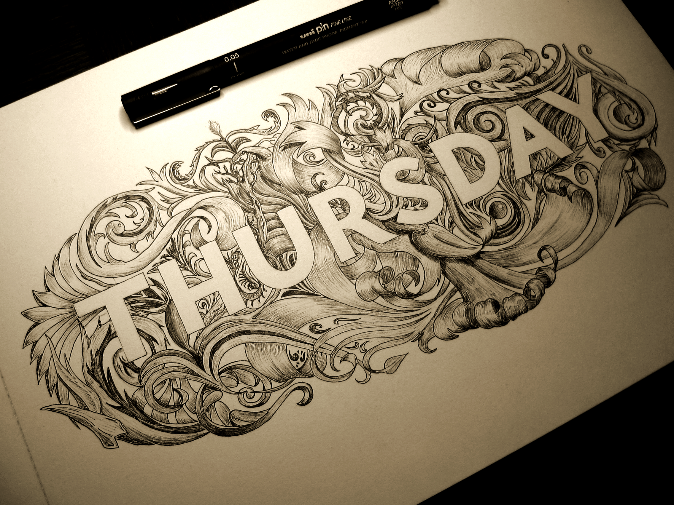
Seeing as I’m no longer doing a project so predictable as the days of the week, it’s not so easy to know what will be up next week! I do, however, have some other client projects to make progress with, but if they don’t come to fruition by next Monday, my goal is to produce a new logo/banner for myself to replace the hasty version I did for the site during my Thing a Day project several months ago. I’m excited to have several ideas already, and to apply the principles I’ve learnt and the skills I’ve gained since making the last logo. I’m thinking it will be a big improvement, so come and check it out!

Thursday

Good news! Today I got a dribbble invite! If you don’t know what dribbble is, head over to dribbble.com and take a look! It’s a place for designers to share their work and network with other designers. The other good news is that today (at least for another half an hour or so) is Monday. So here’s the new thing:

Thursday

That’s because Mondays are going to be update days from now on until the end of ever, meaning you can always come and check on a Monday (well, on Tuesday, really, because I will update in the evening) to see the next piece. This week’s piece is the 4th in the series of the Days of the Week project I’m currently doing. The goal with this piece was to create something with a filigree feeling to it. I liked the idea of doing something in a filigree style, but I also felt that the piece would benefit more from having the letters be clean and clear, which is what made me settle on letter-spaced sans serif all caps. In doing so, I found that I really haven’t ever produced many works using sans serif letters, and I tend to lean towards script and serif. The piece really called for something strong in contrast to the detailed filigree ornamentation behind it, but standard Roman style all caps just weren’t cutting it. The advantage that I ended up with by using this style is that through even stroke width, it not only creates a great juxtaposition of bold shapes over detail, but also helps out greatly with legibility, which is something that would suffer if the thickness of the letters varied more.

I had originally planned to go with slab serif, but, and not to bash slab serif at all, it feels to me that it’s just sans serif pretending to be serif. I’m sure it has its uses, my original choice to use it was just based on my preference for serif over sans serif, when in fact, what the piece really needed was the simplicity of sans serif. Over all, this piece is mainly an exploration of contrasts. The contrast between strength and fragility, between simplicity and complexity, and between black and white.

If you’re interested in the process of making this piece, here are a few progress shots:

IMG_1801

Having measured out and sketched in the letters, next is to start planning out the detail behind them.

IMG_1807

Fleshing out the detail.

IMG_1808

Detail all planned out. From then on, it’s just a story of ink.

See you at the beginning of next week with Friday’s piece.

Monday

It’s Monday! Or at least, yesterday was Monday. In celebration of this fact, here’s something I finished on Sunday!

Monday

I posted it over at reddit a couple of days ago, and it got a good response, but I’ve only just had the time to make a blog post about it. So, what’s the deal? Well, I’m thinking of starting a series called Days of the Week. I’m sure you can guess what will be featured. I’m planning on doing a different style for each one. The goal of the project could be that each piece should be as different from the others as possible. We will have to see how diverse I can make their styles. Striving for diversity is a great way to expand your skills and your portfolio, so it’s a win-win situation!

I think that many people could be afraid that they will produce terrible work, so they never try. People often ask me how I learnt to do things like this, and the answer is really just that I started doing it. I saw that others had done lettering pieces and posted them to the Internet, and I wanted to try too. Practically everything I’ve ever lettered is posted here on the website, and if you take a look through my portfolio, I’m sure you can see how things have progressed. Some of the earlier pieces aren’t so great, and I’ve learnt a lot since then, but I think it’s worth leaving them up there because it’s an honest reminder of where I came from. I think it’s worth being honest about something like that. They are the beginning of a journey that I’m taking, a journey that hopefully has no end. To come to the end would mean that there is nothing left to learn, and no improvement to make, and I’m sure if anyone thinks they are in a place like that, then they are missing something. So, I’m looking forward to finding out where this project will take me!

This project might be punctuated with other pieces, so it might take a while before I have the full-week set uploaded, but stay tuned to see what the rest turn out like!

Here’s a vectored version. I tightened up a couple of lines here and there, but overall, it’s pretty much the same as the inked one above. The main difference is that in digitisation, I have the opportunity to use gradients, so where I used hatching on the sides of the letters to shade them in the inked version, I had a play around with using gradients to achieve a similar effect.

Monday

The best time is now

Still on catch-up mode here, so this one was done a while ago, but it’s not too old. This one wasn’t a piece for a client, just one that I decided to do on my own steam, just like in the good old days of Thing a Day.

IMG_1635

After a few variations, I settled on going for the old words-within-words style. I did something similar for Tomorrow is a Dream, but this one is a little different. I think that when you first see it you read the word “now”, of course, because it’s so big. Then comes the rest of the sentence, which is finished by the word “now” again. So in a way, it reads “Now. The best time is now.” It has more impact and helps the message, I think.

This piece also has an element that I’ve wanted to try out for a while in it. Imagine that the words “the best time is” simply make everything behind them turn the opposite colour, creating what looks almost like a checker board pattern. The challenge with it is that if you were to simply follow along the guidelines in the picture below, you wouldn’t execute the design successfully.

IMG_1596

The problem arises when you consider following along the pencil lines with a fineliner. In fact, when you look at a pencil outline like this one, you only see the line. But when you look at the finished piece, you don’t so much see the line as you see what is contained or excluded by the line. Because of this, you need to think about the thickness of the stroke that is created when you draw along a line. In fact, it’s drawing ON the line that is the mistake. To allow the negative space, or the white spaces, be the same proportion as their black counterparts, you must always make sure to draw around the surrounding edge, and never on the line itself, unless you want the white parts to become too small. Take a look at the picture from a silly angle to see what I mean:

IMG_1640


I’m working on a big logo design project at the moment, but luckily I’m having the time to post bits and pieces here and there to try to catch up with myself, but it might take a little longer to get a post done about this logo, though when it arrives, there will be a lot to talk about, as it’s my most detailed piece yet, by far.

Don’t mess with the Ref

Hello again, it’s been a while. Things got side tracked in various ways, and I haven’t been around to update this bit, but I’ve been busy (sometimes very) with various commissions and other projects. So, finally, I have got round to doing a bit more in terms of updating, first with a piece I did more than a month ago!

IMG_1568

This piece was commissioned more than a month ago as a Christmas gift for someone. The theme (as I’m sure you can guess) is that of a football referee. The word ref is coloured to match a ref’s uniform, and the piece is decorated with their tools, being a whistle and a flag. Coming from the UK, I was unfamiliar with these aspects of refereeing in American football, so it was interesting to incorporate them into a lettering piece, particularly the flag, which was a pleasure to design, and which functions as the full-stop (or period) for the sentence. Here’s a close up of the illustration:

IMG_1570

Unfortunately. the piece has been shipped, and is halfway across the world, so I don’t have a chance to take any more pictures or scans of a better quality, but I guess that’s how it goes.

I have a few other pieces to upload and blog about, one of which I have already posted on my logos page, which should also be getting a few new submissions soon enough!