Live in the Moment

A little while ago, I did a quick sketch of a design for a daily doodle, which I decided to make into an inked piece this week.

I’ve been taking a while off from doing a piece every day because of travelling and visiting family, but I’m still keeping up with weekly updates on inked pieces. Fortunately for me, I have lots of designs available to play with from having done so many daily pieces. Here’s the initial sketch:Live in the Moment

With this piece, I wanted to make it look like something you might see on a badge or fabric patch, so I started by choosing the shape I wanted to go for, then working around that to fit in the lettering and the ornamentation. The phrase is pretty short, and the length of the words lends itself well to giving the piece a sensible hierarchy.

Daily Doodles

At the moment, and for the foreseeable future, I’m doing something called Daily Doodles. That means that I’m creating one new piece of lettering, sometimes in ink, usually in pencil, always in a day. Last week I wrote a little about it as an addendum to my Create Create Create post. This week, I started putting a bit more time and thought into the pieces – not necessarily in the execution of each, as a day isn’t a long amount of time to create something, but in the exploration of styles, and composition. Sometimes I get so carried away with finding new styles to use in lettering pieces that I don’t ever spend enough time actually exploring a style before I move onto the next. It’s partially due to curiosity about the possibilities, but also due to not wanting to produce things that seem too lacking in variety.

They say that it takes 10 000 hours to become good at something. And that’s a lot of hours. A lot of time doing the same thing over and over again, rehashing, going over, trying again, failing, and learning what to do better next time. Because of that, I decided that using my time doodling a new piece each day would be well spent not only exploring new styles, but exploring styles I’ve used before. Here are a few from the last week:

Air

Air: practising Roman capitals, the root of the letter forms we use today. Though originally a form of calligraphy, the historical records of them are stone engravings. The letters are still written today, however, with broad edged pens and brushes, and hold a lot of mysteries. Unlike learning some Italic or Gothic script, Romans require some difficult techniques to pull off through calligraphy. Sketching them, of course, is easier, providing you know how they are meant to be formed. (Let me give you a hint: that’s the hard part. Hence the practise.)

Beauty in Truth

Beauty in Truth: some experimentation with flourishing and ornamentation in a Copperplate style. I also incorporated the style of B I used in my Drop Cap a Day Inktober project.

Trust

Trust: a Gothic piece, drawing inspiration from several scripts that I’m sure have names, but I can’t remember right now. Though Gothic scripts are pretty straight forward, and easy to sketch in pencil especially, I’m still finding plenty to learn with each piece.

Alive

Alive: some more simple Copperplate calligraphy style letters here. I used ink and pencil on this piece to give it a little drop shadow to make it pop. The effect works quite well, and makes me consider investing in some grey inks to get a more reliable and lasting medium that gives the same feel.

Earth

Earth: similar to the Air piece in style and ornamentation. I think it should be a letterer’s mantra that you can never know too much about Roman capitals. And if you do, please start teaching others.

Be Your Own Hero

Be your own hero: combining two styles here – Copperplate and Gothic. The composition came out as I wanted, but I can’t help but feel it would be nice if the words had allowed for a letter with an ascender at the end of the last word so that the Copperplate would be nested between the Gothic on each side.

Better Together

Better Together: sometimes simple & elegant is all you need, and what better way to achieve it than a Copperplate-style script piece? It’s my wife’s birthday today, so I made her this little sketch to show her my appreciation, and took the time to doodle out some flourishes while I was at it.

Some of these pieces might pop up again later, or elements from them, at least, in later posts. I’m thinking of making a piece around the Earth/Air/Water/Fire “elements” after having watched a TV show called Avatar, so the other two will probably be along at some point, but they may be in a different style as I explore ideas for the piece. As always, if you’re interested in staying up to date with these daily doodles as they come, follow me on Instagram.

Create Create Create

What if you had to make a new thing every day? It might be easy to start with, but after a little while, you would run out of ideas. Maybe you’d struggle to think of new things to make. You’d wish you hadn’t wasted good ideas when your execution wasn’t good enough to do them justice. You’d get burnt out and get fed up with doing it and eventually give up. Now imagine if you had to go running every day. At the start, it would be hard to do, and you would feel like you were no good at it. After a while, you would start to feel some improvement; maybe you would be able to run a little further each day, or a little faster. Eventually, you would be much better at running than you were before.

The thing is that creativity isn’t how I described it in the first paragraph: it’s just the same as how I described running. The more you practice something, the better you get. The more you do something, the more your brain understands how it works and how to do it. When it comes to creative things, there isn’t some magic element, some mysterious gift, some much-coveted spark. It’s all down to practice. Do you want to get better at something? Then do that thing a whole lot, and soon enough, you will find that you are seeing improvement.

Create Create Create

Recently, I’ve been focusing on improving creativity though practice. I don’t wait for an idea to strike, or motivation to come along and help me out. Instead, I look to discipline and structure to guide my way. The nice thing about that is that motivation is fickle, and sitting around waiting for it means that more often than not you don’t get anything done, whereas discipline is something that you can build as a habit over time, and strengthen every time you do exercise it. As part of my learning, I’ve been studying calligraphy in order to better understand the roots of lettering. This piece combines 3 of my favourite styles: Copperplate, Gothic, and Italic.

Having a piece with just 3 words, each in a different style, could lead to an inconsistency in the structure. To counteract this, the piece finds consistency through ornamentation, form, and subject matter. Each word has the same left facing shine to the letters, the ornamentation is self reflective, and the words all say the same thing. The repetitive nature of the words also implies the importance of not just creating one thing and being done with it, but creating as a process that continues independently of the pieces being produced.

Create Create Create Detail

Aside from exploring calligraphy, I’ve been dedicating some time every day to making a pencil sketch every day of a few words or phrases. If they turn out well, I may recycle the ideas in inked pieces, and if they don’t turn out well, then I have learnt something valuable in making some mistakes. Here are a few from the last week:

Nihil est Fortuitum

A request someone posted to reddit: Nihil est Fortuitum – Nothing happens by chance. I took the challenge because I liked the phrase; after all, it is true: cause and effect are in everything!

Silence

Silence: Using the composition and the negative space to add some expression to the word.

Balance

Balance: Experimenting with a 3D effect, some drop shadows, and a Gothic style I’ve been experimenting with, which was also seen in Break the Rules.

Don't Look Down

Don’t Look Down: Some simple Italic, and some fun with linking the letters together. Though Italic is quick to perform with a broad nibbed pen, I find it takes a long time to sketch just right with a pencil, unlike Gothic styles and Copperplate, which seem easy to reproduce in graphite.


Break the Rules (Sometimes)

Rules rule! Right? Right! Except sometimes it’s fun to break the rules, or at least to play with them and find out what happens. Of course, I’m not talking about the kind of rules that keep the world running well, like don’t steal stuff, or, say, gravity. Well, I suppose those are more laws than rules, but they’re similar, anyway. I am, however, talking about the rules you learn about how to do something well. One of the great things about consciously breaking the rules is that first of all, you must learn the rules. A good understanding of the rules is that leads you to make informed decisions when making something.

Break the Rules (Sometimes)

This piece, then is about breaking the rules, but only sometimes. If you broke the rules all the time, everything would end up looking terrible. Trust me, the way letters are constructed work because they’re based on rules. Some of the rules can be bent, and even broken, and you can end up with some very stylized typography. For example, Art Deco typography eschewed some of what you could consider traditional rules for letter construction in favour of geometry and symmetry. However, I often see people unintentionally breaking the rules in lettering because they don’t know them yet. In their minds, they are not breaking the rules because they are unaware that what they are doing isn’t right. In that case, it’s a great thing to first learn the rules, and then experiment with breaking them in order to find out why they work and what happens if you don’t follow them.

Break the Rules (Angled)

Well, with this piece, what rules did I break? Well, none, as far as I’m aware. My first idea was to create a piece that had the weighting of all the letters reversed i.e. thick strokes where there should be thin, and vice versa. The problem was that it looked awful. Though I already understand the rules about the weighting of letters, it renewed my appreciation of their importance. Instead, I decided to go with a fun Gothic style for the “Break the Rules” part, followed by a tame typographical “sometimes”. In starting, I did a few quick experiments with a broad calligraphy nib (as you can see below), just to get an idea of what I wanted out of the letter forms. Then I quickly moved on to fitting the letters into the composition I wanted for the piece, and worked on some ornamentation to go beneath. Finally I scaled everything up by drawing a grid on a larger sheet and matching it to the sketches I had made. This is a very convenient way to translate pieces between size, especially seeing as I had done my initial sketches on dot-grid paper. Once the piece was sketched out fully, and then later inked, I removed the pencil grid and was left with what you see above.

Break the Rules Progress

What else is new? What has been happening since Inktober finished? Well, I’m still doing a piece a day, which you can always catch on my twitter page. Having finished the alphabet of drop caps, numbers, I did a couple of ampersands and then moved on to doing a pencil sketch each day. Take a look:

Ampersand 1:

Dropcap &1

Ampersand 2:

Dropcap &2

Patience:

Patience

Discipline:

Discipline

Spades:

Spades

Life is not a Problem to be Solved but an Experience to be Had

Sometimes it’s too easy to get caught up in avoiding the bad things that we miss all the good things. This piece that sums up the message quite well. It’s a quote that seems to be attributed to a few different people, and has a few variations; however, a message should be valued based on its content rather than who first said it.

Life is not a Problem

I have enjoyed pieces lately that make use of a single style of text and focus more on a solid composition and hierarchy. This piece makes use of a copperplate style of calligraphy, with a few extra elements thrown in. My focus was on reducing the complexity of the piece in terms of the styles used, so there are only two sizes of text, the smaller size having little decoration, and the larger with only minimal decoration (the inner white line and spur on the capitals being the only ornamentation on the letters themselves.) This meant that the piece was open to a lot of fun with flourishing and ornamentation between the text.

Here is an angled shot which has the whole piece in frame but fits it into a landscape layout:

Life is not a Problem detail

Most of the time spent on this pieces was not in the execution, though it may seem detailed, but in the planning. I wanted to make sure that the composition was solid, with good consistency throughout the piece. The word “Experience” in particular, being so long took some time to get centred well without it seeming to hang off the edge of the border. Of course, I could have made the text smaller, but my goal was to have only two sizes of text, so I wanted to stick to it. It’s often easy to over complicate something and take an additive approach to the search of perfection, but in fact, more frequently, perfection can be found through subtraction. That is to say that the more minimal a design, the better. So to in planning a piece, it is important to focus on the basics above all, as they underpin the whole piece. The execution of the piece, in the end, was relatively quick.

Here are a few pictures of the piece as it went along:

Life is not a Problem Progress

I would show you the sheet where I planned out several different ideas for the quote, but it seems to have gone missing. I’m sure it’s here somewhere, but really, you should see my desk. So many papers…

In other news, with Inktober all finished up here’s a fun snap of all the pieces up to the 31st together:

Dropcaps (Inktober)

The number was done on the 31st, which was the last day of Inktober. What about the other numbers though? Well, I started doing these drop caps just before October started, and I hadn’t heard of Inktober at the time, so it was more of a convenient surprise, really. The project continues on my twitter page! Today sees us up to zero in numbers, which means that tomorrow will probably be some fun punctuation like an & or @. After that, I’m debating whether to do a pencil sketched phrase a day or come back to the beginning of the alphabet and do some more drop caps. Follow me on twitter to find out if you’re curious!

Inktober Drop Caps (Part 2)

Inktober rages on! Or at least, slowly advances from my end. Mostly, it consists of lots of sitting in a chair quietly sketching. The raging part, that’s about what you see if you search for #Inktober on Twitter. Inktober is a challenge to artists to make one piece of artwork in ink each day of October. Amidst all the pictures of monsters and anime characters, every now and then, you might catch a glimpse of some typography and calligraphy. So that’s where I come in! Two weeks ago, I posted the first half of my drop cap alphabet (which goes up to M). Though Inktober isn’t finished yet, I’m done with the alphabet and have even started on a few numbers! Here’s the second half:

Dropcap N

N: I had quite a bit of time to doodle this one, resulting in it being pretty ornate! It uses a kind of shading that is similar to hatching to give it a shiny feel, which worked out quite well.

Dropcap O

O: I spent a lot of time on this one just making sure I had the proportions of the Gothic-style O just how I wanted them. The ornamentation is quite simple, but it gives a bold effect, which is what I was aiming for.

Dropcap P

P: This one shares similar ornamentation to the N, but its form is inspired mostly by pointed pen calligraphy rather than Roman caps.

Dropcap Q

Q: The picture is taken from an angle on this one to complement the 3D effect. Lots of fun doing the shading all around the sides, but a headache to get the angles all correct on the 3D parts.

Dropcap R

R: Straight up in terms of form. On this one, I was aiming for a simple shape so that I could fit in lots of details, like little drop shadows and hatching.

Dropcap S

S: A little more abstract than others in the set. It’s inspired by calligraffiti and lettering styles I’ve seen in various places. It looks a little like a swan, but also a little like a flame.

Dropcap T

T: Keeping it simple in terms of ornamentation in order to focus on the shape and create a piece reflective of pointed pen calligraphy.

Dropcap U

U: Similar to the R, and also the A, this combines elements of each, resulting in a bold and stylized piece. It felt incomplete until I added the outline and the drop shadow, which rounded it off well.

Dropcap V

V: Using a kind of shading I did on a piece long ago which I haven’t come back to in a while. The effect is reminiscent of brush calligraphy and pointed pen work.

Dropcap W

W: A bit of a speed run, so it’s done all with one large nib width, which made for a playful, friendly piece.

Dropcap X


X: Aiming for something a bit nuanced compared to the W. A crisp, sharp form with some delicate ornamentation.

Dropcap Y

Y: A Gothic style with plentiful ornamentation in a style I haven’t used much in the past. Would be nice to go over some bits with gold ink if I ever got any.

Dropcap Z


Z: Inspired by some old Cadels. It’s the last one in the alphabet, so I thought I would get fancy and try a new style.

Dropcap 1

Bonus: 1. A Metropolis/Art Deco style no. 1 to continue Inktober. Drop caps out of the way, numbers will follow as a few bonus pieces.

Dropcap 2

Bonus: 2. Similar to the W, it’s a bold and playful piece inspired by high contrast script pieces.

Dropcap 3

Bonus: 3. Lastly, today’s piece! A swirly detailed 3. Click the picture to take a closer look at all the details.

The Journey of 1000 Miles Begins with One Step

About a year ago, I discovered a thing called hand lettering. Having an interest in calligraphy, I had stumbled upon something that seemed similar. Custom designed and hand drawn pieces consisting of letters and words. An art form that centred around calligraphy and typography, constructed in pencil and ink. I started to notice more about the designs of letters I saw around me, and took an interest in what made something a good or bad design. Soon, I began making my own lettering pieces. I didn’t know much, at that point, and looking back now, I can see how far I have come. At the same time, the further I go, the further I see I have to go. Each new thing learnt opens doors and makes me ask new questions.

The Journey of 1000 Miles Begins with One Step

This is a piece I’ve been planning for a couple of weeks now, but only just got around to creating a final version. Having enjoyed making a few pieces that would suit a poster/T-shirt design, I have been keen to make some more in a similar style. I did experiment with some of the fun sign painting space saving techniques that I used in Standing on the Shoulders of Giants, but in the end the piece was better suited to a more standard layout. However, I did take the chance to combine script letters with Roman capitals, (here the J in Journey, and the S in Step). Keeping the decorative style the same helps the letters look like they belong where they are, and allows their differences to add a bit of flair to the piece without standing out too much.

In other news, Inktober will be drawing to a close soon, and with it my daily drop caps will have their second instalment ready. Today saw V as the latest piece, so you can wait expectantly for next week to see what they all look like, or check out my twitter page to see daily updates of each piece. Recently, I have also been studying Italic calligraphy in an effort to learn more about the origins of script style lettering and the finer (or in this case blunter) points of broad nibbed pens. As such, you may see a bit of a shift towards Italic inspired styles. Up until now, I have preferred to base script pieces off Copperplate, (as you can see with this one), but I think it would be nice to see how some Italic pieces will fare.

Inktober Drop Caps (Part 1)

I recently discovered something called Inktober, which is a challenge to artists to produce one piece of work in ink each day of October. Of course, I already work exclusively in ink, so it suits me well in that regard. The daily part, however, is something I haven’t done since my Thing A Day project, which is very close to being one year ago. Back then, I had only just started lettering, and looking back on the posts, I can see so much I would change and so much that I have learnt. So nearly a year later, I find that I’m back to doing a thing a day, though this time I decided to do an exploration of styles in designing drop caps. Similar to my Days of the Week project, I took this opportunity to challenge myself to making each drop cap as different from the others as possible.

At the same time, I’ve been posting each drop cap as it comes to Twitter and having a little fun composing each tweet to start with the same letter as each day’s drop cap.

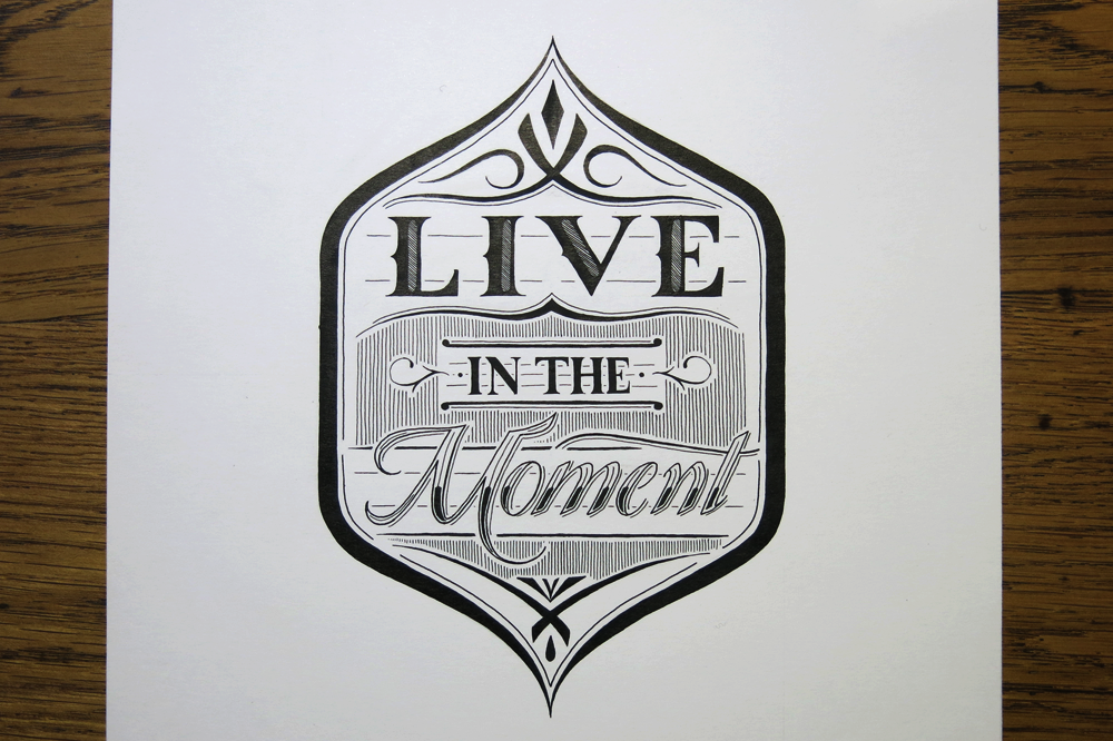
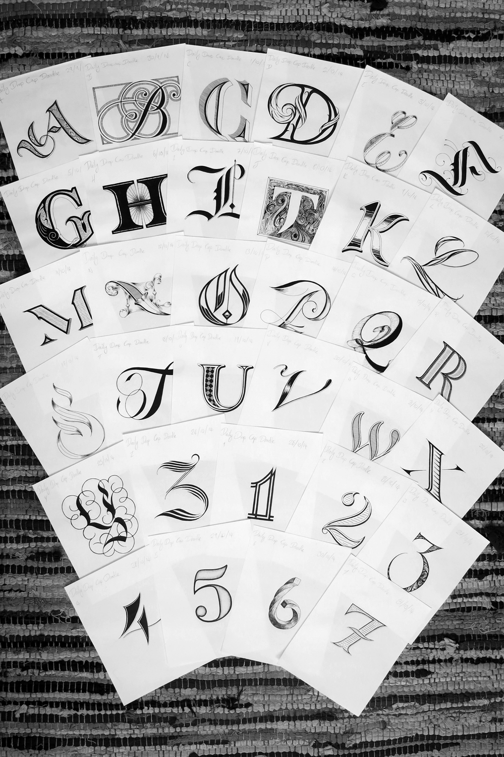
Here, I will provide a little insight into what I was aiming for with each drop cap and how it turned out.

Dropcap A

A: My goal was what is essentially a Roman capital with a healthy dose of Gothic inspiration informing it. As much as I love Gothic alphabets, the letter A always seems lacking somehow, so it was fun to inject a little of the style into something a bit more aesthetically pleasing and legible.

Dropcap B

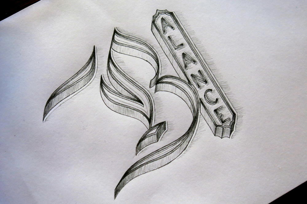
B: I looked to create a letter B that fit well with a Copperplate calligraphy style, but had a unique formation. If you follow the stroke of the pen from the curl at the top right (which would be the starting place in writing it) and trace it all the way through the letter you can see that the lower bowl of the B is created before the upper, which is not the normal way round. To complement the odd formation, the decoration is a little Escher-esque.

Dropcap C

C: Going for a kind of 3D style, which is pretty common in lettering, but the tendency seems to be to use either a shadow or a side-on view of a raised letter. If the two are combined (which they sometimes are) then it seems that the shadow is always comes on the same side as the raised effect. In this case, I experimented with making the light source come from (roughly) the same position as the perspective.

Dropcap D

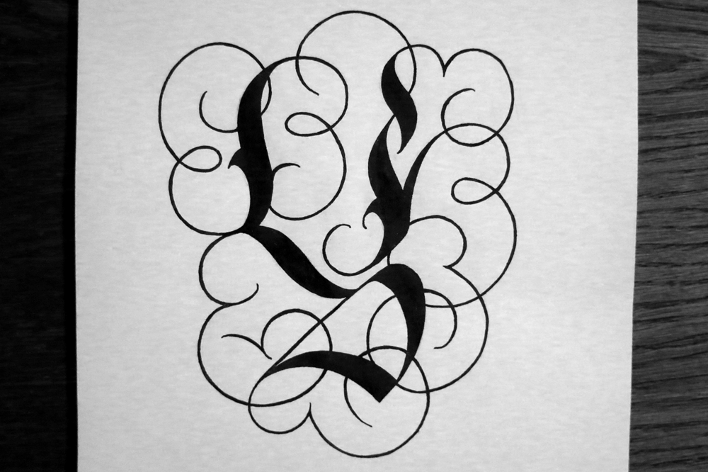
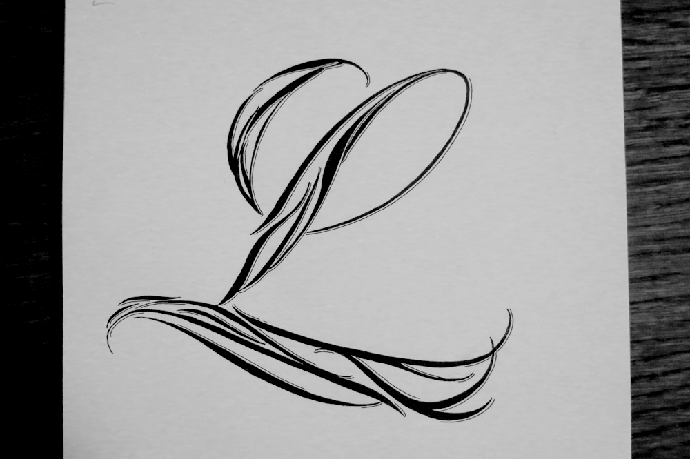
D: A straight up experiment in making things unabashedly swirly. I think that there is a lot more to explore with this style, and I revisit it with the L, later. I think I might experiment further with it in future lettering pieces, too.

Dropcap E

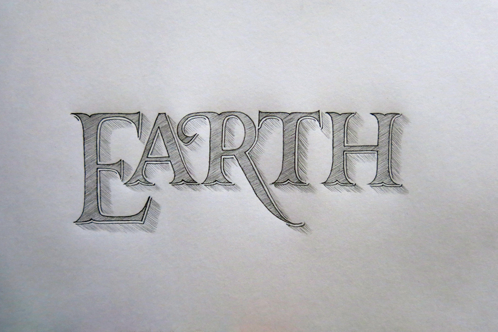
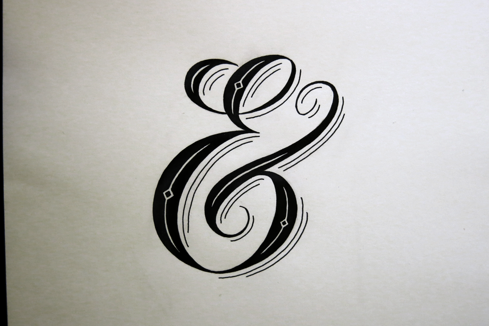
E: This is another example of a raised letter, like the C, but with no shadow. Instead, I endeavoured to make what looks like an inlay made of wood. If it’s hard to see in the small preview, click on the image to get a better look!

Dropcap F

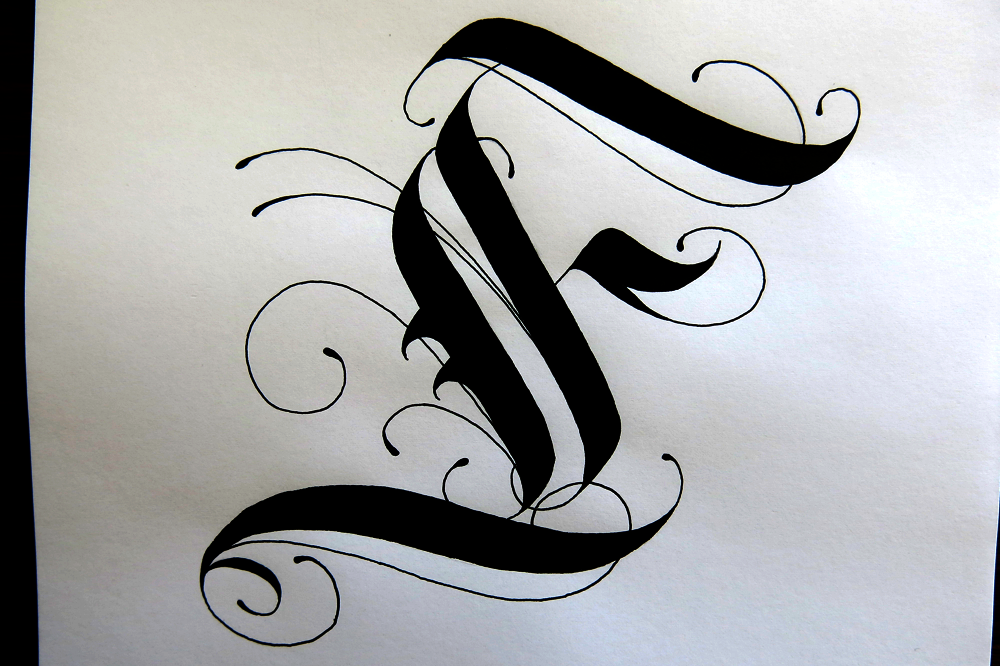
F: The first really Gothic letter I did in the Inktober challenge. The A was an something I wanted to create in a space between traditional styles, but this time, I was aiming for something as more of a calligraffiti-Gothic hybrid.

Dropcap G

G: Sunday is my day off, so I had more time to add more detail and have fun. I was aiming for something ornate and fun, while still adhering to good fundamentals of Roman letter design. It’s important to spend a long time thinking about proportions and form before getting too bogged down in the details.

Dropcap H

H: Bold and strong, inspired by Art Deco power and seeming fascination with trains and forward motion. I used stippling for the first time in what seems like forever to create the effect in the middle.

Dropcap I

I: Similar to the F, this one draws most of its elements from Gothic styles of calligraphy, but its form adheres a little bit more to what we would consider a traditional hand-written capital letter I crossed on the two ends. I think that the little drop shadow outline gives it a nicer effect than what I was going for on the F, so I was pleased with how it turned out.

Dropcap J

J: A bit of an unconventional form with is a combination of a typographic J, which often omits the full curl on the end of the stem, and a hand-written style with a full crossbar on top. The ornamentation is something that I enjoyed doing on a previous lettering piece and wanted to dedicate some time to in one of my drop caps. I did take a lot longer than other letters though!

Dropcap K

K: This one is in a pretty comic-book-like style, which is something that I haven’t explored much before. The form of the letter, the strong drop shadow, and the interior shading come together to make the style, and it ends up standing out as quite different from the other drop caps.

Dropcap L

L: Having enjoyed the D, I decided to create a letter that was made entirely of swirly bits. Before filling in the outline it looked almost as though it was made of feathers, and it does a little still, I suppose.

Dropcap M

M: This one combines quite a few things I’ve done in past lettering pieces. The decoration on the inlay, the fragmented style and the raised sides are all elements I’ve used before, but not quite in this combination, where they end up creating a unique effect.

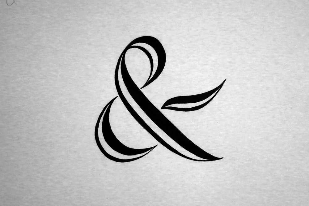
The rest of the alphabet will be along in a a couple of weeks or so after I’ve finished the Inktober challenge. In fact, I started a couple of days before Inktober, having decided on a whim to do a drop cap a day, so I will run out of letters a few days before the end of October. I’m planning on doing some number-based lettering pieces, or at the very least some ever popular ampersand practice, and other symbols. Why do designers love ampersands so much anyway? What about the poor @ sign, which never gets much love?

Where Words Fail Music Speaks

This is a little piece I threw together this week. When I say little, I mean it! It’s pretty small. The x height is about 5mm, which for calligraphy isn’t so tiny, but compared to the lettering pieces I usually do, it’s quite small.

Where Words Fail Music Speaks

What I was aiming for with this piece was to go for a relatively simple calligraphic style and try to capture the feeling that I’ve seen in lots of progress pictures of lettering pieces that seems to get lost in the final piece. During the design stages the letters are often sketched out, and perhaps filled in lightly with pencil, but usually have darker outlines. Once the piece is inked, the feel of the letters and the overall impression of the piece becomes very different. Having the outline stand out somehow makes the piece feel a lot more spacious and delicate.

This piece is in fact a quote from Hans Christian Andersen. Being a musician and an awkward English person, I often feel that words can fall short whereas music is something that provides a different kind of connection between people. I saw the quote and decided that it would make a nice piece in a calligraphic style. Compositionally it suits a piece that is all in the same style rather than a grand, type-mixing poster. The message itself is about the inadequacy of words, and yet the message is in words itself, so it also suits a relatively understated style.

Recently, I’ve been digitizing more pieces (some to come in a few weeks, too,) so I thought I would quickly throw this piece through the digital assembly line to add a splash of colour. I have a few coloured inks, so I should quite like to add some colour to the physical piece, but the colours didn’t really match up with composition, so I will have to wait until I get some other colours. Here’s the digital version:

Where Words Fail Music Speaks 2


Don’t be Afraid to Dream

This week is another New-Pen-Week! Last time, I got some Rotring Rapidographs, which I use pretty much the same as the old fine liners I started out with. Not much changed in the style of work I produced, but for me, the process was changed a little. This time, however, I got some Pilot Parallels, which are a kind of fountain pen for broad nibbed calligraphy. I’ve been wanting to start practising some broad nibbed calligraphy for a while now, so that I can further my understanding of Gothic/Blackletter styles, and this week allowed me the chance to give it a go!

Don't be Afraid to Dream

I found a wonderful image that displays a style of Blackletter that I haven’t seen reproduced quite the same anywhere else. The title of the image is “Williams Style of German Text”, which doesn’t seem to bring up much other than the original image, so I don’t have much more information than what you see there. I’m sure there is much to learn in exploring the style, and I’m going to spend the next few weeks trying to understand the intricacies of what makes the letters function in the way they do, but in the mean time, I took some inspiration from the style, as well as several other styles I’ve seen around the web, and came up with the piece above.

The pens came with two inks, which was unexpected, but it provided me with the opportunity to experiment with a bit of colour, which is something I’ve been purposefully avoiding in other works in an effort to focus on form. After all, restrictions are what give us guidance, and having too many directions to explore often leads to little progress. That being said, it’s sometimes refreshing to allow yourself a little deviation. These inks are black and red, though refills are available for all manner of colours, so I’m interested in getting some more in the future. In the mean time, I found neat feature on my camera that replaces individual colours in a photo for others, no photoshopping required. Here, I’ve replaced the red ink with a green, blue, and brighter red. Look how each colour creates a different feel for each piece. Colour matters!

Don't be Afraid to Dream Colours

The speckles that surround the letters were made by pulling on the tip of the nib, and letting it go, which flicks the ink on to the paper. Unfortunately, it also flicks it everywhere else, so I ended up with some red fingers, pens and surfaces. Before I did the speckles, I first drew out some guidelines for the word “Dream”, then wrote in the red parts. Once they were dry, I went over in black to complete the bottom part of each letter, then added in the Copperplate above with a brush pen. The speckles came in last because I didn’t want to get my hands so messy if I ended up making a mistake and discarding the paper!