Prepare Today for Success Tomorrow

A little while ago a client contacted me requesting a lettering piece. Surprisingly enough, I make more logos and digital pieces than physical lettering projects that get sent off in the mail. This client, however, wanted a custom lettering piece to give as a gift to someone special. The phrase was “Prepare Today for Success Tomorrow”. After many iterations, many design elements, hierarchy re-shuffles and composition tweaks, the piece was designed and inked as you can see below:

Prepare Today for Success Tomorrow

After that comes the part where you have to wrap it up tight and leave it in the hands of the postal service and international shipping companies, and hope that nothing terrible happens to your creation as it hurtles across the ocean. Thankfully enough (and predictably enough) the piece made it there just as it had left and everything was well.

Here’s a little close-up on the detail:

Prepare Today Detail

Though editing and digital manipulation were not part of the commission, I enjoyed working on the piece enough that once it was gone I couldn’t help but do a little more, so I took the piece into the realm of ones and zeros. Several weeks ago, I did some experimentation with using a photograph I had taken of some gold leaf to replace the colour and texture of the letters in a piece, and set it over a black background. The effect turned out well, so I used the same technique on this piece. I used the same gold colour, as it suited the piece’s luxurious style of flourishing.

Prepare Today For Gold Leaf on Black Background

I also experimented a little with adding a wooden texture. It gives a different feel to the piece than the gold does, and I can’t say that one suits it better than the other, just that they would serve different purposes.

Prepare Today For Wooden Texture

The Ligature Collective

A couple of weeks ago, I made a post about having recently joined Instagram, and a competition that was being held to draft a new member of something called the Ligature Collective. The competition was to make a piece to celebrate their success on Instagram, and the best submission would lead to the creator becoming a member of the team and have their work displayed to a large audience.

Well, I had sketched up a quick piece, which I posted a fortnight ago, but since then, I had much more time to dedicate to a better thought out piece.

Ligature Collective Ten Thousand Followers Blog Upload

My main goal with this piece was to create a visually interesting piece with lots of little details, but to have a very clear hierarchy, such that the piece was structurally simple. Seeing as the piece was going to be posted to Instagram, it had to work at a small size, and be easily identified. The words “Ligature” and “Followers” worked well as the emphasised words, seeing as they were not only easily legible on small Instagram thumbnails and conveyed the essence of the piece, but also tied the piece up at each end. The piece is symmetrical down through the middle (apart from the words themselves, of course,) and it also has a vague structural symmetry horizontally, too. The words “Ligature” and “Followers” are in the same style, and curve around the piece in the same way, while the smaller central words reflect each other’s style and layout too.

The piece ended up being quite small. I took several photographs of it just on the page on its own, but it always ended up seeming as though it was bigger than it really was. I decided to put some other items in the picture that I uploaded to give a sense of scale. The photograph seemed a little unbalanced with only the lettering piece and a single pen, however, so I scattered a few other objects around it to frame it. Some things, like the camera strap and the rotary lead pointer might not give a very good sense of the size of the piece, but the pens and lead holder should do. Incidentally, these were all things used to make the piece, aside from the keys, of course. But with the keys there, at least I get to show off my funky Rubik’s cube key ring.

After all is said and done (or just done, really; being a letterer is a pretty silent job) the results will be out tomorrow, on April the 7th. There were some truly excellent submissions among the hundreds submitted by other artists on Instagram, so I wouldn’t be at all surprised if they should win. Good luck to everyone else – I’m sure they’re waiting with bated breath for the announcement of the winner. If you’re curious to see the other submissions, click here, or search for “#Ligature10k” on Instagram!

The Medium is the Message is the Medium…

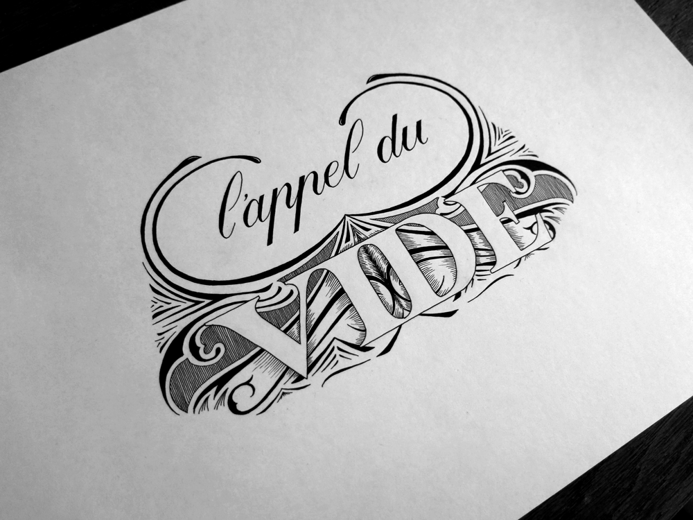
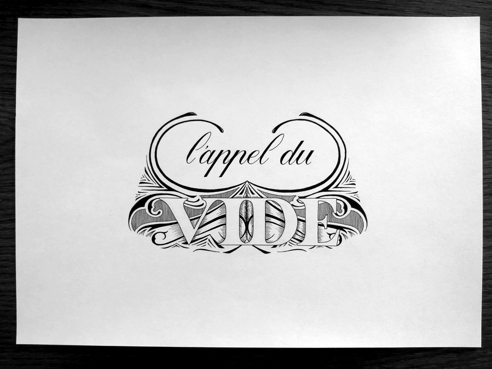
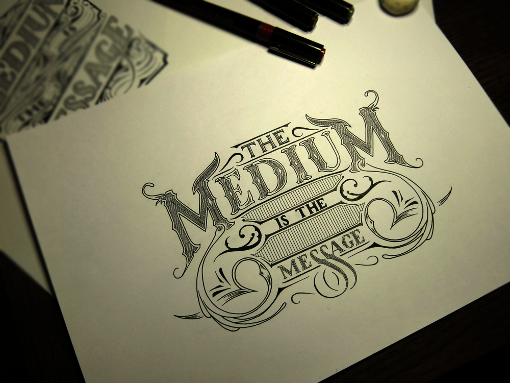
If one thing is equal to another, then the other thing must be equal to the first. Similarly, Euclid explained two things that equal the same thing must equal one another. So if the medium is the message, we can deduce that the message is the medium, and anything the medium is equal to is also equal to the message. What third thing would that be – the thing that both the message and medium are? Why, today’s piece, of course!

The Medium is the Message is..

This one plays a little game with the idea that if one thing is another, then the other is also the first. After all, if A=B, then B=A. Seems simple enough, right? But what is really the meaning behind this message? It seems to imply, as I said two weeks ago, that the message, as the creator saw it, should be disregarded and tossed aside in favour of the study of the medium itself. That implied that what the creator had to say was less important than the way they said it. In effect, it meant discarding one thing and replacing it with another. But if we take the phrase more literally as I did four weeks ago, it implies that the two things are the same.

In language, unlike in mathematics, you could easily say that there are cases where A=B but B≠A. For example, “The ink is the colour black,” but not “The colour black is the ink”. It’s a little contrived, but you could make the argument. I have much more fun, however, taking the word “is” to mean the same as an equals sign, which leads me to come up with pieces like this.

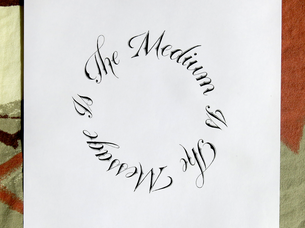
A fun compositional technique that calligraphers sometimes use is to write in a circle or spiral, especially if the subject matter fits thematically with the composition. Usually, however the piece has a break in it to indicate the start and end of the phrase. This piece is fun because due to the simplicity of the sentence structure it allows for the piece to join onto itself and have no defined endpoint. That being said, the eye of the reader naturally arrives on the upper left part of the piece, so the word “The” fills the position of the start of the sentence before the reader sees that it loops, having no end.

Here are the 3 pieces all next to each other:The Mediums are the Messages

With each of them, I’ve tried conveying a slightly different meaning, a slightly different take on the phrase, doing so by changing the layout to get the point across, and keeping the phrase the same (for the most part). So does that mean that the medium really is the message? I’m not convinced that that’s all there is to it, but it’s interesting to consider that layout, presentation, the medium and the way we communicate can sometimes lead to greater insight than what is actually being said. After all, how many articles or blogs (this one included) do you think there are where people skim lightly over the text, but what stays with them, or what they pay attention to is the images?

L’Appel du Vide

With a similar theme but a different style to a piece I did a while ago (Vertigo) today’s piece is “l’Appel du Vide,” a French phrase that translates as something like “the Call of the Void.” What exactly le vide is, whether it be the void, the abyss, emptiness, is not exactly clear. Nevertheless, it refers to the feeling people sometimes get at great heights or in risky situations where some strange call tempts them to jump.

L'Appel du Vide Angle

Stylistically, this piece is similar to another piece I created a long time ago (Thursday). I felt that the style fit well with the meaning of the phrase. The negative space of the word Vide indicates whatever it is conjured by its meaning as abyss or void, the busy surrounds emphasising the effect. The flourishes also show a kind of swirling movement pattern, which is in keeping with the idea of dizziness or vertigo.

The first two words are in a Copperplate style, notably with French style P’s. Seeing as the phrase is in French, I felt it was appropriate to use the French variation, even though to an English speaking audience they can often look like N’s with a strange elongated left foot. The word Vide is done with strong Roman caps, meant to make the word more impactful and make it stand out against the fluidity of the flourishes behind it. As such, the word is in contrast with its background in both tone and form in order to preserve legibility, similar to the choice of letter style in the linked Thursday piece.

Here’s a front shot to give an idea of the composition of the piece on the page, too.

L'Appel du Vide

The Medium is still the Message

The title of the post isn’t quite what it says in the piece, but that’s because what it says in the piece is the same as it was in a different piece two weeks ago. The Medium is the Message. For me, the medium is very much the message. As such, what we usually consider to be the message (the words) could be said not to be the message at all. As a fun way of exploring the idea, I remade the piece from two weeks ago with a completely different composition.

The Medium is the Message 2

This one is still vertical, and it still has flourishes, and it’s still in black and white, but other than that, it’s visually quite different. In this piece, I’ve given the word “Medium” a strong emphasis. In the original piece I did (which you can see blurrily off to the left, the words “Medium” and “Message” had equal importance. In fact, they were almost mirror images of each other, from the style to the layout to the flourishes around them. This was to show that they are the same thing, as the phrase suggests.

The phrase is a little confusing, however. The confusion comes from the double meaning of the word “Message”. In this case, you can approach the phrase from two angles. The first being that it implies that medium and message are one and the same, that the format is the words, the words are the meaning and the meaning is the layout, which is the format. The second being that what we often call the “Message”, i.e. the words, is unimportant, and that the true message is the medium itself. Phew! Confusing stuff. Either way, what that means is that while the first piece I did showed similarity and reflection, this one’s hierarchy is such that it shows the importance of the medium over that of the words, and implies that the words are not where the message lies.

You know, maybe I’m over-thinking the message in the words and missing the point entirely… The medium is the message, after all.

Make More Mistakes

Make more mistakes! Do something wrong. The worst that could happen is that you would die and ruin everything for everyone forever. But that’s extremely unlikely compared with what will probably happen, which is that you will get better at whatever you were trying.

Make More Mistakes

If you start something new, you’re bound to make mistakes. But let’s imagine that you don’t. Let’s imagine that you ace it every time, right from the get-go. Aside from feeling great about yourself, you would probably find out soon enough that you weren’t really progressing in terms of skill. After a little while, you’d stop feeling so great and try to find out what people who could do it better than you were doing. Then you would realise that you weren’t really acing it every time from the start; rather, you were doing decently, but couldn’t see the flaws in what you were doing. So you decide to study the works of the best. The problem with that approach is that more often than not, you only ever see the best of the best. The best people get into the limelight, and once they’re there, all they do is show off the best things that they have created, and what you don’t see is all the discarded paper, deleted documents and failed attempts that they made in learning, and still make all the time. As a result, it’s easy to get disheartened and feel like your work will never be as good as others who are successful.

The point is that to improve you must learn, and to learn you must make mistakes. The more you put yourself in a situation where you can make some mistakes, where you don’t quite know how to do something, where you have to disengage autopilot mode, the more you’ll find that you discover ways to do things and techniques that you didn’t know about.

The Medium is the Message

I learnt about an idea recently that the way in which a message is conveyed often tells us more than the actual content of the message. Certainly, there was a story a little while ago about a man who decided to hand write all his tweets and take photographs of them instead of typing them out. He didn’t change the things he was tweeting about, but he changed the way he was presenting the content. Needless to say, it attracted a lot of attention, and I heard about it through some of the lettering and writing channels I pay attention to.

The Medium is the Message

For me, much of what I do is about the medium rather than the message. I spend my hours and days crafting the letter forms and composition in ways that complement the message I have chosen, but the actual subject matter of the words comes under much less scrutiny throughout the process. The phrase “The Medium is the Message” could imply that the the two things are one and the same, and are inseparable from each other, but in this context I would say that it means that the medium is not just a delivery system for the content, but that is more significant than the content itself. Of course, if I only had the words to communicate, I could simply write them down and take a picture like the twitter user, so it would be true to say that it applies to what I do.

Stop Hesitating

If you’ve been following my blog since I started, or if you’ve lurked through everything I’ve uploaded (I know you’re there, lurkers!) then this piece might ring a bell. When I did my first Thing A Day, the second thing on the second day was a piece called Stop Hesitating. This time, I decided to redesign the piece completely and approach the phrase with a few new styles and techniques I’ve picked up since that time.

Stop Hesitating

It was interesting to revisit an idea, even if it was to completely redesign it. I considered simply re-executing the same design, and trying to tweak it in a few places, but I thought it would be more exciting to see what new ideas I could come up with. I went through a few different iterations before settling on this, and though the layout is similar to the original, the style and overall presentation are very different.

One of the reasons I decided to revisit this piece was because I liked the message. It stands as a little reminder that sometimes it’s all too easy to hesitate and be apprehensive before doing something, and more often than not, once you actually start doing whatever it is that you’re thinking about, it’s not nearly as bad as you had originally thought. That being said, I had a good time redesigning an old piece, so I may consider giving some of my other early pieces a bit of a rehash to see what good can come of them.

Make No More Excuses in 2015

So it’s a new year, but I decided to wait to do this piece until we were a little bit of the way into it so that it didn’t come of as a New Year’s Resolution. It’s pretty easy to make excuses for why we don’t do things. Sometimes it’s things we might even want to do, but it’s hard to motivate ourselves to do, and instead we end up mindlessly consuming media instead of doing anything productive. It’s what our brains seems to desire, but not what they need. The virtual equivalent of junk food, so to speak.

Make No More Excuses in 2015

So, this year, I’m only going to make one more excuse, and then after that, no more. So what’s my excuse? “Sorry, I have to stick to my plans.”  My excuse is to keep to my commitments. After all, what’s more fulfilling than achieving things?

Incidentally, this piece was also a little experiment for me to see how I have progressed since I started lettering. When I first gave it a go, I did a piece a day for a week. To measure up to what I came up with in that week, I decided to do this piece in a day, too. Starting from scratch with the phrase “No Excuses” I sketched out several designs before I found that I preferred having something a bit longer, and lengthened the phrase. From then, I moved onto sketching the piece out at full size and inked it all today!