Never give up & never surrender

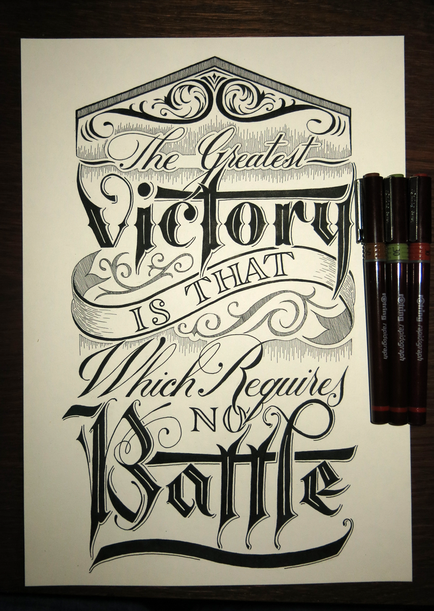
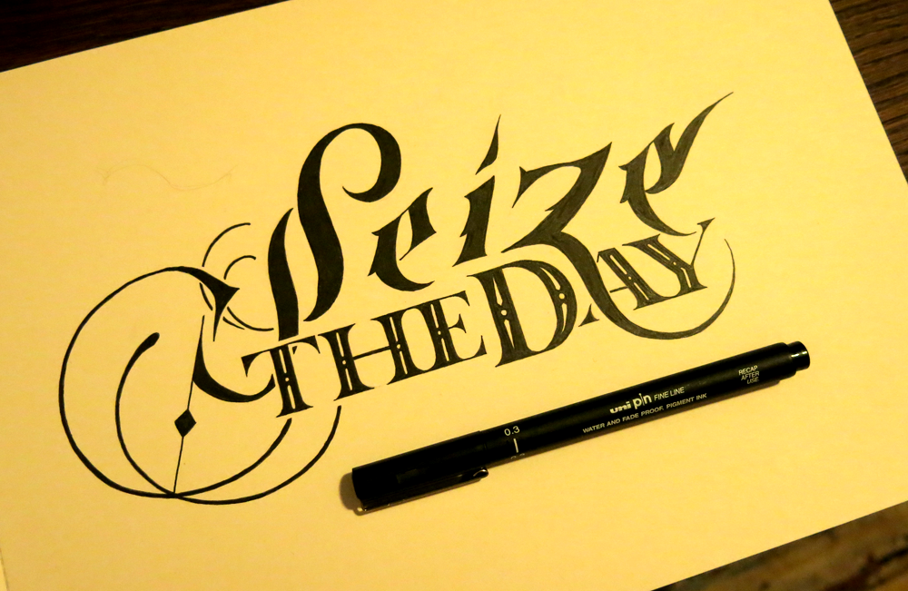
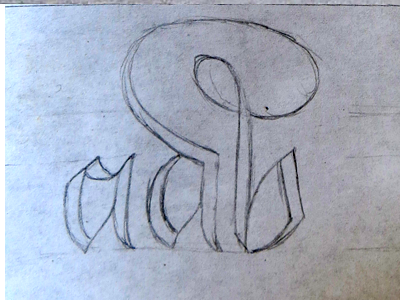
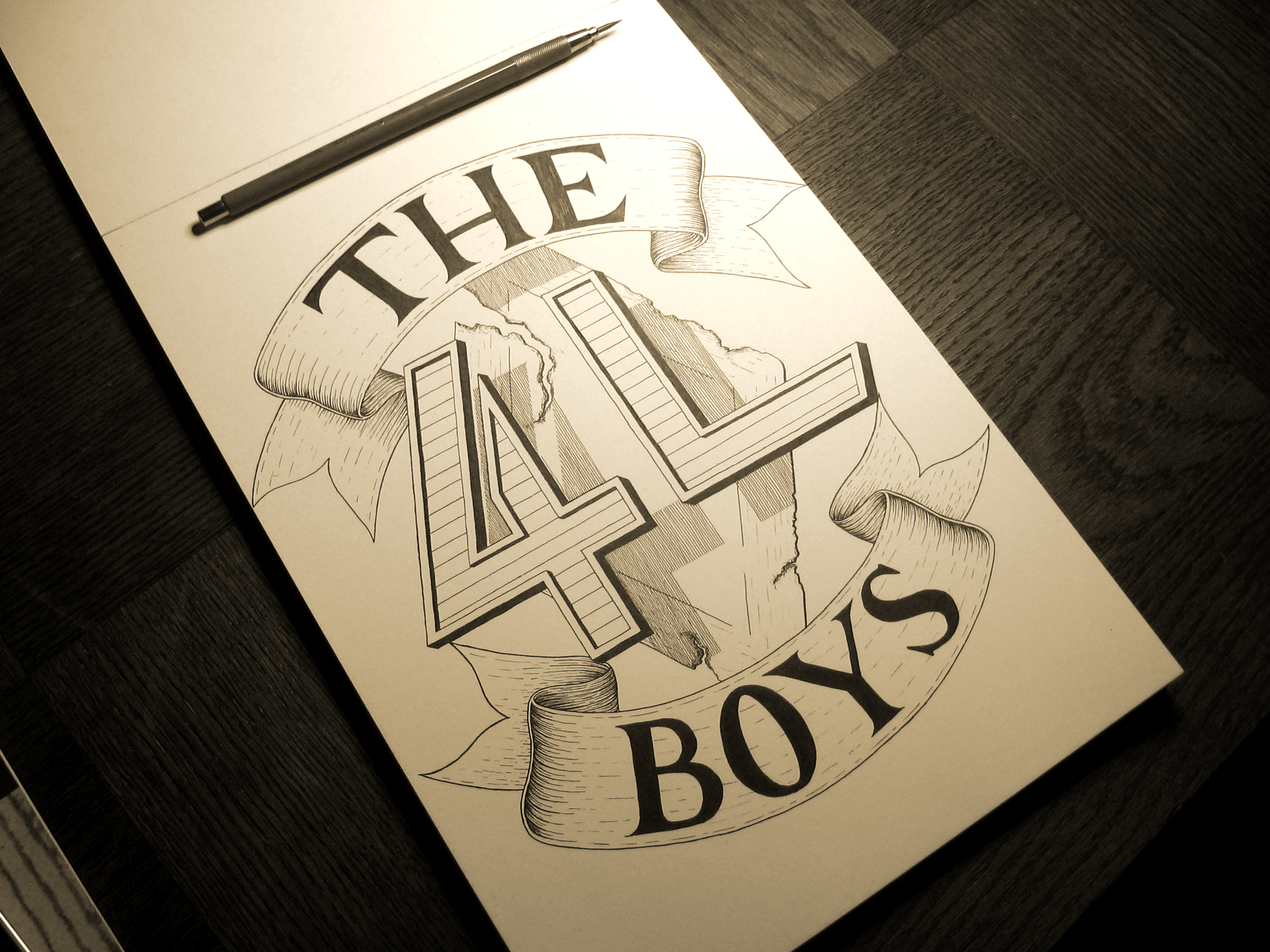
Here’s a little piece I did just recently. Something motivational which should help to look at any time it seems like it would be easier to stop trying with something. When it comes to finding inspiration, it can be a problem for many people, so this is a nice little mantra. Never give up! Never surrender!

Never give up & never surrender

Surrender to what, though? It’s not exactly a battle, is it? Well, maybe it is, in a way. A battle between the person who wants to get things done and the temptation to give up. One thing that you can say for certain about successful people is that they would say “No” to the question “Did you ever surrender to your doubts?” It can seem daunting when you’re trying your hardest and feeling like you’re getting nowhere. They say “Rome wasn’t built in a day”, which is a neat little cliché. The reason things become clichés, however, is because they’re true. If it weren’t something that resonated with a lot of people, it wouldn’t get said again and again until it was over used. I, on the other hand, am not building Rome, so what am I building? At the moment, it s a portfolio. But it’s also consistency. I’m holding myself to the promise of weekly updates, and though they may end up a few hours late some weeks, I’m not going to let myself fail. I will never give up, and never surrender, even if it seems like it would be easy to do so. You are also not building Rome, unless you are, in which case, well done. But if you’re not, what are you building? What won’t you give up on?

The art of war (a rapidograph experiment)

This week I received some new pens which I hope to use in place of the Unipin and Micron fine liners that I’ve been using up until now. These new pens are Rotring Rapidographs, which are a kind of technical pen. What that means is that I won’t have to go out all the time to buy new fine liners, (though of course they will need ink refills,) and I won’t have to worry about the slow blunting of the tip. These pens have a mechanical tip that never dulls, unlike the felt of the fine liners, so barring them being stamped on, they should be just the same in 20 years!

The greatest victory is that which requires no battle

This piece was my first with these new pens aside from a few test scraps to get used to the different feel. I wanted to do a piece that would test out a few different uses for them, including hatching and filling in large sections. In all, they worked out really well, giving very consistent line thickness. The ink seems to be better than that of the fine liners, too, creating a much better matte surface that doesn’t seem to suffer at all from reflecting camera flashes or other lights, leading to great straight shots.

The piece itself is a quotation from the Art of War by Sun Tzu, which seems to contain a lot of wisdom. Though the quote is about victory and battles, coming from a book about war, it has quite a pacifist sentiment to it, which I found quite interesting. Of the quotes I found, this one suited my needs well. I wanted to continue to explore into the world of Gothic lettering, which is something I haven’t examined as closely as other styles, my main areas of study being Roman and Copperplate calligraphy. In this piece, there is a combination of all three! This being my first real quotation piece in a long time, I also wanted to do something with an interesting visual hierarchy so as to make it the kind of thing you might see on a poster.

Take a look at a few progress shots:

IMG_3594

Sketching out the top half after the space was measured out.

IMG_3599

Pencil version complete.

IMG_3600

Half way through inking.

Auto pilot engaged

Sometimes I have one of those days when I can’t quite get my mind in gear. Wouldn’t it be nice to just have an auto pilot mode? Well when you have a timetable to stick to, sometimes you just have to do it anyway! Searching for inspiration can be tough, so in light of that, I made this piece this week:

I can't brain today. I have the dumb.

I can’t remember when I heard the phrase, but it’s suited the feeling. I decided to make a light hearted, quick piece that wasn’t too complicated. After all, it’s been a pretty hectic week! Last week I did the words of the week challenge on the lettering subreddit. This week, there was a drop cap challenge, so I decided to do a bit of a speed challenge! I tried to focus more on the fluidity of the lines and less on minute, precise details. I often get bogged down in the details of something, so once I zoom in, it’s often hard to zoom out again and look at the piece as a whole. Maybe it’s a trap a lot of perfectionists fall into, or maybe it’s just me, but the solution is to force yourself out of the usual conditions so that you can’t succumb.

Dropcap N

Having some lovely Rhodia dot grid notepaper really helped in diving straight in and not over thinking things. More time that I’m willing to admit usually goes into measuring out the space on the page before I even make a pencil mark for most pieces. Sketching out the design took about half an hour, followed by roughly an hour for inking. That’s much faster than the turn over for a typical piece of mine, so I’d say that the challenge was a success. I’m pleased with the piece, too.

Aside from those two pieces, I also wrapped up a little client project for a tattoo design this week. The brief was to have the word “Ruby” in a similar style as Monday. The dimensions to work with turned out to be perfect for the word. As it was just for a basic design, the client opted to have a slightly less detailed piece than Monday, so you’ll notice a few dissimilarities.

Angled shot small

The next lettering challenge isn’t up yet on the lettering subreddit (where are you mods?) so I don’t know if it’s something I’d like to do next week, but I’m thinking that I might make a thing of doing the drop caps, which come up every fortnight. I think it would make a good series!

Just Some Words

Just some words, just for fun. Another piece inspired by the brush pen style of Copperplate calligraphy that I’ve been doing recently, which has been steadily infiltrating my lettering work.

Just Some Words

I thought, with this piece, that I would keep it as simple as possible. I love to create fine details in all of my pieces, so recently, I’ve been focusing a bit more on simplicity, in order to concentrate more on form. So this piece was going to be filled in with solid black, but when it came down to it, I thought I would add in some of the “shine” elements that I had included on the ornamentation on Monday. I thought that there’s no reason not to, and if I wanted to, I could fill it in after I had finished, so that it was fully black, but I think the effect suits the piece well.

Something else to mention with this piece is that it’s not a combination of typographic or calligraphic styles, which is something I do in most pieces that involve more than one word. The reason for this is that having more than one style in a piece naturally gives it a hierarchy, or at least some contrast in the way you view the words. With this piece, however, I felt that seeing as the word length was so similar, and there being no really strong focal point of the phrase, it would be best to have it all in one style. Aside from anything, the meaning of the phrase is such that it lends itself to something that seems more casual, so it would seem odd to have “Just Some” in a weaker style that “Words”, which would probably be the way it would work out if you wanted to give any of the words more weight. In that case, the word “Words” would seem too important make it seem that it wasn’t, in fact, just some words.

Non-Zero Days

A commenter in a thread on reddit once posted some advice on how to keep motivated and strive towards your goal. One of the main points in his post (which was full of value) was that if nothing else, every day should be a non-zero day. By that, he meant that even if you only take one step towards your goal on any given day, make sure that you take at least that one step. Even if it’s the smallest thing you can do to get yourself to where you want to be, it means that your day is not a failure. The advice stuck with me, so I made a piece around it.

Make Every Day a Non Zero Day

Over the past few weeks, I’ve been focusing on producing pieces with a focus on detail and intricacy, and while that is my style, and not something I want to abandon, I felt like making something a bit bolder. To achieve this, I chose to have the piece contained in a circle, and for the letters to be white on a strong black background. To keep things stylistically simple, I stuck with only two styles: copperplate inspired brush pen script and traditional Roman letters.

With this week’s project, I also wanted to design a piece that I would like to see on some merchandise, such as mugs or posters. It would be exciting to have some things to sell with pieces printed on them, so I thinking of starting to build up some pieces that would work well in that medium. This will be the first of “poster suitable” pieces, which would be something easily printable by a letterpress. As you can imagine, I’m sure, some of my other pieces would be too detailed to be printed easily on a reasonably sized poster, and you would need a very large mug indeed to accommodate them!

In other news, I have a new camera, so all the old photos of my work are likely to be replaced soon enough. I’ll wait until a nice sunny day (which is all the time!) and take some nice photos in the sunlight. That may include this one, as I unfortunately left it a little (very) late to catch the sun for the photo today.

New Logo

This week, I’m a day early. That’s not because I’m some kind of motivation machine, as I’m sure you were all thinking, but because I’m going to be away tomorrow, so I pushed my deadline forward a little. Anyway, to business! I have some new branding that I’m going to be putting up in the coming weeks. First, I have a new logo for myself in the form of a monogram.

MonogramL

This is part of a lettering piece that’s going to replace the header I currently have for the website, which was an old piece that I did for Thing a Day. Seeing as it was part of Thing a Day, it was a piece that I planned and executed all in one day, so I decided that it was time to think a bit more deeply about my personal branding. I wanted a piece that could be broken down into several parts so that it could fit into different spaces, e.g. business cards, social media, website banners etc. What I came up with is something that you’ll have to stick around to see, as it’s not going up this week. What I am doing, though, is taking the social media element of it, and putting it out there already, seeing as it’s finished. What you see is a vectorised version of part of the lettering piece.

So what’s the deal? Well, it’s a monogram, meaning that it’s my initials combined into an interlinked shape. In the final piece, the letters overlap, and run on top of each other in different places, but I wanted to preserve simplicity for the social media icons. Being shrunk down to a small size hurts! Or at least, it hurts pictures, especially if they’re detailed. With this digital version, I made sure to keep it simple, but added in some details like a smattering of vector textures and a roughened edge atop a gradient background. All that so it looks a bit more interesting when it’s big, as you see it above. However, usually it’s only about this size:

MonogramTW

That’s twitter size, which I’m reliably informed is 73×73 pixels. Why that size, I don’t know, however, it’s only big enough for a certain amount, so simplicity (at least compared to what I usually go for) was pretty important.


The 4L Boys

Today is the first week on new projects after the Days of the Week series. This week is a piece of lettering based around logo design. The client is a French rock band looking to go pro called The 4L Boys.

The 4L Boys 2

The project consists of making a logo that can be used at a variety of sizes and positions, so the final files will include several far less detailed versions for display on social media sites etc. The aim of the logo was to have the 4L as the centre-piece floating in front of  a diamond shaped road sign that has been eroded away and become rusty. One of my main focuses for this piece was to create a 3D effect to give the feeling that the elements are all suspended around each other. The 4 and L have a small 3D effect, including on the inlay, and also throw a shadow onto the sign behind them to create an illusion of distance. The group also wanted to have banners surrounding the piece with the words “The” and “Boys” written on them. However, for use in different spaces, there will also be another version with the two words set at a more diagonal position in order to reduce the height and increase the width of the logo, in which case the banners will disappear.

I produced the logo as a lettering piece more as a keepsake for the band to have, as the real process of making the logo in all its variants takes place in a largely digital setting. The digital files will be have more of a focus on simplicity and legibility to accommodate for resizing. That means that the detailing on the ribbons and the hatching for the drop shadow will become cleaner and more regular for scalability. Something esle I had to keep in mind for this piece was for it to function completely in black and white. While the band aim to use colour in certain instances, in many cases the logo will rely on being rendered in black and white, or black and yellow.

Be sure to check out more versions of this piece on the logos page once the digital files are completed, which will be in another week or so.

Seeing as I’m no longer doing a project so predictable as the days of the week, it’s not so easy to know what will be up next week! I do, however, have some other client projects to make progress with, but if they don’t come to fruition by next Monday, my goal is to produce a new logo/banner for myself to replace the hasty version I did for the site during my Thing a Day project several months ago. I’m excited to have several ideas already, and to apply the principles I’ve learnt and the skills I’ve gained since making the last logo. I’m thinking it will be a big improvement, so come and check it out!