Auto pilot engaged

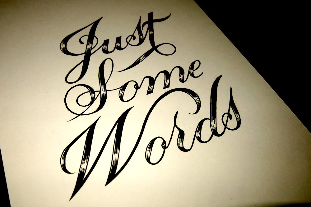
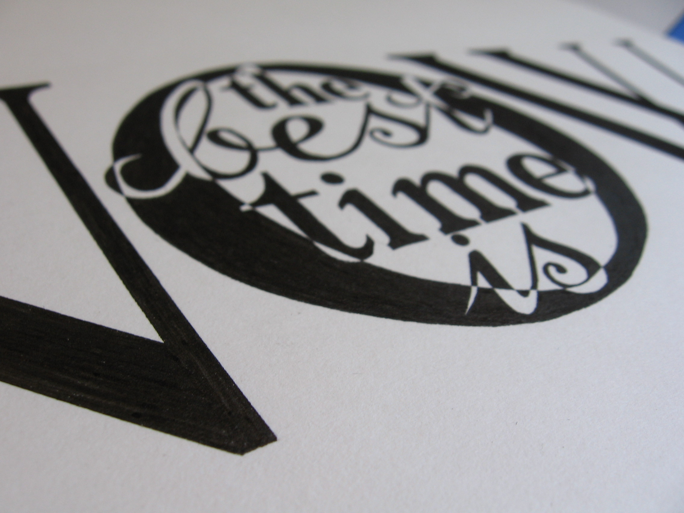
Sometimes I have one of those days when I can’t quite get my mind in gear. Wouldn’t it be nice to just have an auto pilot mode? Well when you have a timetable to stick to, sometimes you just have to do it anyway! Searching for inspiration can be tough, so in light of that, I made this piece this week:

I can't brain today. I have the dumb.

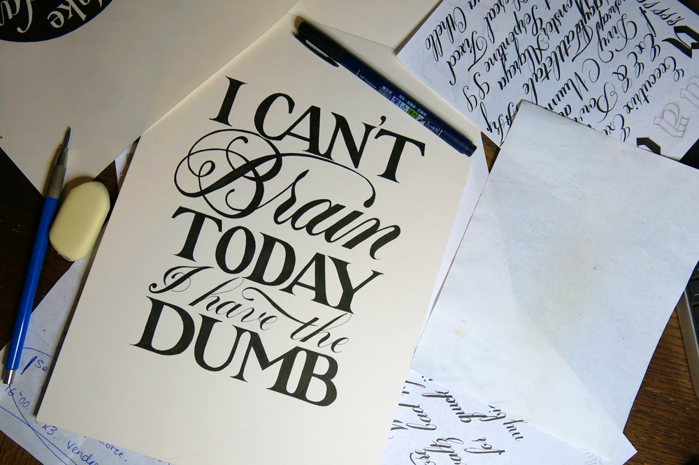
I can’t remember when I heard the phrase, but it’s suited the feeling. I decided to make a light hearted, quick piece that wasn’t too complicated. After all, it’s been a pretty hectic week! Last week I did the words of the week challenge on the lettering subreddit. This week, there was a drop cap challenge, so I decided to do a bit of a speed challenge! I tried to focus more on the fluidity of the lines and less on minute, precise details. I often get bogged down in the details of something, so once I zoom in, it’s often hard to zoom out again and look at the piece as a whole. Maybe it’s a trap a lot of perfectionists fall into, or maybe it’s just me, but the solution is to force yourself out of the usual conditions so that you can’t succumb.

Dropcap N

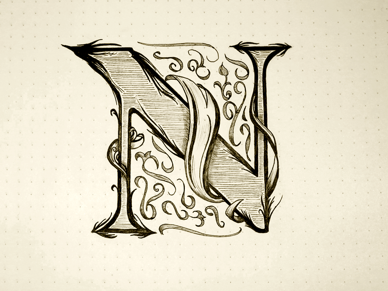
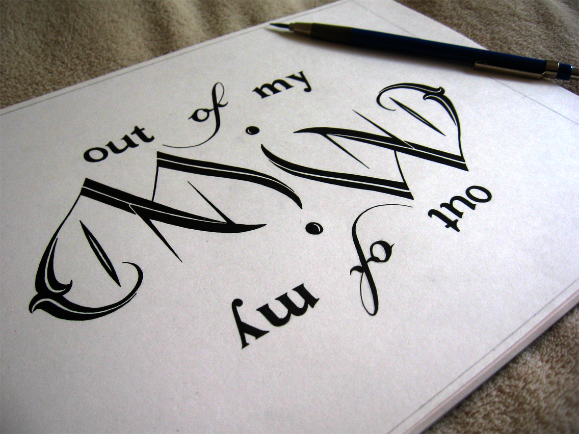
Having some lovely Rhodia dot grid notepaper really helped in diving straight in and not over thinking things. More time that I’m willing to admit usually goes into measuring out the space on the page before I even make a pencil mark for most pieces. Sketching out the design took about half an hour, followed by roughly an hour for inking. That’s much faster than the turn over for a typical piece of mine, so I’d say that the challenge was a success. I’m pleased with the piece, too.

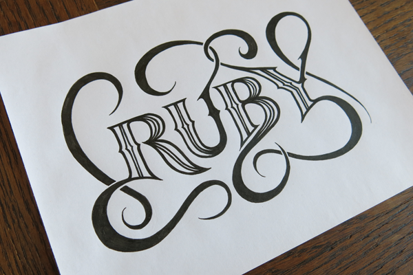
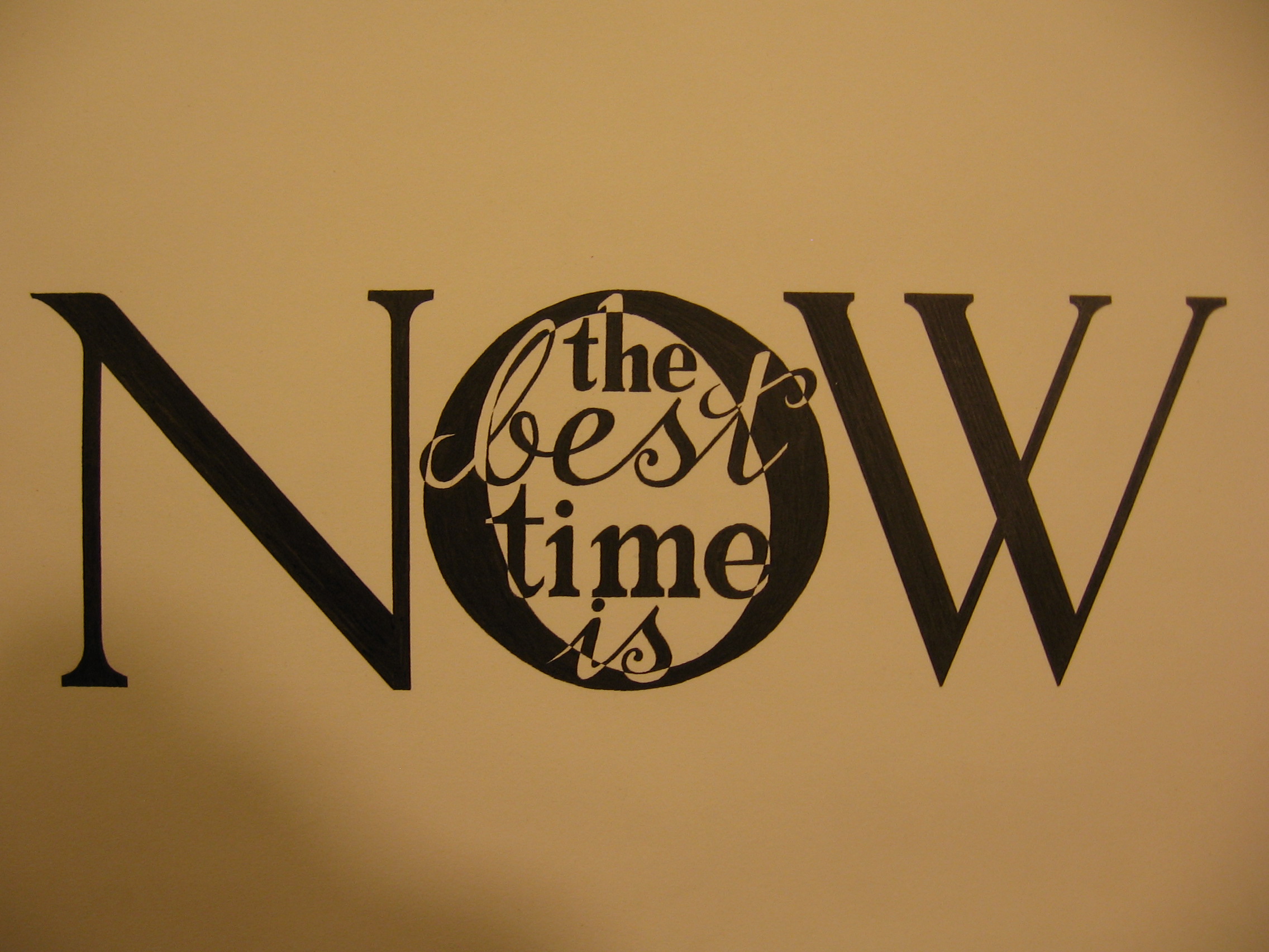
Aside from those two pieces, I also wrapped up a little client project for a tattoo design this week. The brief was to have the word “Ruby” in a similar style as Monday. The dimensions to work with turned out to be perfect for the word. As it was just for a basic design, the client opted to have a slightly less detailed piece than Monday, so you’ll notice a few dissimilarities.

Angled shot small

The next lettering challenge isn’t up yet on the lettering subreddit (where are you mods?) so I don’t know if it’s something I’d like to do next week, but I’m thinking that I might make a thing of doing the drop caps, which come up every fortnight. I think it would make a good series!

Just Some Words

Just some words, just for fun. Another piece inspired by the brush pen style of Copperplate calligraphy that I’ve been doing recently, which has been steadily infiltrating my lettering work.

Just Some Words

I thought, with this piece, that I would keep it as simple as possible. I love to create fine details in all of my pieces, so recently, I’ve been focusing a bit more on simplicity, in order to concentrate more on form. So this piece was going to be filled in with solid black, but when it came down to it, I thought I would add in some of the “shine” elements that I had included on the ornamentation on Monday. I thought that there’s no reason not to, and if I wanted to, I could fill it in after I had finished, so that it was fully black, but I think the effect suits the piece well.

Something else to mention with this piece is that it’s not a combination of typographic or calligraphic styles, which is something I do in most pieces that involve more than one word. The reason for this is that having more than one style in a piece naturally gives it a hierarchy, or at least some contrast in the way you view the words. With this piece, however, I felt that seeing as the word length was so similar, and there being no really strong focal point of the phrase, it would be best to have it all in one style. Aside from anything, the meaning of the phrase is such that it lends itself to something that seems more casual, so it would seem odd to have “Just Some” in a weaker style that “Words”, which would probably be the way it would work out if you wanted to give any of the words more weight. In that case, the word “Words” would seem too important make it seem that it wasn’t, in fact, just some words.

Non-Zero Days

A commenter in a thread on reddit once posted some advice on how to keep motivated and strive towards your goal. One of the main points in his post (which was full of value) was that if nothing else, every day should be a non-zero day. By that, he meant that even if you only take one step towards your goal on any given day, make sure that you take at least that one step. Even if it’s the smallest thing you can do to get yourself to where you want to be, it means that your day is not a failure. The advice stuck with me, so I made a piece around it.

Make Every Day a Non Zero Day

Over the past few weeks, I’ve been focusing on producing pieces with a focus on detail and intricacy, and while that is my style, and not something I want to abandon, I felt like making something a bit bolder. To achieve this, I chose to have the piece contained in a circle, and for the letters to be white on a strong black background. To keep things stylistically simple, I stuck with only two styles: copperplate inspired brush pen script and traditional Roman letters.

With this week’s project, I also wanted to design a piece that I would like to see on some merchandise, such as mugs or posters. It would be exciting to have some things to sell with pieces printed on them, so I thinking of starting to build up some pieces that would work well in that medium. This will be the first of “poster suitable” pieces, which would be something easily printable by a letterpress. As you can imagine, I’m sure, some of my other pieces would be too detailed to be printed easily on a reasonably sized poster, and you would need a very large mug indeed to accommodate them!

In other news, I have a new camera, so all the old photos of my work are likely to be replaced soon enough. I’ll wait until a nice sunny day (which is all the time!) and take some nice photos in the sunlight. That may include this one, as I unfortunately left it a little (very) late to catch the sun for the photo today.

New Logo

This week, I’m a day early. That’s not because I’m some kind of motivation machine, as I’m sure you were all thinking, but because I’m going to be away tomorrow, so I pushed my deadline forward a little. Anyway, to business! I have some new branding that I’m going to be putting up in the coming weeks. First, I have a new logo for myself in the form of a monogram.

MonogramL

This is part of a lettering piece that’s going to replace the header I currently have for the website, which was an old piece that I did for Thing a Day. Seeing as it was part of Thing a Day, it was a piece that I planned and executed all in one day, so I decided that it was time to think a bit more deeply about my personal branding. I wanted a piece that could be broken down into several parts so that it could fit into different spaces, e.g. business cards, social media, website banners etc. What I came up with is something that you’ll have to stick around to see, as it’s not going up this week. What I am doing, though, is taking the social media element of it, and putting it out there already, seeing as it’s finished. What you see is a vectorised version of part of the lettering piece.

So what’s the deal? Well, it’s a monogram, meaning that it’s my initials combined into an interlinked shape. In the final piece, the letters overlap, and run on top of each other in different places, but I wanted to preserve simplicity for the social media icons. Being shrunk down to a small size hurts! Or at least, it hurts pictures, especially if they’re detailed. With this digital version, I made sure to keep it simple, but added in some details like a smattering of vector textures and a roughened edge atop a gradient background. All that so it looks a bit more interesting when it’s big, as you see it above. However, usually it’s only about this size:

MonogramTW

That’s twitter size, which I’m reliably informed is 73×73 pixels. Why that size, I don’t know, however, it’s only big enough for a certain amount, so simplicity (at least compared to what I usually go for) was pretty important.


A riddle

Today, I have a riddle for you. Take a look and see if you can figure it out.

Dad

The riddle, then, is who is “this man”?

Recently, I started out on a foray into the world of brush pens, and found myself going back to what had originally got me into lettering in the first place: copperplate. Copperplate is a kind of calligraphy that uses a thin flexible nib to create varying thickness in the letter strokes by applying pressure and spreading the tines, setting it apart from broad nib calligraphy like Gothic. Once I had bought a brush pen a few weeks ago, I found myself trying to recreate the elegance of copperplate without the hassle of having to use dip nibs and an ink well, and the messiness that goes along with it. However, I had the wrong pen, and it was terrible. Then, I bought a couple of Tombow Fudenosuke pens, and after an agonizing 2 week wait as they were shipped from Japan, they got here. I really can’t recommend them enough.

I’ve been practising with them for a week or two now, and I’m getting to grips with how they work. At the same time, I’ve been exploring using a bit of photo wizardry to transfer the lettering to sit on top of photographs, as you can see above. Regarding the riddle, seeing as it’s a family matter, I chose a photo of my father, taken by my mother. That’s not a hint though! You’ll have to figure out the answer on your own. If you’re really stuck, a quick google will tell you the answer, but it’s a fun piece of mental gymnastics to go through to figure out the answer, much like phrases such as “I couldn’t fail to disagree with you less” and those sentences with the same word over and over again that still make grammatical sense.

Take a look at the unadulterated version of the lettering below to get more of an insight into what the original looks like:

Brothers, Sisters Riddle

Out of my MIND

Here’s a little piece I did for a competition over at the lettering subreddit. I found out about the competition 3 days before it was to be closed, so I had to work quickly! Fortunately, Thing A Day set me in good stead to do so.  I don’t really know where the idea came from. I was trying to think of things to submit for the competition, but couldn’t come up with anything, so I had taken a break and was messing around with ambigrams of the word “moon”, seeing as I could see it out of the window. Somehow, in the sketches, I saw how the M could form the curve of the D, and the phrase sprang to mind (or out of it).

Out of my MIND

This time, however, it needed to be vectored. Not too great a task, but it didn’t help with the time constraint. This one is also an ambigram, if you hadn’t noticed, meaning it’s the same both ways up. I had a little fun with vectoring it, playing around with the colours, etc. but I think that it’s best viewed in plain old black and white. I’m sure there’s something to be said here about the relationship between colour and form, but I’ll leave it to the better informed. In other news, I’ve recently been learning some HTML and CSS, so with any luck, I’ll be able to get my head around making a new website, which will be exciting!

Another blog post will be up in a day or two about a very big project that I’ve just finished, which ate up a large amount of my time. Hopefully after that, I will have more of a consistent output in terms of numbers of pieces and blog posts. (Dare I say Thing A Day?)

The best time is now

Still on catch-up mode here, so this one was done a while ago, but it’s not too old. This one wasn’t a piece for a client, just one that I decided to do on my own steam, just like in the good old days of Thing a Day.

IMG_1635

After a few variations, I settled on going for the old words-within-words style. I did something similar for Tomorrow is a Dream, but this one is a little different. I think that when you first see it you read the word “now”, of course, because it’s so big. Then comes the rest of the sentence, which is finished by the word “now” again. So in a way, it reads “Now. The best time is now.” It has more impact and helps the message, I think.

This piece also has an element that I’ve wanted to try out for a while in it. Imagine that the words “the best time is” simply make everything behind them turn the opposite colour, creating what looks almost like a checker board pattern. The challenge with it is that if you were to simply follow along the guidelines in the picture below, you wouldn’t execute the design successfully.

IMG_1596

The problem arises when you consider following along the pencil lines with a fineliner. In fact, when you look at a pencil outline like this one, you only see the line. But when you look at the finished piece, you don’t so much see the line as you see what is contained or excluded by the line. Because of this, you need to think about the thickness of the stroke that is created when you draw along a line. In fact, it’s drawing ON the line that is the mistake. To allow the negative space, or the white spaces, be the same proportion as their black counterparts, you must always make sure to draw around the surrounding edge, and never on the line itself, unless you want the white parts to become too small. Take a look at the picture from a silly angle to see what I mean:

IMG_1640


I’m working on a big logo design project at the moment, but luckily I’m having the time to post bits and pieces here and there to try to catch up with myself, but it might take a little longer to get a post done about this logo, though when it arrives, there will be a lot to talk about, as it’s my most detailed piece yet, by far.

The Urban Orb

Second in my series of “What was going on a month ago” is a post about the a bigger project that I did. The client wanted 3 things: first, a logo for a series of youtube videos consisting of the words “The Urban Orb”, second, the text “Next Episode” to be shown at the end of each episode during the preview of what will happen next time, and third, a large number of quotations and phrases to be edited into the videos, but to be done in calligraphy, not lettering.

The Urban Orb

The Urban Orb is a streamer who usually broadcasts himself through streaming websites like twitch.tv, but in this case, he wanted to have a series consisting of a challenge run through of the game Dark Souls uploaded to youtube. Though he was unsure exactly which colouring/texture was going to work out best once the videos were edited, we settled on the outline of the project, and I started work. In the end, the client received several different versions to test out on the final videos, allowing for legibility, unobtrusiveness, and thematic consistency. The logo was designed to be easily read, unique in its ligatures, and styled to match the feel of the game it is used to watermark. In the end, to blend unobtrusiveness and legibility against all backgrounds, the final version consisted of a solid black outline with a semi-transparent white fill, allowing the logo to be constantly visible, but never stand out harshly in the way that a solid colour would do.

Next Episode

The Next Episode text was done in a similar style to The Urban Orb logo, but was designed to fit a much larger space. The text was originally intended to be in a calligraphic style that would interact with the ornamentation around it, and though it was sad to leave some of the calligraphic designs by the wayside, I think that the increased legibility and thematic consistency is worth more than the ornamentation’s interaction with the text. As it stands, the text is nested within the ornamentation, which also continues up to surround the in-game interface, thereby integrating the text with the aspects of the game.

Nietzsche Quote Blog Upload

Executing the calligraphy was a very different task to the design and execution of the lettering. To start with, calligraphy is more of an all-or-nothing process, where one mistake in a quotation can mean that you must start again. Some quotations were much longer than these three, so a mistakes could mean that double or triple the time would be needed to get it correct. I used traditional dip nibs and ink to write these – black ink on white paper. Once they were completed, I scanned them into the computer and colourised them digitally, though they are not vectorised, of course, which would take more than one man’s patience worth, I think.

In all, this project was wonderful to work on, not least because I was exposed to so many inspiring quotations, some of which I had read before, but many of which were new to me. Most were on the topic of perseverance, success and failure, which certainly helped me continue past making a mistake towards the end of a long quotation!