
Something that’s important for people to do is to make sure that they challenge their own opinions on a regular basis. Re-evaluating what you think about a topic not only sometimes leads you to change your opinion, but it also allows you to have more empathy for others, even if you don’t agree with them. It’s often said that if you only ever talk to people whose opinions are the same as your own that you are in an “echo chamber”. Anything that you put out just bounces back to you without any differences. With that said, there’s something else that is very important that you can do for your mental well being, and that is making sure that you are surrounded by positive people. People who don’t detract from your life, who are supportive of who you are, who don’t bring unnecessary negativity. In short, good company.
So what’s the difference between being “in good company,” i.e. surrounding yourself with people who are going to support you and encourage you, and being in an echo chamber? Being challenged. A true friend is one who isn’t afraid to help you grow and improve as a person, even if it’s difficult. Maybe you can think of someone in your life who doesn’t just agree with you all the time, yet with whom you have a positive relationship. Maybe others are lucky enough to call you that person. Either way, I’d say that means you’re in good company.

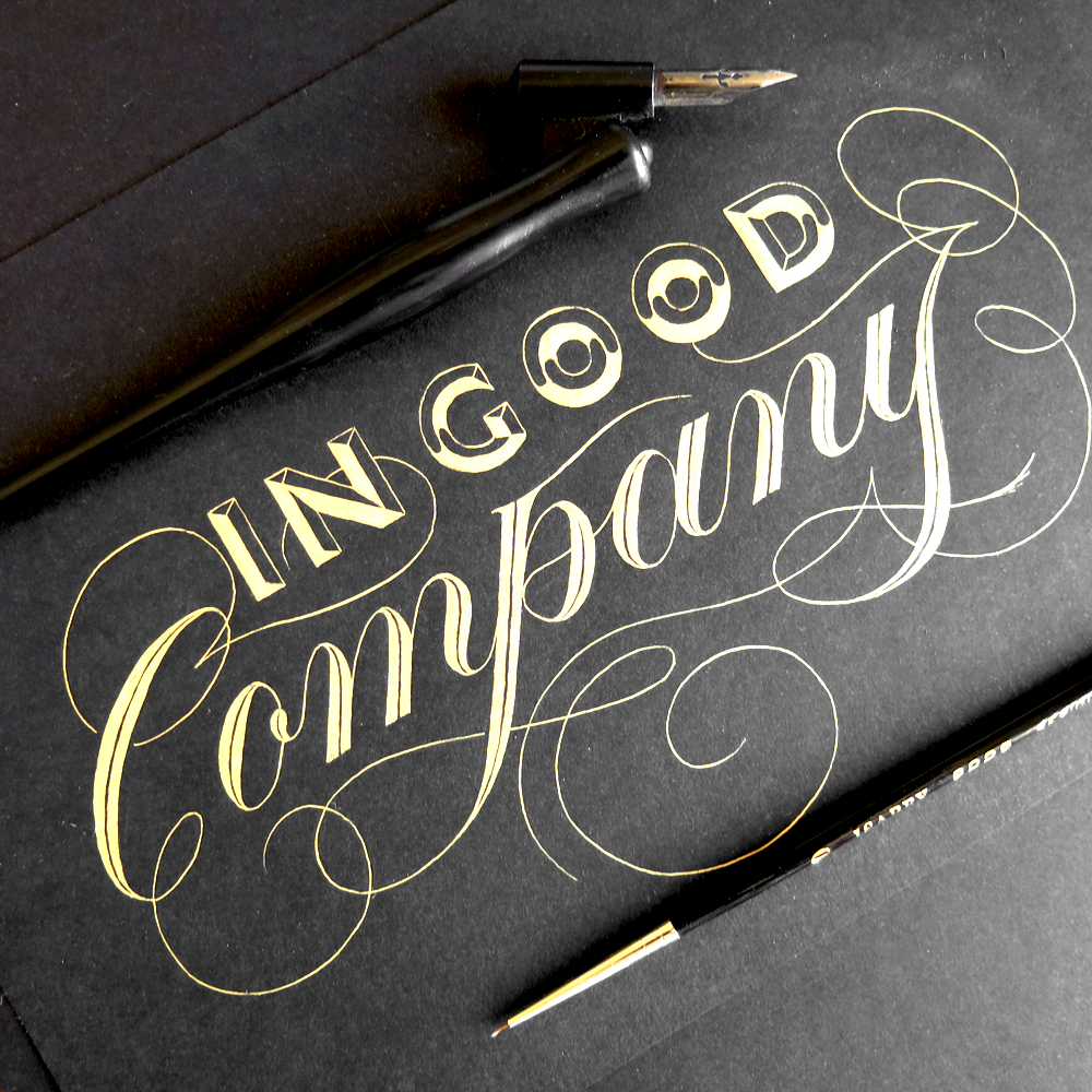
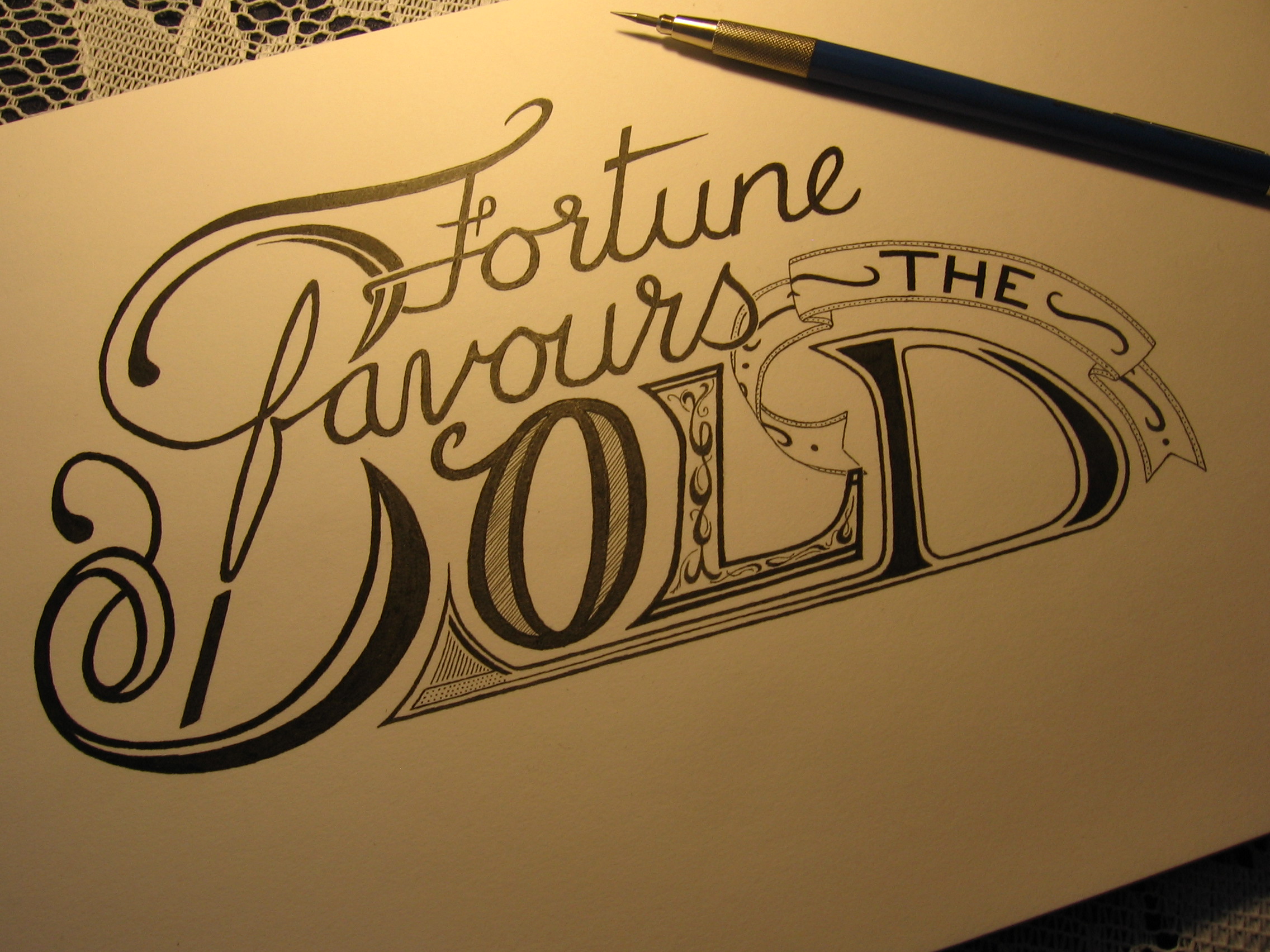
In Good Company Collage
I made this piece to celebrate having found the Instagram community of calligraphers and letterers, a great network of creatives who display a remarkable level of skill, community and support. Lately, I got some new materials (which I used for the first time in last week’s post) and I was excited to show off their effects on Instagram. I had also recently reached 2000 followers, so it was the perfect time to make a thank you piece, and make it a little special.

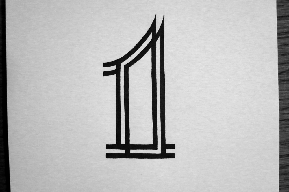
This bit for you letter-nerds:
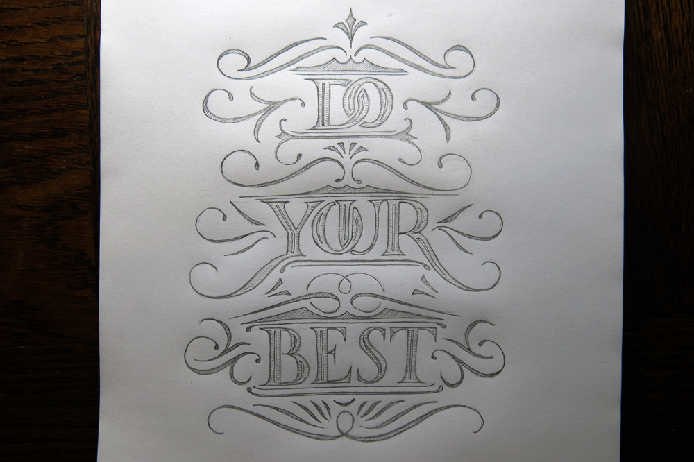
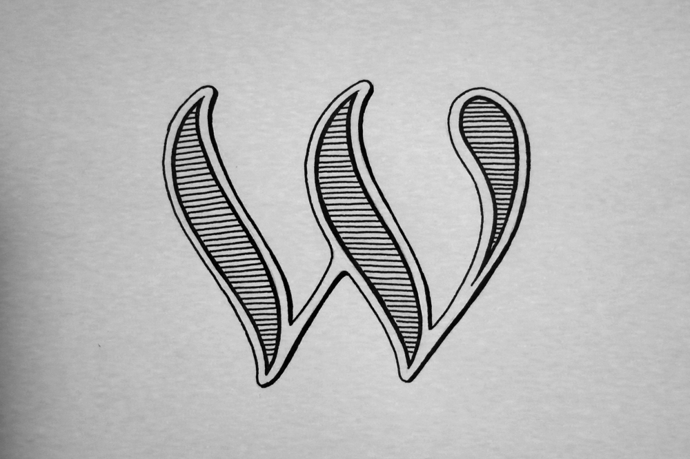
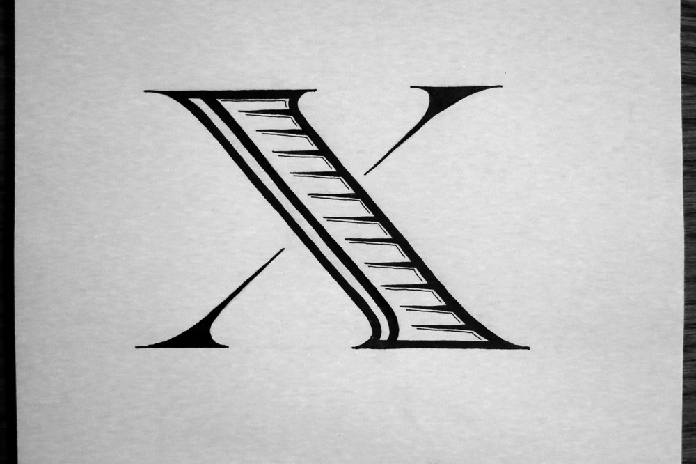
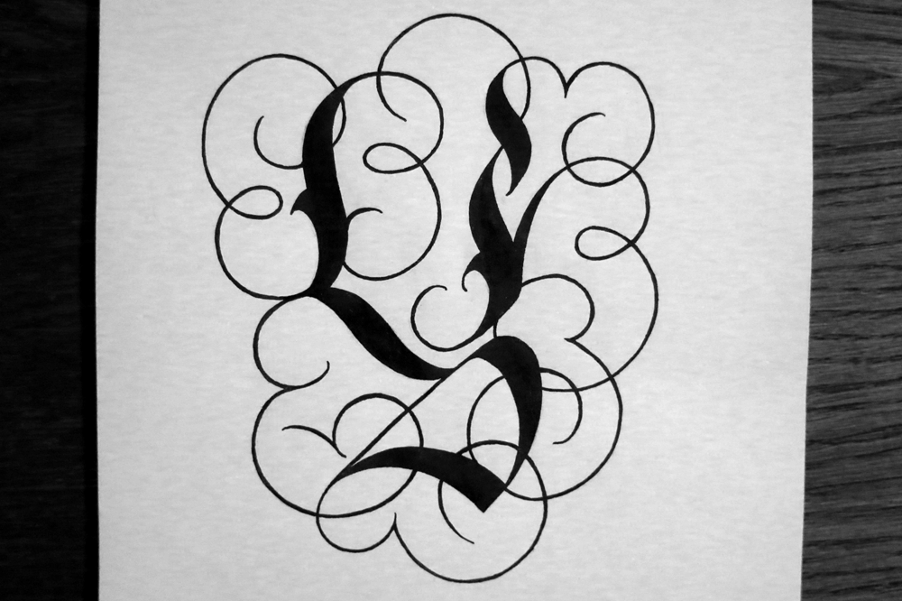
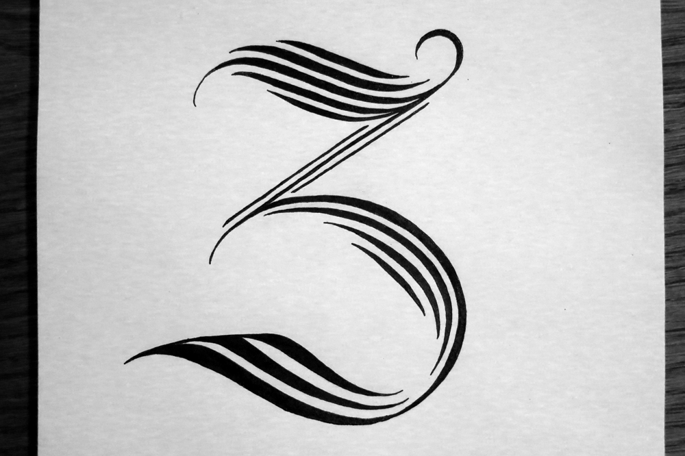
I made a visit to the land of sans-serif (gasp!) for this piece, which is a change of pace from usual. Seriously, my middle name is Sebastian, but I’ve often considered changing it to Serif instead. Man, do I love serifs. But that’s not to say that sans-serif typography doesn’t have its place in my lettering pieces! Not at all so, and so here it is for the first time in a while: I paired it with a whimsical Copperplate style to add some contrast. The blocky power of the sans-serif seemed like it might have been able to overpower the Copperplate, even at its reduced size, and so I lightened it up by giving a fun sign-painting style of inner letter shading. This pop-art-esque style of 3D effect breaks up the appearance of the letters and gives them a more open yet clean texture, which helps it sit comfortably with the calligraphic style below.
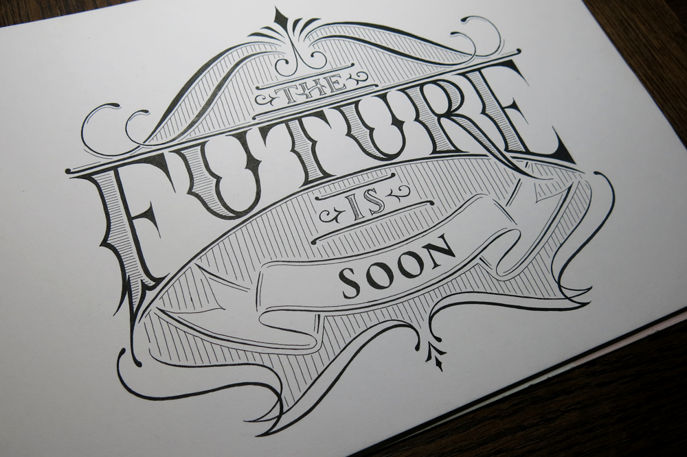
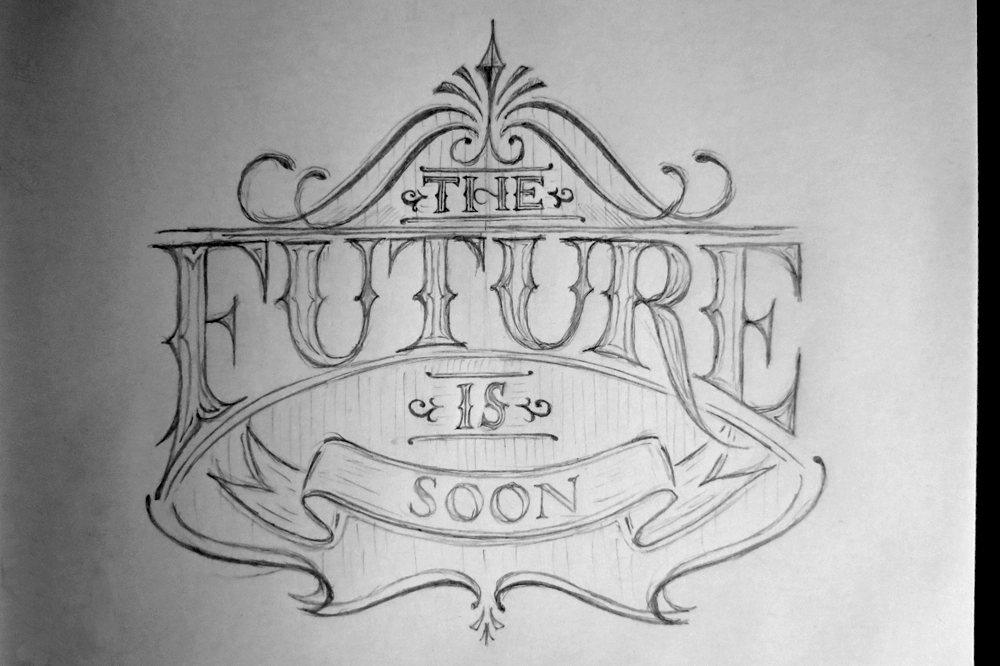
Here’s a glamour shot:
Pictured: tools used to make the piece (left), tree painting (upper left), part of a popup card from my brother (thanks Jamie!) from Vietnam (upper right), pot of gold paint (right).


You must be logged in to post a comment.