
This week, I ran found that I had used the last of my large pad of paper that I usually do inked pieces on, so I turned to doing something digital instead. One of the pieces I did for my daily doodles turned out quite well, and I felt it was worth refining a little. Here’s the sketch I first made for my daily piece, in pencil in an A5 notepad:
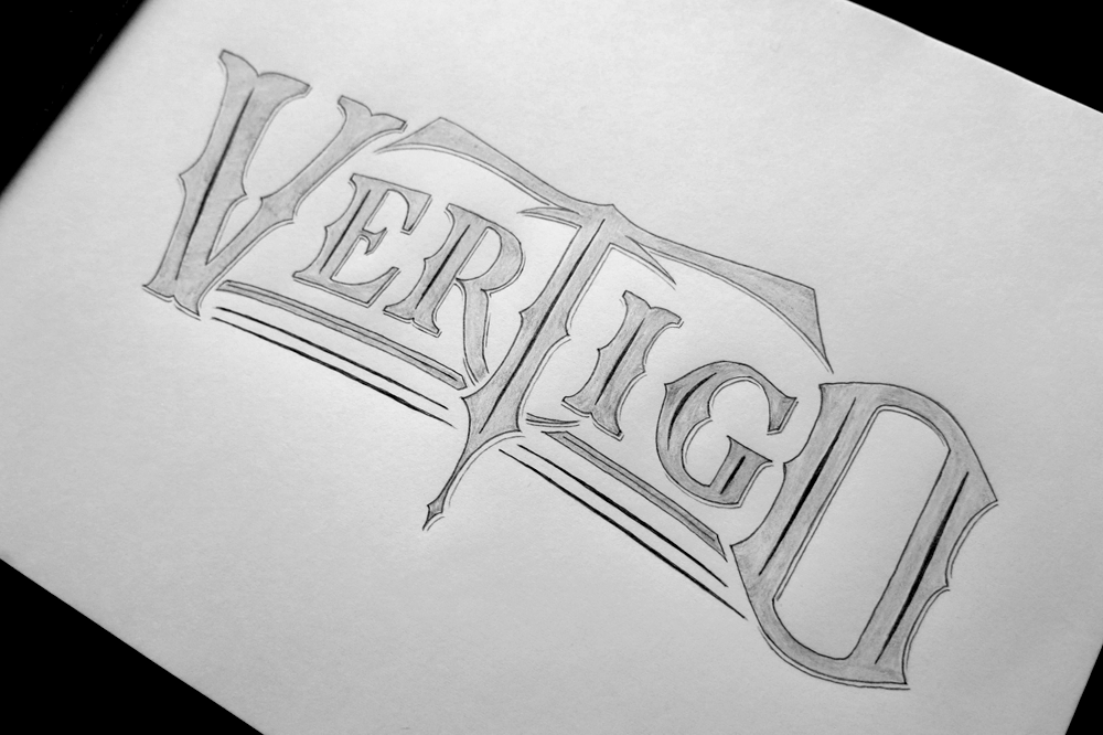
From there, I took a few square photos of it (I don’t have a scanner, unfortunately) and then took it into Inkscape to turn it into a digital version. I used the software to iron out all the little bumps and irregularities that you don’t quite notice when you have it on a piece of paper in front of you, but which stand out once it’s displayed on the screen. For instance, in the digital version, the baseline for the smaller letters is a smooth curve, which uses the same line as the top of the letters and the spurs mid way up each letter. After tracing the outline, it’s much quicker to make the little drop shadow by duplicating the whole thing, shifting it slightly, then cutting away everything that lies underneath the original. From then, it’s just a matter of choosing a splash of colour,

As for the other daily doodles this week, they have a mainly calligraphic element to them. The first, “Imagine” is a simple Copperplate inspired doodle I drew a couple of days ago with some flourishes to give it a rounder shape.

The second is one I did at the start of the month. It’s a mixture of Copperplate and Gothic styles.

The third is some real calligraphy! Surprising, I know, but I do sometimes do other things than lettering with pencils and fine liners. “Strive for more,” done with a Pilot Parallel 3.8mm pen.

Lastly, something that’s coming up next week, for one of my daily pieces I started designing an ornate piece that will be up in ink next Monday once I have gone to buy some more paper.

