
So the lettering subreddit has a weekly challenge for people to participate in. Unfortunately, it doesn’t have many contestants, unlike the word of the day on the calligraphy subreddit, which has several submissions every day! That one, however, isn’t a competition, so maybe that makes a difference. Anyway, I think the lettering challenge has few takers because lettering is a pretty lengthy process compared to calligraphy, so it’s quite a time investment to take part. This week, I decided to give it a go.
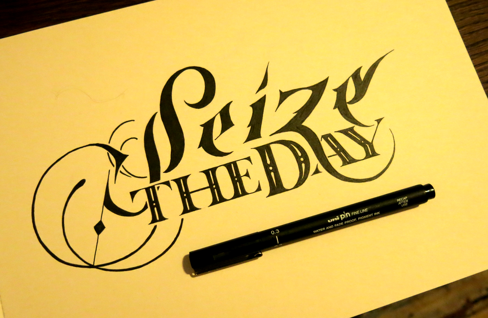
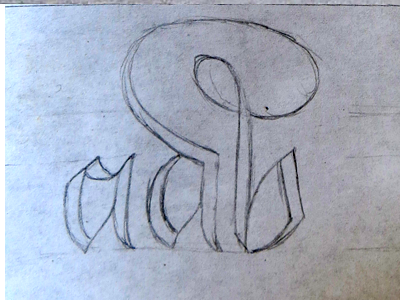
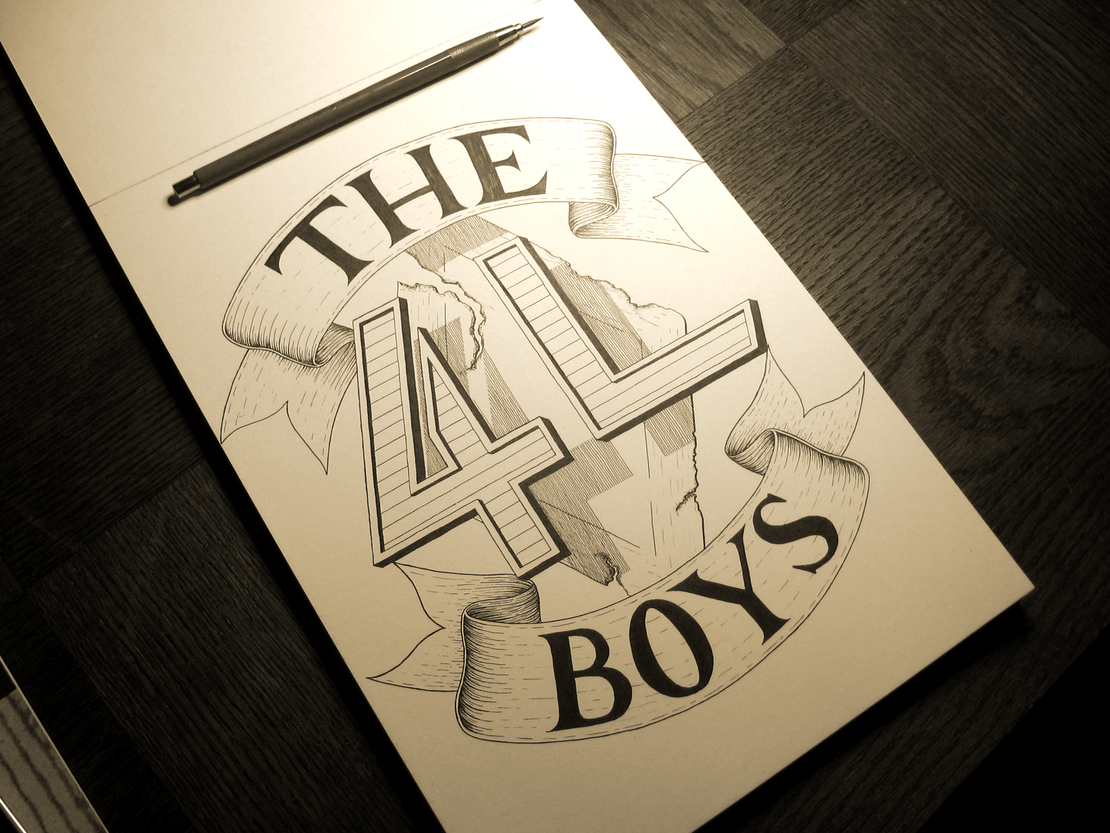
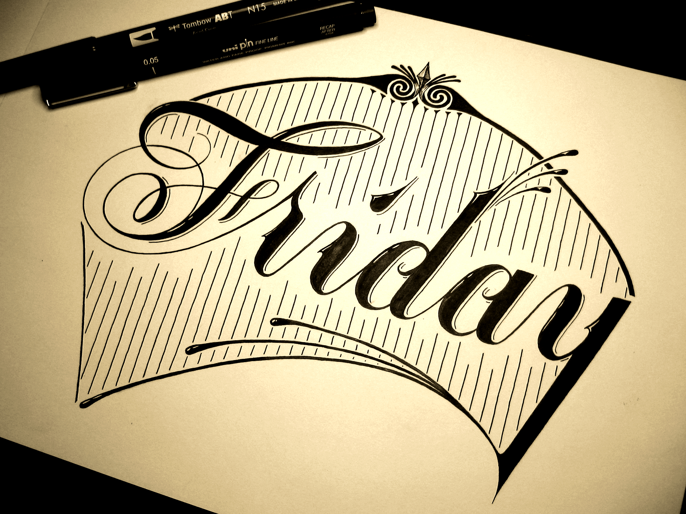
I only had a couple of days to bash out a piece seeing as I’ve had some client work I’ve been focusing on since the beginning of last week. I had a pretty good idea of what I wanted to achieve with this piece. Luckily I wasn’t going for any insane level of detail, so finishing it quickly was fairly doable once I had it planned out. My goal was to emulate a style that I’ve often seen with the logos of things like production companies and music studios. The style seems to include a single word in a brush lettering or Gothic style, often done with a liberal amount of flair (dare I say pizazz?) followed by one or two smaller, more sensible, neat Roman words beneath. It typically ends up reading something like “SUCH AND SUCH music studios”, with the such and such being the name. This piece is a little bit of a deviation from the style in that the Roman letters are a little more stylish than what you might usually see, where they are very understated. The reason for that is that this being a lettering piece rather than a logo means that I have more freedom to explore the combination of styles a little further, knowing that it won’t ever need to be sized down to fit on a business card or social media branding.
On a related note, I’m still exploring brush lettering as much as possible, (the aforementioned calligraphy word of the day being very helpful) and I’m thinking of looking into getting some broad nib pens like pilot parallels to explore Gothic styles a little more and expand my knowledge. Understanding a style thoroughly takes a lot of exploration and time, sometimes!


You must be logged in to post a comment.