Non-Zero Days

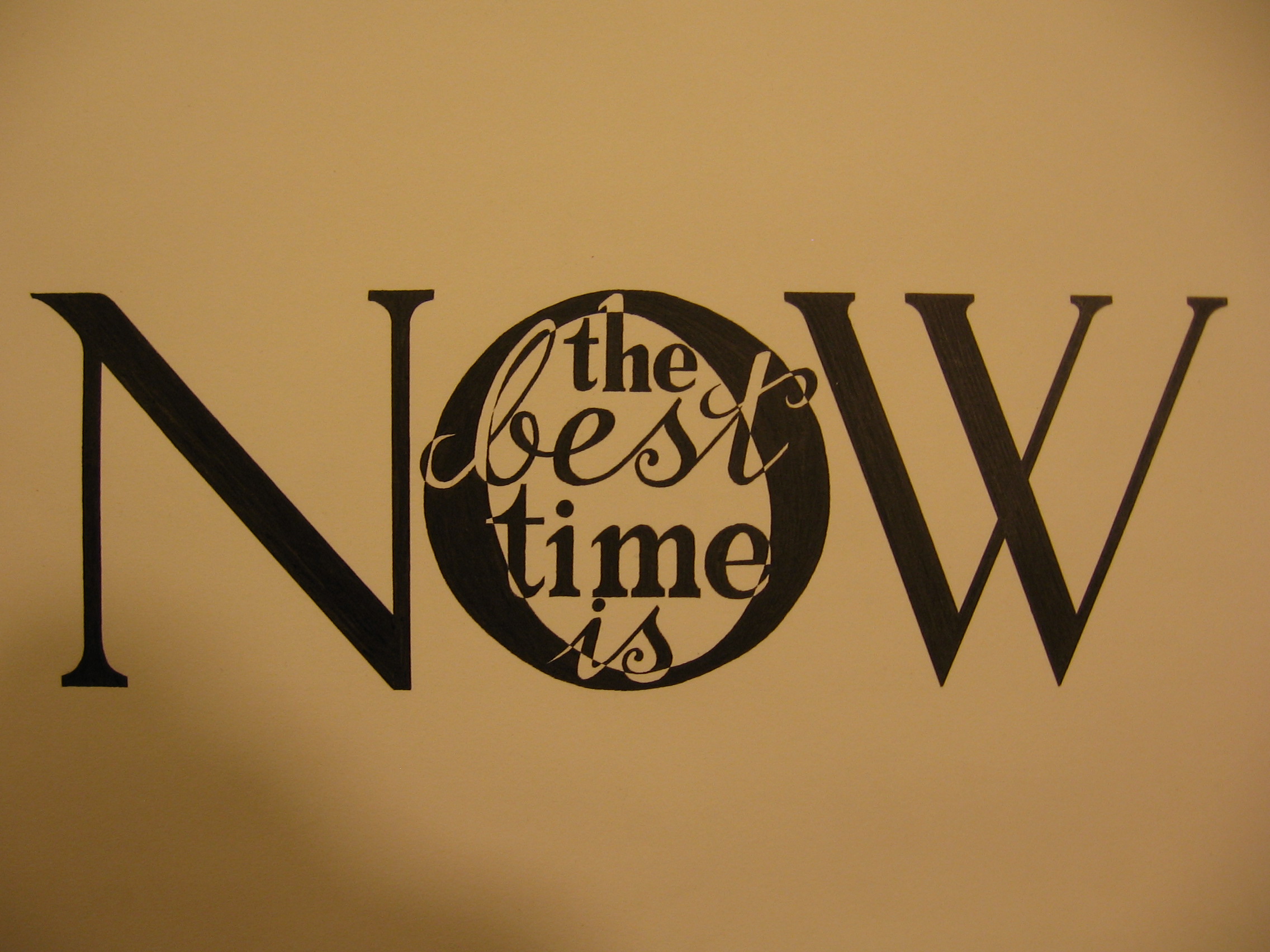
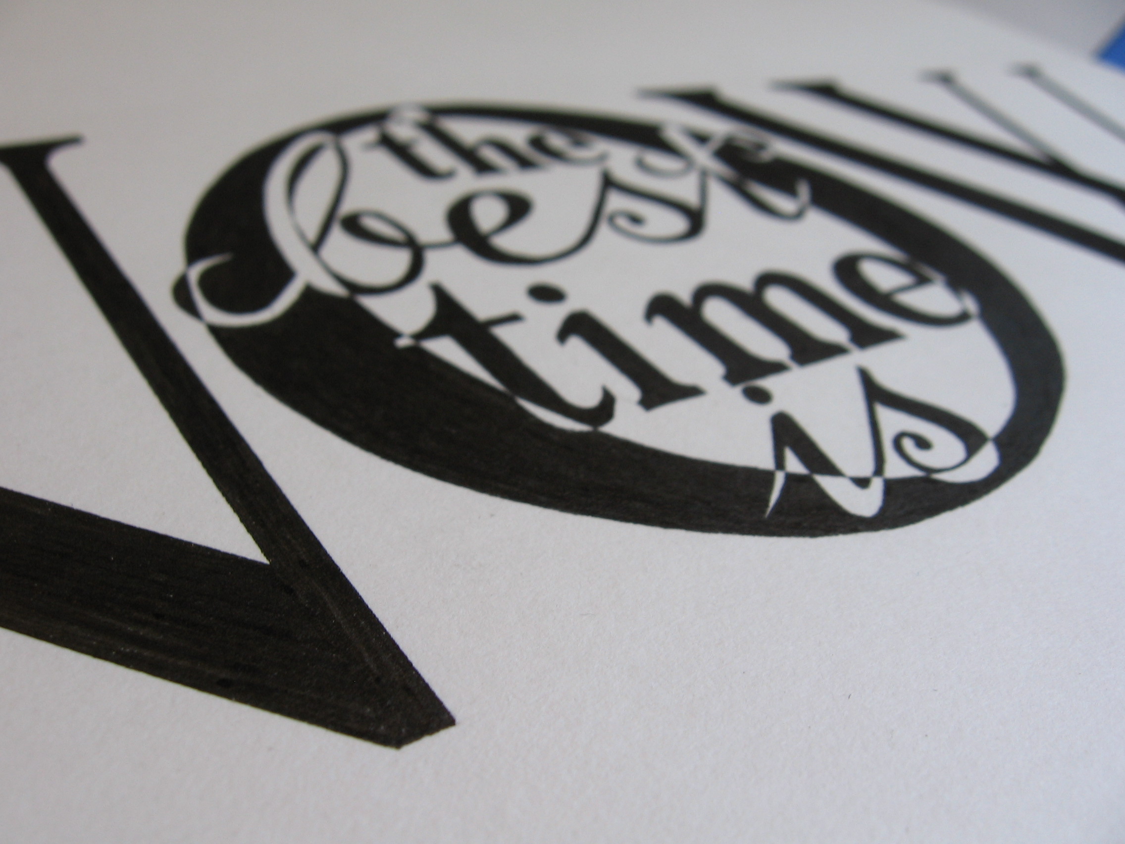
A commenter in a thread on reddit once posted some advice on how to keep motivated and strive towards your goal. One of the main points in his post (which was full of value) was that if nothing else, every day should be a non-zero day. By that, he meant that even if you only take one step towards your goal on any given day, make sure that you take at least that one step. Even if it’s the smallest thing you can do to get yourself to where you want to be, it means that your day is not a failure. The advice stuck with me, so I made a piece around it.

Make Every Day a Non Zero Day

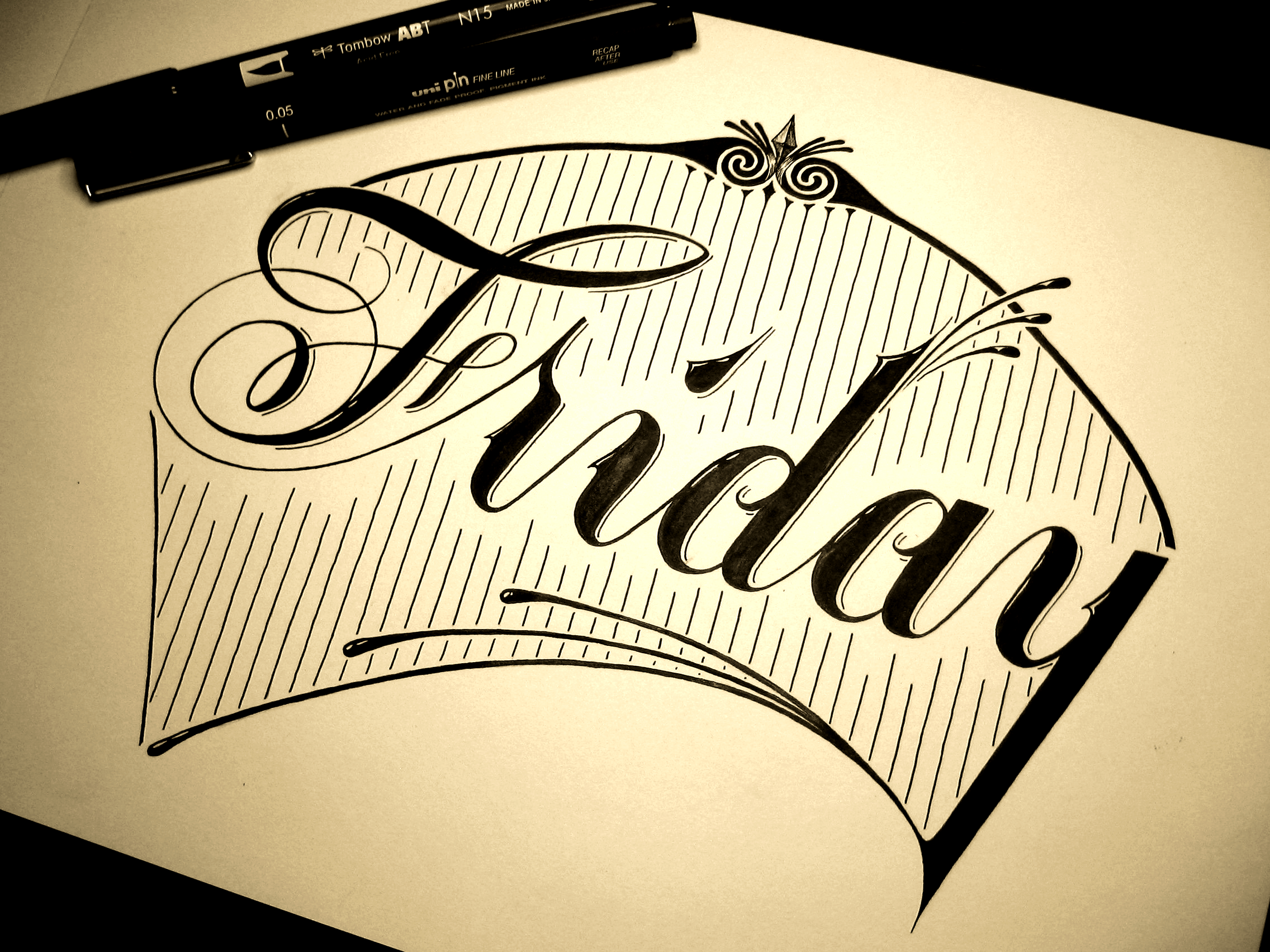
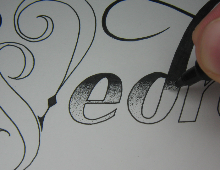
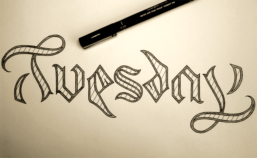
Over the past few weeks, I’ve been focusing on producing pieces with a focus on detail and intricacy, and while that is my style, and not something I want to abandon, I felt like making something a bit bolder. To achieve this, I chose to have the piece contained in a circle, and for the letters to be white on a strong black background. To keep things stylistically simple, I stuck with only two styles: copperplate inspired brush pen script and traditional Roman letters.

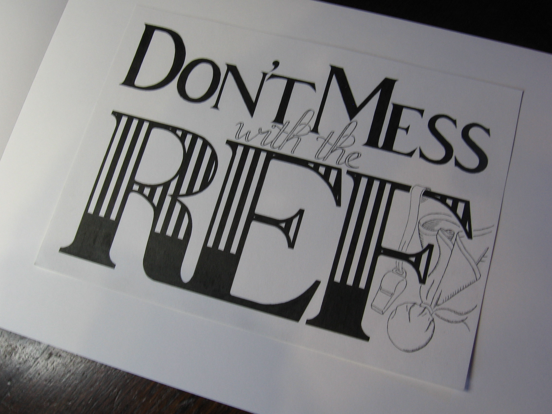
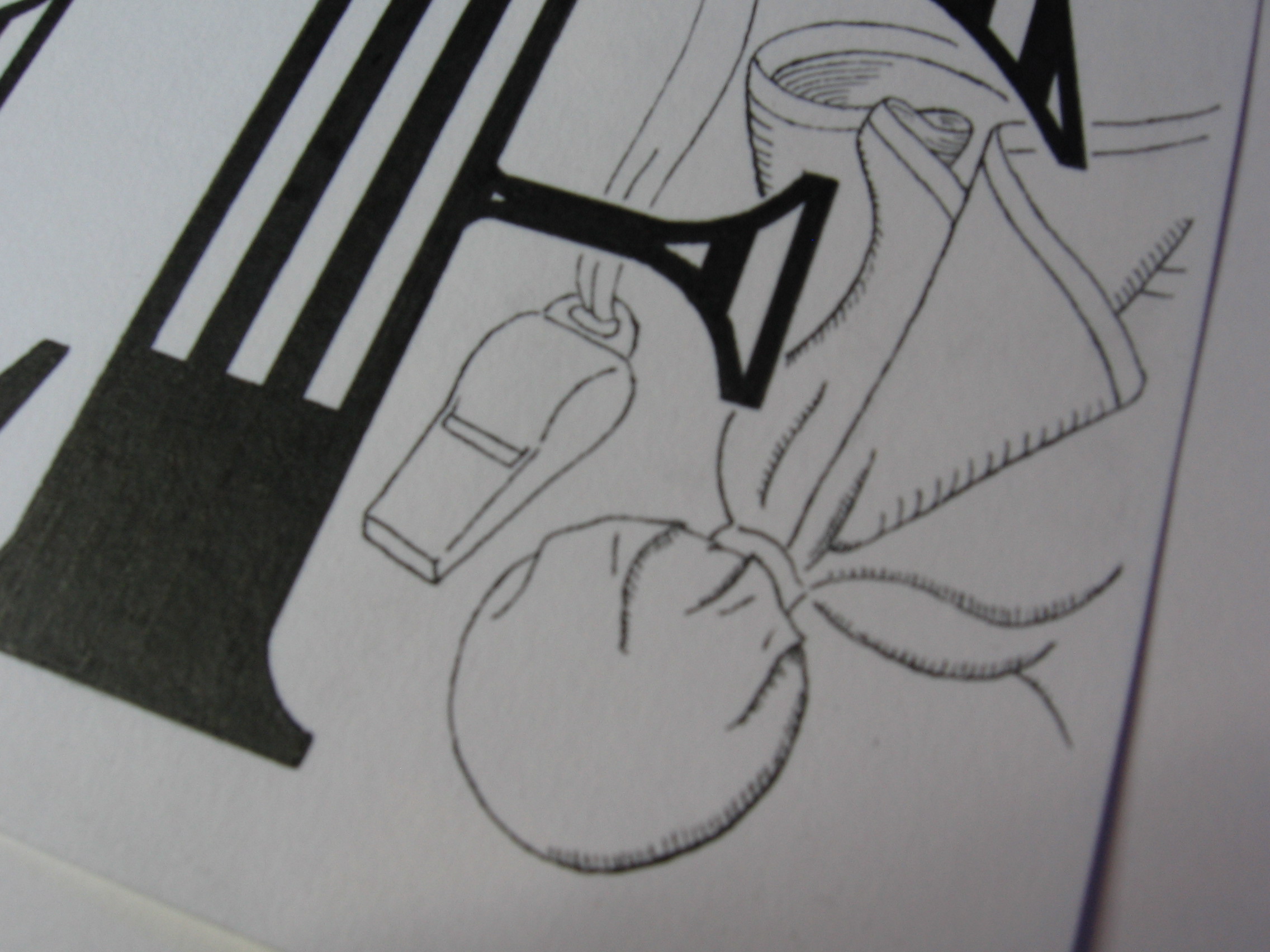
With this week’s project, I also wanted to design a piece that I would like to see on some merchandise, such as mugs or posters. It would be exciting to have some things to sell with pieces printed on them, so I thinking of starting to build up some pieces that would work well in that medium. This will be the first of “poster suitable” pieces, which would be something easily printable by a letterpress. As you can imagine, I’m sure, some of my other pieces would be too detailed to be printed easily on a reasonably sized poster, and you would need a very large mug indeed to accommodate them!

In other news, I have a new camera, so all the old photos of my work are likely to be replaced soon enough. I’ll wait until a nice sunny day (which is all the time!) and take some nice photos in the sunlight. That may include this one, as I unfortunately left it a little (very) late to catch the sun for the photo today.

New Logo

This week, I’m a day early. That’s not because I’m some kind of motivation machine, as I’m sure you were all thinking, but because I’m going to be away tomorrow, so I pushed my deadline forward a little. Anyway, to business! I have some new branding that I’m going to be putting up in the coming weeks. First, I have a new logo for myself in the form of a monogram.

MonogramL

This is part of a lettering piece that’s going to replace the header I currently have for the website, which was an old piece that I did for Thing a Day. Seeing as it was part of Thing a Day, it was a piece that I planned and executed all in one day, so I decided that it was time to think a bit more deeply about my personal branding. I wanted a piece that could be broken down into several parts so that it could fit into different spaces, e.g. business cards, social media, website banners etc. What I came up with is something that you’ll have to stick around to see, as it’s not going up this week. What I am doing, though, is taking the social media element of it, and putting it out there already, seeing as it’s finished. What you see is a vectorised version of part of the lettering piece.

So what’s the deal? Well, it’s a monogram, meaning that it’s my initials combined into an interlinked shape. In the final piece, the letters overlap, and run on top of each other in different places, but I wanted to preserve simplicity for the social media icons. Being shrunk down to a small size hurts! Or at least, it hurts pictures, especially if they’re detailed. With this digital version, I made sure to keep it simple, but added in some details like a smattering of vector textures and a roughened edge atop a gradient background. All that so it looks a bit more interesting when it’s big, as you see it above. However, usually it’s only about this size:

MonogramTW

That’s twitter size, which I’m reliably informed is 73×73 pixels. Why that size, I don’t know, however, it’s only big enough for a certain amount, so simplicity (at least compared to what I usually go for) was pretty important.


Sunday

Days! Weeks! Days of the week! I started off idly sketching the word Monday and had the idea for the series. Well, 7 weeks later and it’s finished. Here’s the last one:

Sunday2

Over the course of the weeks, (or the week,) we’ve had brush style, Gothic, typography, flourishes, graffiti, stippling, even an ambigram. My challenge was to create 7 pieces that were as different from each other as possible. The goal was to expand my horizons, learn how to do new things, and explore styles that weren’t just replicas of what I had done in the past. It was tough finding a style for each piece that set it apart from the others, especially towards the end. With this piece, I had exhausted the styles that I was used to doing, which eventually gave me the idea to make something that looked more like a poster. The main difference is that this piece has a lot more non-lettering elements to it. I could have had it with the word just as it is, but seeing as so many lettering pieces are simply the words sitting stark and bare, I wanted to embrace the challenge of deviation from things that are too familiar.

One of the results of having such a detailed piece is that I under estimated the amount of time it took to complete it, meaning I’m a little late in posting it, as it’s just past midnight. Next week, I have some client projects to get working on, so I will either upload some progress, or finished shots of them, or I will get back to doing some pieces that aren’t just single words, like this series has been. Come back and check it out!

Just in case you missed any of the other Days of the Week, here are the rest:

Monday

Tuesday

Wednesday

Thursday

Friday

Saturday


Friday

Happy Monday! Or as I like to call it, Friday!

Friday

I don’t really call Monday Friday, and I do, in fact, have a solid grasp of what day of the week it is. The thing is, however, that this is the 5th instalment of my Days of the Week project, meaning that today’s piece is Friday! This week I was having an interesting time playing around with a new brush pen of mine, which you can see in the picture. I experimented with a lot of different styles and found that it’s a very versatile thing, but it’s also not as easy as it looks. The brush pen is great for a couple of uses. First, it’s much faster at hashing out an idea than it is with a pencil, meaning you can chase the ever elusive image in your mind that bit quicker, hopefully capturing more of its essence as you go. Second, it can be used to fill in block areas of shading much faster. Both of these uses were a great help to me this week, and the piece draws inspiration from brush lettering styles and makes use of the brush pen’s speed at filling in. Unfortunately, however, it seems to me that the ink has a different quality to it than that of the fine liners I use to outline the piece, resulting in a slight difference between the inside and the outlines of the letters. You can’t really see it here in the picture, and it’s only really noticeable upon close examination of the piece in person, but it’s interesting to note.

Another thing to note about the piece is the decoration around the letters. There are several artists that I admire who do similar things, their lettering pieces adorned with much ornamentation in addition to the letters that make up the piece. I had a great time experimenting with that idea last week, and it’s something that I’m going to keep in mind in the future for all pieces, too. The form of the piece is not necessarily bound by the letters that make it up, and as I’m starting to learn more about it, it will be something that I’m going to start to consider more in the planning of each piece.

I’m afraid I didn’t take any progress pictures this time, because with all time I took experimenting with my brush pen, the execution of this piece was left a little bit to the last minute! As I’m sure you can guess, the piece to follow this one will be Saturday, but, as usual, it will be out on Monday next week.

Wednesday

Day 3! Well, in real time, it’s week 3, not day 3, but this is the third day of the Days of the Week series. This one, as you can see, is Wednesday, as I’m still going with the whole chronological approach.

Wednesday

Last week, we had an ambigram, which was great, but I didn’t want to continue with that theme, because while it’s fun, the point of this series is to try to deviate as much as possible from each of the other pieces. The main talking points of this piece are the stippling and the difference in style between the W and the rest of the word. First of all, the stippling, which is shading using lots of little dots. When I was first sketching the piece in pencil, I shaded it so that it was darker at the top, which, of course, is easy when you’re working with graphite. However, it’s not so easy when it comes to ink, when you have the choice of either black or not black. The challenge, then, comes in tricking the eye to think that between the solid black and white there exists something else. Having some experience with stippling, I was keen to put it into practice again to see if it would do the trick. The effect is certainly different from the pencil, and while it’s difficult to exactly imitate the way pencil strokes can be used to shade a piece, I think that the darkness that you can only achieve with ink makes more of an impact.

With the W, I wanted to create the feeling of a drop cap: something ornate and eye catching. However, last week’s piece was in a Gothic style, so while I was content to have the W in a similar style, I’m glad it turned out quite differently than Tuesday did. This style is much more fancy, which was something that wasn’t an option to me when making the ambigram last week, which has a functional side that restricts it in many ways. I also like to imagine the W in colour in the style of an illuminated letter from old Gothic texts, in this case in red and gold. However, I am more concerned about keeping this project purely black and white to focus on the form, but once I have finished the series, perhaps it’s something I will revisit.

Here’s a close-up of the stipples getting done:

Stipples

About the specifics of the pen: it’s a 0.05 mm fineliner, though I couldn’t tell you if each stipple is truly 0.05 mm in diameter.

Check back next week for the next in the series, which will be Thursday, uploaded on Monday!

Tuesday

So last week, I uploaded Monday as the first part of my Days of the Week project, which, as you can guess, will be a seven part project. The goal with this project is to explore diversity in lettering and make each piece of the project as different from the last as possible. This week, not to be too predictable, I’ve decided to go chronologically from my starting point. So, here’s Tuesday!

Tuesday

The style is inspired by Blackletter/Gothic calligraphy, but the main defining feature of the piece is that it is an ambigram. Like several of my other pieces, such as Out of my Mind and the word Longer in this piece, this means that it reads the same both ways up! The biggest challenge of the piece was definitely the T/Y combination. The curl of the top of the T certainly lends itself to the loop of the lowercase Y but the rest of it needed quite a bit of work to come up with something that would read well. Fortunately, Blackletter capital T’s often incorporate a half moon shape that curls around the left and underside of the letter. Here, the shape is very understated so as to make the shape of the y neat and stay within the x height of the piece, but it was nice to find a solution that created stronger stylistic consistency.

The lowercase U and A practically solved themselves once I started with the Blackletter style, and the S, of course, falling as it does in the middle of the word was the perfect centre point for an ambigram, it being a rotationally symmetrical letter in the first place. The last puzzle was the E/D combination. With this, again, I felt like I had stumbled across something that seemed almost too convenient due to the Blackletter style. A quick google of Gothic script will show plenty of examples of the lowercase D with a very low, curled form, which simply requires the bottom of the E to cut through the baseline a little way to achieve the right effect.

When creating an ambigram, it is such a restrictive form that it’s almost more like solving a puzzle than creating something. It’s as though you’re looking for something that you’re not sure is there. Trying to see if a rock contains a fossil, and until you spend the time and care chiselling away the outer layers, you can’t say for sure. Sometimes you find nothing, sometimes just some fragments, and sometimes you find a whole dinosaur. A similar comparison is with very restrictive poetic forms. To craft words to a restrictive form and still say what you want to say is a very challenging thing, and as I’m sure proponents of the “Poetry doesn’t translate” movement would hasten to tell you, it’s not only down to the skill of the poet, but also the intricacies of the language that allow the poem to work. In the same way, just as not everything can be expressed through sestinas or haiku, not everything can become an ambigram, as much as you might want it to.

I did go on to make a vector of this piece, mainly because I wanted to make a rotating .gif of the image. Take a look!Tuesday


The best time is now

Still on catch-up mode here, so this one was done a while ago, but it’s not too old. This one wasn’t a piece for a client, just one that I decided to do on my own steam, just like in the good old days of Thing a Day.

IMG_1635

After a few variations, I settled on going for the old words-within-words style. I did something similar for Tomorrow is a Dream, but this one is a little different. I think that when you first see it you read the word “now”, of course, because it’s so big. Then comes the rest of the sentence, which is finished by the word “now” again. So in a way, it reads “Now. The best time is now.” It has more impact and helps the message, I think.

This piece also has an element that I’ve wanted to try out for a while in it. Imagine that the words “the best time is” simply make everything behind them turn the opposite colour, creating what looks almost like a checker board pattern. The challenge with it is that if you were to simply follow along the guidelines in the picture below, you wouldn’t execute the design successfully.

IMG_1596

The problem arises when you consider following along the pencil lines with a fineliner. In fact, when you look at a pencil outline like this one, you only see the line. But when you look at the finished piece, you don’t so much see the line as you see what is contained or excluded by the line. Because of this, you need to think about the thickness of the stroke that is created when you draw along a line. In fact, it’s drawing ON the line that is the mistake. To allow the negative space, or the white spaces, be the same proportion as their black counterparts, you must always make sure to draw around the surrounding edge, and never on the line itself, unless you want the white parts to become too small. Take a look at the picture from a silly angle to see what I mean:

IMG_1640


I’m working on a big logo design project at the moment, but luckily I’m having the time to post bits and pieces here and there to try to catch up with myself, but it might take a little longer to get a post done about this logo, though when it arrives, there will be a lot to talk about, as it’s my most detailed piece yet, by far.

Don’t mess with the Ref

Hello again, it’s been a while. Things got side tracked in various ways, and I haven’t been around to update this bit, but I’ve been busy (sometimes very) with various commissions and other projects. So, finally, I have got round to doing a bit more in terms of updating, first with a piece I did more than a month ago!

IMG_1568

This piece was commissioned more than a month ago as a Christmas gift for someone. The theme (as I’m sure you can guess) is that of a football referee. The word ref is coloured to match a ref’s uniform, and the piece is decorated with their tools, being a whistle and a flag. Coming from the UK, I was unfamiliar with these aspects of refereeing in American football, so it was interesting to incorporate them into a lettering piece, particularly the flag, which was a pleasure to design, and which functions as the full-stop (or period) for the sentence. Here’s a close up of the illustration:

IMG_1570

Unfortunately. the piece has been shipped, and is halfway across the world, so I don’t have a chance to take any more pictures or scans of a better quality, but I guess that’s how it goes.

I have a few other pieces to upload and blog about, one of which I have already posted on my logos page, which should also be getting a few new submissions soon enough!