
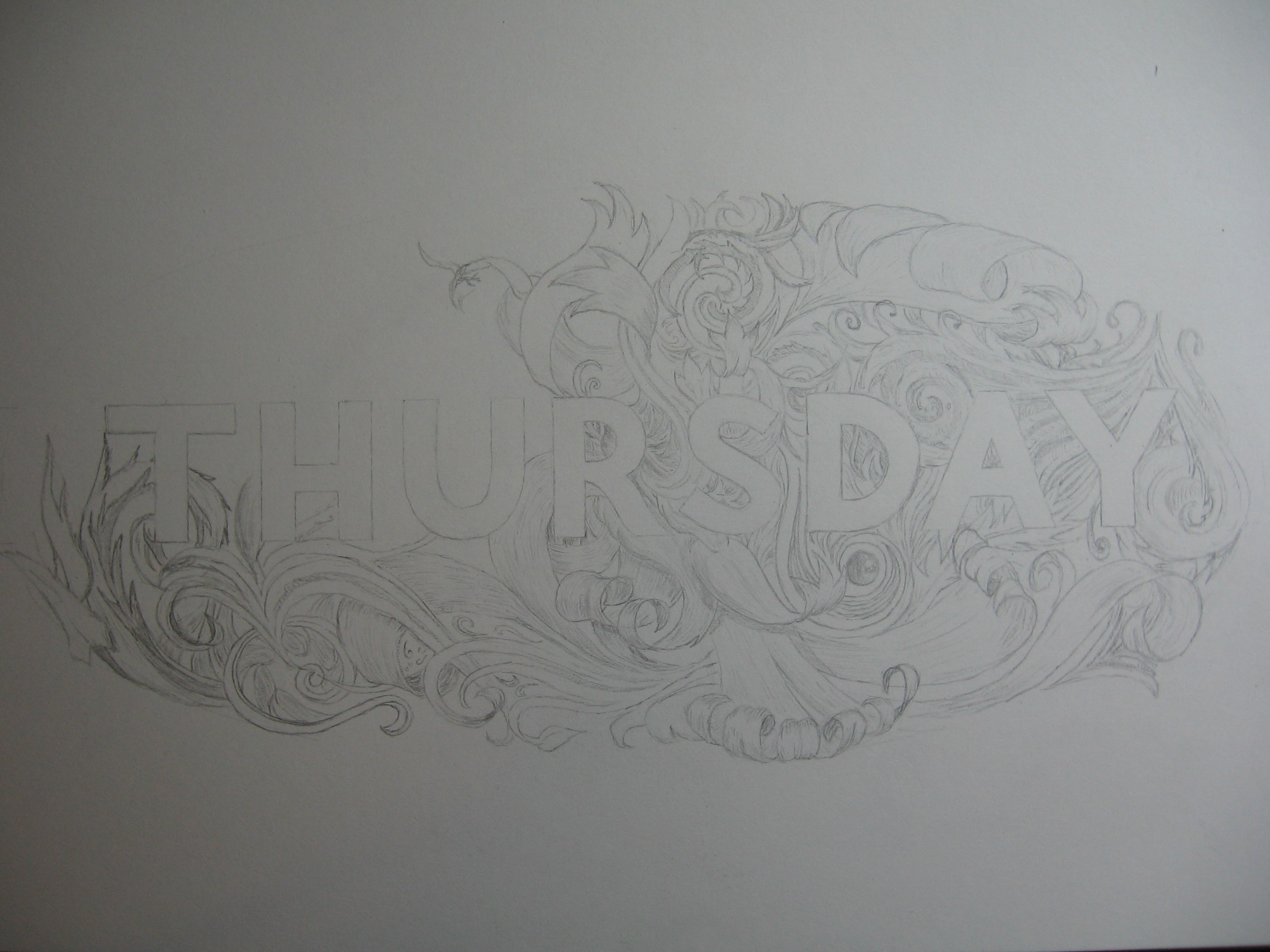
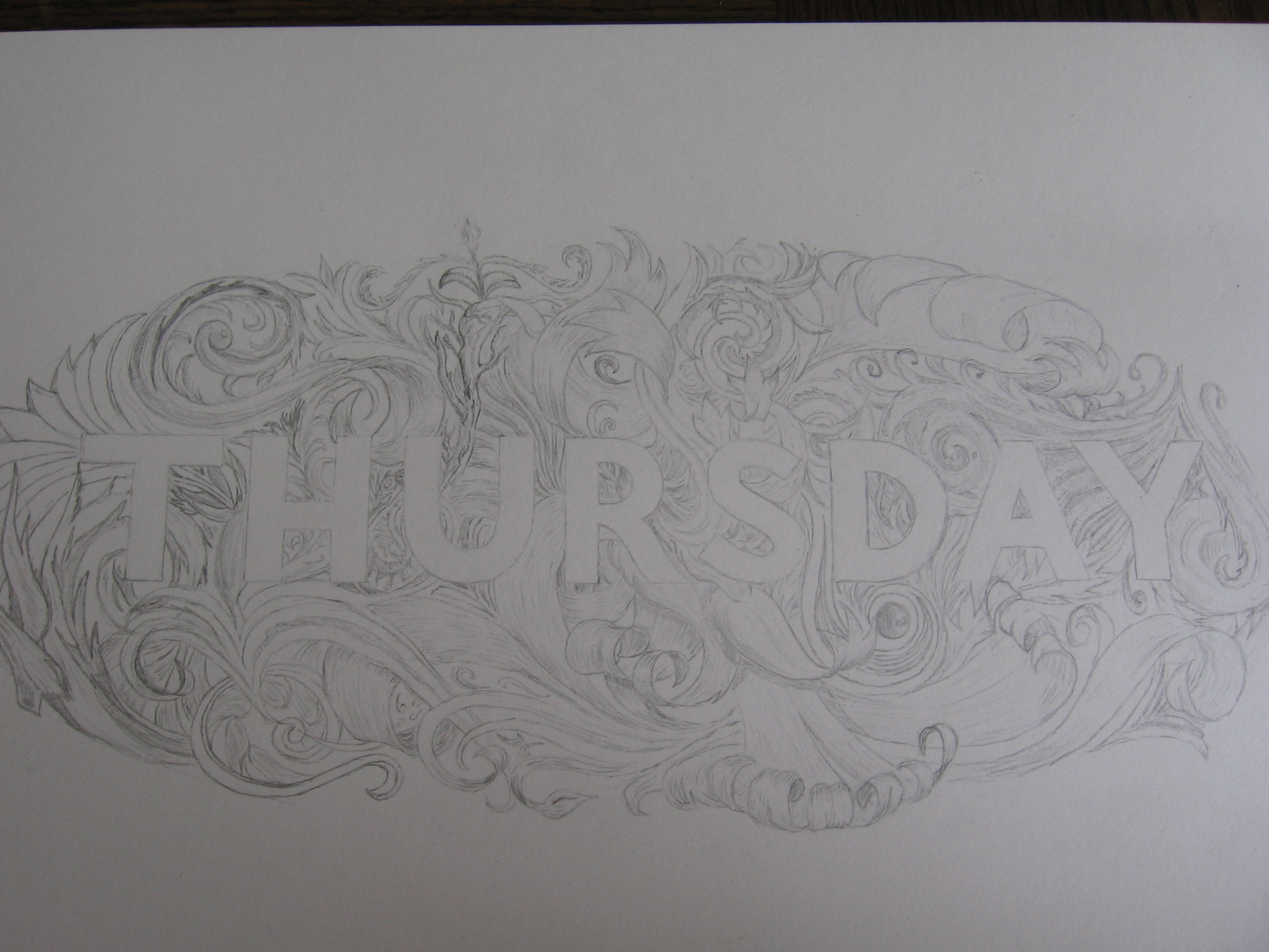
So, new pieces every Monday. Where’s today’s piece then? It’s up there, at the top of the page! It’s part of my personal branding project that I’ve been working on, which includes the new banner and the monogram for social media platforms that I posted a couple of weeks ago. Not only does it give me a new logo (the old one needed a revamp) but it also showcases the kind of work I do much better than what I had before. Now when you come to my website, it’s much easier to get an instant idea of what I do and what this site is about.
![]()
So what was wrong with the old one? Firstly, it was part of Thing a Day. That means that it was a piece that was conceived and executed in only one day. Secondly, I started doing Thing a Day almost as soon as I discovered what lettering was, meaning that they were all beginner’s pieces. Since I started, I’ve learnt a lot about lettering, logo design and calligraphy, all of which I’ve implemented in this piece. Being in the place I am on my journey to becoming ultimate lettering master of the world, I’m a lot better equipped to apply what I’ve learnt. Designers often say that they find it the easiest thing in the world to design a logo for a client, but when it comes to designing one for themselves, they come to an impasse. Thankfully, after some time thinking about what I wanted out of this piece, I came to some pretty strong conclusions as to how I wanted it to look.
![]()
First of all, I wanted a monogram made of my initials. A monogram makes the ideal logo for a letterer, as being a logo made of letters it encompasses the aspects of letters and logos perfectly. I had tried several times in the past to make some monograms out of my initials, and ended up with pages of different ideas. No dice. However, this time, with the clear goal of making myself a new logo, I found a solution that worked much better than my previous ideas.
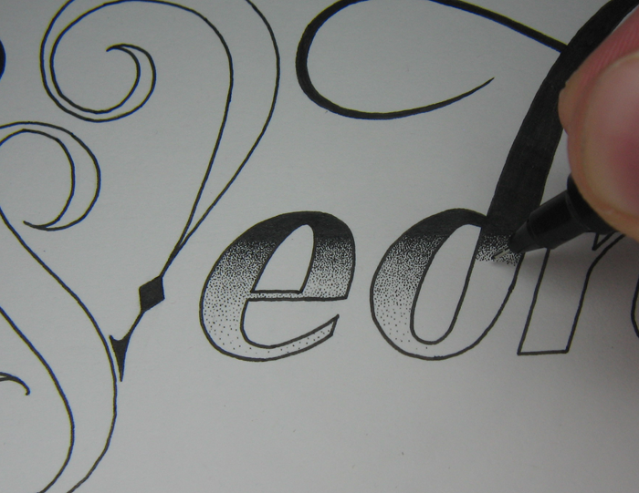
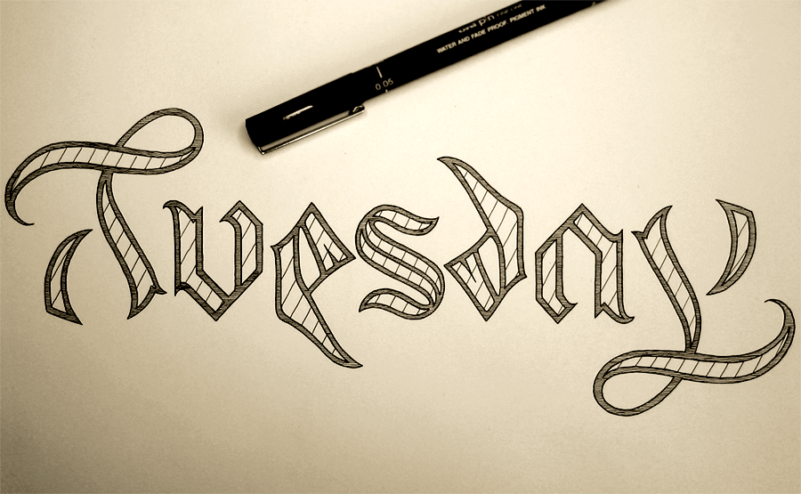
Second, I wanted the piece accompanying the logo to fit into a banner shape to replace the old banner on my website, and to explain what it is I do, but also showcase the brush lettering style of copperplate-inspired calligraphy that I employ in pieces. I originally thought to have the words “Logo Design” and “Hand Lettering” be very different from each other, having “Logo Design” as a thick small caps sans serif. However, with my name in Roman serif, “Hand Lettering” in brush pen calligraphy and “Logo Design” in sans overall made too much type soup, so I gave the two lines a similar flavour, albeit with a different spice to each one.


You must be logged in to post a comment.